What is Information Visualization

The term information visualization comes from information technology. It includes all concepts, methods, and tools that are used to visually prepare large amounts of data for users. This makes it easier for users to use large amounts of data and information for their respective tasks. Information visualization describes the optimal representation of data and information with the aim of supporting human users in their tasks.
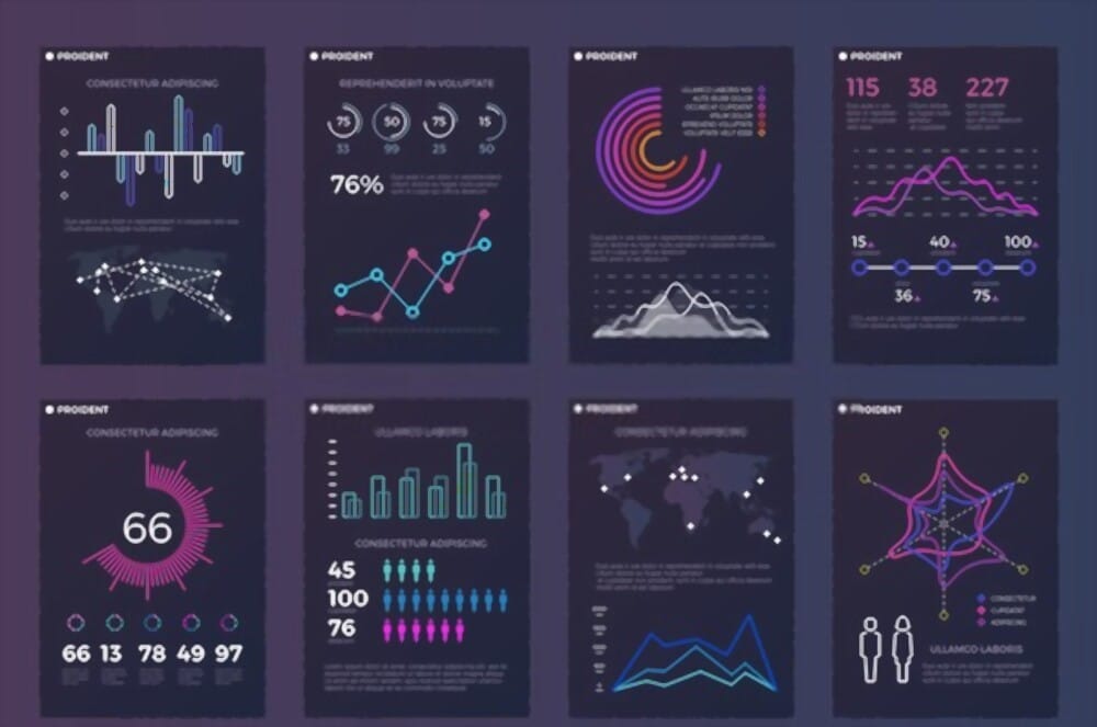
Information visualization is simply the act of visualizing a data set in a way that can be easily understood. We're all familiar with simple visualizations such as bar charts and timelines. Increasingly, data viz designers are souping up these simple graphics into interactive visualizations and multimedia experiences, such as with dashboard design.
Importance of Information Visualization
With the help of information visualization, complex processes, their workflows, and the individual relationships between the objects involved can be clearly illustrated or simplified. In this way, users are given access to extensive data sets, such as those generated by data mining, by classifying and structuring the existing data. Once these two steps are done, information visualization simplifies the next step, analysis. Here it is particularly patterns, connections, or trends that can be identified through the visualization.
Another advantage is that the existing visualizations can be viewed from different perspectives, which results in further possibilities for interpretation and analysis of the existing data. In addition, visualization techniques meet the innate human ability to visually perceive the environment to more than 75 percent and understand and grasp things on the basis of these impressions.
Visualized data sets can be compared more easily with other data sets. Thanks to visualization technology, more easily understandable and clear graphics can be created from complex amounts of data and relationships between individual data. The tasks of information visualization can be summarized as follows:
- Support of researchers and users through the simplified representation of process flows or object relationships
- easier access to large amounts of data through structuring or classification
- simplified analysis of data volumes
- faster recognition of data patterns to identify trends
Common Uses / Application areas for Information Visualization.
Information visualization is used for various purposes. One of the most common applications is the graphic display of hierarchically structured classification structures. The information visualization design also offers assistance for web analysis. For example, it can be used to graphically display the hyperlink structure. In practice, SEO tools, for example, provide an overview of the backlink structure of a website.
In another area, information visualization ensures that large databases such as libraries make search results visually understandable for the user. In a broader sense, search engines are programs for the visualization of search results that are compiled from huge databases. In marketing, information visualization is used to make complex issues easily understandable, even for laypeople. For example, visualization techniques for infographics are used in content marketing.
Significance for usability
On the one hand, information visualization offers many possibilities to clearly visualize large amounts of data, for example, obtained through data mining. It reaches its limits, however, because the necessary prerequisites for the preparation of this data volume and the structuring are missing. These can be appropriate resources as well as required software. In addition, researchers are often faced with the problem of how to visualize the data and how the presented content can be described without the interpretation of the actual information visualization becoming too complicated.
Types of Information Visualization
There are many types of information visualization. Each type having unique characteristics designed to help people interpret and understand the information. Some popular visualization techniques and methods for presenting visual information include:
- Cartogram
- Cladogram
- Concept Mapping
- HyperbolicTree
- Multidimensional scaling
- Parallel coordinates
- Problem-solving environment
- Treemapping
- Dendrogram (classification)
- Information visualization reference model
- Graph drawing
- Heatmap
What is multidimensional scaling?
Multidimensional scaling is a technique used to create comparisons between things that are difficult to compare. The end result of this process is usually a two-dimensional diagram that shows the level of similarity between different elements, all in relation to each other. For example, a researcher might give subjects several varieties of apples and ask them to compare several criteria between two apples at the same time. Once all apples are directly compared to each other, the data is plotted on a graph that shows how much one type is similar to another.
The two components of multidimensional scaling are the correct name, multidimensional testing, and scaled response. Both of these concepts are very simple - only the analysis at the end makes the process difficult. Multivariate testing simply means that many factors of the item under test are tested simultaneously. The apple example can discuss things like color, level of sweetness or astringency, or even how hard the fruit is.
The scaled response of multidimensional scaling refers to the method used to compare factors. Typically, this is a five- or seven-point scale that ranges from not at all the same to identical. This allows subjects to interpret questions and provide answers based rather on their feelings and regarding themselves with right and wrong. It also has the added benefit of generating numerical results, ranging from one to five or seven, that researchers can use to manipulate the data mathematically.
These types of studies have a minimum and a maximum for comparison. If there are too few comparisons or comparisons, the data may show artificial similarities where there are none. When there are too many of them, comparison systems become so overloaded with information that the result usually does not produce results. Usually, four to eight comparisons are made between four and 12 points.
The relationships between information Visualization and UX
When it comes to improving the user experience on your website and in your marketing efforts, information visualization is one of the best elements you can add. Information visualizations are so effective, 74 percent of social media marketers add visuals to their social media posts. There are many places and ways to use information visualizations.
Whether static or interactive, information visualizations help us understand information faster and often reveal insights that would otherwise have gone unnoticed. Also, there's no arguing that visualized data is more attractive and digestible than a ton of grey stats.
Why do UX Designers need information visualization?
UX Designers have access to more data than ever before. This is great when it comes to product development, but UXers have to ensure that they get real insights from the data glut. Data visualization can help UX Designers understand trends over time and space, and find design solutions based on fact, not feeling. Data visualization can work for UX Designers in two main ways:
Information visualization to inform the design process: UX Designers collect and collate data to improve the design and development of a product. Eg, UX reports
Data visualization to inform the user experience: UX Designers design interfaces that will allow users to visualize and contextualize data. For example, a tool dashboard
Once data is visualized and contextualized into journey maps, infographics, and charts, you can start to prototype solutions. Luckily, Justinmind allows you to incorporate real user data into your prototypes!
