Less Is More: Best Minimalist Website Design Examples in 2024

Simplicity has always been viewed as class and elegance. It has now made its way into the web designing world. So, let's get all web designers and developers in the bandwagon of 2023's latest trend - minimalism.
As UI/UX designer, your quest for best minimalist website designs may come to an end here. We will present some incredible samples for you to replicate and incorporate into your interactive app wireframes or prototypes. Fortunately, the internet is teeming with examples that can steer your creativity in the right direction.
However, before giving you the material, we'd like to provide you the perfect tool to match your beginner as well as expert skills.
Learn to create a minimalist website design with Wondershare Mockitt
Wondershare Mockitt is an easy-to-digest online prototyping and collaboration tool. Whether it's clickable mockups of mobile (iOS/Android), pad, web, TV, or watch, Mockitt is the most economical choice for devs. You can start exploring the useful platform right away to create innovative designs to impress your clients or visitors.
Here's how:
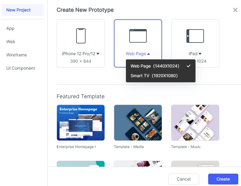
- After logging in, go to "Workplace" There, you can choose whether to "Create a Blank Project", choose the right device type and name the project, or to "Create Project from demos". To make a minimalist website, we will choose a blank project and dimensions of a webpage.
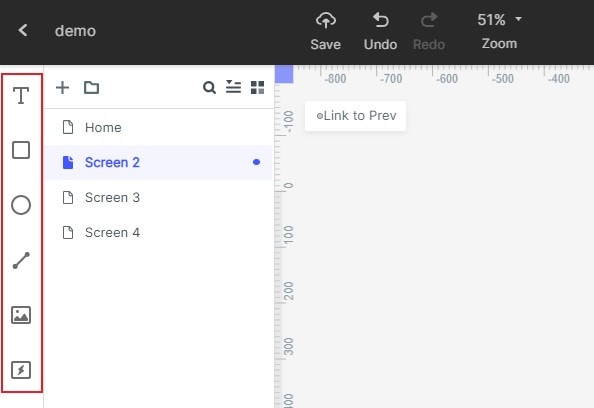
- Add screens and then, select the one you want to work on. Once the canvas has opened, you can add widgets and icons to it. The fast widgets are placed on the left. There are three ways to add Fast Widgets to the canvas. You can either double click the widgets, drag them to the canvas or can press the hotkeys and draw.
- Suppose you want to edit a widget. Simply click it and edit its properties in the Inspector Panel.
- Once you have created a perfect widget, you may want to use it in the future too. For this, you can save the widget. Simply add that widget to the "My Widget" library. You can do that either by dragging the widget to "My Widget" Panel or Right-clicking the widget to "Add to widgets".
- Now, you can also add links between screens to turn the webpages over or direct them. To do that, you can choose the widget, then click "New Link" in the Link Panel on the right. Then set the gesture, action, target screen/state, and animation for the widget.
Or you can drag the Link icon on the left of the widget to the target screen, then you could adjust the gesture, action, target screen/state, and animation on the Link Panel.
- Designers often add text notes for their design to explain it further. Can you do that in Mockitt? Absolutely! Well, simply use the "Sticky" in the Build-in Widget Library.
Then you can write texts in the Sticky to note in the future. Note, the "Sticky" is only viewable in the Preview Mode.
- You have learned the basics, but if you still want to just paste design and save the labor, worry not! Mockitt provides templates of various industries. While creating a project, choose the available demos. A library of templates will open up. Click "Use Demo" to enter the project.
To use the screens in the template, hover on the screen list and click "move to" to move the screen to the target project.
Minimalist Website Designs That Didn't Fail to Blow Our Minds
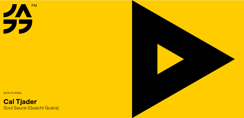
#1: Jazz FM
Jazz FM is a Bucharest-based website for a radio station that did a great job of letting the music speak for itself. The colorful platform simply urges the visitors to stream the live broadcast. How? Through an eye-catching triangular play button that covers half the view. They got us more by doing less, a logo, and a Now Playing track display too. This minimalist website design benefits users in the shape of faster loading times.
As we notice further, there is a continuation of gorgeous 'jazzy' SVG illustrations that of course scale with immaculate crispness, regardless of your screen size. The site becomes very accessible as you scroll down its yellow and black-themed graphics to search channels, and shows schedule.
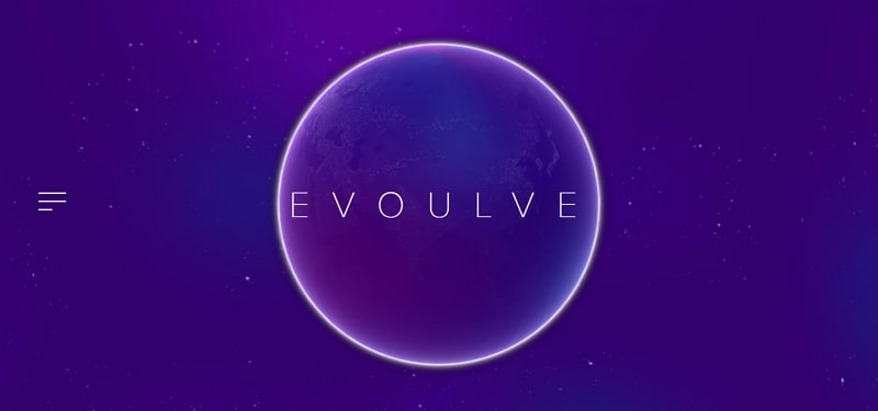
#2: Evoulve
Evoulve's website is one of the masterpieces of design agency, Fleava. The platform is dedicated to transforming emerging technologies into practical products. Its site's design has a mesmerizing feel with a very futuristic aesthetic. The UI designers have added very few elements on the webpage to let the visitor's imagination wander. It has bare minimal navigation options and simple text annotations that set against the backdrop of a slowly spinning purple globe and space with stars. Each section of this minimalist portfolio website has been crafted carefully, with subtle CSS animations accentuating the sense of magic and creating a mood of discovery.
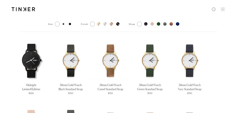
#3: Tinker
Tinker is a classic watch retail website and the UI design for it has been stripped back to basics. The brand was indeed created with a simple concept in mind: customers can easily select the face size of the watch, its strap color, and metal, in any given combination. They have featured no unnecessary details that can confuse the customers while making the right choice for themselves. It is among the best minimalist websites for a reason. The UI for Tinker makes the concept clear; without any mental hassles, people can choose their ideal combination from the finite options available at the online store.
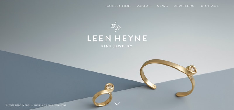
#4: Leen Heyne
Leen Heyne is a jewelry brand that has made sure glitz and glam stays away from its website so they can only focus on what is significant. They have driven the visitors' attention to its jewelry alone by using a monochrome logo and company name at the front of a dull toned background. Two magnificent jewelry pieces are the only visual elements on Leen Heyne's homepage. A subtle arrow urges the user to scroll down and see more of their products firsthand before diving into their collections. This minimalist website design is product-focused and is a safe bet to pull anyone's focus in.
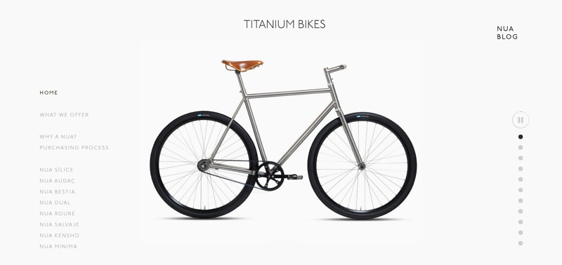
#5: Nua Bikes
Nua Bikes' site has been precisely engineered to give the deception of a minimalist website. How? All the elements on its homepage are balanced in such a way that everything looks airy but, it isn't. They have actually featured a lot of description sections that are not looking visibly stuffy. By condensing the text and maximizing the whitespace in its background, the UI designer was able to keep the visitor's focus on its product alone, the bike.
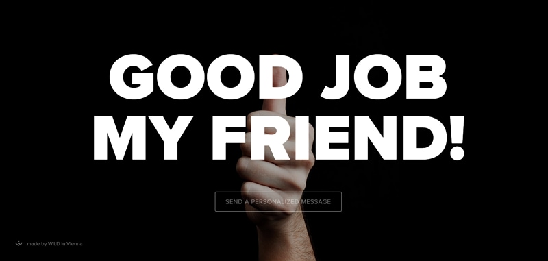
#6: Sendamessage.to
Sendamessage.to's website has only one clear purpose and it is conveying it very conveniently. The amusing platform lets people customize messages to deliver to friends with a hand gesture. The main image of a hand showing different gestures on command is placed against a barren black background to add a powerful effect. Other than that, the text has been used in bold white letters to stress the message being sent. This minimalist website design was built around the concept of its service itself and how beautifully!
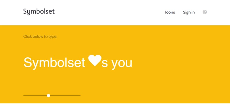
#7: Symbolset
Symbolset is an icon font vendor that lets individuals convert words into symbols and icons. The developers and designers of its website have exploited the ideology of the firm very well in the business' favor. They pasted an interactive area in the front middle of the site by minimizing the competing elements and adding a brightly colored, ever-transforming background. If this doesn't grab a visitor's attention while keeping it minimal, we don't know what can.