How to Use Design Components to Make Mobile/Web UI UX

When creating a ui component design, you should know how to use design components in the right way. There are several mobile ui components you can use, but you should know the ones you should use for your specific design project. The various design components play different roles you need to understand during the designing process. There are various tools you can apply as you make your component based design. The most critical thing is to use a tool with the highest number of easy to use components so that you can create a user friendly design fast. Let's look at Wondershare Mockitt which is the best tool with tons of built-in components to use.
Where to Find Design Components
As you look for design components to make mobile/web UI UX, Wondershare Mockitt is the best tool to use. The tool is not only easy to use, but it has a myriad of features that make it easy for you to make ux components that help you create highly interactive Mobile/Web UI UX design. It has an in-built library of assets that is full of templates and components you can add to your component based design in a simple and quick way. There are also icons and all of them have built in interfaces you can apply with a wide range of styles you can choose as you create your design. In the library, you find the "Mine" tab that allows you to upload your own files by using a simple drag and click action.

Mockitt also allows you to collaborate with other designers. You can all work on the same component level design simultaneously and see the changes that each of the members is making. You can also share your design with others for both online and offline preview. Being a cloud based tool, you can use it wherever you are, as long as your device is connected to the internet. No coding is needed, adding to the simplicity and user friendliness of the tool.
How to Use Design Components to Finish Your UI/UX Design
With Mockitt, it is easy to use available components to create highly interactive UI/UX design. Here are steps on how to use design components to finish your UI/UX Design.
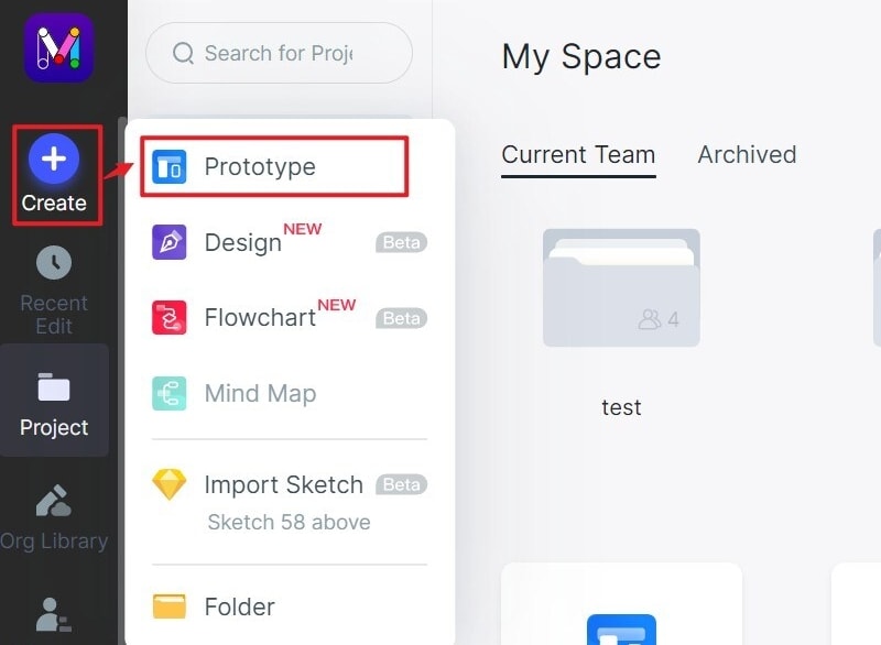
Step 1: Create a New Project
Create a new project UI/UX design by clicking the "Create > Project" button, name it and select the device you want to create the design for.
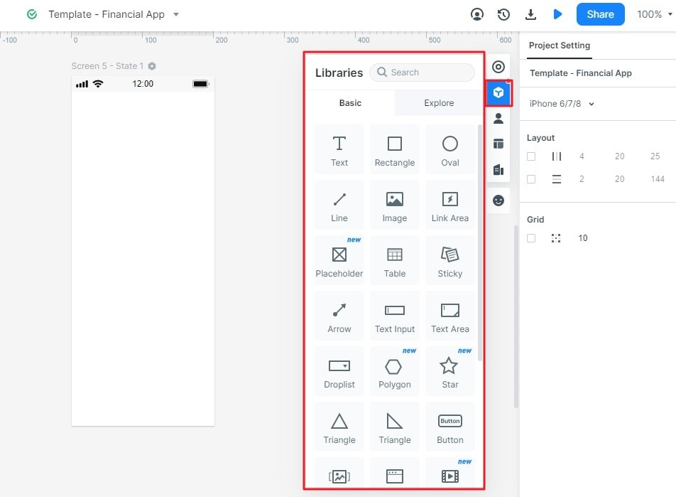
Step 2: Find the Design Components
Built-in design components:
Once you create a project and you will enter the editing area, and you will see the "Built-in" components opened. There are many components, and you can double-click any of them and they will be added to your canvas.
More design components:
If you want to find more design components to use, you can click the "Library" button and you will find there are many widgets and icons. You can also click the "Resources" to save more components to your account.
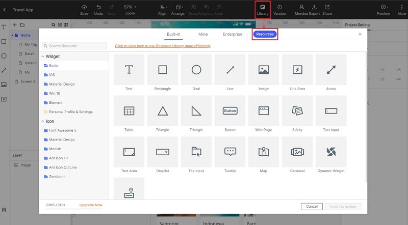
Go to the platform and Click "Library" where you find several components displayed. Some of the components you get include the various shapes, such as rectangle, oval, triangle, and others. There are also several other components such as Text, Image, Button, map, carousel, widgets, icons, Text Area, arrow, line and other design components you can select for your UI/UX Design. Choose all the mobile ui components you need for your UX/UI design. Save them into the library to use for the design. Double click the components or drag and drop them into your design canvas. Now go to the design canvas to apply the specific ux component in your design.
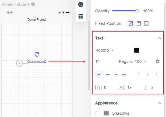
Step 3: Use the Design Components into Your UX/UI Design
After you have added the design components, start editing them to create a customised UX/UI design. You can edit by repositioning, resizing, adding notes and other ways you find necessary to create a design that meets your specifications. Click "Appearance" to choose the background color of your UI component design. Continue editing the design components until you get the design you want. If you have several screens, repeat the same procedure to all of the others. To edit all of the mobile ui components at once, assign "Master Status". This helps you save time during the UX/UI design. Besides, you can also use the "Sticky" feature to add notes to give further explanation regarding your component design.
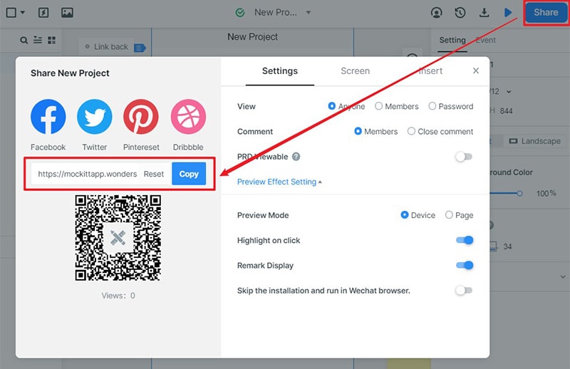
Step 4: Preview and Share your UI Component Design
After creating your UX/UI design, take time to review it. Click "Preview" to have a look at your component based design. This helps you find if it has the feel and look you need. You can also allow others to review by clicking "Share" to generate a URL link to share the design with others. On the comment section, they can give feedback on how you can make the right improvement on your component design.
What is Component-Based Design
Component-based design involves designing sites from ready-made components. These components are created and programmed segments that are used as building blocks for your site. One of the features of the components is that you can reuse them on all subpages. The components offer high level versatility because you can re-use them because they enable you to share and rearrange your website without involving developers. With the many readymade components, your site becomes a universal tool. These components are easy and intuitive, and you do not need to have web development skills to use them.
Useful tips about design components
1. Create components you need
As you do the design, you should only make use of UX design components you require. Only use the ones that you require for your current needs and remove the ones you do not need.
2. Know why the components are good
Understand what you need the components for your design. With this knowledge, you will be able to apply them in the right way to make a highly interactive component-based design.
3. Shape
You should think how the various components of the component-based design are, and how the shapes interact. Play well with the shapes to make a customised design.
4. Space
Make use of the negative space to develop shapes as you do with any other component you are using for your design.
5. Customizethe components
To get a highly interactive or customised component design, you edit the components to give then a specific feel and look you need. Wondershare Mockitt allows you to customise these components to meet your specific design goals.
