Create a Responsive Carousel/Image Slider That Acts Like a Lead Magnet in 2024

Responsive carousel is a fun and easy design addition to lure your website visitors. These responsive image slider segments are generally composed of a massive image in the center. They usually have some text overlay on top. Whenever a viewer clicks on the image part or text part, the corresponding page opens. Then the user can explore that associated page.
- Part 1. What is a Responsive Image Slider or Responsive Carousel
- Part 2. How to Make a Responsive Carousel Easily for Any Website in 2023
What is a responsive image slider? And why are these segments attractive and must be on your website?
As we've learned so far, responsive image slider segments with text can become an indispensable part of any website. They attract the visitor's attention in an instant! More than that, they are very clean and powerful additions that give a premium appeal.
If you want to do the following things, you need to add responsive image sliders to your website:
- Attract visitors and prospect buyers towards something, for example, a sale banner, a product launch, and so on.
- Make your website look more professionally designed.
- Add life and personality to your branding online.
- Use the "less is more" theory to add value and showcase your brand's core visions.
Some examples of the best websites containing responsive image carousels are from:
- Amazon
They use responsive image sliders with text codepen integrations to grab attention towards ongoing sales and new product launches.

- Airbnb
Airbnb has bagged numerous design awards, owning some of its success to the lucrative responsive carousels that facilitates visual storytelling in the form of cities to explore.

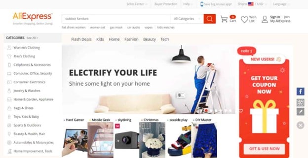
- Aliexpress
Aliexpress is famous as one of the e-commerce giants in this world. It uses not only one but multiple image sliders on its homepage itself. It surrounds the customers with all the products they have to offer on their web store.
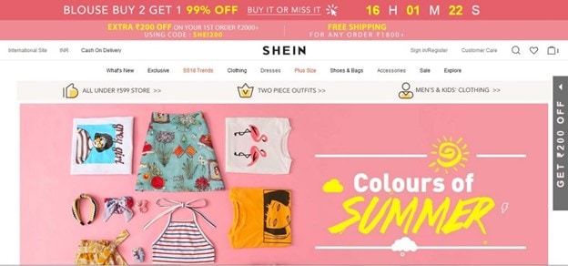
- Shein
Shein is the most popular retailer in the digital space, makes use of responsive image carousels to market and make customers click on their catalog. It's some of the most sought-after examples of clean design principles.
How to Make a Responsive Carousel Easily for Any Website in 2023
Now let us quickly go over how one can actually integrate a responsive slider with text in the website. For this purpose, there are multiple tools available online where usage doesn't require any prior coding knowledge. One of such free tools on the internet is from Wondershare Mockitt.

Mockitt is a free digital and online prototyping tool made available by the famous tech giant WonderShare. With the help of it, anyone can create visually stunning websites that attract users in a matter of seconds. There are pretty cool features that it offers, which are:
- Easy to learn and use - Getting started with Mockitt has a natural learning curve. It offers a drag and drop interface so you can play around with different style elements and truly scale your design thinking.
- Available for all major operating system platforms - Using Mockitt is a cross-platform experience. It is available on Windows, Mac, Ubuntu is easy. The downloadable files and onboarding guide is available on the website.
- Huge design elements library - With the help of multiple styles and customizable widgets, buttons, icons, and more, you can make innovative designs that speak volumes for your brand. These are also available to be animated or become responsive to trigger events like clicks, hovers and so on.
- Community driven - it is trusted by the design community of over a million users. What's more, is, help is always available around the corner from fellow designers.
- Team management and easy role distributions - It can be used by individuals and across teams. Project managers can easily assign and limit roles and iterates down to person levels- just like a real office.
- Cloud synchronisation capabilities - Every time you make a design change, you don't have to worry about saving it. Mockitt does this job for you automatically. This means you can resume work just where you left it before! If you choose to go over certain actions, you can also use the traceable revision history.
How to make or create a carousel and generate code
Using Mockitt to create your ultimate responsive image slider is an easy task. In this tutorial we will jump to the carousel creation part using the "Carousel Widget". Let's begin with this step-by-step tutorial.
Step 1. Locate the carousel widget and click on it after opening design screen
Mockitt offers an inbuilt Carousel widget that would do the heavy lifting for you. You can add as many carousel picture sets as you like. In the "Widget Panel" you will find the "Carousel" button.
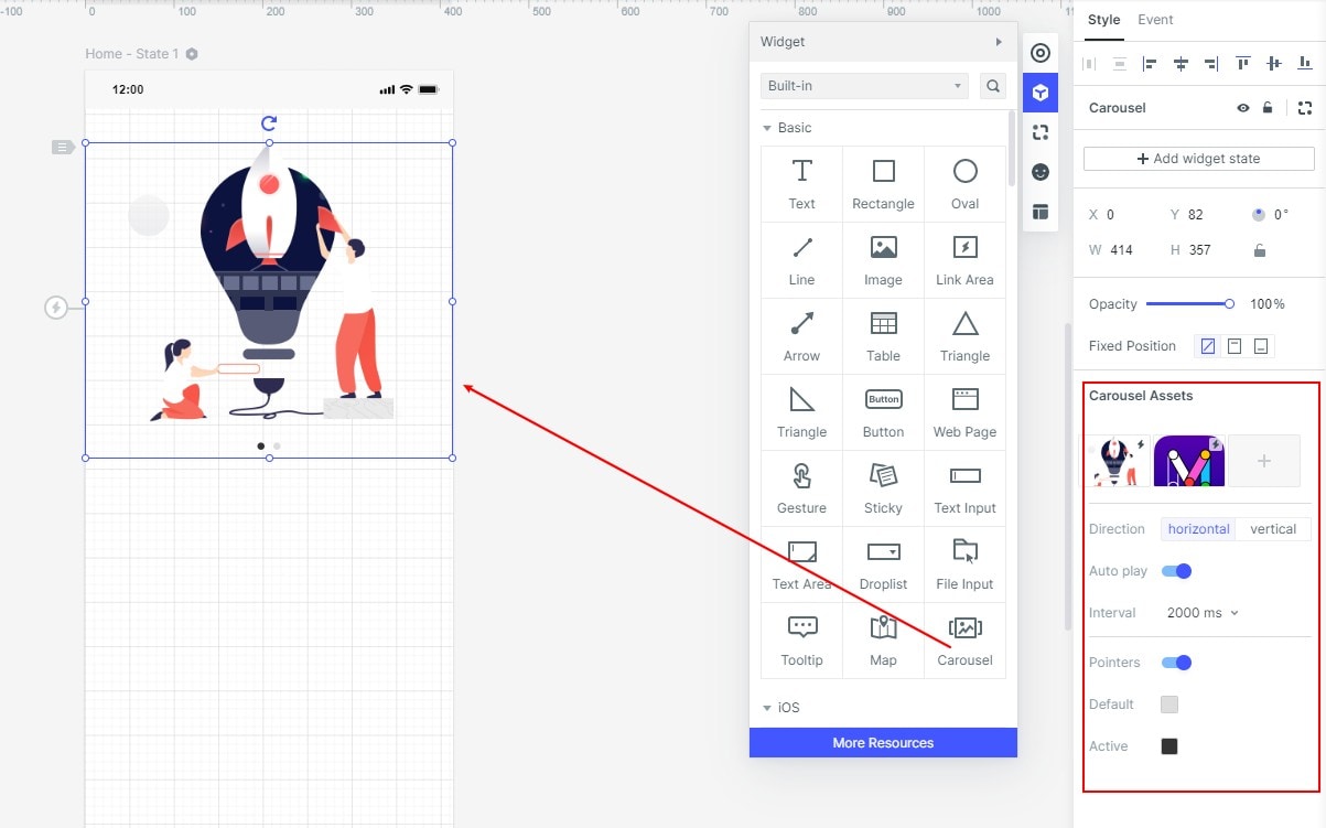
To add the desired carousel in action, you need to drag outside the carousel component from the in-built component. You can also press 1 as a shortcut key for this purpose. When you hover the cursor on top of the carousel, you will get an option to select from "Local Upload" or "Material Library".
Step 2. Setting scroll orientation
Depending on your choice of vertical or horizontal scroll, you can make adjustments. Mockitt indicated whichever is about to be implemented when pointed upon automatically.
Step 3. Click to rotate or auto-rotate
The duration or intervals between the scrolls of your carousel are also up for adjustment. (Just one of the many customisation options offered by Mockitt!).
On the thumbnail, you will find a small lightning icon. From here, as a user you can set it to click the carousel to jump to other pages or other states.
Step 4. Whether to set indicator point and its color
The display indicator and color indicators are also highlighted by Mockitt. You can also choose to customize it according to your need, or simply skip and process to the next step which is code sharing.
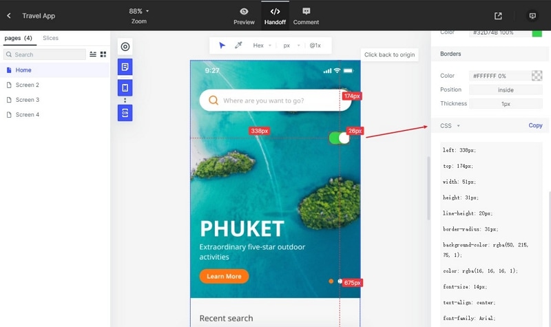
Step 5. Handoff to the developer
Your responsive carousel design can also be shared amongst the other team members and developers.
Mockitt comes with a "Handoff" mode to solve this purpose. You will find the "Handoff" icon (as shown in picture) with which you can download shareables or generate links. That's it, your design masterpiece is ready to be seen by the team before the world!
And that is it! Its just how easy it is to create and share a responsive image slider for your website! You are now set to take your website design a notch ahead your competitors.
Quick recap on responsive carousel
A responsive image slider, or a responsive image slider with text, is a visually attractive and interactive design element that engages your audience on the website. It can contain from one or more images with a text overlay on it.
The ultimate responsive image slider is the perfect amalgamation of UI/UX experience and images that complement each other. The duration of scroll, the images, the dimensions, cursos color and more, are some of the parameters that can be designed keeping your brand voice in mind. And luckily, many online prototyping tools like Mockitt by Wondershare will allow you to just that!
By using Mockitt and its inbuilt carousel widget you can create image carousels that make your website visitors stop and stare! The free version for trial is available on the official website . So what are you waiting for? Design your next design masterpiece without any coding on Mockitt now!
