Mockitt - Free UI/UX Design Tool
"UI is the saddle, the stirrups and the reins. UX is the feeling you get being able to ride the horse. - Dain Miller
- UX Design vs UI Design | What's the Difference?
- Step-by-Step Guide on How to Do UI/UX Design with Ease.
- Top List of Must-Recommend UI/UI Tools.
- Leading UI/UX Design Trends to Dominate in 2020-2021.
- UI/UX design secrets you need to know.

Top 10 Examples and Rules for Better Dashboard UI Design
Dashboards are applied to display the most critical and valuable information in your app or site. You get them in various in most mobile and web apps used daily ranging from business intelligence suites to photo sharing apps. A good dashboard UI design should only show relevant information at a glance. It should be designed in a way that saves end users time, meaning it should be efficient. As you create a dashboard UI design, start with a high level overview and offer easy paths for target users to increase granularity levels. This articles offer more information to help you understand more about the dashboard.
Top 10 Dashboard UI Design Examples
1. Micromobility web dashboard
This is one of the top dashboard UI done by Ramotion that users can stare all day. It is designed in a superb way and nice color. It is nice, simple and clean meaning you can get all the information you need. The dashboard has a minimalistic design which is one of the thigs that makes it easy to use even for beginners.
2. Covid information dashboard
This is one of the best dashboard UI in which profile and search are proportional compared to the entire interface. It has a nice and elegant design that attract user to it. The textfield is big enough making it easy for user to read. The design has contrasting colors which most of the other similar dashboards lack. There are also graphs and cards that help provide more information to users.
3. Tasks- Maise dashboard UI kit
This is a dashboard ui ux design that has different tasks. It is easy for users to use with even demos provided. It is created with an awesome design with a highly responsive and customisable component library. The library has 31 unique and premade page templates in different categories such as social networking, getting started, productivity, content, coming updates, and more.
4. Local autumn calendar events website
This is another website designed in a simple and easy way to understand the content. It is has a few graphics that makes it easy to know all the local events organised for each of the day of the month and years. With a few colors used, users are not distracted as they look for information they need from the site. By just hovering the mouse over the dates, you can get the events fast.
5. Web app smart house
Web app smart house is among the top dashboard UI examples. It is an app for managing a house that you can connect with other users to monitor the actions performed by use of a remote control. It makes it easy for you to ask the house to prepare a cup of tea or even close curtain at the comfort of your seat. The colours and the design are awesome and meet the expectations of the users.
6. Frappe accounting/ customers
Frappe accounting is a simple to use dashboard UI design for business owners that helps in managing their finances and accounting. One of the great things about the design is that it works offline and stores all information in a local file that is highly portable. It works in all platforms including windows, macOS and Linux.
7. Personal budget app-Tinetik
This is another nicely done design with easy to use and understand features. All the elements used including colors and fonts are well perfected to make it user friendly. It gives all the information reading how to manage your finances in a simple way that even as a beginner you can understand well.
8. Diet app dashboard
Diet app dashboard has a unique dashboard design UX layout from most of the others you find online. It has a decent design with relevant information on recipes and information. The app is created in a way that is easy to follow and understand. The font and color selection is great making it easy to read the information provided.
9. Ripple net home dashboard UI
Ripple net home dashboard UI has a smooth and nice interface you like navigating. The logo designed in the glass cube has a nice touch that makes the entire dashboard look amazing. Unlike most other dashboards, it does not contain a lot of clutter, thus it is easy to get the information you need fast.
10. Order list animation
The dashboard UI design looks nice. One of the things that is unique are the interaction animations. The contrasting colours also make it more appealing. The elements are also well integrated making it user friendly to navigate.
Top 10 Rules for Dashboard UI Design
1. Determine the goal of your dashboard
Determine the goal of the dashboard UI to serve. The kind of dashboard you design should be determined by user needs and roles you want to satisfy. Have a dashboard that makes them take action quickly and get value from it. Carry out prior research to decide your user needs and expectations to create a dashboard that serves them well.
2. Select the correct representation for the information
Representing data in a dashboard is complex. You need to have the right chart type to enhance date interpretation. Before you begin have a look at internal documents and reports for inspiration. Use features such as graphs and scatter charts to provide the data for easy understanding. Avoid the use of gauges, 3D charts and overstyled charts because they distract viewers from your data.
3. Be consistent with your messaging
The major objective of a dashboard UI is to offer message to users fast. Users do not have all the time, so be sure have a clear framework to enhance consistency. The best way to do this is to have a single framework to avoid distracting or confusing the users as they look for information. Note that dashboard users like having peace of mind as they look for information. If they find it confusing, they will go for other alternatives.
4. Consider the flow and layout
You can attain consistency and alignment by use of grid. Grid helps you attain this, with less effort and design a simple structure for your design. As you do this note that the top left corner of screen usually grabs more attention, so place the most crucial information there. Make sure your dashboard has a continuous flow to make it easy to navigate across it effectively.
5. Apply building blocks with constant structure
After defining the grid, you should work with widgets that hold charts, controls and info. It is easy to arrange cards. Using cards is the best option since they are manipulatable. They are also a perfect choice for highly responsive design. Cards also allow for consistent layout of data inside and controls. With a consistent structure, it becomes easy for users to navigate the interface and get the information they want fast.
6. Doubling your margin
Make sure that your dashboard UI UX design has a balanced white space to make it easy for users to read your copy. The white space matters a lot just like any other typography elements you have on your dashboard. Your readers might not be aware about this space, but as a designer you have to focus on it to allow readers get information they need. It is one of the elements that make your dashboard have an elegant look and easy to use.
7. Never hide information or depend on interactions a lot
One of the top objectives of a dashboard is to offer data at a glance. If you create a dashboard that relies a lot on scrolling or one with many interactions, the whole purpose of the dashboard is diluted. The most important thing is prioritization. Understand key information and present it on the space above the fold. Never overwhelm your target users with information because they might not have the luxury of time to read all the information needed.
8. Focus on personalization and customisation
Your users have high expectations that the content you present will be valuable for their specific needs. Customisation and personalization are two techniques that can make your targets get what is valuable to them. A personalised and customised design makes the dashboard not only valuable, but easy to use by user as they look what they need. The users will develop ownership of the dashboard if it is personalised.
9. Ensure your data tables and lists are aligned in the right way
Using a data table is a perfect solution when you want to present ample information for several items. For instance, contacts, list of customers with their ID, last activity and many others. If you have such information in your dashboard, present the information as a data table. Some of the benefits of doing this include easy scalability, leverage space and makes it easy for your users feel comfortable working with excel. It is also easy to get and change something when you present your information using data table.
10. Create the dashboard last
The dashboard should be the last thing you should create. This is because it has the summary of all the information and show the most important information from the different areas of the app. Designing it as the last option helps you avoid having to keep on going back and updating the design as you work on other pages. In addition, when you design a majority of the views, you have a myriad of elements to work with as you put the dashboard together.
The Best Tool for Dashboard UI Design
There are several tool you find online you can use when designing dashboard UI design. For your design, the best tool to use is Wondershare Mockitt. This is a tool that provides a chance for you to prototype for several platforms. It offers you a convenient environment to design a dashboard that offers value to the end users. The other reason many dashboard designers use it is because of its vast icons and widgets that are helpful in the designing process. Some of the widgets you can apply include video, button, text, map and others. Besides, there is an icon library with all resources that are valuable for your designing process.
Whether you are a starter or have experienced in dashboard UX, you will find it easy to use this tool because it just allows you work by simple dragging and dropping. It also has user friendly transitions and gestures. The tool also makes it possible for you to implements animations, gestures and transitions into your dashboard UI design. In addition to this, there is a sketch plugin that you can sync with your files and link to screens fast to enhance your prototyping.
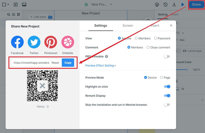
It has a shareable URL or QR code that makes it easy for you to share your dashboard design with others. It also makes it easy for you to preview and interact without the need to log in. Since feedback is core to the succeed of a UI dashboard design, the tool allows you to share it with others and get feedback that can help make the required improvement.
Steps on how to make a dashboard UI design with Wondershare Mockitt
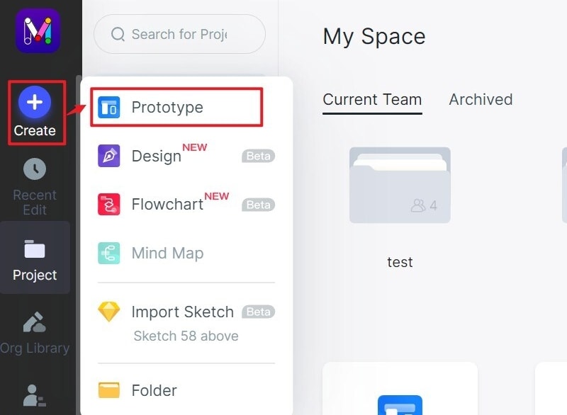
Step 1: Create a new project
- Start the dashboard UI design by logging in, click a new project, select the device you are making the dashboard for and save. You can also create a project for demos.
- You can edit the project by clicking settings where you can make the necessary changes.
Step 2: Design the dashboard UI
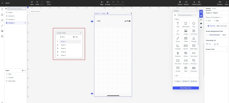
- Add widgets and icons- Go to fast widgets on the left side and add them by double clicking, dragging to the canvas or press hotkeys and draw. Then, check the right side, where you see build in widgets, my widgets and icons. Double click or drag them to the canvas. The tool also allows you to edit the widgets to make the necessary changes.

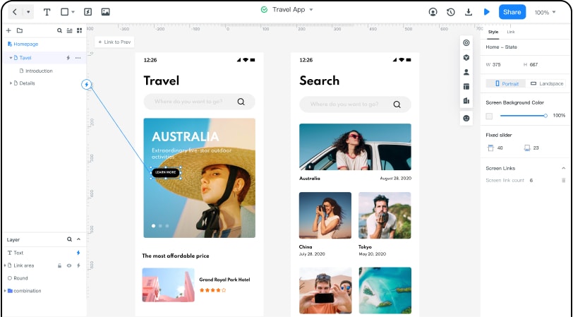
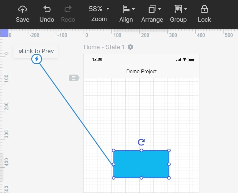
- Add links- now you can add the links to the screens, by choosing widget and then click new link in the panel or drag the link icon located on the left of the widget.
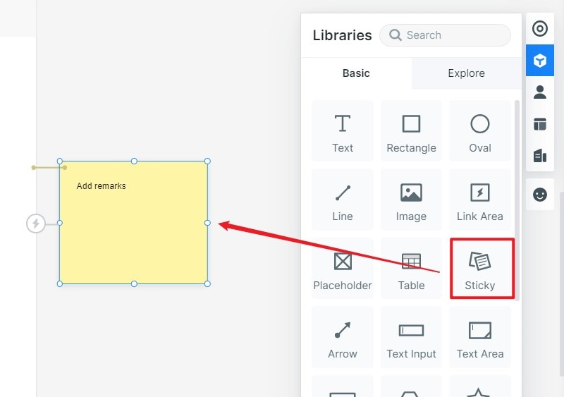
- Add notes-to further explain your dashboard ui ux design you can add notes by using sticky feature found in the icon library.
- Interactive animations-create interactive animations by use of the dynamic widgets.
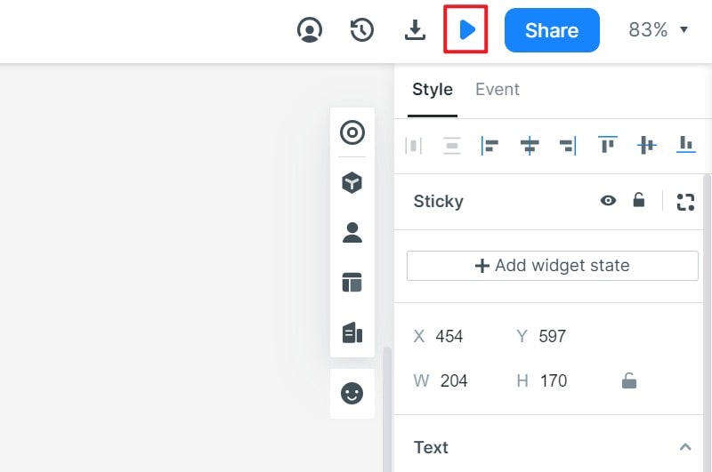
Step 3: Preview the design
- Preview your dashboard UI design to check whether it looks the way you desired.
Step 4: Share the dashboard design
- You can now share it with others to get comment/feedback for improvement. After you are sure it is perfect you can now launch it for your users.