Top 5 UI Button Design Examples and How to Create Great UI Button

Buttons are among the most interactive elements of a User Interface. They are important in creating clear interactions and favorable user experience. They enable getting the expected feedback from the system after a certain command. A button allows the user to communicate with the digital product directly. Modern UI buttons are different and serve many purposes. Regularly, buttons present an interactive sector, marked out for visibility, and having a certain shape. This is often supported with a copy explaining the action fulfilled by the button. Designers have to use time and effort to create successful and observable buttons. They have to stand out in the layout.
- Part 1: 5 clean website examples for inspiration
- Part 2: The Best Tool for UI Button Design
- Part 3: How to Create UI Design Buttons
Top 5 UI Button Design Examples
1.Call to Action (CTA) Button
This is an interactive element of a user interface that focuses on influencing users to take action. The action presents a conversation for a particular page. E.g. buy, contact, subscribe, etc. This turns a passive user into an active one. It can be any type of button that is supported with a call to action. The only difference with other buttons is its engaging nature. It catches attention.
2.Text Button
It is presented with a piece of text. It means that the text is not integrated into any shape or filled tab. The UI Button Design doesn’t look like a button in our normal understanding. It is a live control that allows users to interact with an interface. These buttons are marked with a color or underlined. They connect the user with important content sections of the websites without interfering with the main page.
3.Dropdown Button
In the dropdown button, when you click it, it will show a drop-down list in conjunction with omitted items. When tapped, they show added content.
4.Hamburger Button
It is the button hiding the menu. When you click it, the menu expands. It got its name from its horizontal three lines. It is widely used as an interactive element of web and mobile layouts. Active surfers visiting different websites regularly know by default the button hides different categories of website content. Hamburger menus free the space for other important layout elements.
5.Share Button
There is high popularity of social networks, chatting, and emailing. These UX Buttons are used in simplifying the process of connecting an app or website. Content to users’ social profiles. This type of button allows users to share the content directly to social media accounts.
source: uxplanet.org
The Best Tool for UI Button Design
Wondershare Mockitt is an online tool that specializes in creating mobile app wireframes and prototypes. It allows you to create any prototype for Android and iOS devices. In an organized workspace, you can create a prototype without having to write a single line of code. Below are the main features of Wondershare Mockitt:

Asset Library: This feature helps individuals/teams start an efficient design journey. It has enough widgets that can be directly used. You can make prototypes without any experience.
Design: Design prototypes build dynamic effects without coding knowledge faster. Import design files directly and adds interactions. Drag crucial images directly. When you add the “link area”, you can easily make your design files interactive.
Efficient Presentation and Review: Good design enables smooth and efficient communication. You frame your prototype with the device shell to stimulate a real interactive experience. Use the black and white full-screen mode to highlight your proposal. You can share your link or QR code so others can see your prototype. You can also set passwords.
Hand Off: developers can read the specs online through URLs shared by designers.
Cloud Editing: here, you don’t need to install the software. You can start immediately through a browser.
Multi-Member Collaboration: team members can co-edit and co-manage projects in Wondershare Mockit enterprise.
How to Create UI Design Buttons
Step 1: Create a New Project
You can create prototypes for mobile (iOS/Android), iPad, Web, TV, or watch. You can also customize the project size for any screen.
When you log in, click “Create Project” to start prototyping. You may create a blank project, choose the device type, and name the project. You may choose “create project from demos”.
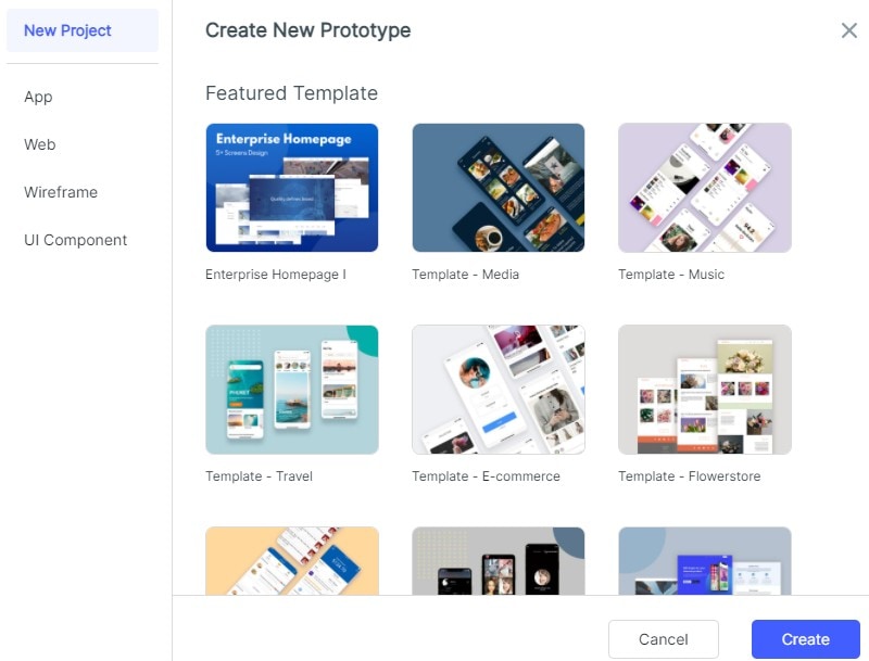
Click “blank project”. Choose whether you want to create it in a mobile, tablet, web page, TV, watch, others, or customize. Followed by size. Then click the “create” button.
Click on “settings” in the project. Change the project name, the device type/size, and save. If you change the size of the screen, adjust it manually.
Step 2: Design the UI Design Button
- Add Widgets and Icons
On the left, there are fast widgets. There are three ways to add widgets to canvas. Double click widgets˃ drag the widgets to the canvas˃ press the hotkeys and draw.
On the right, build-in widgets, my widgets, and icons are the type of assets found. There are two ways to add them. Double click the widgets˃ drag the widgets to the canvas.
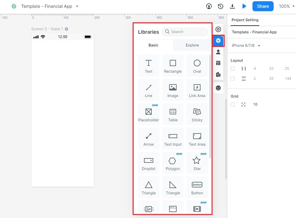
To edit the widgets, click a widget and edit its properties in the inspector panel.
To save the widget, add it to “my widget” library in the following ways: drag the widget to “My widget” panel and Right-click the widget to “Add to widgets”.
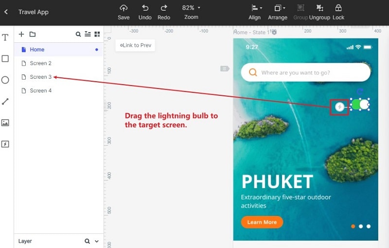
- Add Links between Screens
- There are two ways to do it. Choose one widget, then click “New link” in the link panel on the right. Then set the gesture, action, target screen/state, and animation for the widget.
- Drag the link icon on the left of the widget to the target screen. Then adjust the gesture, action, target, screen/state, and animation on the link panel.
To convert widget to master:
- Right-click the widget to “create master”.
- The master will be saved in the master library. Drag the master canvas to create its instances.
- To change the Master, click “edit”.
- To Add Notes:
- Use the “sticky” in the build-in widget library.
- Input texts in the “sticky”.
- The “sticky” is viewable in preview mode.
- Creative interactive animations
Use dynamic widgets to create interaction animation. Animation effects of dynamic widgets and screen states are achieved by the state. It affects the widgets on the whole screen, and the animation effect will only affect the widgets within the dynamic widgets. Users are recommended to use dynamic widgets to achieve interactive effects.
To make animations using dynamic widget:
- Create a new widget. Click the “widget” icon beside the inspector panel then click “new widget” to create a new widget and name it.
- Create states of the widgets. Click the “state” icon and the state panel will pop up. Click “new state” to create a new state.
- Link the states. Drag the “link” icon to the target state. You can also adjust the animation settings in the link panel.
Step 3: Preview the UI Design Button
To preview it on a pc:
- Click “preview” on the top toolbar
- Adjust the preview settings such as “page scroll”, “highlight on click”, “sticky”, and “shell”.
- To get a more immersive presentation effect, click “full screen”.
To preview it on mobile:
- Click the “share” button to get the sharing link and the QR code of the project.
- Open the link on your mobile or scan the QR code to preview the prototype.
- Download and install Wondershare Mockit player. Log in and view the prototype.
To preview offline, there are three ways to do it.
- Download the HTML demo package. Click “download” and download “HTML5 zip”. Use chrome to view the index.html file.
- Download APK. Click “download” and get “Android APK” and send it to an Android device and install it.
- Use “Wondershare Mockit player”
Step 4: Share the Button
- Click the “share” button. You will get a QR code or a link.
- Send the link or QR code to others.
- You may change the “privacy” settings as you wish.
- You can also download your prototype and send the offline file.
