5 Fabulous Dribbble Trends of UI Design in 2021
Creating a design for any sort of device is not a static process, rather it is as dynamic as the imagination of the designer. Every year, we observe new trends in the UI framework and in this context we see several time-agnostic UI design trends on Dribble as soon as they arrive.
Dribbble is one of the most popular and defining platforms to share the practicality and the viability of the UI designs. UI designs are determined by the dedication of the designers to enhance the User Experience and its applicability in the latest requirements and preferences.
So, a trend or design must adhere to the audience preferences and the designers need to be at the forefront of these developments. Dribble is the unofficial platform which helps identify what is being accepted by the community.
- Part 1: What is Dribbble?
- Part 2: Latest UI Trend on Dribbble
- Part 3: How to Make an App Wireframe of Dribbble Trends?
What is Dribbble?
Dribbble's tagline says that it is a platform that helps creative artists build and promote an open community where they can share, grow, and get hired. It is a platform to get inspired and feed your creativity with the designs, illustrations, graphics and other creative art forms made by other people.
The easier way to understand Dribbble is that you can compare it with Twitter. Just like on Twitter, when a person posts something it is called Tweet, on Dribbble, we call it shoot.
Tweets are retweeted, liked, and commented upon, but the Dribbble design is liked, commented upon, and rebound.
So, with the help of the community and fellow designers, the Dribbble designers can grow their network, make connections, and also get hired by showcasing on Dribbble and through Dribbble by showcasing their portfolio.
Latest UI Trend on Dribbble
In 2021, the way we see and make designs has changed from what we saw in the yesteryears. But this story repeats every year. As the UI experts find new and better ways to make intuitive and user-oriented designs, the UI designers implement them with their own touch.
Here are the top five dribbble design trends you need to know in 2021.
1. Dribbble: Neumorphism
Neumorphism is like old wine in a new bottle but with a unique touch. UI designers will remember the era of skeumorphism, that was prevalent in 2012 to 2013.
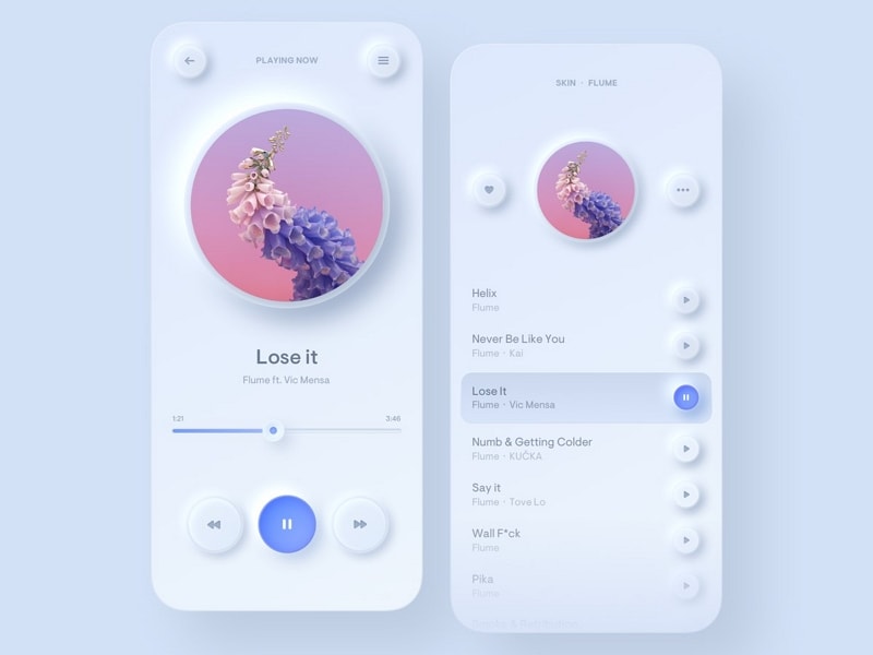
Neumorphism design by: Fillip Legierski
Where skeumorphism had flat designs, neumorphism is more appealing to the eyes, and it also looks neat and clean. Yes, some designers might feel that it is less viable and functional
Skipping the part where the designers need to build a contrast between the real and the digital world, neumorphism is more focussed on the color palette. The aim is to create a new user experience with the help of colors.
2. Dribbble: Hero Illustrations, But in 3D
Yes, the hero images that we see on landing pages, web pages, brochures, application layouts, among other places have taken a 3D form in 2021. The purpose of making these 3D graphics with hero images is to highlight the central message of the product, service, or anything of importance via an image.
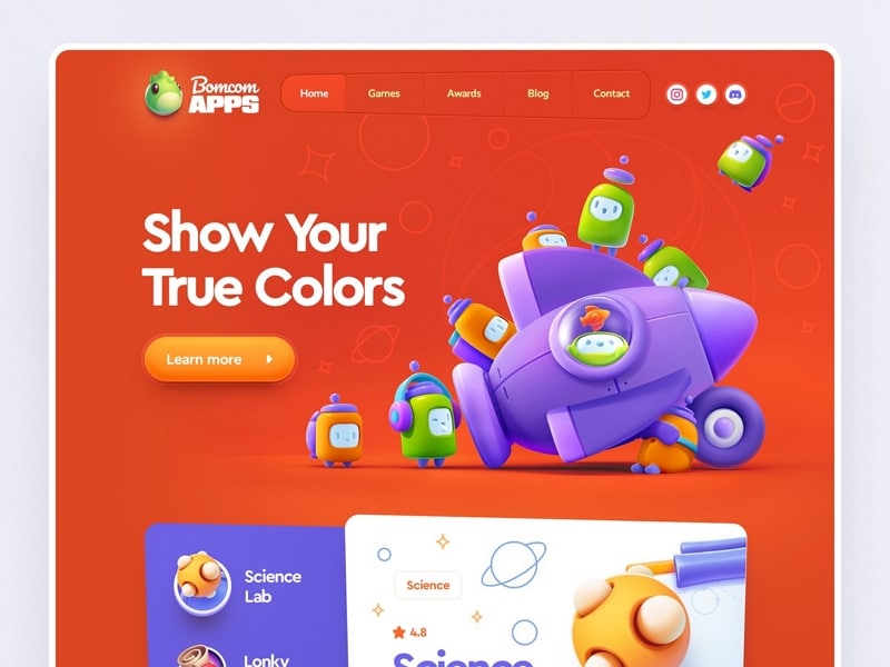
3D Hero Image by Mike | Creative Mints
We have also seen 3D videos, graphics, and illustrations finding their way to the web pages and layouts. The 3D rendering of the hero image is said to be more cost-effective than other forms of images.
Due to their high levels of attractiveness and convincing nature, there has been an influx of various dribbble designs with 3D hero images.
3. Dribbble: Voice Based UI Coupled with AI Technology
Taking inspiration from Alexa, Siri, and Google's Voice Assistant, UI designers are delivering Voice UI on websites, applications, and other digital interfaces.
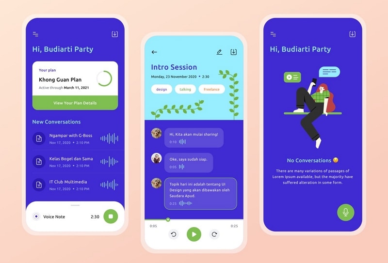
Voice UI Design by Budiarti Ar-Rohman
Voice UI has found a place into the designing as it helps increase the interaction and engagement levels of the user with the interface. So, we are allowing the users to communicate with the website via voice commands.
On Dribbble you will find several voice UI settings with the designing part embracing this new trend. Voice UI has been developing and undergoing changes since 2018. But in 2021, we have seen some great dribbble designs boating Voice UI layouts.
4. Dribbble: Monochrome Color Schemes
For those who believe that the rainbow is underrated, the 2021 brings them several dribbble designs boasting a simple color. These are the designs that have a single color and its variations are used to design the entire page.
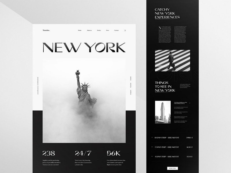
Monochrome design by Achraf Elkaami
So, not only are these designs countering the vibrant color schemes that we often see in other websites or applications, but they also help to create a minimalistic design.
Monochromatic web designs are used to reduce the distractions and shift the user's focus on unnecessary elements, while letting them focus on the content. It is not that monochrome is a new trend, but this time around we are seeing a new element to the monochrome designs.
5. Dribbble: Interaction-led Web pages
The year 2021 filled dribbble's library with designs that are both interactive and lead the conversation by their impressive designs. Interactive pages work with a duality, they are helping the visitors start an engagement with conversation-starters and engage them with the illustrations, images, and other graphics.
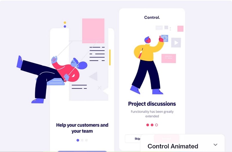
Interactive Design by Anton Tkachev
When we say interaction-led, it is not just images and videos anymore. But, a lot goes into developing interactive designs for the websites. Somewhere, the elements and items are disappearing, they are moving in all the directions, and the cursors lead the way to generate a response from the webpage.
Where the cursor goes, something new and interactive appears, while another item or element disappears.
In all these design trends on dribbble, the designer's skills, and talent is showing. The combination of colors, images, and advanced features helps create amazing user experiences and interactions. In 2021, we saw these design types rule the market. But we are also excited to see what 2021 has in store for the designers and developers.
How to Make an App Wireframe of Dribbble Trends?
To create an app wireframe similar to what you see on Dribbble trends, you need to work with an advanced and intuitive wireframe builder. Wondershare Mockitt has a unique set of tools and features that will be helpful to create dribbble designs easily and intuitively.
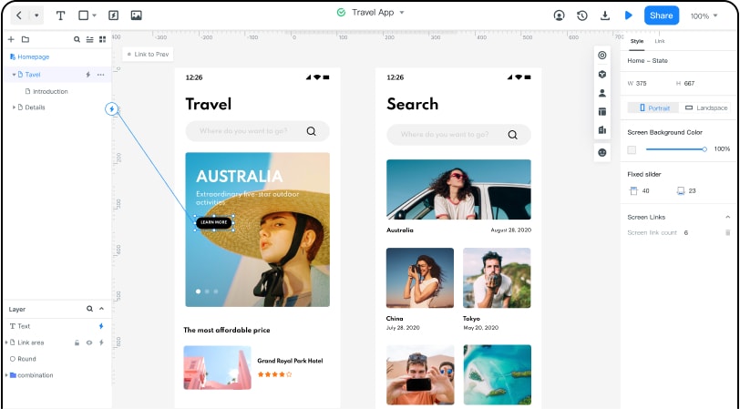
Let's see how you can create an app wireframe with Mockitt.
Step 1: Sign Up and Create a Mobile Project
Open the Wondershare Mockitt online app wireframe builder and you will find yourself looking at an interactive portal. Sign up or sign in with your email address, and set a password.
Once you are in, check the interactive guide and then move on to creating a new Project. Name the project, select mobile, and then select the phone screen size you want to create the design for.
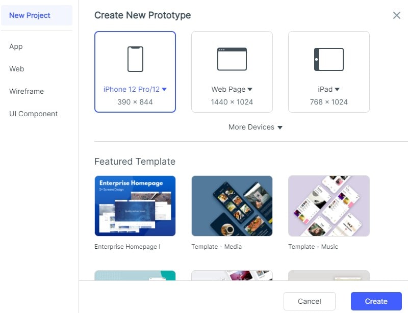
Moving on, get familiar with the elements and the toolkit at your disposal. The Wondershare Mockitt artboard is like a designer's paradise where you will get access to many basic to advanced tools for designing, wireframing, and other prototypes.
Step 2 - Create the Background and Add the Elements
Once you have the artboard ready, start by adding a background image for the design that you are going to create. It is not necessary to add a background image. You can also add colors by first adding a shape, rectangle, oval, or even a triangle.
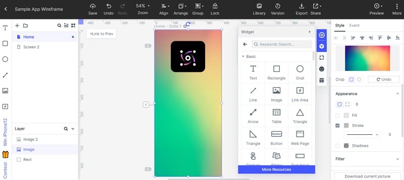
Moving on, add the icon image for the brand. Have these aspects ready before creating the app wireframe on Mockitt. To change the shape of the icon you are adding, go to the style section and set the custom dimensions.
The significant part about Mockitt is that you can change the shape on any side, collectively or individually.
Step 3 - Add Texts and Button
Adding the icon is easier. Let's add the text. This can be your application's name, tagline, button, and CTA. Since this is the home screen, it is best to keep the content to a minimum.
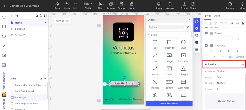
So, after adding the text and formatting it via the right-hand side styling bar (which helps change the color, font, texture, size, and much more). While adding the button, you can either integrate the default button from the toolbar or take a rectangle and tweak it according to the design.
When adding text to the button you can change the style by adding borders, shadows, and even animate the same.
Step 4 - Add a New Screen
On the left sidebar, you will see a Plus (+) at the top. Click on that you will see a new screen appearing in the log sheet. Go to that screen and try adding additional elements.
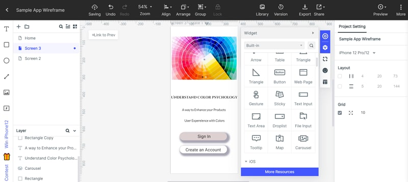
Like a Carousel (add images to it). You have the option to add maps, table, drop list, tooltip, and much more to the screen and make it better.
You can also preview your design and make the required changes. Mockitt also allows you to share your designs with the collaborators and clients to get their reviews.
