Flat UI Websites Design – 14 Creative Web Examples 2024
What is flat design?
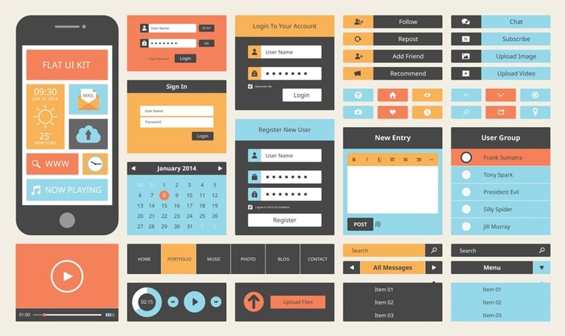
Flat UI design is a minimalist approach to object design that emphasizes usability and is more end-user-oriented. Flat UI began to evolve in opposition to the concept of skewformism and opposed the methods of "real" visualization of objects in favor of more simplified and aesthetically simple solutions. A Flat UI design became popular in the 2010s when Microsoft released a new system with a minimalist style, as opposed to Apple's skeuomorphism, a design dominated by realistic effects. Not a single large company can do without it: Apple, Amazon, Microsoft, and even IBM work in the Flat UI design. Obviously, this is no longer just a fashion trend.
Principles of flat design
Modern Flat UI graphics have several features:
- There are no unnecessary effects. All images are two-dimensional and are in the same plane. Such graphics do not involve the use of textures, highlights, and volume demonstrations. Even the falling shadows are absent in it, unlike the material design.
- Simple and recognizable outlines of objects. Flat UI design does not pretend to be realistic - it is based on schematic images. To make them understandable to the user, they try to simplify them as much as possible: remove all unnecessary and leave only the characteristic shape by which the object can be identified.
- Rich color contrasts. If there are no textures and shadows, the color becomes the only means to visually separate one object from another. Therefore, flat design is impossible without contrasts.
- Emphasis on typography. When images are flat and concise, the text comes to the fore. Therefore, designers pay great attention to the choice of fonts, size, and spacing between the inscriptions.
- User-oriented approach. We know what a Play button, a burger menu, or a Home icon means because we see these simple icons all the time on different resources. For a user who first sat down at a PC, such simplified images will not be very clear.
- Fast loading of pages. Flat vector objects are lightweight, which makes websites and applications run faster.
14 creative design examples
1. Airbnb
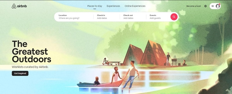
Airbnb, a popular booking site, underwent a major redesign in 2014. Flat UI web design eliminated gradients and shadows, resulting in a better presentation of information to the user. The site uses flat form elements and a minimum of colors. Large photographs help to solve the main task of the new design - they make it easier for users of the service to make a decision on booking accommodation.
2. Gogoro
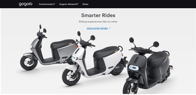
Gogoro is a site on the benefits of a smart scooter. Its flat UI design is combined with large photographs in the style of Apple products. Pure white, metallic gray, deep black, and display blue create a sense of technology and novelty. Crisp images and fonts enhance the effect of color. Light animation adds dynamism and liveliness to the site. An important part of the page is small diagrams and infographics that explain and show the benefits of their scooter in fact.
3. Dunked
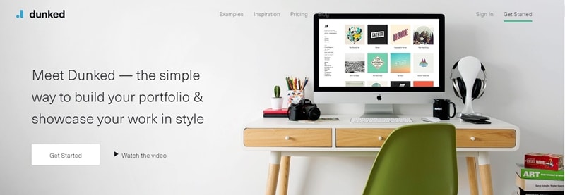
This design is a perfect example of Flat UI design. Portfolio publishing service for creative professionals. The site is distinguished by a good selection of bright colors, flat icons, and large flat buttons. Overall, it looks minimalist and simple, evoking a feeling of reliable and affordable service. A clean and tidy page makes it easier for the user to understand the content and meaning of the page without being distracted by unnecessary visual effects.
4. Vox
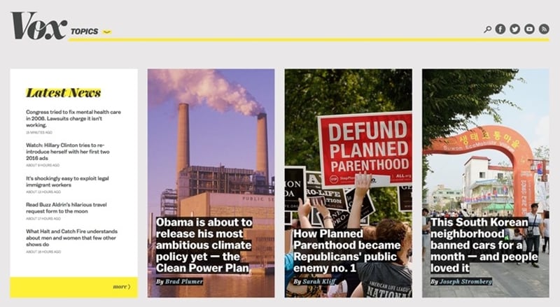
A news site in a flat, minimal design that has an important goal of explaining the news. Recognizable design with just a few colors and large photographs creates a memorable style. On the main page, thanks to the flat design, the user spends less time choosing the news he is interested in. The large typography and modular grid are ideal for reading news and articles on your site.
5. Coulee Creative
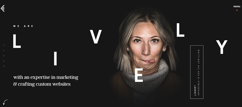
Original Flat Site of American Web Agency. Looped two-color video, scrolling effects, light interface microinteractions, animated sketch picture located in the center of the navigation menu with an unusual interactive design.
6. Bukwild
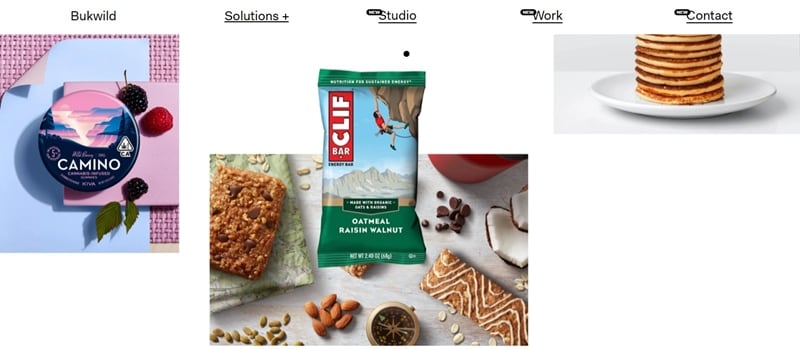
California digital agency website with a laconic selling flat design. Non-standard navigation is applied to start from the main page. Bukwild's uniquely styled transitions increase agency awareness. Translucent dies effectively present seductive media.
7. Appico
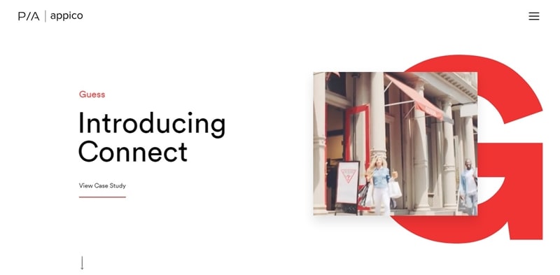
Appico is a German design studio specializing in UI / UX design. The latest & current web trends are beautifully applied: elements in a common space, layers of material style, interesting flat illustrations.
8. Animal logic
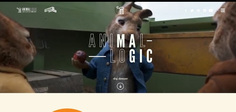
The site of the world leader in film animation, made on WordPress using CSS3. An intriguing and user-centric flat design helps you remember your brand. Colorful columns of full-screen menus and an ominously illustrated footer with a UI color that adjusts to the header.
9. Waaark
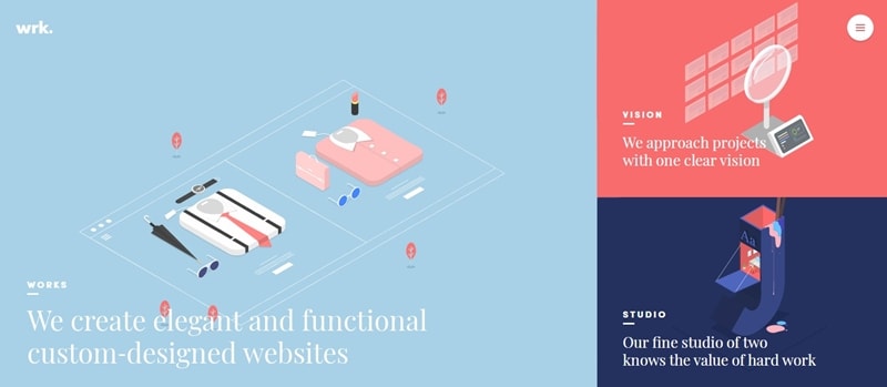
Waaark is a French studio that shows an example of flat website design on WordPress. Spectacular material design with HTML5 / CSS3 / jQuery. The main page features high-quality interactive animation with realistic vibration damping. The beauty of the design is achieved by the optimal proportions of the layout & page elements and transitions.
10. MezzoLab
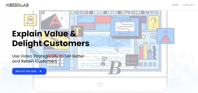
An unusually compact site with original transitions attracts attention with interesting flat illustrations and flat videos.
11. Paris American Academy
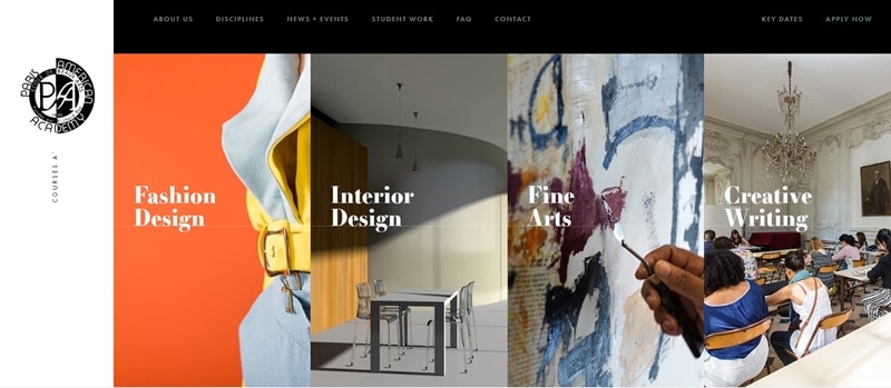
Black and white minimalistic Flat site with soft effects. The stylish and solid design uses a non-standard layout & navigation, animated geometric shapes in the background, elements of material style.
12. Holm Marcher & Co.
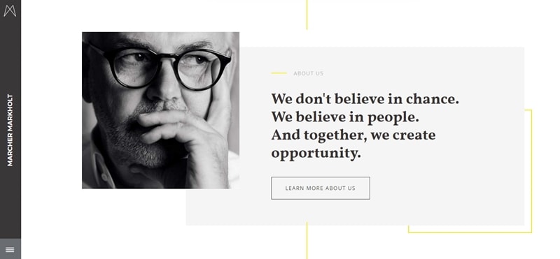
Unobtrusive design with custom navigation. The pastel duotone in two-color images does not make it boring, on the contrary, the special energy of the combination of muted red with navy color creates an atmosphere of professionalism and tranquility.
13. Nurture digital
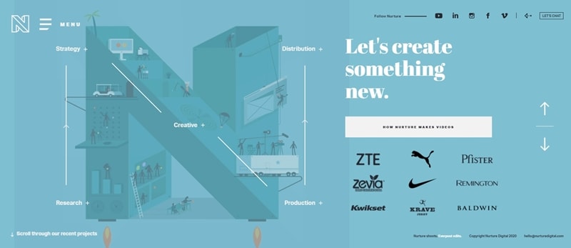
The top-notch digital agency in Los Angeles has a creative, high-tech website. The ability to flip through slide screens with announcements of live client cases is something that is interesting to the visitor. At the same time, it remains on the main page, and the illusion of a new page is created by a change in shades of the background and the effect of an animated drawing of a giant stencil letter. Intriguing background video engages and seamless transitions.
14. Made in Haus
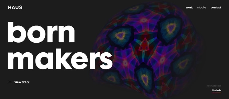
Los Angeles marketing company has a sticky website with intriguing visuals. The interactive animation on the main page is captivating. The full-screen menu is colorfully animated. The portfolio uses color filters for project previews, interesting videos, looped videos in the background.
Introducing the best tool for UI design – Mockitt
Wondershare Mockitt is multifunctional system management and optimization tool. Users can easily design prototypes to illustrate their ideas and enhance customer experience. Use Wondershare's complete built-in UI assets and template Mockitt library to design prototypes faster. Create And reuse your own library to introduce customizations into the workflow.
Why designers should use Wondershare Mockitt?
1. Intuitive
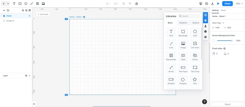
A well-designed tool is one that users won't wonder how to use. Designers know that. What impressed me the first time I looked at the user interface was that it felt very familiar. While the Inspector's placement, artboard, and widget tool aren't the same as other prototyping tools, it didn't take me long to navigate things. It was designed with the designer's mental model in mind.
2. Easy to learn
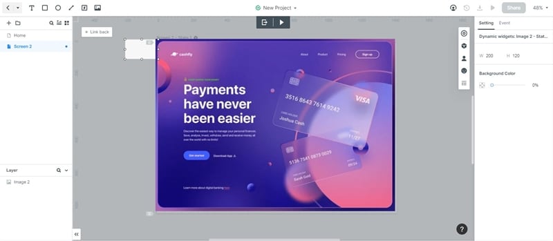
One of the best features is the onboarding function and the direct feedback when the user makes an update. Onboarding increases the learning curve exponentially. It showed me step-by-step processes with helpful animations. This saves a lot of time figuring out what to do. In this way, I was able to create the prototype in a short time without any prior knowledge. Direct feedback gives us confidence.
3. Ready to use built-in libraries
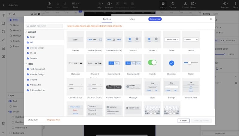
I like Mockitt because the widget library is embedded in the tool without installing any other plugin or importing widgets. The library has tons of options to choose from Basic, iOS, Material Design, Windows 10, and Symbols. It also has advanced template resources that are easy to use. Integrated libraries speed up the process. Also, we can customize the style to match the appearance of the design.
4. Rich widgets interactions
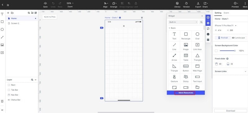
As a designer, I think the little details are important. This is where micro-interaction comes in to enhance the experience. For example, adding animation to the prototype improves the user experience. The animations predefined in Mockitt can make the difference between a prototype and a high-quality prototype. Although users can only adjust the delay, duration, and a number of repetitions, it makes the design more vibrant.
5. Easy collaboration

When it comes to collaboration pages or prototypes, the best platform to make this process truly collaborative – with Mockitt you can work on the same exact file and project at the same time and see each other's real-time updates This makes it work. Responding to a group call or meeting is super and stops people from accidentally repeating the work that others have already done, which is a big taboo. You can also share some or all of the project, really quickly and easily, restrict access to certain clips, or export to popular formats, at the press of a button. This makes the iterative process really reliable and fast, which is a relief for all project managers.
Conclusion
Today, flat UI design is used in design for many purposes and tasks, and these designs have some of the same style characteristics. Flat design is a direction that presents diverse expressions in digital art and is famous in the circle because of the minimalist abstraction and the simplicity of visual expression. Since the basis of flat design is simplicity, this definition is now widely used as the opposite of Rich Design. This design style can improve the usability and visual harmony of the user interface.
The reason why Apple has formed today's interface style is that Jobs paid great attention to low learning costs, and therefore used a large number of metaphors and imitations in the interface. Wondershare Mockitt is a browser-based collaborative UI design tool. You can easily create a Flat UI design by using Wondershare Mockitt.
