Wondershare Mockitt - Free UI/UX Design Tool
"UI is the saddle, the stirrups and the reins. UX is the feeling you get being able to ride the horse. - Dain Miller
- UX Design vs UI Design | What's the Difference?
- Step-by-Step Guide on How to Do UI/UX Design with Ease.
- Top List of Must-Recommend UI/UI Tools.
- Leading UI/UX Design Trends to Dominate in 2020-2021.
- UI/UX design secrets you need to know.

Best Mobile Dashboard UI Design Examples in 2024
Without a doubt, mobile apps are the one stop shop where business happens today. Therefore, it is not sufficient for your users to just install your app. They must be active users of the Mobile app. With proven research, user delight certainly contributes to stickiness of an application.
Mobile dashboard UI is the graphical and mostly touch-sensitive display on a mobile, which allows users to interact with the mobile app’s features, contents and functions. Most mobile apps present statuses or metrics of some form to their users in the form of a dashboard. Since the presentation of data can always be tricky. A great mobile dashboard UI design certainly adds to user delight and in-turn helps you keep users engaged.
5 Good Mobile Dashboard UI Design Examples
When starting out to build a UI for your mobile app, it is always advised to take some inspiration from the apps that have got it right. So here it is - Some great examples of mobile UI designs that stand out and make them the most loved apps -
- Dropbox: The Dropbox is the perfect example of how responsive design and its unique color system can keep the users engaged as they navigate through the app. Responsive colors are the booming trend in UI design. Dropbox includes one of the most easily understandable UI interfaces so far. Its delicate illustrations and animated icons help the users complete their file sharing tasks with zero learning curve. Every page has its unique color scheme, which adds to the ‘surprise’ element (a pleasant one of course!).
- Airbnb: Airbnb is an online marketplace that enables people to post and book accommodations. The UI of Airbnb is designed so well, that it instantly builds ‘trust’ between two complete strangers, which is really the premise of Airbnb. The UI design is beautiful and the online booking experience is seamless. It provides the users with various filters, offers and keeps the number of push notifications minimal. The right mix of photos and videos ensures that users connect with the app at an emotional level.
- Pinterest: Pinterest is an online pinboard that lets its users save images, videos and ideas. Pinterest is completely built on sticky-note sized blocks which instantly captures the creative audience. Pinterest mobile UI design brims with creativity, unique touch controls and illustrations. The UI is extremely engaging and interactive with unique layouts, filters, suggestions, and what not! It has smartly enhanced visibility that makes any user fall in love with the app.
- MailChimp: Mailchimp is a one-stop marketing platform that helps you manage & talk to your customers, clients, and other parties. At first sight upon installing the app, you notice “Things to know” which aims to clear the potential doubts of its first time users. This ensures quick learnability. The overall UI is simple and elegant with animated icons and images. Mailchimp has tried to provide a sense of satisfaction to the people who will use it, by giving clear instructions about its contents. Overall, the mobile UI design is neat and flat with more focus of typography keeping the target users in mind.
- Dribbble: Dribbble is a social networking platform for designers and creators to share snips of their work. The UI speaks out what the app would include. The images, videos and color scheme used make the app look amazing and instantly draws attention. Minimalism is a focus throughout minimal elements and tabs in the app keep it simple. The app really makes it easy for its users to showcase their talent. Further, the experience on mobile is very consistent with the experience on a tablet or laptop. We certainly love this app!
How to Make Mobile Dashboard UI
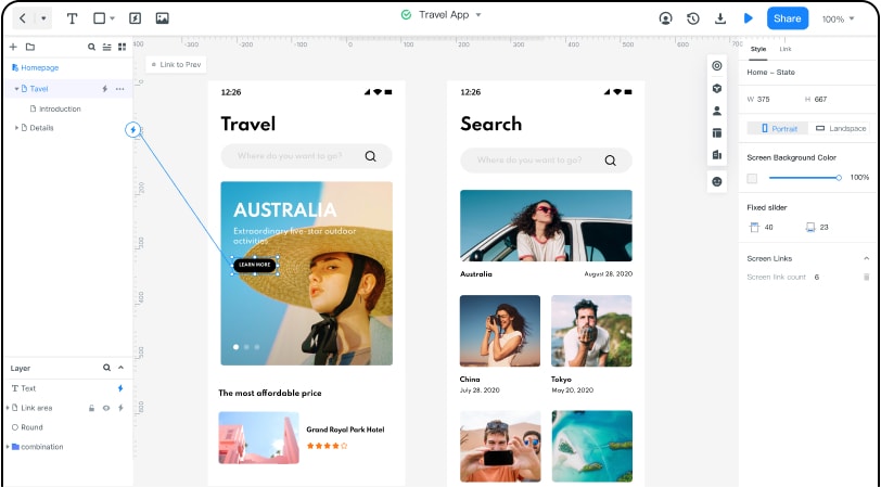
Let’s face it – We all want a great mobile dashboard UI design and the starting point is often tricky. If you are looking for an app that has lovable illustrations, typography, unique color palette and what not just like the above examples, then you should start from Wondershare Mockitt While there are many tools available in the market for designing your mobile dashboard UI, Wondershare Mockit helps to get started quickly.

The tool can be used freely to create wireframes of the mobile design UI. It comes with a large variety of easy to use templates that help you design and collaborate effectively. A good design ensures efficient communication. You can demo your designs online/offline and get instant feedback. Also, you can easily share with one click. You can easily import sketch files with the help of Sketch plugin. Wondershare Mockit automatically provides specs and multi-platform codes.
We hear your next question - how do I begin designing the mobile dashboard UI in Wondershare Mockit. Here’s how -
1.Create a new project
Once you login to Wondershare Mockit, you can get started by creating a new project and choosing the form factor and device type.
2.Design the app
You are now all set to start working on your wireframing canvas.
- Add a few widgets and icons. Several built-in widgets and icons are available and you can add them to the canvas by dragging them to the canvas or double clicking the widgets. Don’t worry, you can easily edit the widgets as you please. You can also save your widgets for reuse.
- Add links between screens. Now that you have brought in widgets and icons to your board, you should have the screens ready. However, they are all in isolation and it’s time to link them together. You can choose the widget and click “New Link” or drag and drop the link icon to link screens.
- Add notes. While a lot of your designs are usually quite intuitive, it helps to add some quick notes to explain your design further. Especially when you are working in a team. Simply use the “Sticky” in the built-in widget Library and add a description.
- Create interactive animations. The dynamic widgets help you create animations which provides a more intuitive experience for the viewer.
3.Preview the app/prototype/animation
It’s now time to see how all the hard work has taken shape! By clicking on the ‘Preview’ button in the tool, you can see your mobile dashboard in action. You can preview the web page on your PC and mobile both online and offline.
4.Share theapp/prototype/animation
It is likely that you are working with a team and need to get inputs on your early prototypes. You might also want to test your landing page with a few users for some early feedback. Click on the share button in the tool and you can generate a QR code or shareable link.
Looks like you have the right inspiration and tools to get started with designing a great mobile UI. Happy designing!

