Mockitt - Free UI/UX Design Tool
"UI is the saddle, the stirrups and the reins. UX is the feeling you get being able to ride the horse. - Dain Miller
- UX Design vs UI Design | What's the Difference?
- Step-by-Step Guide on How to Do UI/UX Design with Ease.
- Top List of Must-Recommend UI/UI Tools.
- Leading UI/UX Design Trends to Dominate in 2020-2021.
- UI/UX design secrets you need to know.

How to Do Notification UI Design
A good notification UI design helps bring something to the user. It is used in web or app to give notification or send a certain message that user can read without the need to open an app. A simple form of notification is email alert whereby you get a flash message on your phone once you get a new email. Your desire is that you can open the app directly from the main screen or can also dismiss this notification by just sliding it across. When creating notification UI design you should consider the importance of the message, choose correct colors and use the right icons.
The Best Tool for Notification Dashboard UI Design
When creating a notification dashboard ui design you should use the best tool. The favorite tool for you to use for fast and best result is Wondershare Mockitt. It has features that make the designing process easy and the other good thing is that it is easy even for beginners to use these features. With the tool you can embed your app into the forum of any web page or MB. It also allows for screen switching meaning that as you design your notification ux design you can switch screens fast and select text copies by applying the preview and sharing mode.
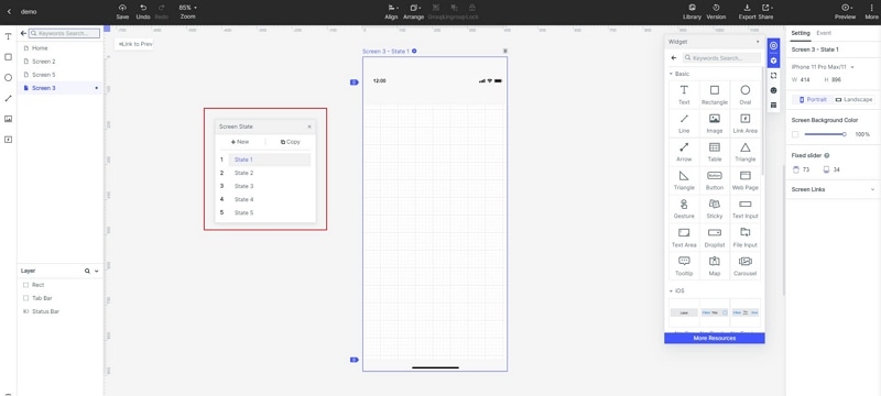
It allows for team support. This means you can work with other team members as you do the notification UI designing. You can also make animation using the screen states with state transition of the same screen. Another feature that makes the tool top the list of the tools to use is the icon library that has more than one hundred icons that you can use as you design other notification ui design in the future. All these icons are easy to use because you just need to drag and drop then ion the canvas as you do the designing job, making the work easier even if you are a beginner.
How to Create Notification Dashboard UI Design
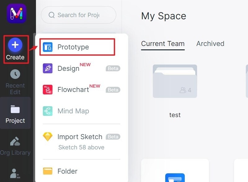
Step 1: Create a new project
- Create a new project to begin the notification dashboard UI design process. Select the device you are doing the designing for and then save your project. If you want to create a design for demos, the tool gives you an option to do so.
- You can edit the name of your UI design by going to settings where you can make all the changes you want and then save.
Step 2: Design the notification design ui
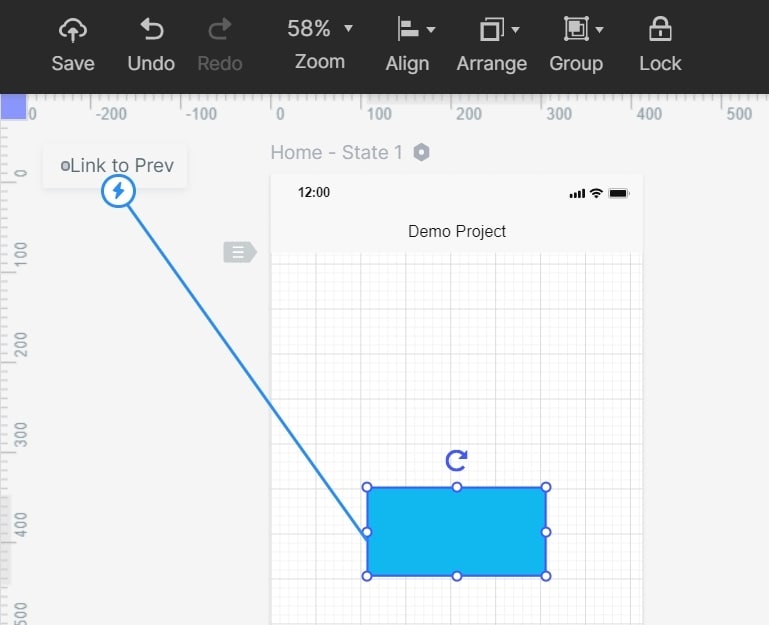
- Add icons and widgets- start by adding the fast widgets on the left side. Do so by double clicking, dragging them to the platform or press the hotkeys and draw. Then, add icons, my widgets and build in widgets. Add them by double clicking or dragging them to the canvas. You can also make changes to the widgets.

- Add links- add links between screens. Choose one widget and click new link in the panel or drag the link icon on the left side on the widget to the screen
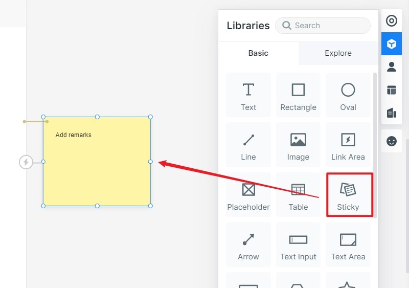
- Add notes-you can add notes using the sticky feature in the library to add notes. This helps give more explanations about your notification ux design. Input the text in the sticky.
- Create interactive animations- to create interactive animations, use dynamic widgets.
Step 3: Preview the notification design ui
- Preview your design to get a glimpse of its functionality and look. Previewing is a step you should never overlook because it shows whether you have done a superb job in creating a design that serves the needs of your target users.
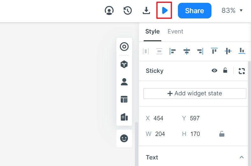
Step 4: Share the notification ui design
- You do not want to launch the design before others people give feedback. Share the design by clicking the share button and receive the sharing link. Users can have a view and give comments to help you make the right improvements.
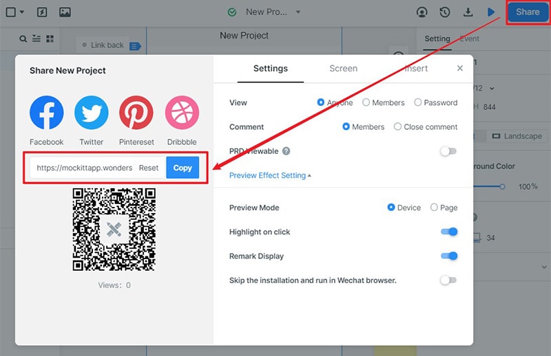
Top 5 Notification Dashboard UI Design Examples
Flash message - Success & Error
Flash message - Success & Error by venturix studio is a top notification dashboard ui design. It is designed in a clean and elegant ways that make it user friendly. It displays the error messages in a precise, polite and constructive way. The design brings in new guidelines that make it easy to use. Flash message - Success & Error bring in messages in a clear way, reduced the efforts required to sort out the problem. In addition to this, it also informs the users along the way. In addition to being clean, it is also designed using a great approach. The style applied is great and simple for users to know about the errors and success alerts provided.
Toast Messages + Notifications
Toast Messages + Notifications by Dario Figueroa is another great ui notification design that offers great value and user experience to users. It offers simple feedback when carrying out different operations on the app. One of the great things about the design is that it fills the amount of space that is required for the message. The current activity remains interactive and visible. After the timeout, the toast disappears automatically. It gives different notifications such errors, warnings, info and success. The error include alert when you enter wrong information. Warnings alert you when you go beyond your limits. Info is the notification you get when there are new updates. Success is when there are items added on the cart. The design is scalable and easily accessible.
DailyUI#11
DailyUI#11 Flash Message by Maddy Fréville is a notification design that makes it easy for users to get all alerts instantly and take the necessary action. It gives instant oops alerts when there is a problem or something does not go right during the navigation process. In addition, it also has a success alert when something goes through successfully. One of the things you like about this notification design UI is the nice integration of icons that adds it its usability. Besides the great choice of icons, there are also clean cards that make it look great. There is a minimal use of colors and graphics meaning that users are not distracted in anyway. It is one of the simplest notifications design you get.
Alert Message Rebound
Alert Message Rebound - Version 2 by Miguel Marques has a simple and clean interface. It offers four types of notifications to the users. It has a success notification that gives users that alert when something goes through. There is also an info notification that shows things that are of great important or updates. You also find a warning alert that shows alerts if the user needs to take care and avoid taking some actions. The fourth alert is error that shows if there is a problem or disaster making the users stop taking a certain action or shows when there is a problem. The design is scalable and clean. The colour choice is magnificent making it clear for users to get the notifications in a clear manner.
Plain & Warm Flash Messages
Plain & Warm Flash Messages by yuki yoshinaga is another ui notification design that is among the best not only with it simple design, but also the way it gives the alerts to the users. It is simple in the style it is presented. There are two styles i.e. the plain and the warm styles, meaning that users are given options. The plain style is mostly while with the warm one having oink colour that makes it more appealing to users. It gives three types of notifications i.e. completed, warning and failed, making it easy for the user to know what is happening as they perform different tasks.
