The power of Space in UI design
For the visual appeal of your user interface and to make all the elements stand out that the user's eye misses nothing is the space in the layout.
While many designers and clients believe in making most of the available space and pack it with content, What they fail to understand is the importance of space between the content and other elements of the UI.
Space also termed as white or negative space plays a vital role in making the webpage appear more attractive giving an outlook of calm and sophistication in it.
With the right amount of space, UI design is more interactive and comfortable to explore. You can feel the harmony and balance in the interface.
So let the content breathe and use this space to make your UI unbeatable!
What is meant by white space?
White space or negative space is the vacuum or absence of any content elements. This space exists between the text, symbols, icons, or images on the landing page.
This space in UI design enhances the user experience by adding to the aesthetics of the page or app and drawing more attention to the existing elements of the page.
People hate overwhelming information and won't last on your page for long if it has too much to read. With good balance among images and text to convey your point and leaving the right amount of space in between will encourage better visual communication and organize the elements elegantly.
As it is said
"White space is like air: it is necessary for the design to breathe!"
Types of white space:
Effective use of white space in UI is crucial, as too much or too little will not work in boosting the traffic and stay time on your page. White space in general are of the following types:
- Micro white space
By micro white space, it is meant the space between the text, paragraphs, between grids of images, and between the menu links. This small space between the design elements holds huge importance as the ratio of this space decides the content legibility and user understanding.
- Macro white space
Macro by its name means the bigger chunks of space left on the surroundings of the layout or between different sections of content. For simplicity and calmness in UI design, space containing the whole design proves to be the star ingredient.
- Active white space
White space is also classified as active space, this term is for the space that is used to develop the reading flow and to guide the user navigates through different design elements.
- Passive white space
Space between paragraphs line and text portion that improves the readability of the content is called the passive white space.
Why white space is crucial in interactive UI design?
There is a big conflict among designers and clients on the use of space on the page. With limited space in the digital medium, it is thought to be efficient that as much content as possible must be adjusted on the page.
White space is often neglected and clients most of the time won't appreciate a design with too much, unused space. Well, this may sound silly but this space left empty is the most contributing factor in enhancing your overall UI design and User Experience. Some of the reasons that depict the power of space in UI design are:
- Increased legibility
Micro space between the paragraphs and the text is important to alter the user experience. With white space on the page, the content is more legible and the customer won't have to face any difficulty while reading or other layout experience of your page.
- Visual hierarchy
With the proper use of white space, you can easily design the visual hierarchy of the design elements. This is done by focusing and highlighting the most important features and add other features on the side or less prominent.
- Drives attention and focus
Using empty or white space around the interactive and important elements on your page can create focal or attention driving points. With this space in UI design, it is easy to engage the user's attention focused on the important content to absorb the brand message or other relevant information.
- Engage user longer
Efficient use of micro and macro white space will create an aesthetic view and uniformity in the UI design. Better comprehension and readability of text with smaller and to-the-point sentences and images. This will lower the bounce-back rate from your website and will engage the user to stay and read through your website.
- Defines character and brand image
The right balance of the macro white space and micro space will help you define the character of your webpage. With the layout and focused images and text, these white spaces portray the whole brand image.
Reflecting luxury and sophistication with more white spaces around and in the layout. While for a busy and informative website like for newspapers closed and less macro white space design is used.
- Logical grouping in layout
With the use of white space in the design, you can easily show the link between various elements. Groups and elements linked together are closely spaced while the different ones are spaced more. White spaces in UI design acts as invisible margins defining the logical groups in the design layout.
Using White space effectively in UI design
Here comes the technical part. We are now well convinced about the use and importance of white space for an effective and brilliant user interface design and plans to use this smart feature in your design. Following are some ways you can use white space to power up your website design and make it more eye-catching.
- Use between text
Using legible and clear fonts that push the eyes forward to read, plus proper spacing between the lines and leaving ample space on both sides of the UI. This will make the text more legible and easier for the reader's eyes.
- Around CTA's and main elements
With the help of padding or invisible margining around certain elements or texts, you can draw focus and the user's attention towards the CTA's or important features of your webpage that the user should see. Use your white space effectively so that the brand message, call to action, or the products stand out on the page and the user's eye sees it as soon as they land on the page.
- Avoid too much negative space
Although you must avoid packing up your UI design and use space to let the page breathe and have a feel of the organization. But leaving too much space, with disconnected text and no clear understanding will work against your goal to make the page attractive.
So always aim to strike the right balance between the content elements and white space in your design, to make it have a good visual hierarchy along with avoiding the bland look.
Examples of brilliant use of white space in UI design
Following are some of the best examples of the brilliant use of white space in UI design to enhance user experience and branding.
- Tinker

Being a customized watch-making company tinker depicts its brand image through its best product images and a simple background focusing on the CTA "shop now". A simple navigation menu on the right corner and search bar with a logo at the corner gives the UI design a classy and sophisticated look, giving you the brand's high-class vibe through its display.
- Apple
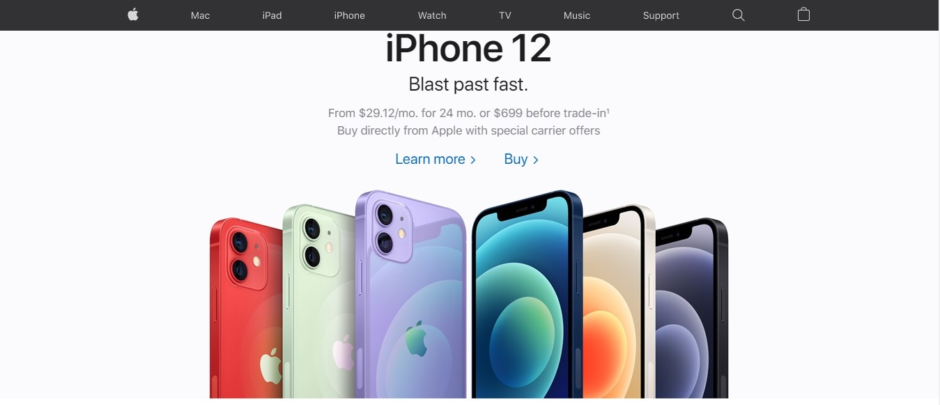
Apple is one of the prominent users of white space in its UI design. With the main focus on its artistic products and CTA's the user's attention is focused only on the important things, the products, and "buy now".
- Dropbox

Dropbox with a complete rebranding of its UI by introducing a block design to have an ample amount of white space and legible text on the page with keeping the elements separate from each other is a great thought. Also, these color and white space blocks are effective in delivering the brand message without suffocating the layout.
UI design tool for beginners – Mockitt for designing UI like a pro
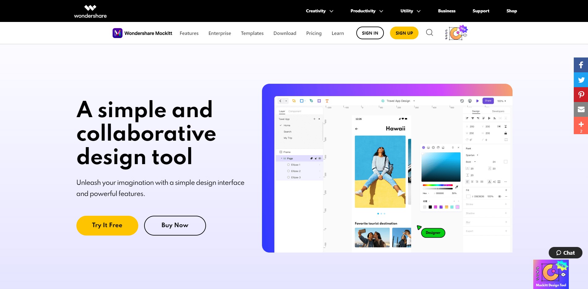
If you are a beginner designer and are planning to design your website's UI with the right amount of white space or breathing room then we have brought a superb designing tool for you. Mockitt is one of the most advanced yet easy-to-understand UI design tools that suits beginners as well as experienced designers equally.
Following are some key features of Mockitt that make it stands out among all other design tools:
- Intuitive design and direct feedback
The layout design and placement of the artboard and tool on this software are placed differently from other tools but are very easy to access and navigate through.
The direct feedback feature in Mockitt makes it easy to learn for new users and lets the user know about changes, also helping to perform the task by the step-by-step animated guide.
- Built-in libraries and widgets
One of the best features of Mockitt is the built-in libraries that consist of almost all templates and icons for UI design on iOS, windows, android, etc. also the animated widget pre-installed in it will make your prototype design high quality. And all that without having to install separate plugins and import from other sources.
- Simple interface
For beginner designers, remembering the different screen states and altering them is hard. Mockitt resolves this problem by keeping all the screen states on a single artboard by listing them together. You just have to choose any screen state and customize it, rather than working on multiple artboards.
- Latest screen settings
Mockitt updates its settings and libraries frequently and remains up-to-date. All latest screen settings are available for design in this amazing tool.
- Cloud-based design platform
Like other design tools, Mockitt is also a cloud-based platform for prototype creation and design. You can easily collaborate with your teammates remotely and also don't have to burden your PC or laptop's memory with heavy design files.
- Swift workflow with easy collaborations
You can connect with your design and development teams easily on Mockitt by its collaboration options. This will speed up the process and establish a good workflow, letting all the teammates view chunks of codes and each component in detail.
Wrapping it up!
Effective use of white space is like art and you need to do it right to make your UI design look attractive and professional. White space is the core feature of an efficient UI design as it ensures better readability and navigation through the page by organizing the content and forming the visual hierarchy.
To make a statement and stand out among all web pages a designer must employ the use of white space in proper ratio enhancing the user engagement and experience, with strategically achieving business goals.
Hopefully, you understand the power of space in UI design now and will revisit your design to check whether it is on the right track with the right amount of white spacing.
