Simple Design Tips for Designing Better UI Card

What is Card UI Design?
Many of us related to UI design would know the term UI card and its benefits of using inside the design. But for some designers, card UI design is a new thing. The term "Cards" often use in mobile design; the user interface. It's one of the most frequent and modern use to design different mobile layouts.
So, what exactly is the card UI design?
It's a mobile UI component that holds the content and information. Inside the card, there might be several elements or components, but they are in a single subject.
In visual design, cards can have a lot of different features and layouts. However, some typical use of the features inside the cards are as follows:
- Image: Image or video that fits the top area of the container.
- Title: Title to understand the purpose of the unit or element.
- Summary: A summary to describe your subdivision.
- Buttons: This one is optional, but you add actions inside a UI card.
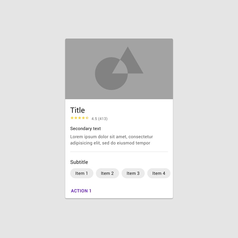
Well, above are some standard features that can be used in a traditional user card design. There are lots of ways to design a card. Following one is the simplest one for understanding:

Image Source:Material.io
What are the Challenges of Card-based UI Design?
Card-based designs really do produce some fantastic and attractive layouts for websites and mobile apps. UI cards also have the advantage of increasing the user experience. But all the good things come with some challenging tasks.
Using UI cards in your design may be challenging at some times, especially for new designers. There are few challenges you may face during the integration of UI cards into your interface.
You may want to look at the following challenges before switching to the card-based design interface:
1. Hierarchy:
One of the significant challenges of using UI cards is that there is no traditional hierarchy. For example, you do not have the power to show specific content first. To grab the user's attention, you may choose the other options like resizing the card with brighter color options something like that, but at the same time, users might be interested in something else. If you're not an expert in handling the cards in good order, then your design will be in complete chaos.
2. Not Easy to Stand Out:
User card design may be popular among different websites and mobile applications even though there is plenty of applications available that are using UI cards, but standing out your website could be a difficult task. Not impossible, though. Think of the business cards, same limited information they got, i.e., company's info, name, address, logo, and contact numbers. The same goes for the website UI cards.
4. Hard to Update:
Fixing a limited number of elements on the page is easy, but when it comes to the bulk of content review and updating becomes hard to handle with UI cards.
Well, these were some challenges that most UI/UX designers face. Sometimes, users find themselves annoyed with the structure of UI cards present on a particular design. So those are some flaws of using UI card-based designs, but that doesn't mean using the card in your design is a bad approach.
Top 5 UI Card Design Tips
As we know, cards are elements or UI components that contain specific information or content. The purpose of the cards is to present the information in a concise and organized way. Many designers used card UI design to show ads or profile displays on different social media platforms.
Already familiar with cards, but stills having doubts regarding better UI card design? Don't worry; the following 5 tips will help you to design better UI cards to design:
1. Single Element Use
The idea of using cards inside the design is to show the content or information concisely or efficiently. So, it's better to focus on things that you want to convey before creating your cards. Also, it's important to know for which topic you're going to design your card. If you're about to design a card for advertisement, stick with a single idea or element; don't mix another idea into it.
2. Use Images sensibly
Many designers often rely on using images on the cards. Because visuals are the only way to grab the user's attention, it gives a good user experience. But sometimes, cards don't look attractive with the visuals as well. So, would you cope with such difficulties? UI card is like a business card; often, people don't rely on the size or visuals on cards. All they want is the correct information which matters for most people.
Yes, visuals may make your design more attractive and catchier, but be wise and choose the relevant imagery for your design.
3. Use of Shadows
Almost every UI card contains drop shadows in them. Shadows make cards more visible to the design even if it doesn't have any shadow, the background color of the website or app slightly different from the cards. This shows a clear difference between UI cards and standard interfaces.
Apart from making it visible, a shadow indicates the particular thing is clickable. In this way, shadow amplifies the card call-to-action (CTA) if you've placed it on the card.
4. Use Simple Fonts
Card UI design is more of a visual than a simple context design. But when it comes to text, cards look astonishing with more straightforward texts. Lots of font choices available to put them on the cards, but sans serif fonts are splendid when it comes to simple and easy to read. Most designers rely on visuals, but sometimes straightforward typography would do a great job.
5. Use of White Spaces
When configuring elements on the cards like buttons, text, and images, make sure to use white spaces between them. Most new designers think using white spaces is a bad approach, but it isn't. Many professionals take assistance from white spaces. So, it's better to give your UI cards a free hand to use white spaces.
So, these were some ways by which you can make user card design better or much more professional. Different UI designing tools can also play an essential role in designing a better UI card.
Introducing The Best Tool for UI Design – Mockitt

Prototyping tools are the best friend of UI/UX designers. Tools provide the best and most precise picture of the product. Hundreds of prototyping or graphic designing tools are available over the internet. Some of them are well applauded by professional UI/UX developers. Mockitt is one of them!
Mockitt standout to be the best and highly recommended tool considered by the designers. Looking forward to designing a UI card? Mockitt is the best choice to do it. Mockitt already showed some quality and promising results of the website and mobile designs. Don't believe us? You should give it a try.
What makes Mockitt a leading prototyping tool? The answer is its features! Before going deep into the features, let's get to know what exactly is Mockitt.
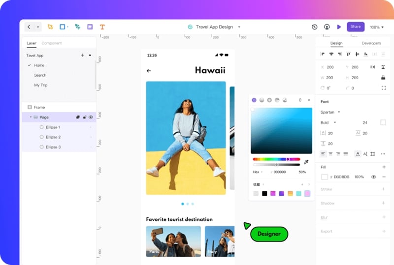
Mockitt is a prototyping and collaboration tool that helps you enhance your design capabilities. In other words, Mockitt is used to design user interfaces of websites and mobile. You can also use Mockitt for other graphic designing purposes.
Features of Mockitt
Mockitt has tremendous features that can enhance your way of thinking. Some important features of Mockitt are as follows:
Fast & Rapid Prototyping: Mockitt has a library of pre-installed themes or templates. With the help of templates, you can create your prototype quickly and easily. The good thing about Mockitt is that you can access these templates for free. No need to pay for the templates.
Dynamic Widgets: Mockitt also supports some dynamic widgets, including charts, diagrams, dropdown menus, collapse, navigation menu, and much more.
Multi-media Insertion: You can easily insert audio and video into your prototypes within few clicks.
No Need to Install: Mockitt is a cloud-based tool; you don't have to install it on your systems. You can access your projects anytime and anywhere in the world. All you have to do is just sign in to your account.
One-click Sharing: The good thing about Mockitt is that it provides the facility of sharing within the system. You don't need to export your project for sharing. Your prototype or design is a few clicks away to reach the outside world.
Team Management: With real-time collaboration support, team management has become easier than ever.
Conclusion
Everything is important when it comes to UI designing. Keep that in mind there's no short of graphic designing. Nothing is possible without the true dedication and hard work. Although UI card is just a single component of UI material it, still requires some effort to handles. This article proves how a single part or element of design needs some work to keep things on track.
