A Guide to Know About the Types of Color Palette and Creating a UI Color Palette for Best Results
We cannot say enough about the importance of colors in our lives. Not only are they essential for creating a vibrant life, but colors also have an impact on our thinking, actions, and reactions. Therefore, using the right colors and integrating them in the website or application design can sway the user's perspectives and actions in the desired direction.
However, to fully understand the importance and scope of colors, we need first to understand their work and scope. Understanding how colors work is essential because designers tend to standardize the UI color palette in their designs.
Sometimes it might work and evoke the right response, but the majority of the time, adding colors according to one's intuition does not resonate with the audience. They might not take the design with the same enthusiasm as the designer, which is not good for business.
What are the different types of color palettes?
As a designer, your core objective must be to play with colors and ensure that you follow the objectives, customers, and the action you want your customer to take while adding colors. While it is not humanly possible to test every color, you can use a UI color palette to create the right design with relevant colors.
There are six types of color palettes that suffice the usage of different types of colors.
1.Monochromatic Palette
A monochromatic palette comprises different tints, shades, and tones of the same color or hue. See the image below.
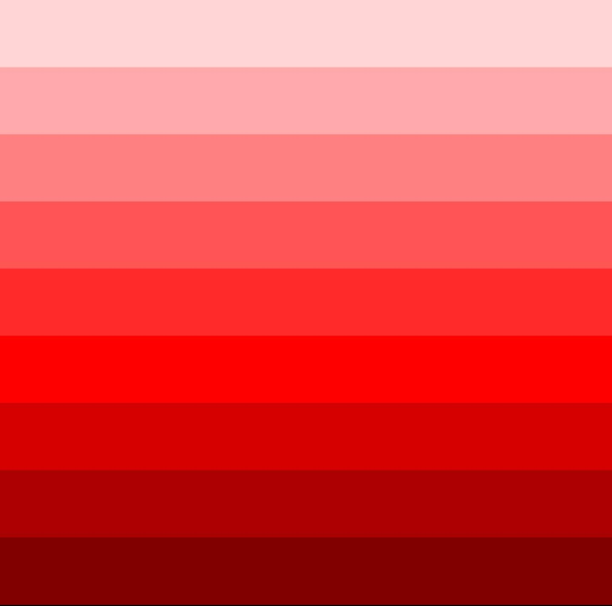
Notice the difference in every shade? It feels like every shade is one level down from the one above. To create the lighter version, we need to add a white hue, but to add depth to the parent color, we can add darker hues to achieve the desired color.
Choosing a monochromatic UI palette is one of the easiest choices because the only mistake you can make is choosing the wrong color by one level. Instead, add some white or a dark color to it, and you will get the perfect color for your design.
2.Analogous Color Palette
Three consecutive colors on a color wheel make up your analogous color palette.
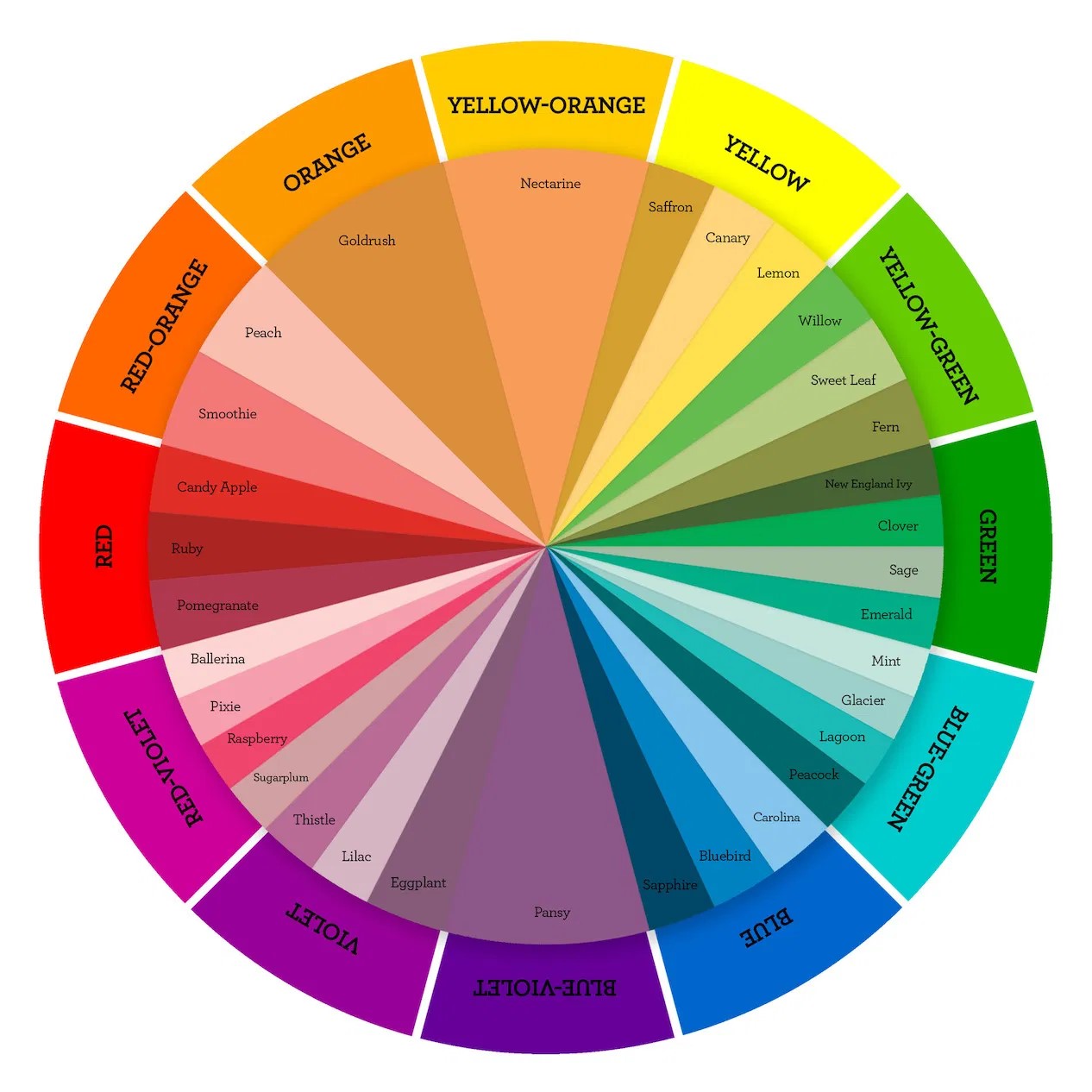
For instance, Green, Blue-Green, and Blue will create your analogous color palette. However, the best part is that you can make changes to every dominant color and create its tints as required. Hence, Mint, Glacier, and Lagoon will also make for an analogous flat color palette for your UI design.
The industry standard uses one dominant color out of the three and the other two as its accent colors.
3.Complementary Colors
Mostly the designers choose two colors along with their tints, shades, and hues that complement each other or add to each other's presence. The best practice is to select opposite colors in the color wheel.
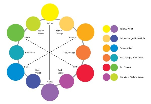
The mixing of two colors can also depend on your motive and objectives. Sometimes designers can use this sort of UI color palette to give a comparison between two aspects. The translation and journey between the two colors must be used to each other's advantage.
4.Triadic Color Palette
Creating a triadic color palette may be the easiest thing to do when you want to add three different shades to your design.
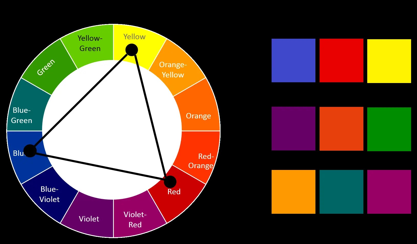
The general practice is to choose three equidistant colors. The motive of choosing a triadic color palette UI is to depict contrasting qualities. However, creating the perfect triadic UI color palette is easier said than done.
If you are not getting there, it is best to leave things as they are and move forward with another type of palette.
5.Split Complementary
This is where things start to get a bit intense. In a split complementary UI palette of colors, you have to play with three colors and, yes, all of their different variants across the spectrum.
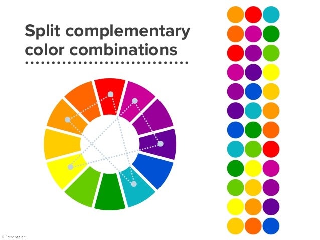
Here is how it will go down! First, you have to choose one color that can be your potential dominant color and then check out the color opposite to it on the color wheel.
Instead of choosing the color precisely opposite to the color you have chosen, go for the two colors on either side. There is a reason why you do not fiddle with this type of color scheme, as it can quickly get out of your hands.
6.Tetradic Color Palette
The tetradic UI color palette is a combination of four different colors, or we can say two complementary pairs. Also, the two colors on either side of the color wheel should be alternates, but that will naturally occur when you choose two complementary colors.
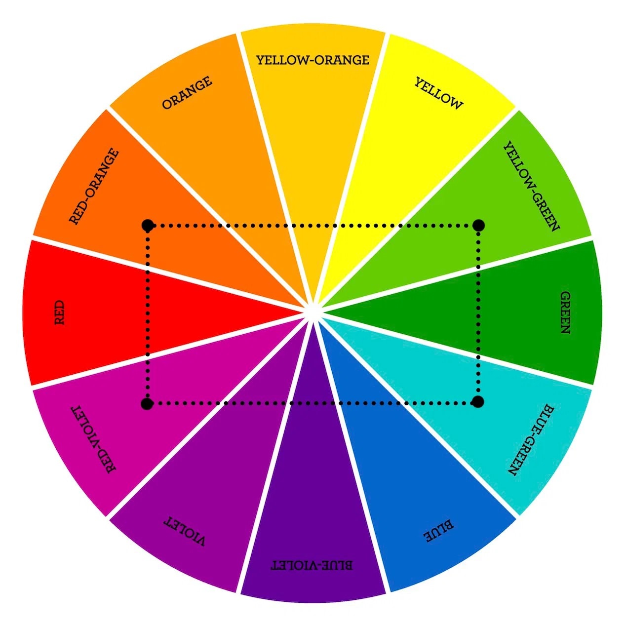
Using a tetradic UI palette can be complex, and including all of them in the design can be even more dreadful.
5 Things to Remember When Creating a Color Palette For Your UI
A few things are important to drive your color palette creation process in the right direction. Because creating a UI color palette is a labor-intensive process and things can easily go haywire. These five tips you will see below will help you move ahead with the right approach.
1.Begin with Black & Whites or Grayscale
We want you to begin with black and white to identify the contrasting parts of the UI design. There is a general rule in designing whereby you must use one dominant color and two accent colors.
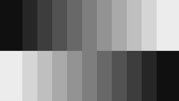
Identifying the areas which will receive the dominant colors is primary to your designing because it directly relates to the aspects resonating your design with the customer's preferences.
In addition to this, you must also include the grayscale in your design because inserting only black and white takes a toll on the customer experience. This is because white color has 100% luminance and black has no luminance. By using a grayscale, you can mix up things and work from there.
2.Use Three Colors for Best Results
The purpose of creating a UI color palette is to ensure that you use the colors in moderation. In this, the standard approach is sticking to a mix of three colors. While selecting the colors, aim to create a balance with the three colors. Using more colors makes it difficult to create the right balance in the design.
Those looking to add more than three colors can use tints and shades of the same three colors to bring variety. However, you will face some difficulty in creating balance here, but it will be relatively easier than creating balance with more than three distinct colors.
3.60-30-10 Rule
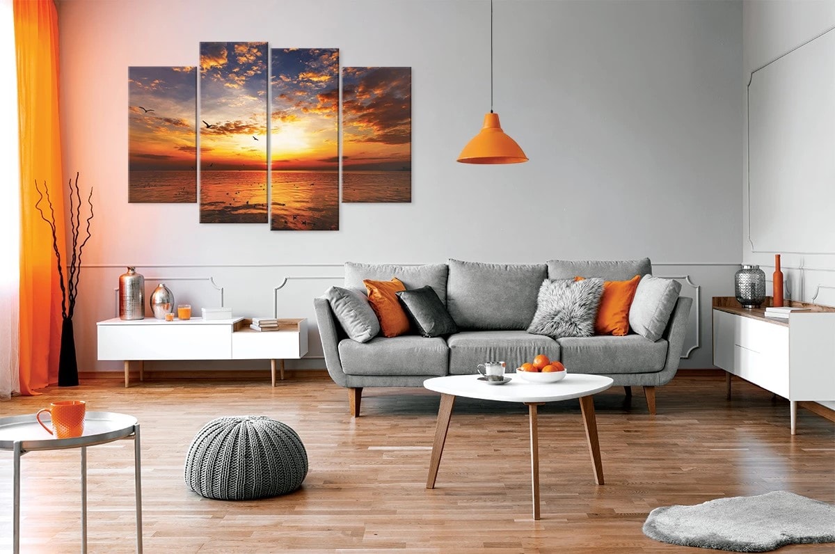
This rule has been in existence for a long time, and it still holds. The 60-30-10 rule defines the balance of colors you should use in the design. The same applies to creating the UI color palette. You must choose those colors that can easily fit into this rule.
Moreover, this rule makes it easier for the viewer's eyes to moving through the structure from one point to another without getting distracted. As per this rule, 60% is your dominant color, 30% is your secondary color, and 10% is your accent color.
4.Colors Evoke Emotions Molding User's Perception
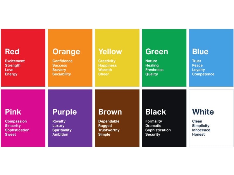
Colors evoke emotions in humans. While creating the UI palette, you need to understand which colors evoke what type of emotion. For instance, the color red is known to evoke emotions like passion, danger, or love. Black is related to mystery, elegance, or evil. Similarly, green is associated with new, freshness, and nature.
UI designers choose the colors based on the product they are promoting. So, for example, a beverage meant to deliver freshness to the consumer will have colors like green or orange.
Ergo, identify the product or service you are creating a design for, understand the emotion you want to obtain from your users, and then choose the right colors.
5.Mother Nature gives the Best Inspiration
Have you ever wondered how butterflies get their beautiful colors or how we have flowers with so many distinct shades? When you need to get inspired to choose the right colors, look outside towards Mother Nature and see how she creates the perfect balance with different colors in one frame.
We have understood how to play with colors and how to choose the colors. However, to implement both these aspects, we also need the perfect tool at our disposal, which we will discuss next.
The Best Tool for UI Design - Mockitt
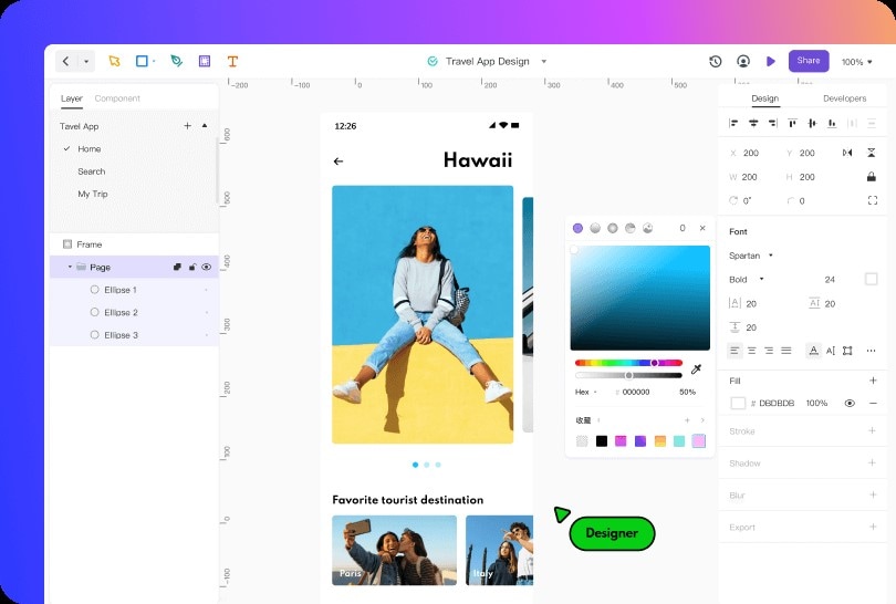
Working with UI designing is not a straightforward process. There are several ebbs and flows on the way, and working to navigate through them by following the right process is imminent. It will be easier to go through the process if you work with Mockitt Design, a state-of-the-art UI design, and logo-making online software.
Mockitt Design is an all-in-one design tool that helps you make creative and task-specific UI designs with speed. We have mentioned speed because very quickly, the existing UI designs get a new shape and format for the sake of getting more attention.
And if you want to make an early impact among your audience with efficiency, you need a tool like Mockitt Design. An incredible thing about Mockitt Design is it is a simple tool, yet once you start using it, there is a big world of opportunities at your behest.
Let's know some of the features;
- Collaboration at its Finest: Creating a design with collective intelligence reduces time and helps expand the horizon of creativity. Apart from this, you will have new ideas from the entire team to create a relevant UI color palette.
- Create Vector Graphics Like Never Before: Mockitt Design gives you the power to build creative and smooth images, graphics, and design UI components. Within vector drawings, you can also create designs with bezier curves and boolean techniques.
- Tools That Make Designing a Walk in the Park: On the main interface, you will only see a handful of tools, but once you start creating the design with Mockitt, a wide array of other tools will show up. This is particularly when you want a clean and decluttered interface and get the most space to create the perfect design.
- Exemplary Widgets and Components: Not only does Mockitt Design helps you include any UI palette of colors, but it also helps you vivify the design with in-built widgets and components. You can use them to animate and enhance specific design elements and build a better overall structure.
Conclusion
Using the right layouts in your UI design is pivotal to create a smooth interface; we already know that. However, to stimulate the response you need from your viewers, it is essential to use the perfect UI color palette aligned with your objectives and customer's preferences.
Colors have the power to influence a user's decision; that is why we have talked about the ways and means to choose the perfect color for your UI design. In addition to this, to create the required design, you must also leverage the possibilities created by a tool like Mockitt Design.
Mockitt Design offers free and online access to a modern UI designing artboard with the option to create platform-specific UI designs meant to create the best outcome for your application or website.
