A Guide to the Most Effective Principles of UI Color Schemes for Your Next App Design
If we look at it closely, everything an individual interacts with on a daily basis has its own words and a unique language. The same applies to colors now more than ever because we have started using them to send a message, evoke an emotion, share our feelings, etc.
Similarly, using colors in the UI design is not just an aesthetic exercise. Instead, designers have been using it to define products and enhance the overall user experience driven by the ideal color palette.
Choosing the UI colors for your application, website, landing page, or any other digital product requires some thought. You should not select the UI colors in haste without first considering the message you send through branding, your audience, their interest, and your purpose, etc.
So, using the colors is as essential to your UI design as is following the UI design specifics of the iOS or Android platform. While working on the colors, you also need to identify the right structure based on your design and the layout.
Just as some specific principles you must follow for creating the UI design, like the simple interface, working on the UI color must also bank on some principles. So read on to know ten principles of color usage in UI design.
10 Principles for Color Usage in UI Design
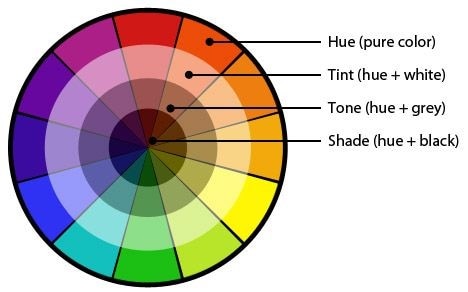
1.Get Familiar with the Color Terminology
Source: Pinterest
The first principle asks you to understand the terms used in creating the UI design with colors. There are terms used here like hue, tint, shade, tone, contrast, value, saturation, etc.
So, in UI colors, you must know what is meant by hue (a saturated color or a parent color) and a tint (any color when added with white is referred to as tint). Similarly, learn the meanings of other terms and leverage them to create the best color combination for your design.
2.Conduct an Interface Inventory for Color Organization
The number of UI colors that you can use in a design is unlimited. This will certainly create problems for you and make things hard to comprehend. You cannot possibly organize all the colors, not if you want to deliver the work on time.
Source: Pinterest
So, a better approach is to create an interface inventory, wherein you must categorize all the components that make up the structure of the solution, and that will tell you how many colors you must use in your design.
3.Using Colors to Show the Hierarchy of Components
We know that the components above the fold are important and are created to create the highest value instead of the components below the fold. However, with the help of UI colors, you can designate the importance of a website's or application's components everywhere.
One way to do this is by using a tint of colors to give weight to each of these components within an interface or on the same page. For instance, inside the header, you might want to draw the user's attention to the CTA from the get-go.
It would be helpful to use a parent color for the CTA and a tint for the other parts of the header.
4.Create a Visual Balance
Have you ever seen a painting closely, like real closely from a distance, that you can hear their breath if you look at a person from the same distance? Paintings are created with many things, and by bringing colors together, creating a visual experience.
Source: Medium
Similarly, while using and choosing the UI colors, you need to use the correct values of each color. Here, values represent the scales of color from lighter to darker versions. So, there are different variations of color you will need to create the design, and the recommended number of variations is three.
The purpose is to create a balance by using different shades and using the right tones for every aspect of UI design.
5.Leveraging the Tenets of Color Psychology
Colors trigger a response in the viewers. So, by using the right UI colors, you will stimulate a response in the viewers. So, using color psychology means you can modify the viewer's response and drive their behavior towards your desired objective.
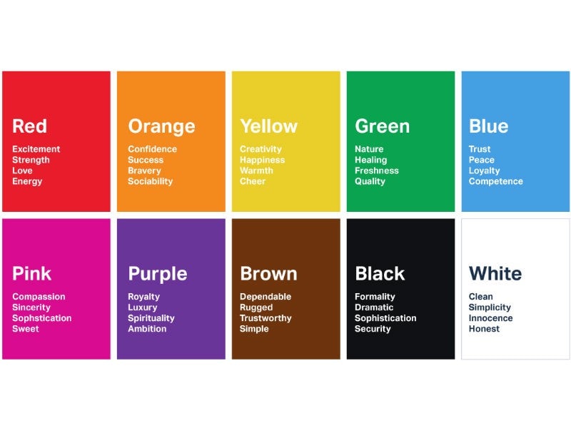
Source: London Image Institute
Not only this, but understanding color psychology will also help you identify how the perceptions of color vary across different cultures, regions, and age groups.
It is really empowering to understand everything about color and how it can incite an emotional response in your viewers.
6.Use Limited Colors to Create Better Attention
As we already know, colors evoke a response from the viewers, which applies to every type of shade. Hence, using too many can easily evoke a confused reaction driving the viewers away.
When you use limited colors, the beautified areas with colors get a better response than the areas that do not get colors. Hence, use colors to evoke a response for the exact areas you want to invite a response for.
7.Use Denotive Colors in Your UI
You can use colors to denote a meaning to the elements of the interface. For example, a UI color like red is used to share the state of change in the interface and depict the not allowed action.
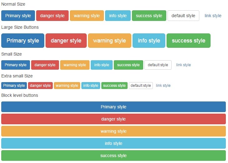
Source: jquery
Similarly, the green color can be used to say that the desired action is complete. In this, the UI designers also need to maintain the color consistency for dark and light modes. For example, it is not good to have different colors to show the Success and Failure state in light and dark interface mode.
8.Contextual Consistency is Important to Avoid Any Confusion
There should be consistency in the UI color schemes you choose for the application or website. In other words, if you are using one color for an element like the header background color, it should not be used for another element like the CTA.
The color should change with every context. For instance, if you have used the blue color to denote the Add to Cart button, it should not be used in another context on the same or any other page.
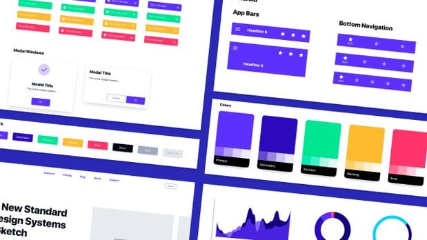
9.Create Your Color Palette and Fuse It Together
A color palette contains all the YI colors that you are using in the design. Therefore, not creating a color palette will lead to a disorganized UI color schema, and it will create design problems and affect your conversion negatively.
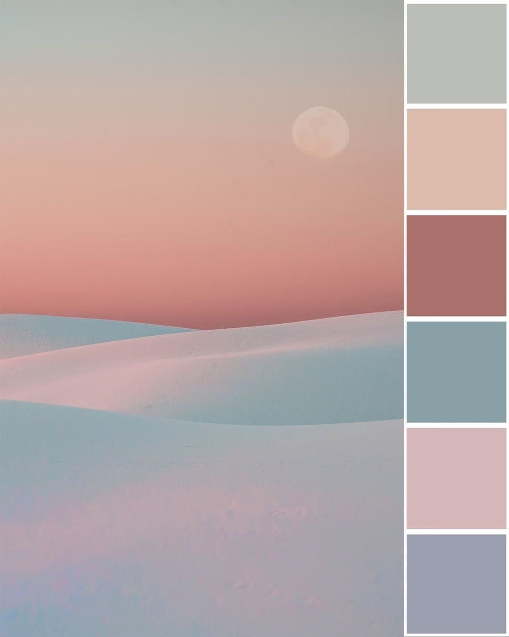
Source: Swell and Stone
To create the right color palette, start with choosing the primary colors followed by the color of the text and then the background. The primary color is your brand color like Red for Cocacola, Yellow for Snapchat, Blue for Facebook, Green for Whatsapp, etc.
With primary colors covered, you can use a popular color tool to get the variations of each primary color. Lastly, bring the desired colors together to build a uniform design.
10.Use the 60-30-10 Rule to Maintain Consistency
The 60-30-10 rule is a necessary addition to every sort of UI design and one of the most important things to cover in UI color schemes. This rule implies that you need to use 60% color composition of the dominant color, 30% for the secondary color, and 10% for the accent color.
The 60-30-10 is useful as it helps create a balance and provides a unique comfort to the eyes for moving between different areas within the application or website.
With the ten principles of UI colors in UI design covered, you must also know about the perfect tool for building the right UI design, and that will help you implement these principles.
The Best Tool for UI Design - Mockitt
Creating the best UI design is not an easy task, but it can surely be systematized by using the right tool, which is Mockitt Design. With this tool, you can create pixel-perfect icons, graphics, and other UI design elements embellished with rich UI colors based on the core tenets of UI color schemes.
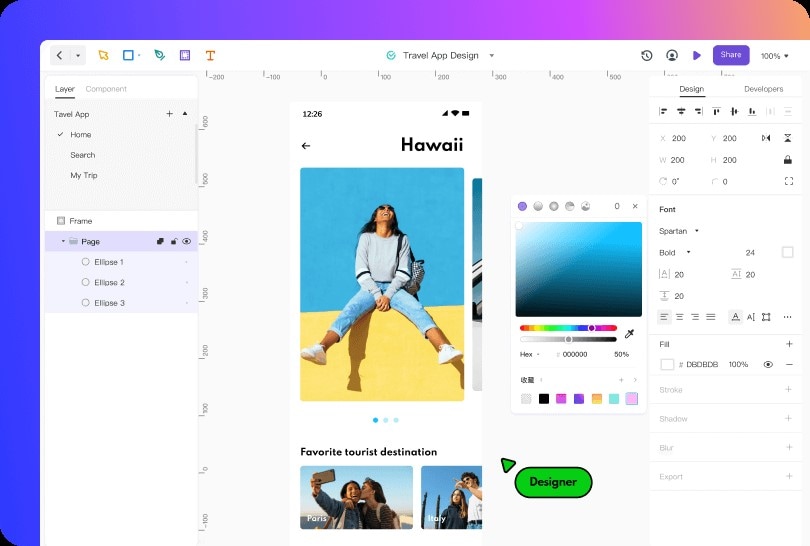
The Mockitt Design tool is free to use and available as an online version boasting a simple yet powerful interface consisting of all the required features and functions. Everything that you need to create a UI element for the digital solution is available in Mockitt.
- You get access to various Vector tools, including Pen, Bezier Curve, and Boolean.
- Add to your design a wide gamut of widgets and components.
- Choose pre-added templates for different mobile devices segregated as per their default dimensions and screen sizes.
- Import your existing designs built in Sketch and start editing them on Mockitt for free.
- Share your work instantly and get a preview option to give your design one last look before sending it to the client.
Mockitt Design further gives you the ultimate tool required by every designer, and that is to collaborate with other team members in real-time, reducing the to and fro while making the changes on the spot.
Conclusion
There is no denying that choosing the right UI colors is imperative for building the entire design's ideal aesthetic and emotional value. While you are working with colors based on authentic principles, choosing the perfect tool for realizing the principles and working on them for the best results is also essential.
Mockitt Design is a free and convenient solution for creating UI designs. This online tool gives you access to device-specific artboards and a ton of tools, including vector designing, pre-added shapes, and various color-based features to bring the design to life.
