10 UI Design Examples that You Must Know
What is UI design? UI design is short for user interface design, and UI design is the process that designers make the interface for software. UI design focuses on the visual look and style. Knowing what needs to be done to create the best UI design, you should also understand what must not be done. This article will talk about some good and UI design examples and explain why they are good or bad.
- Part 1. What is UI Design
- Part 2. 5 of the Best UI Design Examples
- Part 3. 5 of the Bad UI Design Examples
- Part 4. The Best Tool for UI Design
What is UI Design?
The user interface is the same as expecting to feel welcomed and enjoy the visual aspects of the place. However, you are only welcoming your visitors on a digital solution like an application or a website and ensuring that it interacts, giving them an impressive overall user experience.
UI design focuses on the usefulness of the elements and components of the digital interface rather than only creating a visually aesthetic experience. While harnessing the principles of a UI design, you would want to get the most bang for your buck as quickly and cost-effectively as possible.
But what makes a UI design good or bad? What are the elements to check before certifying their impact? We will closely examine these aspects with visual examples to help you better understand what qualifies as good and bad UI.
Top 5 Good Interface Design Examples
1. Stand Out with your Design
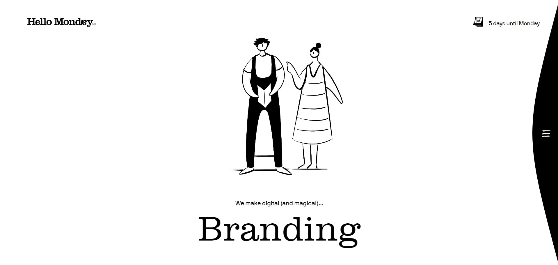
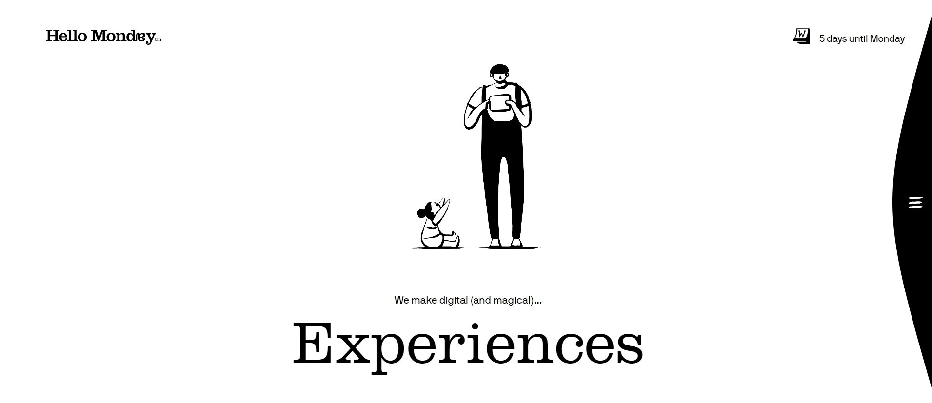
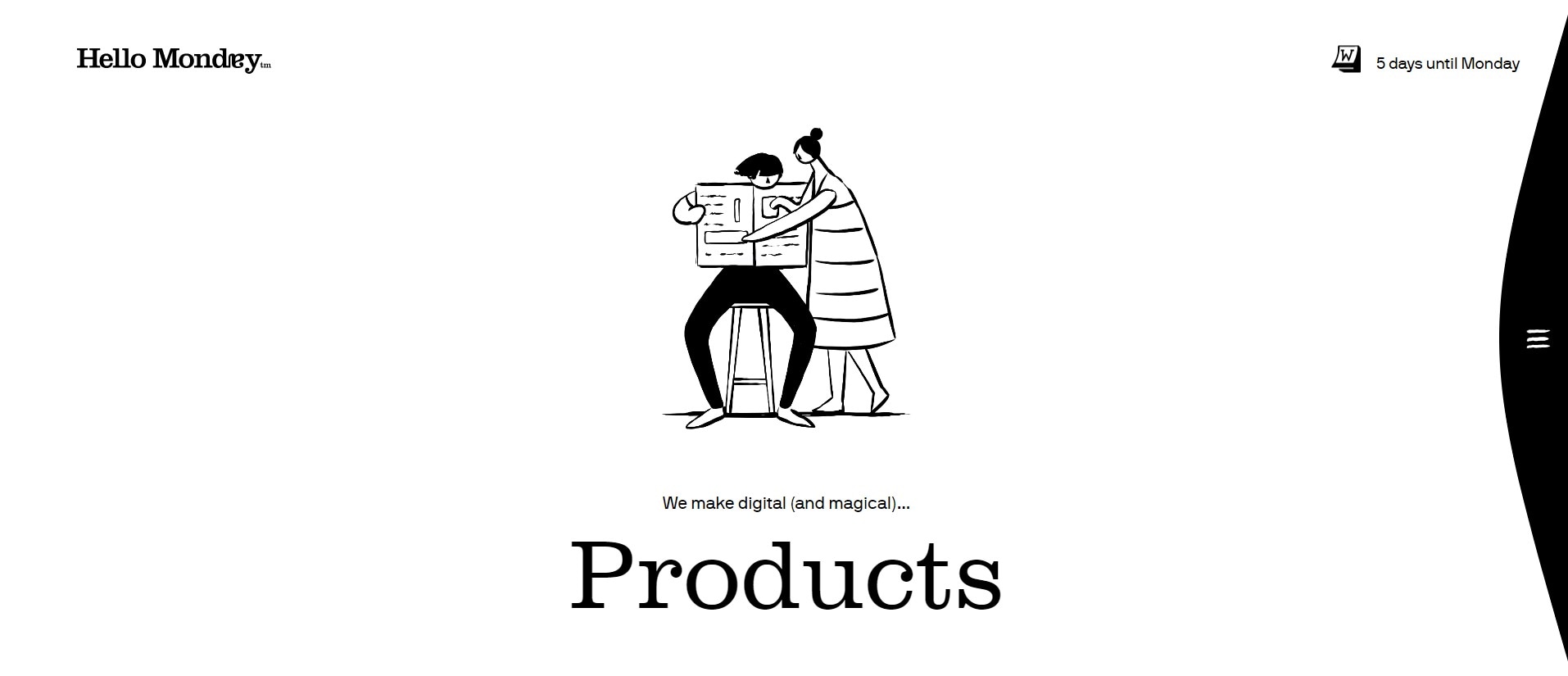
These are only two screenshots of a design agency, Hello Monday. Here we have Branding, Experience, and Products. Notice how the website is designed with a white background with only the message they want to show in the center.
Such a setting will quickly grab the user's attention because they have nothing to see or contemplate in the rest of the area. The entire design is simple yet evocative enough to get the desired response from the visitors, with nothing but a few words and white background.
2. Changing Colors with Every Page
Colors have a significant impact on the visitor's thinking about the brand. For example, here we are showing a few screens of the popular cloud storage platform, Dropbox.
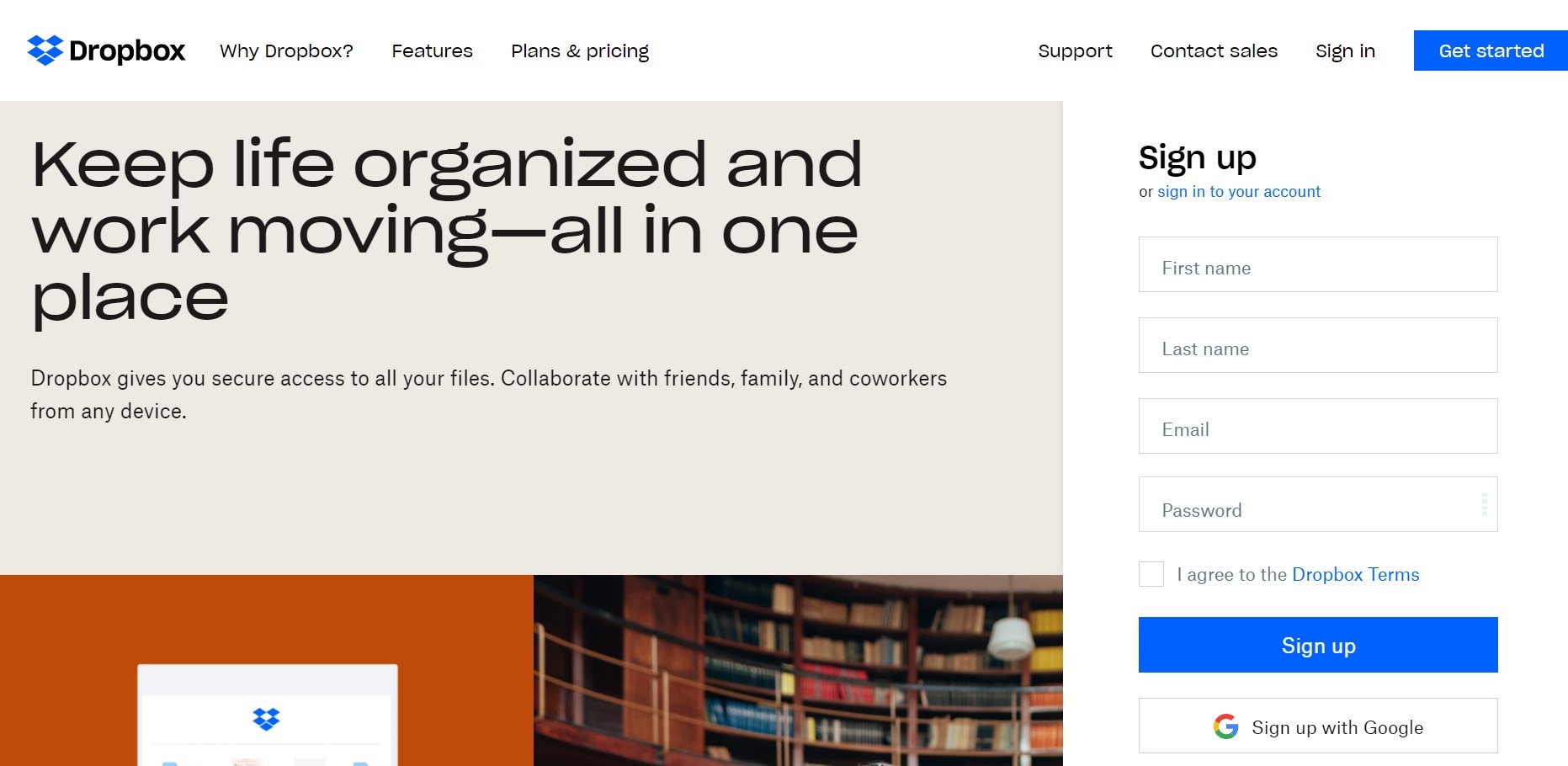
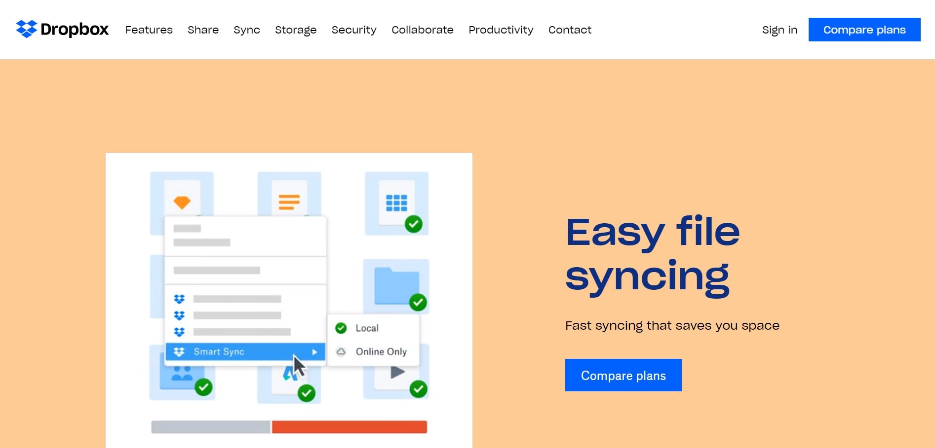
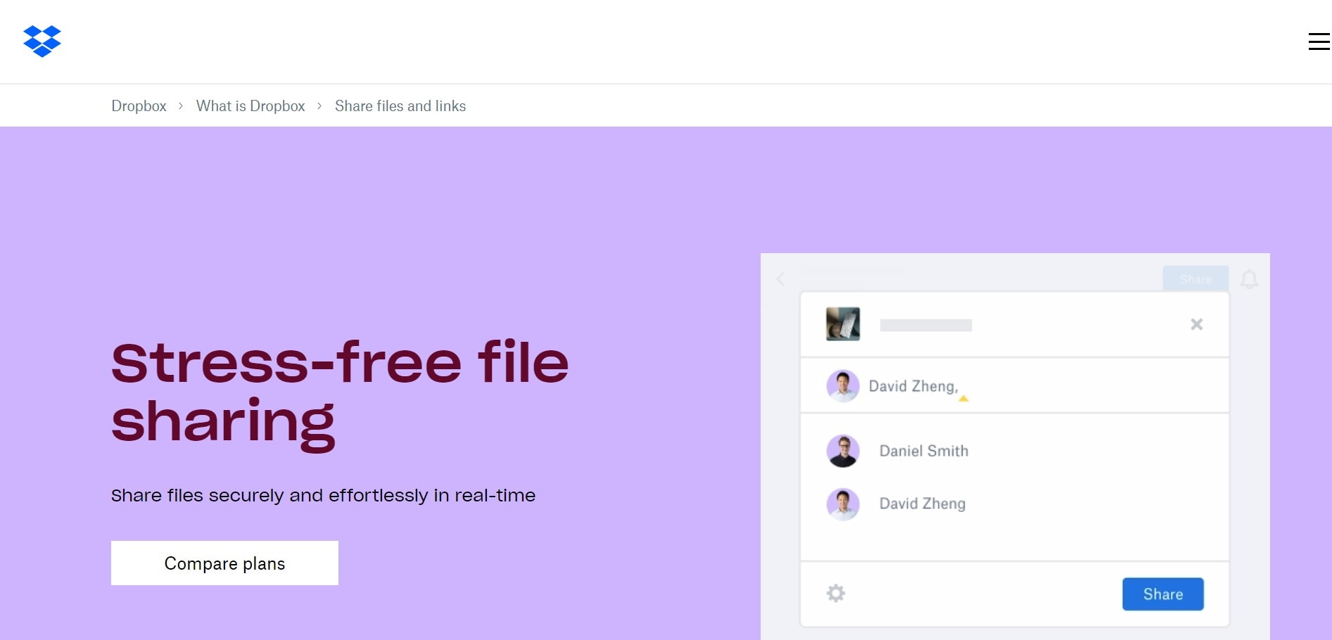
Dropbox uses different colors for different pages, and all the colors align with the feature or motive they want to share with each of the pages.
Such a website setting is another good UI design example that redefines the idea of creating novel ways of engaging with the audience.
3. Usability of Space
Every website or application has the same amount of screen area to show its content and media, but what makes them different is how they are using that space.
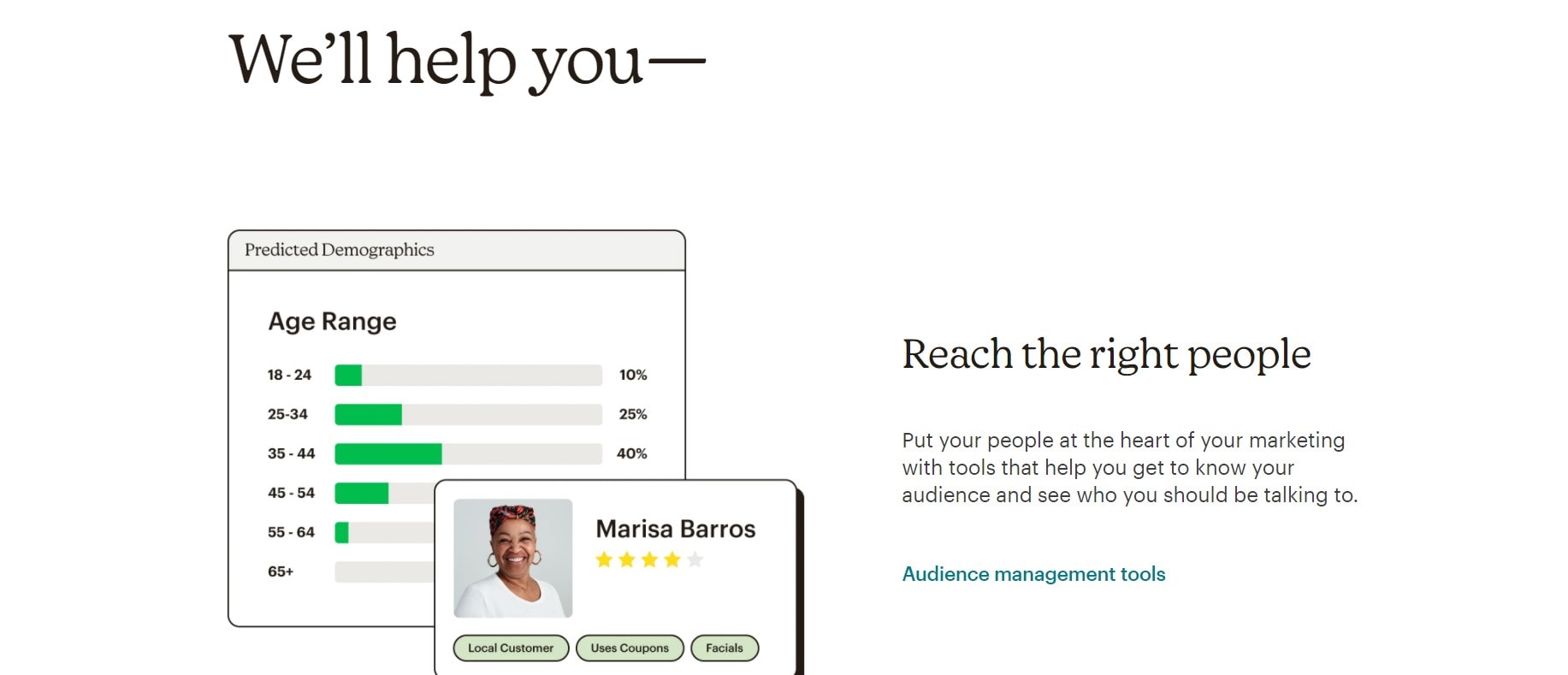
In the image above, we can see that Mailchimp provides the information on one side and shows real-time images of how their tool classifies the users. So, the audience visiting here will get the information they need, it's proof of work, and the CTA to start using it.
4. Let the Buttons Tell the Story
Buttons provide a creative yet simple way to evoke a response from the audience. Within good UI design examples, the designers use all sorts of creativity to provide a user-centric layout.
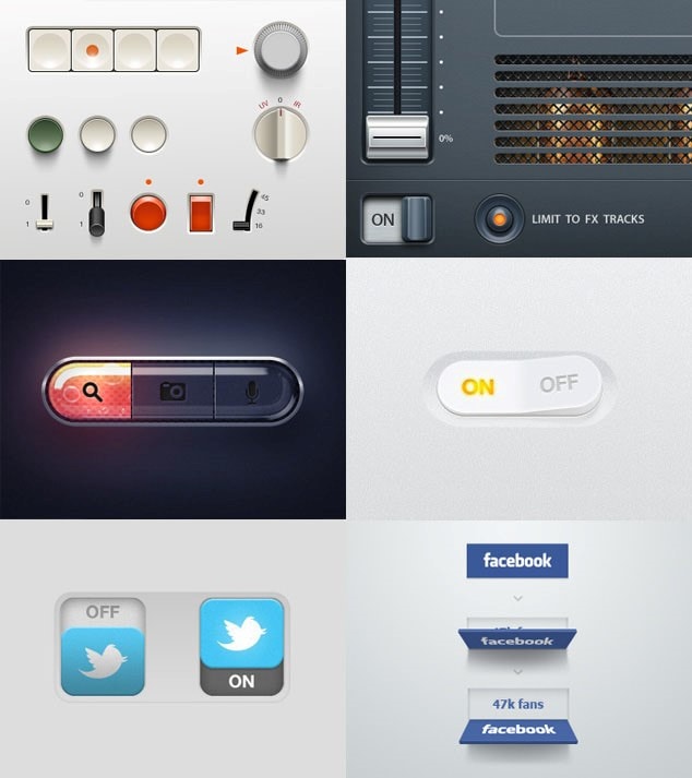
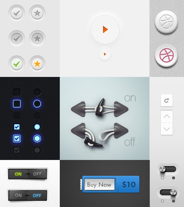
Following this pattern, some buttons have animations, while others play with colors, and some are embellished with a waterfall effect. The two images above show all sorts of good UI design examples with buttons that create an immersive and interesting effect.
5. Using Motions in the Design
Designers and creators are exploring many new ways to ensure that their users enjoy their interaction with the website or application. With this thinking, we have another good user interface design example depicted by the Cognito website.
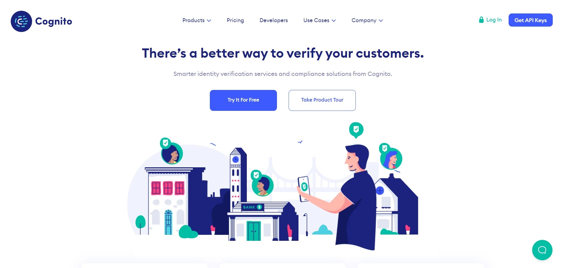
This website comes to life after loading, and the picture, along with some text, defines what they do and how they can help their target audience.
These were some good UI design examples that you should know about and try to implement in your next design. To some extent, the completion of a UI project is dependent on the tool you are using. Because even if the designer has the skills to create exemplary designs, sometimes their efforts may be thwarted by the lack of the right tool.
With this in mind, we are also sharing a tool that you should know about to ensure that no design effort and possibility is wasted.
Top 5 Bad Interface Design Examples
1. A Design Without Contrast
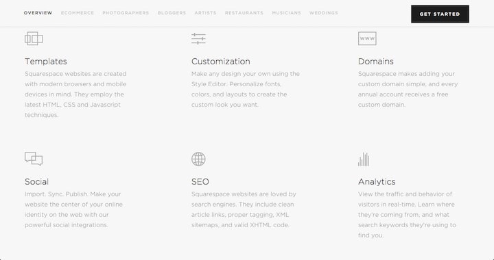
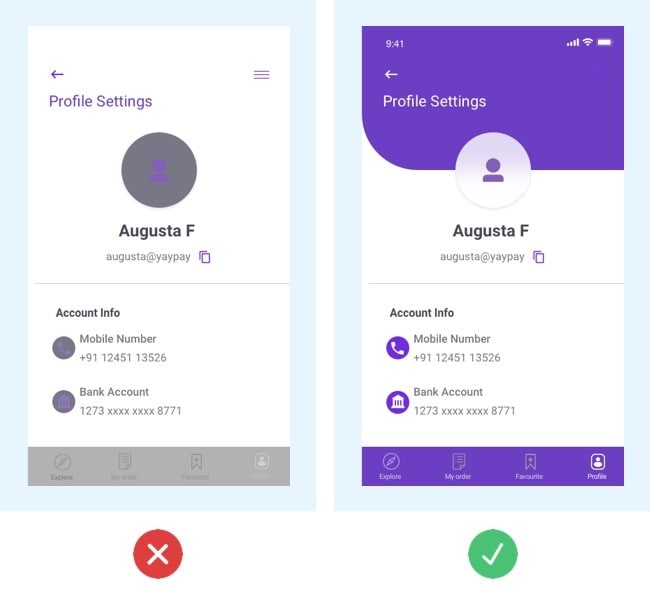
Take a look at both images. Can you read the content easily? Most probably no. not without looking at it closely or by flinching your eyes. That is what we mean by lousy UI. It would help if you never let your users do the work to read some simple content on your application or website.
Instead of this, ensure that the background color and the text written on it are clearly visible, easy to read, and not overwhelming.
2. Non-Responsive Website Design

A website design needs to respond according to the device they are accessed on. Here is another of the bad interface design examples. As you can see, the website on the left is responsive as it conforms to the device, but for the website on the right, the user has to scroll horizontally and vertically.
Because if they have to scroll, they will have to leave the website and leave with a bad impression.
3. Inconsistency in Design and Format
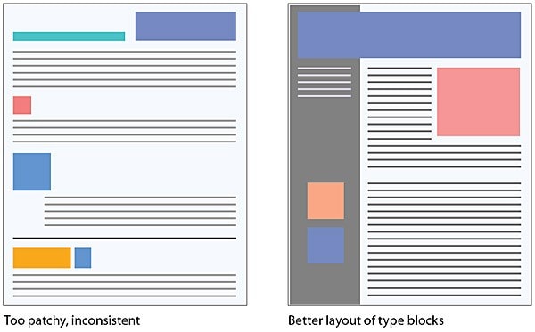
There has to be a uniformity in the design and format, and it must show in every aspect of the application or website. Consistency implies that you need to build and improve the website with the right colors, styling, font size, typography, shapes, and everything else.
Look at the design on the left. The content, images, logos, headers are not aligned, which is the perfect recipe for a bad user experience. However, the design on the right is better positioned to provide the right information and value to the viewers.
4. Lack of Distinction Between Buttons
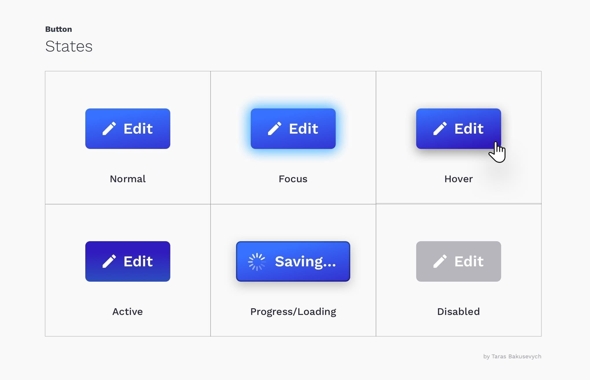
The website or application has different types of buttons, each with its required functional aspects. Your prerogative is to ensure that the distinction between these buttons is visible with the right design elements.
The upper three images represent three different actions, but they are not distinguishable because all the buttons' color and shape are the same. However, the three buttons below are better at distinguishable and clearly demarcate the functions they are meant to do.
5. Too Much Information
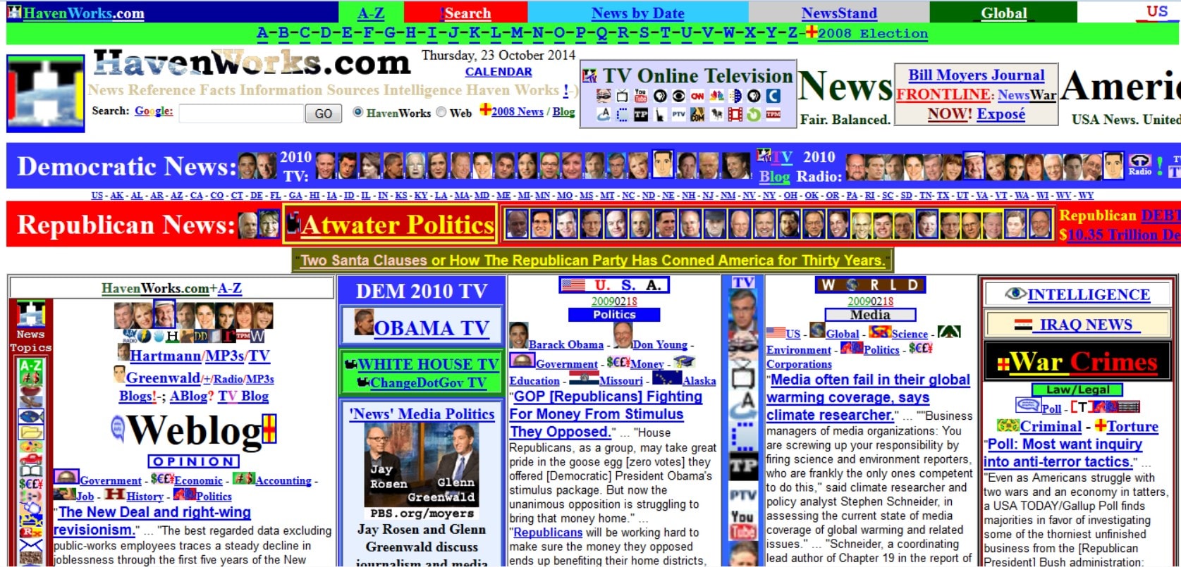
The art of copywriting teaches you to say more with fewer words, which stands true for your website design. However, too much information on a single page of the website can be misleading, confusing, and the best bad UI design examples.
Notice the website copy above? Do you find it easy to read and understand what it is that they are trying to say? No, right? That is why you need to follow the proper structure and ensure that every sort of information is clearly stated and shared for better conversion.
These were the five bad interface design examples. Remember, bad UI means user experience, which is not good for any type of business. Well, now that you what should not be done, follow on to know what must be done with a few UI design examples.
The Best Tool for UI Design
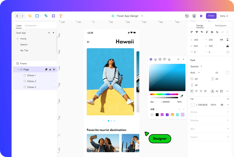
Beginning with its team collaboration, you can invite other team members to work together on the project and leverage the possibilities created by collective intelligence. Besides this, it is easy to share the design with a link and open the same in any browser accessible by the other team members. They can also add annotations and comments while suggesting changes and improvements.
Without a doubt, this tool is built with the developers and the entire software development life cycle in mind. It supports several advanced functions, including vector drawings including Boolean editing abilities.
The best part is that for every setting and addition, you will get access to pre-generated HTML code for a smooth handoff and accurate recreation of the design elements in the code.
In another possibility, Mockitt Design can create some good UI design examples driven by its design systems. Design systems are primarily collections of items and widgets that can be used with infinite permutations. But the design systems accessible with Mockitt Design works with a holistic approach and maintains consistency throughout the designing exercise. In this, the designers can also share their libraries of elements and widgets with other team members.
With the sharing aspects, Mockitt Design saves all the edits and versions created by other designers on the team and makes them accessible via history management. All in all, we can say that Mockitt Design is built to scale your design thinking and help you build enterprise-scale UI designs delivered with the perfect representation of modern, user-centric, and approachable designs.
Conclusion
Good and bad interface design examples are not created by any designer deliberately. Instead, it is all about understanding the designing aspects and how much a designer understands their audience and the impact of a good design on their decision-making process.
Designers also need the best tools in their hands to successfully create and design good user interface layouts and fill them with the right colors plus graphics. To this end, Mockitt Design has been developed to meet every designer's different needs and roles. As a tool, Mockitt Design lives and breathes with the designer allowing them to create the best UI designs fathomable.
