Top 5 UX Myths for Most Designers
UX design does not have an official, standard definition because various elements that together decide the fate of UX. But, pain is forgotten where gain follows, UX myth always happens. Therefore, Wondershare Mockitt is listing the widely held but false beliefs or ideas, for UX designers, fellow seekers of truth to bust some myths around UX/Product Design.
UX Myth 1 - People Do Read Page
Actually, they don't…
Most people don't read but scan. In 2013, analytics vendor Chartbeat analyzed Slate and other websites and found that most visitors scroll through about only 60% of an article page. People rarely read Web pages word by word; instead, they scan the page, picking out individual words and sentences.
According to an eye-tracking study by Eyequant, when users land on your site, their eye path starts from the upper-left corner, where will get the most attention, and moves down and right from there. The bottom-right terminal area is where you should place your call to action. Note that this is not some universal truth but a good starting point. A button in the terminal area is a compelling call to action because it's placed at the end of the user's viewing pattern. When it's at the end of their viewing pattern, users don't have to look around to find your call to action button.
And the funny thing is, people often process pages in an F-pattern. If you have a vertical menu, put it on the left. Navigation placed at the top of a homepage however performs best.
Source: Nielsen Norman Group
UX Myth 2 - Photos Always Improve User Experience
The old adage “a picture is worth a thousand words” is an incredibly powerful statement, implying that a single still image can convey more to the observer than an elaborate block of text, nearly instantly. Human beings are highly visual creatures able to make connections and process visual information almost instantly.
But, such images aren't related to the topic of the website and don't hold useful information, rarely add value to a website, and even less to a mobile app. They more often harm than improve the users' experience.
A real case in VWO: Using appropriate images increases conversions for Harrington Movers (New Jersey moving and storage industry) by 46%.
Brian Mckenzie, the Senior PPC Manager in Harrington Movers, states that this test has added about $10,000 / month in interstate moves so far.
Photos of products and real people are treated as important content and scrutinized. But, some types of pictures are completely ignored. This is typically the case for big feel-good images that are purely decorative.
Users ignore stock photos of generic people:

Source: aPhotoEditor
UX Myth 3 - The most important page: Homepage
A homepage is important real estate to a publisher. It is a carefully constructed mix of links and graphics designed to deliver the right message and the right stories to the user.
Usability experts, including Jakob Nielsen, have long argued that your homepage is the most valuable real estate of your website. As a result, lots of web designers and developers still spend most of their time on the design of the home page.
In the article Web Design: The Decline of the Homepage, Gerry McGovern states that more and more customers are going straight to specific pages on your website, rather than the homepage. In 2003, 39% of the page views for a large research website were for the homepage. By 2009, it was down to 19%. In one month in 2008, of the 70,000 page views a technology site received, 31.42% of views were for the homepage. For the same month in 2010, of the 120,000 page views the site received, only 2.08% of views were for the homepage.
Traffic to the New York Times homepage fell by half in the last two years, according to the newspaper's internal review of its digital strategy. Here's the very stark chart:
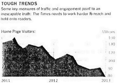
Source: SCRIBD
UX Myth 4 - People Do Know What They Want
Till today, many organizations still rely on asking people what changes they'd like to see on their website or service. So, what are people actually doing when they respond to questions on a survey questionnaire?
The standard answer is that when people say they prefer X over Y on a survey questionnaire, they're simply describing a preexisting state of feeling more favorable toward X than Y.
Brain science researchers have found that human preferences are often much more temporary and much more easily manipulated than consumers' sincere declarations of brand love might lead marketers to believe. Unrealistic optimism makes people think bad things are less likely to happen to them than to others, and it hampers their decision-making. What you have to understand is, people make confident but false predictions about their future purchasing behavior.
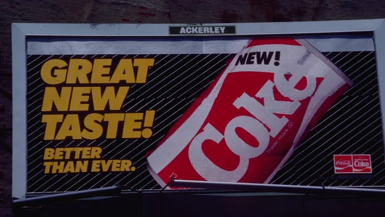
The reality is that there are many organizations used to neglect historical research failures. New Coke was one of the greatest marketing blunders in history. Despite thousands of sip tests and countless efforts to fine-tune the taste based on the customer feedback, the New Coke was a huge disaster. The story of New Coke remains influential as a cautionary tale against tampering with a well-established and successful brand.
Source: dailymail.co.uk
UX Myth 5 - Is white space wasted space?
Many clients consider white space as merely a waste of useful pages:
- There's all this empty space at the top.
- Can we add more content since there's space for it?
- Let's make everything bigger to fill up space!
Despite what we call white space, it does not need to be white. It can be any color, texture, pattern, or even a background image.
The white space (or negative space) we talk about should refer to the area between design elements. It is also the space within individual design elements, including the space between typography glyphs (readable characters), that are often overlooked and neglected.
A web design should consider the way we interpret the visual stimulus. The human eye prefers to look at visuals that are not cluttered or crowded, and white space can assist in clearer communication and effective graphic design. White space improves readability and allows time to pause and reflect on the message people just received.
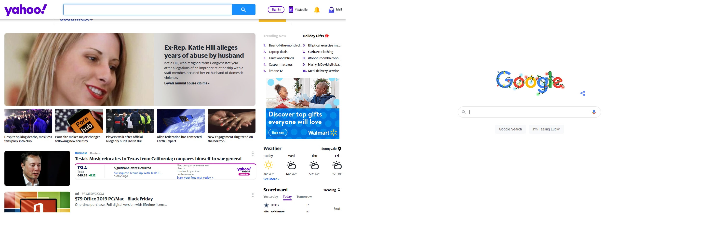
Comparing with Yahoo, as you can see, Google is a big advocate of white space in their designs. The search engine is widely regarded to have a clean design since the focus is on the main aim of the page, without massive dedication to other areas.
If you are still obstinacy, go check out the white space eliminator.
