10 Rules of Good Web UI Design to Follow On Every Web Design Project

Web user interface design is a headache for many designers! Because web user interface design needs to consider many aspects, such as not only a good-looking user interface but also a good user experience, so that users can achieve their goals without confusion or errors. No matter how big a design company is, whether it is from application development or website construction, user interface design is a key factor for success.
However, despite the popularity of the concept, the basic rules of UI design are still poorly understood by many user interface designers. Many designers have a vague understanding of what it means to be user-centered in UI/UX design. Moreover, it can be even more difficult to apply it in practice. In this article, we will introduce you to the 10 most important web UI design principles and show you how to use them.
10 Rules of Good Web UI Design

Image Source: Shutterstock
1. Be consistent
You need to be consistent in the placement of functions in the web UI. At the same time, the web UI should work and look the same in all sections of the site. Consistency means that design and functionality remain the same across all your pages and products. Many of the most popular and successful applications and websites use similar patterns for user interfaces across resources, be it the placement of buttons or the way menu systems "flow". The design must be consistent across all publications of the resource. Do not change the fonts of the headings and content on different pages.
2. Simple and clear UI design
The hallmark of a good web user interface is simplicity. We don't mean sticking a button here and there with primitive animations. We are talking about a web user interface that is easy to understand and master, even for a beginner. Users should clearly understand how to get access to this or that functionality. Following this principle implies refining the UX. This increases your viewing time and decreases your bounce rate. One way to achieve clarity is to move from one step to the next on different pages. Offer users the ability to navigate from product page to cart, checkout page, checkout page, the confirmation page. This is especially important for mobile users, as screen space on their devices is limited.
3. Focus on one action at a time
Due to the interactive nature of web design, users often have to perform a lot of interactions. However, this can quickly overwhelm them. This is why we need to focus on one activity at a time. This is especially important when it comes to calls to action. We often bombard users with secondary calls to action when the primary action goes unnoticed. Users cannot perceive that much at a time.
4. Use typography correctly
Another elegant way to create visual hierarchy is typography. It's not as easy as picking a good font. Each font has, so to speak, individuality, and affects the target audience in different ways. Size plays a key role when using fonts on the web. Important information, such as headings, is highlighted in a large and elegant font. And don't forget about contrasts.
5. Simplify forms to fill out
Forms are one of the main methods of user interaction with your web projects. It is there that they will click something, cursing you and the computer from time to time. The problem is that most users hate forms of burning hate. Therefore, your job is to integrate them into your interface as painlessly as possible. So that users do not curse computers and their loved ones more often than necessary. This is not easy to do. In many cases, sites force the user to register for no good reason. If you can skip the form and design an unnecessary interface, that's a win-win scenario.
6: Responsive web design
Responsive design is no longer an option today, it is a necessity. Since users' own phones, their tablets, and their own computers are accessing the Internet, your website and applications need to be accessible and look great at any screen resolution.
7: Before you start designing, draw your ideas
Before designing, you need to draw your own ideas in Photoshop. There are thousands of websites that you can use for inspiration. Therefore, you can explore ideas and create concepts while making them easy to implement, perfect and simplify.
8. Setting goals before designing
Every web user interface should be built to achieve an end goal. From navigation to web forms, all aspects of the user interface should be built to achieve your application goals, whether it is to execute a function or discover something new, as simple as possible and realize it for the user.
9. Implement visual site hierarchy
The most important web UI elements should be highlighted so that users can focus on them. Web UI design has an endless arsenal of tricks for this. The simplest example is to enlarge an element, making it the center of the page. A more original way to implement visual hierarchy is to use a space to highlight important parts of the interface. Alternatively, the appearance of an unexpected tasteful element can work wonders.
10. Use high-quality, professional design software
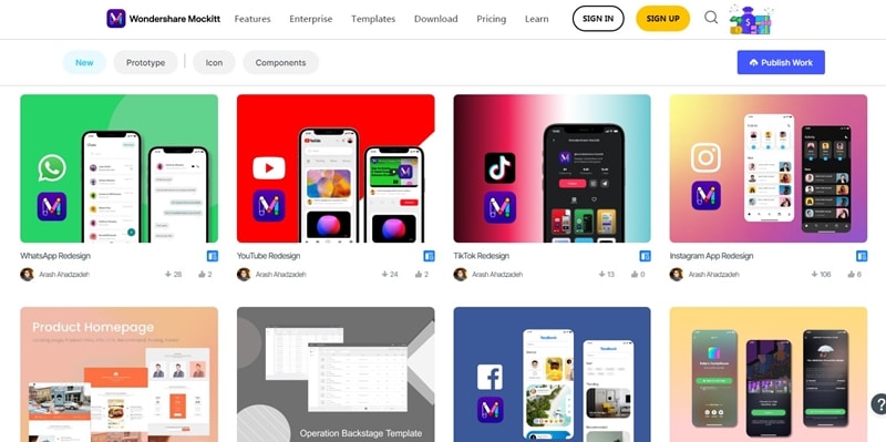
Many web user interface applications simplify the UI design process but compromise the result. If you design a user interface, software for the mass market or an application that you think has the potential to become popular, you need to use high-quality, professionally designed software. There are many UI design tools available on the internet. But Mockitt is one of the best UI design tools. You can use Mockitt to design web UI.
The Best Tool for UI design - Mockitt

Wondershare Mockitt is a program for UI designers with which you can create not only prototypes but also the final interfaces of websites and mobile applications. The process of working in the program is intuitive, and the possibility of joint simultaneous work on a project attracts more and more teams to implement prototypes in Mockitt. With automatic synchronization on all prototypes, you will create one source for the entire team, from design to development, where all the changes, ideas, and adjustments that are so necessary for fast and productive work will be visible.
Wondershare Mockitt is a prototyping tool that is best for professional UI designers due to its well-known dynamic content functionality and features. Mockitt supports powerful prototyping with conditional boolean operators and responsive views, allowing designers to create interactive prototypes with enhanced details. Today, the world's most advanced design companies rely on Mockitt to create even better digital products faster and more conveniently than their competitors.
Interface
Wondershare Mockitt has a very intuitive interface. It's a cross between complex Invison and primitive Marvel, so for me, Mockitt is the golden mean. Regardless of what device you are drawing a prototype for, the program's desktop is a simple layout, and all the tools are collected at the bottom of the screen. This can be a little annoying for those used to having tools in the top menu, but it's definitely easy to get used to.
Components
You can create a component in Wondrshare Mockitt, save it to the team library, and then update the root component to affect all instances. Buttons, icons, fields, menus, headers, forms, and blocks can all be combined to form components. This is a very useful feature that is primarily used in Wondershare Mockitt.
The pluses of working in Mockitt include:
- Free trial version available
- Create and render a layout in one program
- There are a huge number of ready-made websites and mobile app templates.
- Mockitt requires a fresh version of the browser, while the desktop version does not require a powerful and modern computer.
- Save project versions on the free version
- Even a student can create the simplest prototype in Mockitt
- Being a lightweight vector tool designed for interface design, it can significantly save the developer's time;
- it integrates a powerful Layout Grid tool, which is very convenient for the design of a pixel-perfect structured interface; the width of dividers and columns can be adjusted and changed at any time;
- availability of the source export option.
Conclusion
People become accustomed to and more demanding of digital products and interfaces over time, and they begin to expect more than in previous years. Companies must consider this and ensure the quality of their user interfaces. First and foremost, any great user interface is invisible, or something along those lines. They are not bright, have not been redecorated, and are not overburdened with unnecessary elements.
Make every interaction count. Make it simple for users to complete a task smoothly and efficiently; never let them become disoriented while using your interface or lose work they've already completed. Also, don't overwhelm users with too many work items; it's better to hide non-critical items - you'll only get approval from the user. Most importantly, keep your design consistent. Because users quickly recognize usage patterns, it is critical to maintaining consistency in the user's interaction with the site via the interface.
