Wondershare Mockitt - Web Design Tool
Web Design - All Types of Webpage Design
- Complete guide on how to design website.
- Plenty of web design examples and templates for inspiration.
- Best web design software and books recommendation.
- Great web design ideas for different styles of page like real estate, restaurant and hotel.

10 Excellent Samples of Medical Website Design to Inspire You
In today's world, medical marketing strategies have started to focus on empowering the patients so that they can make smarter, easier, and more convenient healthcare decisions - the journey begins with a good medical website design. The hospitals now have digitally aware consumers. It's only fair for a UI/UX designer to serve them right.
If you are looking for ways to show creativity in a sector that requires a little more innovation considering the professional restraints, you are in luck. We have curated some excellent medical website design examples that can serve to inspire any designer out there. Let's not delay and jump right into it!
- Part 1: Medical Website Designs - Keeping It Professional!
- Part 2: A Perfect Tool for Designing Your Medical Website
Top 10 Medical Website Designs - Keeping It Professional
#1: The Royal Women's Hospital
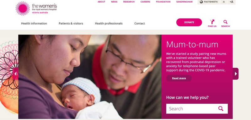
The website of the Royal Women's Hospital has been solely targetted to appeal to females. From top to bottom, they have added elements that resonate well with the women's spirit. Bright colors are used along with a visual treat of banners that display positive messages and images on motherhood.
This medical website design also focuses on accessibility. They have readily presented their services and facilities in an organized manner for visitors to quickly avail of what they're seeking. This women-friendly platform also features a comprehensive support page to help females against domestic violence.
#2: Centura Health
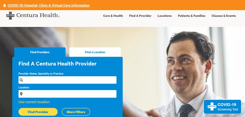
The website of Centura Health may not have the most dynamic or modern design but it does ace at other features. This platform has a sophisticated, neat, and straightforward information architecture that is sure not to confuse any type of visitor. The navigation has only 5 primary links and 2 secondary icons. Many healthcare websites throw in more than 20 elements competing for attention in the front navigation. That's not a mistake that designers and developers of Centura health's site made.
Other than that, the prominent display of the search function in the center of the home page greatly enhances the usability of their website. This healthcare website design became further accessible by using large, high contrasting fonts that are easier to read for people with vision issues.
#3: Mercy Health
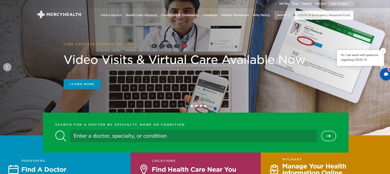
The website of Mercy Health primarily focuses on grabbing visitors' full attention for their own benefit. They have used dynamic images and colors to engage the viewer towards the provided information on the platform. Rich colors and pictures that promote positivism, excitement, and a sense of optimism are featured all across the site to motivate the patients to begin their journey of healing.
This healthcare website design has employed psychological techniques too. The use of a deep, vibrant green color for the search box was a particularly good choice to suit the feeling of health and well-being. Nice tact!
#4: Alfred Health
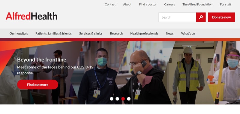
The website of Alfred Health seems fully invested in highlighting the positive impact of their researchers and physicians. Their homepage design features many powerful pictures of medical professionals aiding their patients and soothing various ailments. This strategy invokes trust and reliability when visitors explore the platform.
Throughout the website, UI designers have used positive visuals along with presenting all the necessary information accurately. Thanks to a balanced use of text contents and animations, space doesn't feel cluttered or congested. They have intelligently maintained a specific color theme and style in all their webpages which gives the site a unified brand voice.
#5: Northern Health
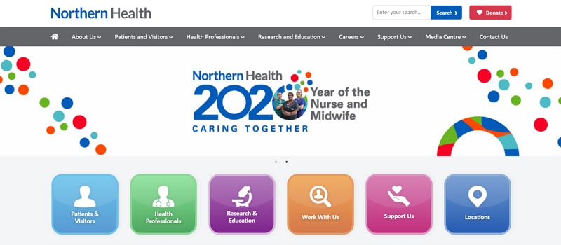
Northern Health's website utilizes the 'feel-good' aspect of human perception. Its interface designers have made sure that the visitors experience revitalization after landing on the site's pages. If we look at the logo, the lotus image gives off a sense of serenity against the generous amount of white space used on the canvas of the platform.
The most useful information that users might be seeking is placed right in the front center. This aspect has given convenience to this medical website design. Excellent quality of service is maintained throughout the site. Visitors are able to find locations, doctors, and departments of diseases easily and quickly.
#6: Indiana University Health
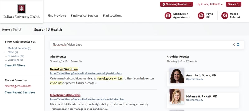
Indiana University Health took it a step further. Its website provides visitors with a robust keyword search feature. On the site, you get the perfect filter to make your searches specific to your needs. The users get to sieve the results by different criteria: medical services, news, and events, locations, and providers. This modern medical website design also has a listing of recent searches on the left side that allows users to track their search history with ease. In addition to that, UI designers have smartly incorporated separate search functions that appear in the header navigation for Providers, Medical Services, and Locations.
#7: Rest Assured
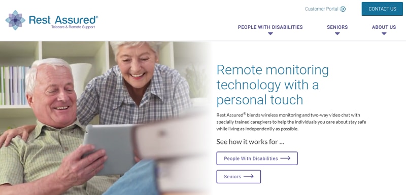
Rest Assured provides remote monitoring technology for people with disabilities and seniors. Its website was carefully designed and built to WCAG 2.0 AA level of accessibility compliance. It is feasible to use and open to all kinds of users, which is always a smart choice for brands in any industry.
The overall feel of the platform is focused on comfort of visitors. Elements such as large, high-contrast fonts, and easy to use keyboard navigation are promoting convenience. The Rest Assured's site also employs alt text on all images which screen readers and other text-to-speech software may use to accurately read and interpret content for visually impaired individuals.
#8: Regional One Health
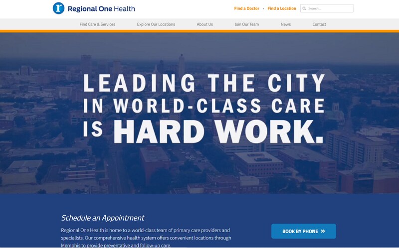
The credibility of a healthcare website spikes tremendously if it manages to tell the story of its community in an effective way. Regional One Health chose to narrate their institute's story through videos on their site. They are offering facility tours, provider interviews, and treatment videos to engage prospective patients.
The creative clips plastered on their homepage is their hero statement that immediately captivates the viewer and promotes the feeling of security in visitors. This healthcare web design of Regional One makes the user believe they have the solution to his/her health issues.
#9: Arkansas Surgical Hospital
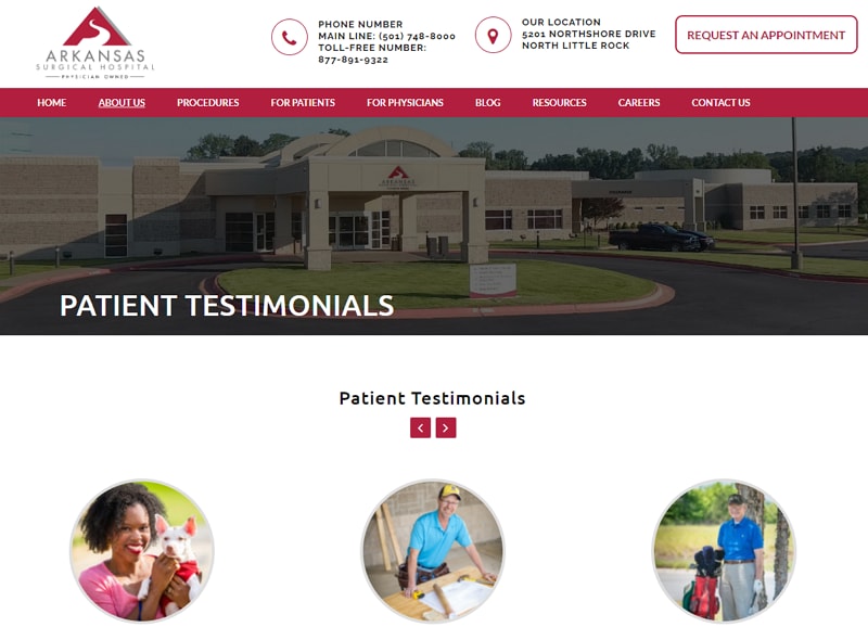
What is the most sought after thing for prospective medical patients? They consistently rank testimonials as one of the reliable sources of information. That is why patient reviews are one of the most powerful sections of a healthcare website and must be included in its design. Arkansas Surgical Hospital excels at presenting patient testimonials in a user-directed carousel. These testimonials put forth added comfort to visitors and create an additional level of credibility to the healthcare provider.
#10: Mayo Clinic
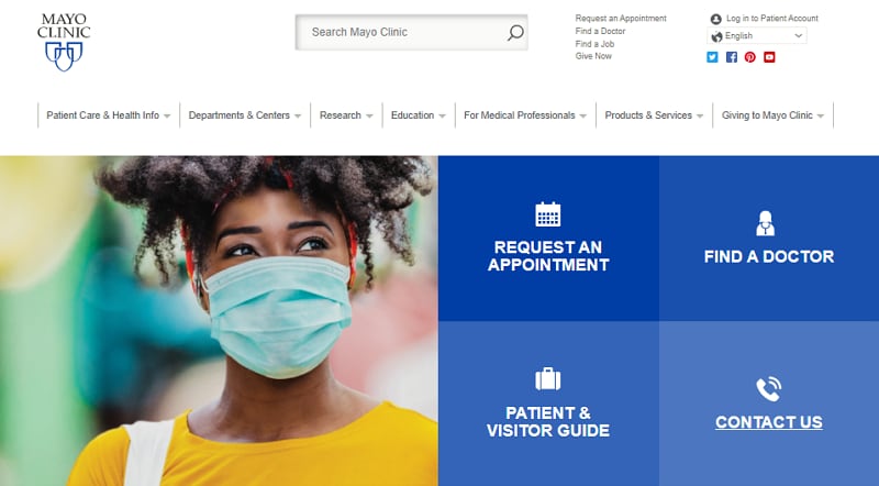
The Mayo Clinic has been long recognized as one of the top medical centers in America. They are also at the top of their game when it comes to providing medical information to website visitors accurately. The section that guides people about diseases and conditions is prominently displayed on their homepage. As you scroll down, health issues can be found to read about from an alphabetical conditions listing, or by using Mayo clinic's comprehensive symptom checker. This platform is among the best healthcare website designs for you to replicate your next interface idea from.
A Perfect Tool for Designing Your Medical Website
By now you must be feeling confident enough to develop your own medical website. It is upon us now to suggest a tool that will help you from the beginning to the end of your designing journey. Wondershare Mockitt is an online tool that specializes in building mobile app wireframes and prototypes of all kinds. This platform is much appreciated in the Chinese tech world. Even market giants like Lenovo use Mockitt. It's about time the English devs get to explore it as well.
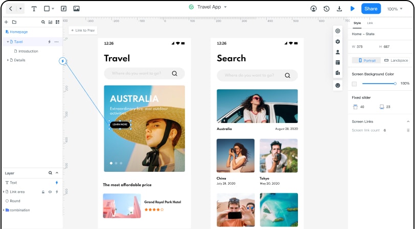
As a UI/UX designer, it can be quite laborious for you to write codes. Mockitt takes the extra hassle out of your way. It provides you a sleek and organized workplace to carry out your web development projects.
What's more convenient on Mockitt is, you can efficiently collaborate with your team members. Mainly, this tool is focused on the initiation of iOS and Android projects, but it also offers you to use custom-sized layouts. With simple drag and drop moves, you can blend object templates, predefined widgets, and combos into your projects.
When it comes to collaborations, Mockitt can also generate a QRcode. This way you can test the prototype on your Android or Apple device. The code is simply scanned with the device's camera. It allows you to share your work and get feedback from colleagues or clients.
Another good news for UI/UX designers who are looking for a free prototyping tool to begin with. Mockitt does offer a free version. Even if you want to enjoy the premium version, this incredible tool is cheap as compared to other options in the market. So, don't delay and build your website with Mockitt now!
