Recommendation: Useful tool for your design

It's a well-known fact that mood can be affected by colors — think how differently you feel when you enter a bright orange room versus a dull grey. But did you know that color often plays a significant role in the first impressions of your brand on your customer? In general, people make their perceptions on how they feel about merchandise in the initial 90 seconds — and approximately 62-90 percent of their evaluation is focused on colors alone. The right colors will get your audience engaged and highlight your brand's personality in a way that words cannot. To stand out among rivals and ensure continuity in all your marketing materials, one must put time and work into creating a color palette from the image.
- Part 1: How to get a color palette from the image?
- Part 2: Three tools to help you get a color palette from an image
- Part 3: Recommendation: Useful tool for your design
How to get a color palette from the image?
Color palettes make it easy to easily recreate your brand's look when you design your website, digital products, social media posts, and business cards. Let's see how you can use a tool to create a color palette from an image in no time.
- Pick a source image for your color palette: Browse for a picture or three reflecting your label. Say one is an outdoor outfitter, so they'll select an assortment of new, green, vibrant pictures to remind us of their colors' palette.
- Open your image(s) in the editor tool: You can start from scratch in the editor or pick a collage template to create your color palette by image. Check by the templates menu for "collage." Choose a collage arrangement that includes enough cells to fit your reference images and the colors you want to select. Put your photos inside the collage.
- Extract label colors from pictures: To open the Graphics palette, click on an image. To open the color picker, press the color circle on the Graphics palette. Use the eyedropper tool with your image selected to pick the popular colors in your pictures by hovering over the photos before finding a color you like. The color hex code will be displayed — this 6-digit string of letters and numbers represents a color digitally.
- Finish choosing your palette of colors: Continue picking your colors until you have a selection that pleases you. A good number to shoot for is three to five colors. Try to choose the darkest, the lightest color, and then the third color in between. If you want to continue to add colors to your palette, keep splitting the difference.
Three tools to help you get a color palette from an image
Below you can find three tools to help you select the best color palette for your project.
- Adobe Kuler: Color wheel
This is an official Adobe tool that lets you create a palette of colors. There are two ways to generate color designs: you can fiddle around with the color wheel and create color schemes according to the color selected, or you can upload an image and let the Adobe Kuler generate one. You can then save the created color palette (if you have one) to your Creative Cloud library.
- Khroma: Infinite color palettes tailored to your style
Khroma, a website that uses machine learning to figure out your color preferences and create unique, custom color combinations to match. When you open Khroma first, you'll choose 50 shades of color that you love. Singling out 50 favorites takes a bit of time, but it can hardly be considered a tedious job to click on pretty colors. The Khroma algorithm will produce color combos in five different displays once you're done: type on a colored backdrop, color blocks, gradient, two-tone images, and a four-color palette.
- Coolors: Professional color search tools
Coolors is a beneficial and skilled method for perfecting your favorite color scheme. This handy tool provides a simple way to find the right colors for your project, whether you're selecting a color palette for your company or a new illustration. The website welcomes you with a randomly generated five-color palette that fills your screen. Click the spacebar to try more color schemes, and watch your screen turn into a color celebration.
Would you interested in color wheel charts? Click and learn more about Best 10 Color Wheel Charts that Helps Your Design.
Recommendation: Useful tool for your design
If you are stuck and cannot find a color palette maker from image for your projects, then switch to Wondershare Mockitt. To empower your design journey, present your proposal, validate your concept, and execute the design, this online prototyping and collaboration tool does it all in one place. It's a reliable and convenient outlet for product design and collaboration to bring your ideas to life.
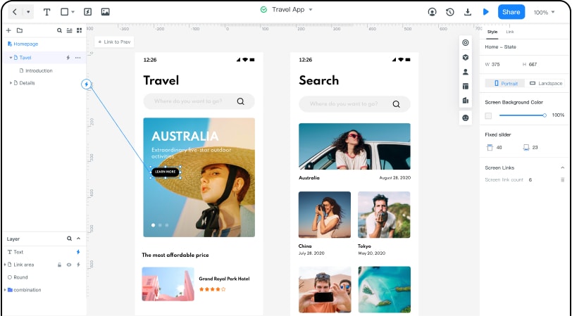
Mockitt Offers a Lot of Features:
- Built-in completely loaded asset library drag and dropped to build beautiful interfaces and interactions.
- Nine gestures and 17 different screen transition effects, together with 'magic step' and custom micro-animation, allow you to create a vibrant prototype without coding.
- No need to download, install, and upgrade a version of the app. You can log in and use it over a browser directly.
- Goodbye to the manual transfer of data, enter the collaboration or submit a connexion, others may edit or view the project, and provide immediate feedback and comments.
Some advantages linked to Mockitt
- Lots of built-in widgets and icons to create beautiful interfaces in minutes.
- Build for accurate and automated creation. Commenting on the designs and collaborating to drive the project forward.
- Rich UI assets and models from diverse industries are speeding the design process. Please create your own or team's asset collection, and reuse it at any time.
- Just start your work in a browser, with no time and space limitations. You are no more uploading and downloading concept files, keeping each project in sync and online.
Check out more about developing color palettes for your marketing materials or creating secondary color palettes at Mockitt.
