Complementary Color: How it Helps in design?
The use of a complementary color wheel has been a trend in modern site creation. Designers keep on looking for ways to attract the attention of their audience.
Analytics show that visitors only stay for 15 seconds on a website before deciding to go on to the other one. The use of the color wheel complementary colors can make a difference to the eye.
That is why Wondershare Mockitt and other website online design applications insist on going with the color wheel and proposing complementary colors for site engagement.
Let's now check which are the paradigms of such sites that offer that kind of color design.
- Part1: Complementary Color: How it Helps in design?
- Part 2: Where Do You Find Complementary Colors on the Color Wheel?
- Part3: Great Tool for Designing
Complementary Color: How it Helps in design?
The rationale behind the split complementary color wheel is to find a way to distinguish between various apparently opposite colors. That means red and blue are two main complementary colors that make a difference to the human eye.
That is how these sites can be prototypes and have a competitive edge among others:
1- Motion Beast
That site is the first one that gives you an impression of a distinctive procedure. The Motion Beast is the ultimate online service for video animation.
Online designers are welcome to come to their site and bring their pictures and videos. The opposition of colors on the front screen seems to attract most of them. It also gives them a good example of what they need to do to make their video viral to the web.
People in social media get easily attracted to videos and animations that use complementary color wheel regulations. It is more than evident that these people will stay attached to your site, offering more quality traffic and better income.
2-Ark
Ark is the ultimate happiness website. It concentrates on the creation of Christmas charities and happenings for homeless people and children in foster families.
The attraction of visitors and traffic bases its existence on the theory of the complementary color wheel. The site uses that kind of color alteration in all possible pages where the visitor stands. In this way, the average time spent on the page increases to several minutes, and the scrips get easily read and understood.
Ark is why the success of a complementary color theory is considered dogma in the modern site building industry.
3-Couple
What would be a better example of the color wheel and complementary colors use besides the Couple site? These people have combined the color theory to sell more wedding rings. The colors make it efficient for visitors to buy more and stay longer at their site.
It is true that engagement and site proliferation increases exponentially with the implementation of the complementary color wheel chart. Most visitors that come on the website enter the other pages and find useful information.
Site owners frequently change the color combinations to keep the community's interest to the highest possible levels.
Where Do You Find Complementary Colors on the Color Wheel?
At this point, it would be useful to explain where do you find complementary colors on the color wheel. As long as you understand how the color palette works, you will have absolutely no problem and hassle identifying them.
The best way would be to choose colors from one side of the wheel. Then try to check the colors situated in the exact opposite direction. In this way, you are going to have the most prominent complementary colors to use for your website.
Another way to check the complementary colors would be to have them inserted in an application like the Mockitt. There you can select the colors you want for your image and animations. The application will give you the exact opposite from the color wheel, and there is zero chance you will make a mistake.
Finally, the use of the neighboring colors rule can help you. When you choose a color, just take a look at the adjacent colors and exclude them from your selection. All the colors, at least two rows and columns away from your preferences, are eligible to be the complementary colors you must use for your images to seem perfect for your visitors.
Great Tool for Designing
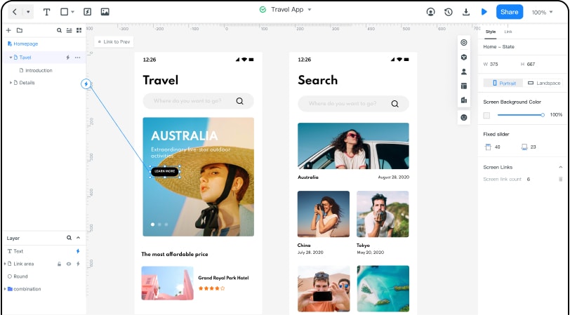
Wondershare Mockitt has been the world standard for website design and animation. You can build your page according to the rules and regulations that the complementary color wheel design dictates.

First, you need to create a new account for yourself in the Mockitt. Then you can use the same account from any possible mobile device (smartphone, tablet) or desktop to access the online workspace.
Then after you log in, you can create your own project or choose a template to start designing. You can drag the widgets you need in the "Built-in" library to the canvas, then click the widget you choose, you can change the appearance like the size, the color, and so on.
Mockitt is the best application to have your peers and friends follow your work. There is a QR code or link that you can share with them, no matter what is step you have reached on your site creation procedure. Then it can easily give them access to propose possible corrections without changing the original idea.
Get Mockitt ready for you when you want to enjoy variety and simplicity. Beginners or experts use Mockitt to create innovative webpages that make a difference to the audience.

