Apply Complementary Color Scheme to Your UI Design

Color theory and color constellations are important components of the work of designers, artists, and photographers. They form the basis for the color harmonies that significantly shape the visual appearance of your brand. Complementary colors are colors that are opposite to each other in the color wheel. They annihilate each other when mixed together. With so-called body colors, a neutral gray-black is created - with light colors, a white light. For this reason, they are often used in advertising. Complementary colors are used to emphasize contrast and create attraction. Complementary color scheme plays a particularly important role in color theory.
In a split-complementary color scheme, the two colors are used alongside the complementary one in addition to the basic color. It thus represents a variation of the complementary color scheme. This scheme has a similarly strong visual contrast.
Usually, one color is chosen as the main color, the other two as secondary and accent colors.
- Part 1: How to choose the right color scheme to your website design
- Part 2: Some complementary color scheme examples
- Part 3: You can design prototype with Mockitt
How to choose the right color scheme for your website design
There are many things you can do to help your business succeed. You can improve your branding, develop a good marketing strategy, rewrite your text until the conversion rate goes through the roof. But there is one nifty magic trick that you may not have used yet that can magically influence your audience: website color schemes.
Stylish and Sophisticated
According to a color study, both men and women count blue and green among their favorite colors, with 35% of women and a staggering 57% of men saying blue is their absolute favorite and both men and women name green 14%.
If you incorporate blue and green into your website's color scheme, you will appeal to a higher percentage of people. You create a positive emotional bond right away and you will soon be walking around your office yelling "You like me! You really like me! "
Warm Colors
These can have an energetic effect on the visitor, but when used alone they tend to be overstimulated. It's not a bad idea to pair them with cold and neutral colors for balance.
- Red - active, emotional, passionate, strength, love, intensity
- Pink - sweet, romantic, playful, warm, compassionate, soft
- Orange - warm, enthusiastic, success, devotion, kind
- Yellow - youthful, lively, energetic, fresh, optimistic
Cold Colors
These have a calming effect on the viewer and that is why they are the most common colors on websites. But be careful! If used too dominantly, they can also exude a cold or impersonal feeling.
- Green - fresh, calm, relaxed, trust, peaceful, hopeful, healing
- Blue - loyalty, trust, comfort, clarity, reliability
- Violet - glamor, power, nostalgia, luxury, ambition, spiritual
Neutral Colors
These can be combined well with warm or cold colors and are often used to weaken primary colors and to give a web design balance.
- Gray - respect, wisdom, patience, modern, longevity, intelligent
- Black - powerful, courageous, serious, elegant, luxurious, dramatic, formal
- Braun - friendships, earth, home, nature, credibility, seriousness, tradition
Some complementary color scheme examples
Panic
Let's explore how Panic, a Latvian animation studio website does that with a bold pink and green color scheme. The pastel colors make major impacts without being jarring. Also, considering that since this is a website for a design firm, its creators probably spent a lot of time determining how best to show potential customers the company has what it takes to create hard-to-forget results.
The Purple & Gold Sports Shop
This website's complementing color scheme is as loud as the sports fans it appeals to, and that's okay. Notice the thin gold bar immediately below the purple box that includes product categories. It has links to a shopping cart and contact information, plus company details. The purple letters on a gold background call attention to portions of the site that people probably deem crucial, especially as first-time shoppers.
Haynes Plumbingut
Haynes Plumbingut used a complementary color scheme. Blue and orange complement each other, and the soft shades of each are very pleasing here. More importantly, they also boost visibility, especially when accompanied by white block-letters.
Each color promotes overall readability, so whether people want to get estimates or find out more about available services, they aren't likely to misread the text. You've already learned how blue is a soothing color, so that's also advantageous if a person is finding it difficult to focus due to plumbing-related stress, rather than an eyesight issue.
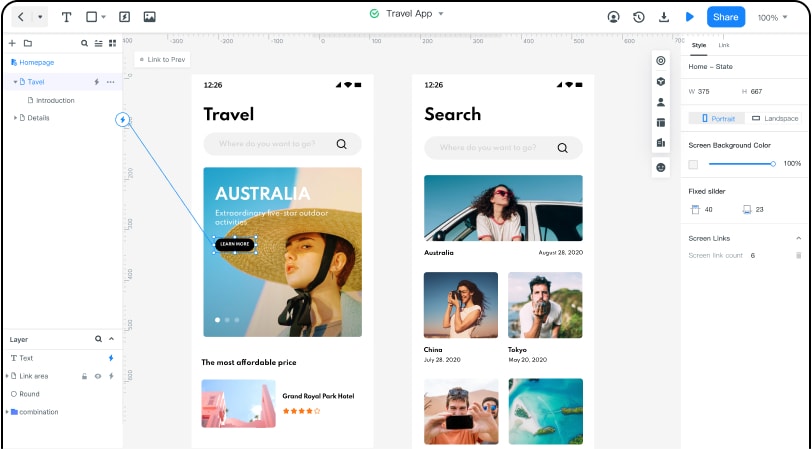
You can design prototype with Wondershare Mockitt
When, in my daily routine, I got tired of repeating the creation of the same lists, tabs, tables, or any other modules whose composition is dynamic, I started thinking about automating these processes so that the routine would at least flow faster. Thus, we should consider Wondershare Mockitt.
The advantages of using Mockitt in this regard are obvious for web designers (as well as for mobile designers): you create a prototype and render the layout in one program.This allows you to immediately go to drawing after the approval of the sketches. Mockitt has a lot of amazing templates . I recommend that you familiarize yourself with the ready-made Mockitt templates. They will help you understand the structure of the site in order to create a prototype more competently in the future.
Also, with Mockitt the client can test the prototype for its convenience. I always design prototypes in Mockitt. It's a great tool because it allows you to do the following things:
1. Ability to continue creating a design based on a prototype. Create a responsive grid. You can even get confused and make a prototype on a mobile device.
2. Drop-down lists, pop-up windows with darkening background, as well as animation effects for the appearance of blocks. These features make Mockitt superior and more attractive than other applications. Also, you can make elements static when scrolling, but there is nothing special about this, other applications also allow you to do this.
3. Of course, the presence of components that help automate the process of creating hyperlinks.
4. The ability for the client to leave comments directly in the prototype.
5. Everything can be modify or customize by simple drag and drop.