The Process to Create a Bootstrap 4 Image Slider

A Bootstrap image slider or Bootstrap multiple image slider is essentially a carousel-style gallery of images that are displayed in a sliding or circular manner. Bootstrap image slider responsive means the slider adjusts to the dimensions of the device on which it is being viewed. This article shows you how to create a Bootstrap 4 image slider using a Bootstrap image slider gallery of images. We'll also cover a unique UI/UX design tool that will help you achieve the same effect on your app or website prototype.
- Part 1. How to Create a Bootstrap Image Slider
- Part 2. The Best Tool to Create Image Slider and Generate Code
The Process to Create a Bootstrap 4 Image Slider
The basic div tag for creating an image slider will be similar to this:
Within this container, there are three elements that can be defined: Indicators, Wrappers for Slides, and Left and Right Controls.
The Indicators section will look something like this:
The carousel-indicators class tells us that the indicators are in an ordered list. The indicators themselves are the little dots you see at the bottom part of a slider, which shows you which image you're looking at right now.
The attribute called data-target defines the id, which is myCarousel in the div section on top. The attribute data-slide-to indicates the corresponding image when a dot is clicked.
The Wrapper for Slides section looks something like this:
Notice that the class for the wrapper is .carousel.inner, which tells us that this is specific to the slides contained in the carousel. The item class defines the contents of each slide as an image or text. Note that the "item active" class must be defined for one of the slider sections in order for the carousel to be visible.
The third component of the Bootstrap image slider is the Left and Right Controls.
This contains the attribute data-slide, which accepts prev and next as keywords, indicating the direction of movement of the carousel when either button is clicked.
That's a basic Bootstrap image slider. To add captions to your slider images, you can use the carousel-caption div class. This must be used within the 'item' class for each slide, and it looks like this:
And that's about it! Your Bootstrap image slider code is now ready for use.
The Best Tool to Create Image Slider and Generate Code
When designing a website or application, you don't want to be burdened with writing the code and style code for each component, such as the carousel component that you will be using as an image slider. To avoid getting into the code part, you can use a UI/UX design and prototyping platform like Wondershare Mockitt.

Mockitt is a versatile online design and prototyping tool that makes every stage of the design, prototyping, and handoff process exceedingly simple and fast. The intuitive interface has a gentle learning curve that's great for new users but powerful features that will appeal to seasoned experts as well. The relevance here is that it comes with a ready-to-use carousel component that you can use to represent your Bootstrap image slider; moreover, the HTML and style code is automatically generated when you add it to your design.
Here's an overview of its important features:
- Extensive Library of Assets: Hundreds of icons, symbols, shapes, and widgets are ready and available to use without having to import anything. However, you can import whatever assets you already have and create custom libraries that can be shared with other members of your design team. The carousel widget and any other component can be dragged to their location or double-clicked to place them on the screen.
- Standard and Custom Widgets: You can also customize any of the standard widgets to your exact requirement and the back-end code will be regenerated so it is always the current version. Widgets can also be assigned a Master status to allow global editing of other instances. Dynamic widgets can be used to show multiple states within the same screen, which is useful for a dynamic component like your image slider (carousel).
- Rapid Prototyping: Prototyping in Wondershare Mockitt is nothing more than creating a link between an asset and a page state. The link can then be edited to add a trigger gesture, transitions, effects, and animations. It only takes minutes to prototype a design in Mockitt.
- Strong Collaborative Features: Since everything is online and updated in real-time, collaborators always have a view of the latest version. In addition, comments, notes, etc. are visible as soon as they are created. Projects can also be co-edited by multiple designers or reviewed by project managers using the role-based permission system.
- Easy Preview and Sharing: Real-time previews are complemented by secure sharing via secure QR code or link. You can define the security parameters for sharing, and you can even download the HTML demo package for offline reviews.
- Convenient and Frictionless Developer Handoff: Since all the code is readily available, the developer only needs to inspect the code and then download the assets and related information. No more conflict between the designer and the developer when you use Mockitt.
The process works as follows:
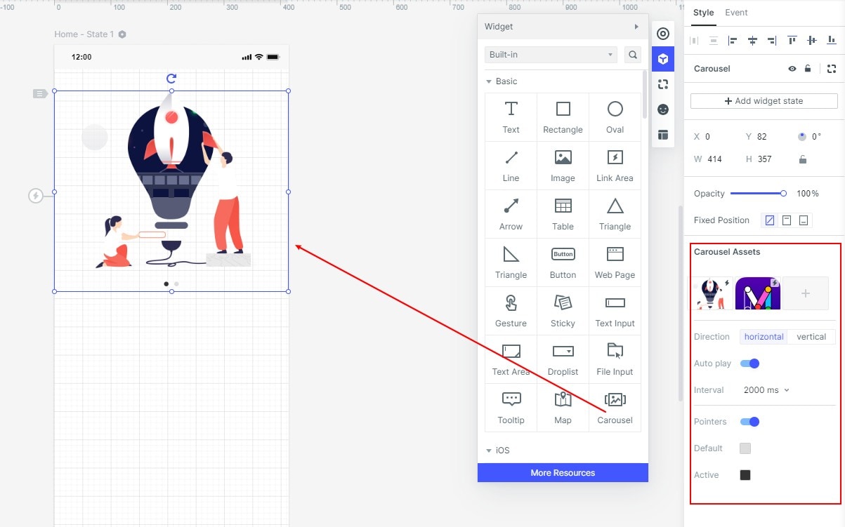
1. Create the carousel on your screen.
When designing the layout, you can drag the "Carousel" widget into the screen and customize its appearance, size, and location.
In the control panel, you can add assets (images) to the carousel and set other parameters like the timing, auto-play, pointers, direction, and so on.
2. Handoff to the developer.
When the design is ready, the developer can simply copy the CSS style code for the carousel to use in the development stage.
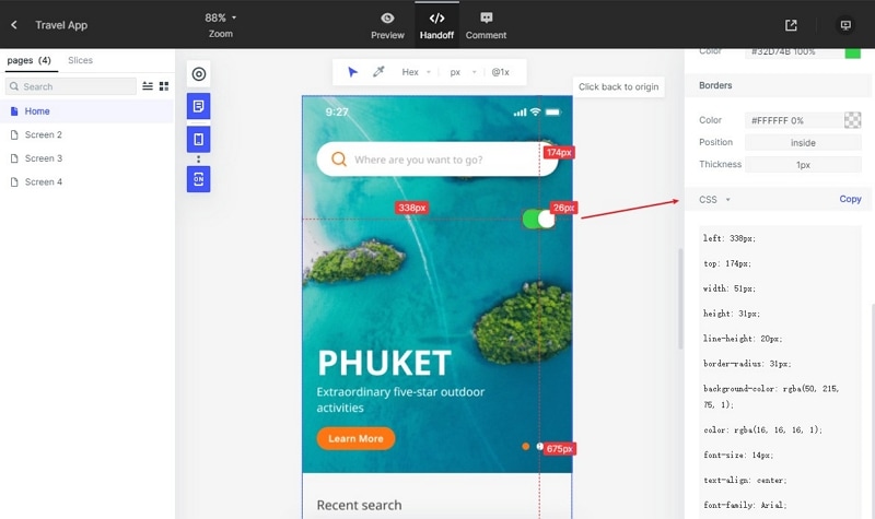
This helps reduce the number of variables in a manual handoff by the designer to the developer. The developer has full control over the handoff process and the designer does not need to worry about the code part.
Summary:
You now know the basics of how to make a Bootstrap image slider responsive using simple code. You have also learned how to use a ready version of a carousel in your design, saving you a ton of money and coding effort. Use Wondershare Mockitt to make your design team more efficient and highly productive. The platform is easy to deploy enterprise-wide, and it comes with several additional features when it is deployed at that scale. But even individual designers and freelancers can benefit from its flexibility and affordability. Try Mockitt today and breathe life into your prototypes whether they're simple or highly
