Wondershare Mockitt - Free Design Tool
Tips For Header And Footer Design
- Different Styles Of Header And Footer Design
- Beautiful Header And Footer Design Templates
- Great Examples Of Footer Design In HTML And CSS
- How to Create CSS Header Design

Mobile Footer Designs for All Types of Businesses
Nowadays, people are more likely to use mobile phones than computers, web pages adapted to mobile phones and all kinds of apps are coming up. Paying more attention to even the minutest detail of designing a mobile website or app is the key to standing out.
Usually, the footer contains basic information about the current apps or websites. Moving forward, creating a mobile footer design is essential and an integral part of the development process.
If you are curious about mobile footer design and looking for some examples, here are some fantastic and inspiring mobile website or app footers for you to get.
- Part 1. All-In-One Tool to Create Both Mobile Footer and Header Design [Recommend]
- Part 2. 5 Jaw-Dropping Mobile Website Footer Design Tools
- Part 3. 5 Awesome Mobile Website Header Design Software & Apps
Part 1. All-In-One Tool to Create Both Mobile Footer and Header Design
There are quite a few things that you need to consider while sketching the mobile footer design. Since the mobile application screen size is the key to creating a responsive and adaptive design, we proffer a highly efficient and design-friendly tool.
Wondershare Mockitt is an online tool that is accessible to anyone who has access to the internet, supported for Windows, Mac, Linux and web. Unlike other designing tools, Mockitt boasts a multitude of features that make the entire journey of mobile website footer design fun and a learning experience.

Key Features:
- Drag and drop feature to customize without writing a code.
- Can get access to icons and items that are specific to a platform or operating system.
- Has a massive library of other assets and widgets you might need to design.
- Allows to connect widgeted pages and preview them in real-time.
- Offers real-time collaboration with teammates and clients.
Almost everything that you imagine should be present in your mobile website footer Mockitt can deliver the same. It is fast, secure, and based on the cloud. It also supports creating prototypes, flowcharts, and mindmaps with massive pre-made templates for both mobile and desktop layouts.
Part 2. 5 Jaw-Dropping Mobile Website Footer Design Tools
Here are 5 useful footer design tools to satisfy your needs. Each has its advantages, read on.
#1: Black Pizza
Black Pizza use the minimalist's way to create mobile website footer designs. They have ended the page with a hashtag and a question that is likely to get a positive response from the user.
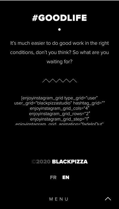
The footer boasts a full black background with no image or anything, except for the business's name and two language variants, and the option to switch between the languages is given at the top.
#2: BlueStag
Another creative marvel and a great example of using adaptive practices, the BlueStag mobile footer design is unique and attractive. First off, it beautifully aligns with the entire website, and you will be tempted to check what's under the fold.
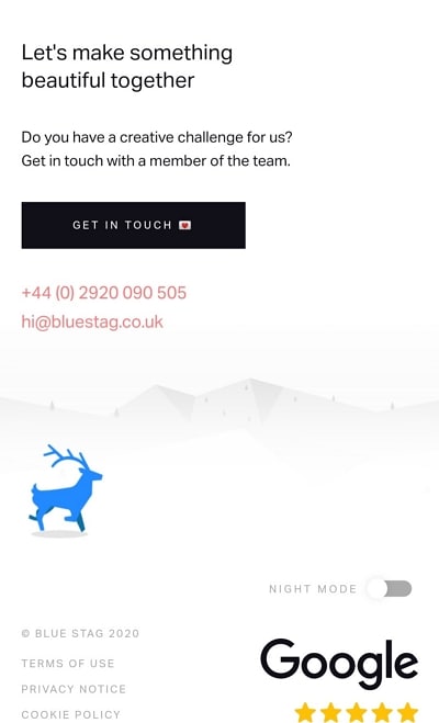
Continuing on the same pattern, the collation of videos and animated typography adorned with elegant colors. The footer is also dynamic. Apart from giving the necessary information like terms of use, privacy policy, and others, it boasts Google ratings and contact information. Plus, the viewers are encouraged to initiate contact and take action with a catchy headline.
#3: Guerlain
Guerlain's mobile website footer is yet another example of keeping it simple and elegant. Like all the footers that you might come across, it offers contact details, legal precedents, and an FAQ section linked to other pages. Furthermore, the social media icons are cool and trippy. Unlike other websites, they are not too small or big.
Apart from asking the viewer to join the newsletter, they embedded the store locator option. All in all, it is practical, minimalist, and has a nice-looking footer that is not too flashy with vivid colors, nor is the font too small, forcing you to magnify the screen.
Wondershare Mockitt
Mobile Header & Footer Designer >>
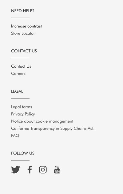
#4: Isitwp
For users who can get easily lost in the complex web of information provided by a website, a footer navigation bar is essential. The IstiWp website lists all the main tabs on the website in one place for the user to find what they are looking for in one click.
Plus, IsitWp used the mobile footer section to share the disclaimer and added an About Us section for the users to better understand their business. Such types of information-led mobile footer designs are designed to improve user engagement.
#5: Blue Fountain Media
The BFM mobile website is fast and decorated with blue and white shades. It follows the eye pattern and also uses illustrations plus animations to attract the user's eye toward the relevant content. This mobile website footer has a link to open the map on the mobile phone via the API.
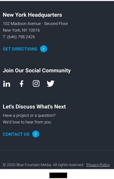
The footer has a link "Get Directions," and clicking by clicking on it, the map will open up in the mobile application. Apart from this, it has an official address, social media buttons, and a contact us option.
Part 3. 5 Awesome Mobile Website Header Design Software & Apps
It is also quite important to manage and decorate the header of your website since this is the main part that users will first see when they enter the website. Below are 5 outstanding header designs we found for you. Read on.
#1: Lyft
Lyft's mobile app header design has a video embedded into it, and there are two options given to the user, ride or drive. Rest everything is below the fold, except for the menu bar slide opens from right to left and covers the entire screen.
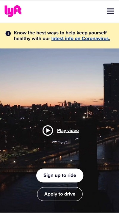
Simply put, their design is not too fussy or convoluted. It is direct and straightforward. The video does most of the work in terms of engagement and UI. Moreover, unlike other mobile websites, they know their customers and understand who will land on the page. Due to this, the options are set accordingly.
#2: Stripe
Stripe uses bold typography with a colorful background that highlights the content and the message within it. Furthermore, they provide an opening statement about the tool's utility to impress the reader.
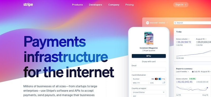
This type of mobile header design bets on sharing accurate and factual information with the user. Plus, it has a contrasting color shade and a menu option on the right, while the logo is on the left. The floating menu contains the entire navigation panel, each with a separate icon to improve readability.
If you want to design personalize mobile website footer & header with ease. Try Mockitt Header & Footer Designer to use pre-made templates and edit by yourself!
#3: Squareup
SquareUp is a mobile-friendly website with a plain header design with only three options on the top panel. They have used images to help potential users understand the services.
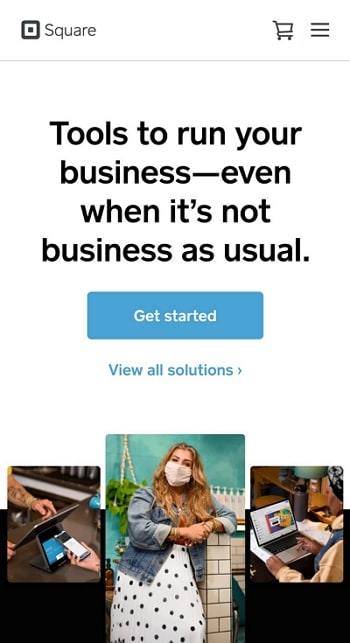
A great thing about their design is that the CTA button sticks to the screen even if you scroll past the header section. This constant reminder to the viewer will allow the user to get in touch with the business when they get the required information.
#4: Shutterfly
Shutterfly's header is filled with a lot of tabs and navigation, but all of these are essential for creating a conducive and conversion-ready user experience. As it is an online store, the flashing discount offer is good for business and attracts new users.
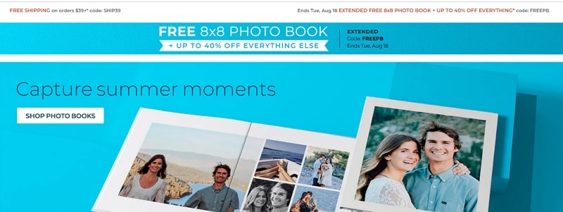
Furthermore, you will see that the navigation bar has different product ranges for sales-ready customers, the shopping cart is right in front of the user's eye, and it is also approachable with the thumb. Lastly, the menu navigation also opens up covering the entire screen.
#5: BuzzFeed
BuzzFeed is a content-sharing platform. For its mobile header design, it went with the same methodology as any other content-sharing platform, and that is to share the trending content upfront.
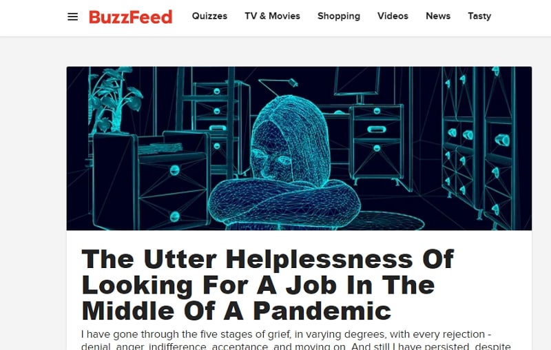
The top header section boasts a logo, menu options, slider menu navigation, and a search bar. BuzzFeed's header is minimalist yet informative.
Conclusion
The need to create everlasting and proficient first impressions is one of the ways to acquire new customers and retain existing ones. After Google updated its algorithm considering the user's mobile usage, businesses are trying every new trick under the sky to pull off a stunning mobile website or application design.
Understanding how important it is for the mobile footer design and the header section, besides using the recommended tools above, why not use
