How to Use Adobe XD Components: Step-by-Step Guide

Adobe XD components are essentially a collection of customizable elements you can use in your UI/UX design. They were formerly called Symbols but Adobe has changed their name to components. A component is useful because copies of the master or Main components can be created and reused in other parts of your design. If you change the attributes in the main one, the attributes of all the other linked instances will also change. This article shows you how to work with Adobe XD components, as well as offers a great Adobe XD alternative you can use to create dynamic components where the states can be shown within a single artboard.
How to Use Adobe XD Components
The benefit of using components in Adobe XD is that it gives you full control over creating and eventually maintaining a set of widgets. In other words, Adobe XD reusable components. This helps align your work to the design philosophy and style guide set by your company or a client you work with on a regular basis. Another advantage of using components in Adobe XD is that once the Main Component is created, every other component instance created from that can be edited by changing the attributes of the Main Component. In addition, an instance can be edited separately from the Main Component but still retain its connection to the latter. This is called an instance with an override because it overrides the attributes usually applied to an instance when you edit the Main Component.
1.Adobe XD Create Components - Adobe XD components can be created in different ways:
- By clicking Object and then selecting Component.
- By clicking the + button in the Property Inspector.
- By clicking the + button in the Assets panel against Components.
- By right-clicking any object that you want to convert into a Main Component and then selecting Make Component.
2.When you initially create a component, it automatically gets assigned the status of Main Component. Look at the top-left corner of the box when a component is selected; it will be a filled green diamond. All the other points on the box are round transparent circles.
3.When you copy a Main Component and create a component instance, you will see that the diamond in the top left corner of the box changed to an unfilled green diamond. Changing the attributes of the Main Component will change all instances, but if you edit a single non-main instance, then the attributes will be unlinked to other instances but the relationship to the Main Component will be retained.
4.To edit a Main Component, you can either edit the component directly or edit one of the non-overridden instances. This edit will be applicable to all non-overridden instances as well as the Main Component. Edits can be made in the following ways:
- In the Component section, you’ll see Default State and an Edit icon (pencil icon). Click on the icon to edit the component or instance.
- In the Assets Panel, right-click the appropriate component and choose Edit Main Component.
- Right-click the component itself and choose the same option as in bullet point b. above.
5.You can also nest a component instance within a different Main Component, such as a button inside a list box, for instance. Adobe recommends that you don’t nest one Main Component within another Main Component, but you can use it as a workaround if you need to.
Would you interested in Adobe XD Cloud? click and learn more about What is Adobe XD Cloud and How to Use It?
Things to Remember about Adobe XD Components
There are a few caveats and tips when using Adobe XD components, as listed below:
- Main Components must be edited within the canvas since there is no separate view or window to make such edits.
- Instances can be unlinked from their Main Component by right-clicking and selecting the Ungroup Component option.
- It’s better to organize your Main Components on individual artboards. For example, use one artboard each for navigation bars and buttons.
- If you want to identify all linked components, just select the Highlight on Canvas option from the Assets Panel by right-clicking the relevant component.
- Some properties won’t be propagated to all non-overridden instances even if you edit the Master. Currently, these include opacity and rotation, among others.
- Don’t worry if you delete the Main Component. Simply right-click an instance and choose Make Component in the contextual menu, following which you’ll see the Main Component being created on your canvas.
The Best Adobe XD Alternative
As we mentioned earlier, Wondershare Mockitt is a great alternative to Adobe XD, especially when working with Adobe XD components is too complex. The same feature is present in Wondershare Mockitt, but it’s called Master status and can be assigned to any component, symbol, widget, or asset in your design. Other features of Wondershare Mockitt include:
- Easy creation of assets, with access to a large library of widgets and components.
- Create a dynamic widget that can show multiple states on the same screen or artboard.
- Use the Master status to make all edits to a widget apply to all other similar widgets.
- The online nature of the platform allows for better collaboration.
- Page states are easy to create.
- Widgets can be linked to target pages with a drag-and-drop motion.
- Links can be edited to add transitions, animation effects, and gestures.
- Better collaboration in a cloud-based environment.
- HTML and style code for each component is automatically generated so there’s no need to edit the code to change the attributes for each widget or symbol.
- Developer handoff is made easy with the online code inspect option.
- Multiple preview modes are available.

How to Design a Prototype with Wondershare Mockitt
Wondershare Mockitt is a flexible and versatile prototyping tool that will tremendously increase your efficiency and productivity through special features being built into the program. Since it is hosted on the cloud, it allows you to work from anywhere - the office, your home, or when traveling or commuting.
Let’s look at the prototype creation process:
- Create a new project and define your target device type and model.
- Start adding components and widgets by dragging them from the right-side full panel or the Fast Widget panel on the left. To change the status of a particular component, right-click it and choose the Master option to make other instances of that component editable.

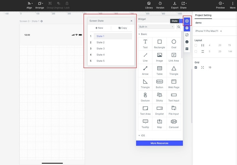
- When the layout is done, start creating page states for each artboard. You just have to click the New State option and modify the state of the page to show what happens after the user has executed an interaction.
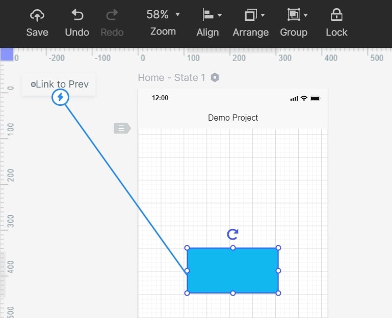
- Widgets and components can be linked to a target page by simply dragging the linking icon to the left of any component. Bring your mouse to the target page and drop the other end of the link there. The link can subsequently be edited to add a gesture or another input, and a transition type can be added to make the prototype dynamic.
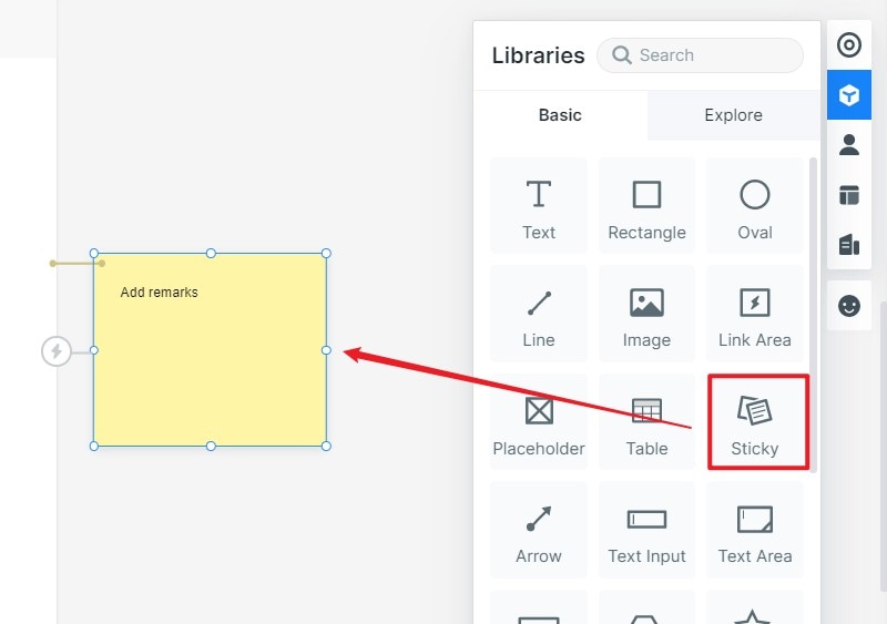
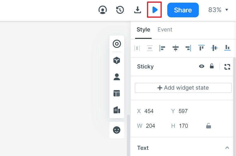
- The “Sticky” widget lets you annotate your designs so others know what’s going on in a specific portion of an artboard.
- Preview links or QR codes can be generated with one click. These can be previewed on any device. In addition, other stakeholders like the client or your project lead can be sent a full HTML demo package so they can view the interactions offline.
- Since the component code is generated automatically by the system, the designer doesn’t need to worry about that. The developer can sign in to their own account once a design has been shared with them and go to the Developer section to inspect code and other asset documentation.
Wondershare Mockitt is a highly collaborative platform with a lot of flexibility, which makes it appeal to a wide range of designers using different design styles. The robust code generation feature ensures a seamless handoff to the development team, while the ease-of-use and rich front-end features make it a powerful tool for designers.
