What is Responsive Web App
In the modern times, mobile devices are popular among many web users. People use their smartphone to surf or look for any other solutions online. This has led to increased popularity of responsive web app that allows users to have better user experience when using different devices. With a responsive web application, you can easily meet your end user expectations regardless of how unrealistic they may be. A responsive web app works in all screen sizes, lower cost of production, eliminate the need to install software into your device and allow for better sharing of content. Here is a comprehensive guide on web app responsive design and how to create it using Wondershare Mockitt the top tool in the industry.
- Part 1. What is Responsive Web App
- Part 2. Responsive Web App vs Progressive Web App
- Part 3. How to Design a Responsive Web Application
What is Responsive Web App
A responsive web app refers to a design that responds effectively to the behavior of the users and the environment depending on the size of the screen, orientation and platform. A responsive web app design has a wide range of flexible layouts, grids and images. When users want to switch from the iPad to laptop, the responsive web application switches automatically to accommodate for resolution, scripting abilities and image size. It has the technology to allow it respond automatically to suit the preferences of the users. The responsiveness of the web app eliminates the need for a distinct design and development phase for each new device that hits the market.
Responsive web application development does not only focus on the adjustability of the screen resolutions and resizing of images. It brings in a whole new ways of thinking regarding web app design. Responsive web app is aimed to be applied in mobile web browser and then it is intended to be fully responsive. It helps your company work effectively towards achieving the level of engagement or revenue you want. By having a responsive web application, you can expect to enjoy higher retention rate and attract more customers to your business.
Responsive Web App vs Progressive Web App
One of the things you note is that a web app responsive design has similar functionality like a progressive web app. However, there are differences worth noting too. A Progressive Web App can be opened by use of a URL just like a website. The webpage is usually the start of PWAs, but it differs with responsive web application in its functionality. The more you get involved in the functionality of PWA the more you can differentiate it with a responsive web app design. Here are other differences.
Push notifications
A major difference between Responsive Web App and Progressive Web App is push notification. A responsive web application gives a popup requesting the user to make subscription to the notifications. Users have to subscribe to get the push notifications. On the other hand, for PWA users get promoted to get push notifications automatically.
Highly adoptive
Unlike a responsive web app, the responsive design of progressive web app allows you to operate on any type of device. There is no need for you to separate coding for the web, Android or iOS.
Faster loading speed
A progressive web app design makes use of App Shell that consists of the code that is cached to your mobile when loading it for the first time and then it can be run subsequently. This makes it quicker and has the feeling or an actual app. In addition, since PWA has cached content, it can run in offline mode, which is not possible with a responsive web app.
How to Design a Responsive Web Application
Start by performing research about the different users. Take time to understand the devices users will be using to access the responsive web application. Think on the different goals users will have using the various devices. You should also think of the technical considerations to make for functionality and content. This helps you decide on your responsive web application project priorities. Take time to think of the tool to use for your project. In designing, Wondershare Mockitt is the best tool you can use.

Responsive web application development is easy using Wondershare Mockitt. With its rich features you can create the responsive web app within a few minutes. Even if you are a starter you will find the tool friendly to use. The tool has a rich library full of icons, widgets, templates and others to use when creating your responsive web application. The fact that it is a cloud based tool, it means you can do the design work wherever you are as long as you have internet connection.
If you are developing the web app responsive design with your team, Mockitt allows for efficient collaboration with other members. You can work simultaneously and view the changes each of them is making in real time. With the tool, you can preview and share your responsive web application design with others so that they can give feedback that allows you to make the right improvement. Follow these steps when doing responsive web application development.
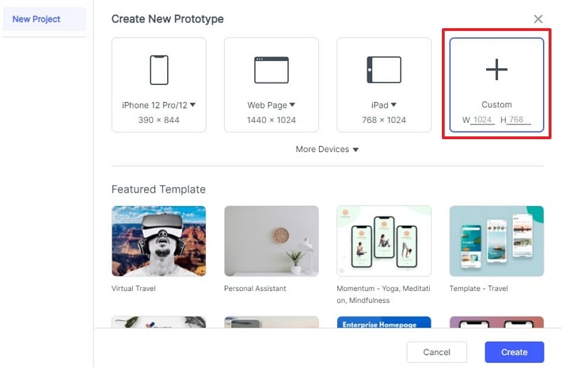
Step 1: Create a Project for Responsive Web App
Click "Create" and then "Prototype". Name your responsive web app and choose device. Set the responsive web size according to your design goals.
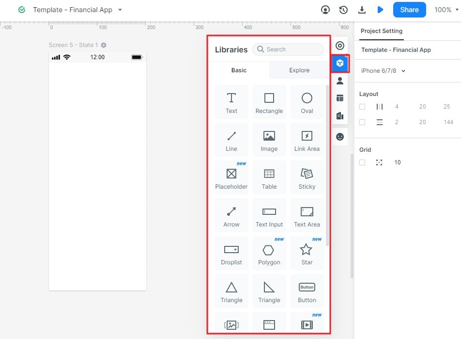
Step 2. Design the Responsive Web Application
Start the responsive web application development process by either dragging and dropping or double clicking the widgets into the platform. Edit the widgets to suit your app requirements. Reposition or resize to customise it.
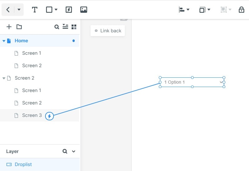
Step 3: Prototype Your Responsive Web App Design
Drag "Link icons" and drop them into your target screen. Establish these links and edit them to trigger gesture and response effects. Repeat the same to all the "Link icons" you use for your web app responsive design.
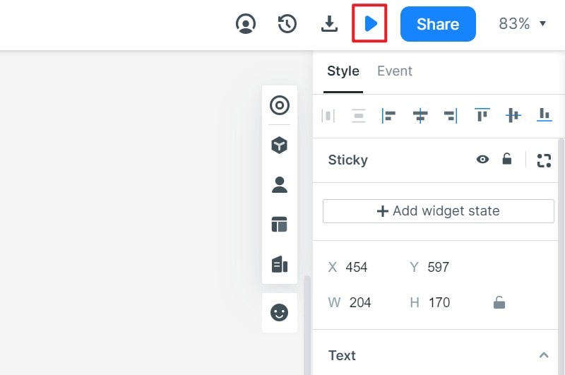
Step 4: Preview Your Responsive Web App
Click "Preview" to view your design and determine if it meets your objectives. Use "Sticky notes" to give more explanations about your design. Click "Share" to generate a URL link or QR code for others to preview and give feedback.