Wondershare Mockitt - Unique Color Design
Color Design - How designers Apply Color to Design?
- Basic color theory you need to know before design.
- Creative color wheels make your design stunning.
- Guide on how to use color in designing.
- Use color tools to make your design more efficient.

10 Best Logo Color Schemes and Combination for Inspiration
Without a doubt, color influences our feelings and behaviors and plays a crucial role in creating a successful logo. Nor is it one of the elements of logo design that small business owners who want to create their own logo feel the most insecure about. With logo color schemes, individual colors work together to make brands memorable. Choosing the right logo colors can highlight your company's strengths and help attract customers. The wrong combination, as you might guess, can have the opposite effect. So, in this article, we are going to help you understand a bit more about color, how it affects our decisions, and how to use it more effectively when creating your own logo.
10 examples of best color schemes for logos
As you now know, choosing the logo design color scheme is not an easy task at all. You should consider these best logo color schemes before design your logo. These modern logo color schemes will definitely improve your brand identity. And will make your brand superior than others.
1.Red Color Scheme for Logos
Although red traditionally symbolizes size and strength, it should be used with caution. Red is typically associated with strong or passionate feelings such as love, trust, enthusiasm, and passion and has been known to make people hungry. Red stimulates the nervous system and evokes a variety of emotions, from love and passion to fear and aggression. However, if you want to encourage your customers to act decisively and create strong associations this color scheme is your best choice for you. Many big names used red with yellow or white in their logo color scheme.
2. Blue Color Scheme for Logos
Dark blue and light blue belong to the category of "cold colors". This is just a metaphor as colors have nothing to do with temperature. However, blue is called "cold" for good reason. That is the color of the water and the sky. It calms, calms, and helps you focus on work. It must be said that blue will hardly encourage customers to make spontaneous decisions. However, once you have built trust, it can be maintained for years to come. The combination of blue, white, or red makes our logo design more elegant and professional. Most of the well-known brands used a blue color scheme on their brand logo.
3.Yellow Color Scheme for Logos
Yellow is the color of warmth, fun, and creative thinking. This color is a powerful source of positive emotions that can be bothersome at times. In addition, yellow encourages action. In contrast to red, however, yellow creates a festive mood and is action-oriented without aggressive or passionate connotations. Shades of yellow can look dirty while tint can challenge the eye-sight. Can look more powerful when you will use yellow with darker colors. This modern logo color schemes is best option for your logo design. If you want to convey joy in your logo you should use a yellow color scheme.
4. Orange Color Scheme for Logos
Orange sits between red and yellow in the color palette and combines the psychological connotations of these two colors. It may seem that putting two energetic colors together would bring nothing new. And it is one of the best color schemes for logos. However, despite its “fiery” nature, orange is more subtle and cozy. It creates a cozy, homely atmosphere.
Successful use of the orange color scheme can be seen in the logos of Fanta, Nickelodeon, and even Harley-Davidson - all are energetic, strong logos.
5. Green Color Scheme for Logos
Green combines freshness and nature with sport and a healthy lifestyle. It can convey both serenity and active decision-making. Green is characterized by a finely balanced combination: it is not as provocative as red, not as aggressive as yellow, and not as serene as blue. If you are looking for harmony and simplicity, you should definitely go for a green color scheme. Do you know that the fast-food giant McDonalds has also been used the golden M on dark green background for some time to express that fast food doesn't always have to be unhealthy.
6. Violet Color Scheme for Logos
Purple is the color of aristocracy and royalty, spirituality, and magic. Purple is associated with strength and size - just like red. At the same time, however, it also has noble and calming connotations. Although it's a "cold" color like blue, purple doesn't stimulate the nervous system or spur you to act. Still, this is the color of success, wisdom, and trust. It can certainly inspire respect for your brand. The color scheme of purple is used successfully by brands such as monster, Aussie, and Yahoo! Regardless of whether it is a job exchange, cosmetics brand, or internet company - they all convey their desired message “with us the impossible becomes possible”.
7. Pink Color Scheme for Logos
Pink looks youthful, light, and dreamy. It's by no means just a color for little girls. The color conveys fun and confidence, is full of energy, and attracts attention. She is, so to speak, the little sister of red, just less aggressive. Of course, the color is more feminine, but can still be used successfully in logo designs. The combination of pink with white or black is very awesome. Some big brands, e.g. B. Cosmopolitan, Dunkin Donuts, and T-Mobile show it.
8. Black Color Scheme for Logos
Scientifically, black is not considered a color; It is the absence of light. In the world of art and design, however, it is a color and is associated with elegance, glamor, and substance. It can also be assigned severe, threat, cold, and death. The color exudes authority, but it can also quickly appear strict. The sparing addition of bright colors with black can add energy to sophistication. Not only in the fashion world is “black always works”. In addition to the sports brands Puma and Nike, the designer brand Chanel also uses black with white for its logo design.
9. White Color Scheme
Strictly speaking, white is not a color, but it should not be missing here. White is often used as additional color and conveys clarity and neutrality. As a second color, it balances out and creates contrast. White, black, and grey always compliment each other. The negative space in a logo is often also filled in with white. Well-known brands such as Adobe, WordPress, and Oral-B use white as a high-contrast second color.
10. Grey Color Scheme
Gray creates a shadow by adding black to white. It is considered to be an emotionless and moody color that can be used to communicate formality, conservatism, and sophistication. The achromatic color gray or silver exudes knowledge, intelligence, and wisdom. But it is also very elegant and neutral. Therefore, gray and silver are often used as additional colors in logo designs. Of course, Apple should first be mentioned among the well-known brands, but Wikipedia and Swarovski also use gray and silver.
Would you interested in the wedding color palette? Click and learn more about the 6 Best Wedding Color Palette Generator Makes Your Wedding.
Useful tool for your design
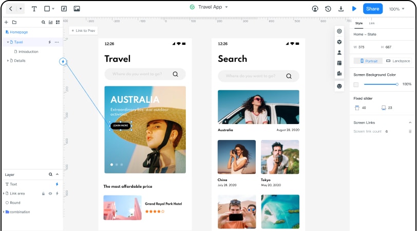
Wondershare Mockitt is the multiplatform prototyping and wireframe tool that can supports many platforms like PC, iPhone, Android, iPad. I must say its simple drag and drop feature is one of the great feature.
With Mockitt, you can also design a various prototype banner style. It has huge widgets, material design, colors and icons library. You can also link your screens with your other team members. I have been used many wireframing tools but they are not up to the mark when it comes to linking the screens. As we know that colors schemes are very important in web or mob application design. Mockitt has lots of colors by default. You can easily create and use your desired color scheme for your web or mobile applications.