4 best app color schemes examples

Like website color schemes, app color schemes also play a pivotal role in distinguishing your brand from millions. Perhaps, mobile app color schemes are much more interactive with the users. Therefore, you should be very careful in choosing the right app color scheme. As compared to the websites, users use mobile apps more frequently. That is why your app design must be perfect and responsive to the user perspective.
Well, in this article, we'll cover all the essential aspects for designers on how they can choose the best app color schemes naturally or with the help of tools. With that, we'll also look forward to some of the best app color schemes examples for inspiration.
Well, that was a brief introduction to the app color schemes and this article. Now, let's dive further into the color schemes for mobile apps.
- Part 1. How to choose a color scheme for mobile apps
- Part 2. 4 best app color schemes examples
- Part 3. Tool recommendation: Useful tool for your mobile app design
How to choose a color scheme for mobile apps
There are 80% chances that new designers pick the wrong color combinations for UI design without knowing the basics. This leads them to design unprofessional or ugly looking UI for apps. There's nothing wrong with that; almost every new designer makes these mistakes. So, to avoid these mistakes, you need to learn the basics. After that, you can implement any color schemes for the UI that you are designing for.
Tips for choosing the perfect color scheme for apps
- First things first, if you are designing something, you need to learn its basics. For understanding, the basics first thing to do is to know what to do, knowing how not to do. Learning basics is equally essential when picking app color schemes.
- After deciding what to do (basics), create a UI hierarchy. The app color schemes must be present a clear visual of UI elements. Why creating a UI hierarchy is essential for designers? Creating a UI hierarchy is important because the user must be able to interact with every aspect easily.
Our priority is to design an engaging design that attracts users. Therefore, a perfect app color scheme is the only thing that attracts most of the users. After arranging the UI hierarchy, the next thing is to pick a brand color. Choosing a brand color is equally crucial for app color schemes.
- You know the basics quite well, and you also create a complete structure and, of course, the brand color. The next and most crucial section in selecting the app color scheme is to create attractive combinations of Primary and Secondary colors that reflect your design. Primary colors are the most critical displayed colors in your app UI elements. So, be careful while choosing the primary color. For alternatives, you can select a secondary color and should be applied sporadically in your UI elements.
4 best app color schemes examples
We've discussed the basics of app color schemes and tips to choose the best app color for apps. Now, its time to dive further and see the best app color schemes/patterns you follow in 2020.
1. Focused App Color Scheme
The minimal app color scheme has been the trend in 2020 so far. And this color scheme has been successful in 2020. In a minimal color scheme, the colors are not overused. There are lots of apps available that use minimal color schemes. One advantage of minimal color schemes is it makes the mobile app more easy and lightweight. This is why most designers preferred minimal color schemes rather than a contrast one. And they are getting success in it.
2. Illustration
Another thing we've seen in 2020, great use of illustrations in the mobile apps. The purpose of illustration, users to understand the step by step work. With the help of illustrations, users can easily understand the nature of the app's functionality. Nowadays, many app designers use bold colors and colored shadows in these illustrations to look more realistic.
3. Complementary Gradients
If we talk about the color wheel, this color scheme is situated on the opposite side of the wheel. The complementary scheme consists of red, blue, green, and purple. If we combine them, they contrast with each other. Professional designers often use this for app color schemes.
These colors are different from bright color trends. However, we can use different types of gradients for app color schemes.
4. Minimal Black
Well, in the end, we've got a classic black app color scheme. Black color has its own class that no one can beat it. So far, the use of darker shades in mobile apps has been the trend in 2020. Nowadays, every popular app has a particular dark theme. Which shows much people love this app color scheme in 2020.
Well, these were the examples of some exquisite app color schemes for the designers to get some inspirations and motivation.
Tool recommendation: Useful tool for your mobile app design
Want to become a professional mobile app designer? So, be like them. Use professional tools and start your career as a professional. The question is, where to find all these tools? If you're reading this article, you shouldn't be worried about the tools. Because we already had some digging and found a perfect tool for the designers. This tool will surely help you to build unique responsive UI designs for your mobile app.
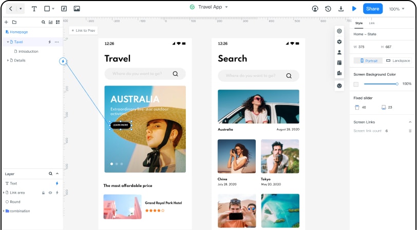
Wondershare Mockitt
We've have tried so many prototyping software or tools for UI designing, but Wondershare Mockitt is easy and straightforward to use. Especially for the new designers, this tool has remarkable features and advantages. Like any other prototyping tool, Mockitt is used to design websites layouts and mobile apps interfaces. Other tools like Adobe XD, Axure, Figma, etc. are way too expensive for the beginners, which leads them to use unprofessional tools.
Feature and Advantages of Mockitt
There are lots of features and advantages presents in Mockitt to assist you in designing beautiful UI interfaces. But for now, we will cover some of its essential features just for the sake of time.
- Design: Mockitt lets its users design freely, whatever they want, and whenever they want. You have the freedom to drag and drop your elements on the canvas without any constraints. Isn't this amazing?
- Assets: Designing beautiful UI interfaces, you need lots of widgets and templates, right? Well, don't worry; Mockitt has everything inside the "Asset Library." All you need is to drag any element from the Asset Library and drop it to the canvas.
- Cloud | Collaboration: The best thing we've seen in Mockitt it provides cloud service to its users. So the users can easily collaborate with other team members anywhere or anytime in the world.
