Types of Figma Components and How to Use Them
A Figma component is essentially a unit of design that can be added to any mockup, wireframe, or prototype to represent a visual element of the design itself. Using themed components can make Figma designs and prototypes unique and consistent across all the screens or pages. You can even create your own Figma icons library with customized stock components that you can then use repeatedly across multiple designs to bring a level of consistency to them. This article will talk about some of the different types of Figma components and how to use them for maximum effect, including how you can show a process flow using Figma component states within their respective page states.
- Part 1. Types of Components in Figma
- Part 2. How to Use Figma Components in Your Design
- Part 3. The Best Figma Alternative
Types of Components in Figma
A Figma component library is essentially a collection of different types of components in Figma that you use in your designs. Such a library can consist of any combination or all of the following component types:
- Figma button components - Any component that can be tapped or clicked to trigger a particular action.
- Icons - A representation of a menu item, a feature/function, a social media link, email link, etc.
- Controls - These comprise toggles (on/off), radio buttons, checkboxes, etc.
- Figma input fields - Data capture widgets are designed for user input and can be pre-defined and conditionalized.
- Menu and sidebar layouts - An easy way to get standard layouts into your design.
- Footers and headers - Useful for static content on multiple pages.
- Images - Add color and richness to your designs by using photos and other images.
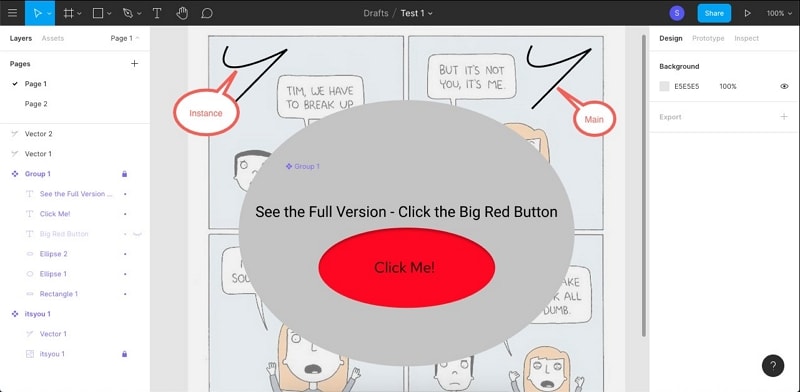
There are also two important states for a component: Main and Instance. The main component is like a master component. Any change to the main component will affect a similar change in subordinate components, which are called instances. It is important to note that a particular instance can be partially disengaged from the main component to create unique variations.
How to Use Figma Components in Your Design
You can easily create or add components to your design in Figma using some simple steps, as shown below:
1. Create a new component in Figma
To create a new component, select a layer of your design, and right-click it.
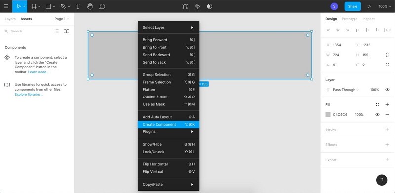
Select Create Component from the contextual menu.
2. Add a component in Figma
Add a component from your library or use shapes, text, and other elements to create a new component.
You can add more components to that layer or choose a different layer.
3. Create component instances in Figma
To create an instance under the main component, go to the Assets tab.
In Assets, choose the main component and drag it into your canvas.
This copy of the component is now an instance. You can create as many such instances as you need to. You can also use the Copy-Paste function to create an instance.
Apart from using and creating components and associated instances, you can also use the Variants feature to group components with customized values and properties. This makes it easier to pick the exact variant you need for a particular page and will be part of your Figma design system.
The Best Cost-Effective Figma Alternative
Wondershare Mockitt is an amazing alternative to Figma because it boasts very similar features. In addition, the usability factor is much higher, the interface is cleaner, and even new users will feel comfortable switching to this powerful hi-fi prototyping software. As in the case of Figma, Mockitt is an online platform with desktop and mobile options to support a wide range of use cases. As such, your projects can be accessed from anywhere and by anyone who had the right credentials, a modern browser, and a device that connects to the Internet.

Here are some of the key features of Wondershare Mockitt that make it so appealing to beginners and experts alike.
- Pre-built asset library - Unlike Figma, there's no need to import assets to get started. All the components you need are already part of the main asset library, which is quite extensive. You can also import your own libraries or customize the existing ones to create design systems that your team members can contribute to.
- Dynamic assets - As with component states in Figma, Mockitt offers Dynamic Widgets, which show multiple widget states on a single page. You can also assign Master status to a particular widget and create instances under it. The components are then editable both locally and globally, depending on how you want them set up.
- Fast Prototyping - Simply drag a link from an asset on your screen and drop it in the target page in the left-side navigation panel. Once the link is established, you can quickly add a trigger gesture and effects or animation to breathe life into your prototypes.
- Robust collaboration - Collaborate with other project members and never worry again about versioning and other issues. Projects can also be reviewed and commented on online and offline. The online option gives the designer a direct feedback loop from other stakeholders, such as the client, the developer, or the project manager, and is done by sharing a secure URL or QR code that lets you see their input.
- Smoother Developer Handoff - From code inspection to downloading asset information, everything is prepared by the software itself before the developer handoff. In effect, this frees the designer up for more design-centric tasks and leaves all the heavy lifting to the platform.
Why Mockitt Instead of Figma?
Although Wondershare Mockitt does not have the large community of users that Figma enjoys, it has many benefits that would attract users to switch from Figma. Some of the key reasons to switch are listed below:
Pricing - The most compelling reason to use Mockitt over Figma is the pricing. Both are subscription-based cloud products with very similar features and capabilities, but there is a stark difference in their pricing structure. For example, even the Enterprise version of Mockitt costs less than $99 per user per annum, while the basic paid version of Figma itself is around $144 per user per annum.
User Experience - Figma is not an application where new users can just jump in and start using it. Many of the platform's features are best learned through tutorials because they're not that straightforward. In contrast, Wondershare Mockitt has a UI that's designed for new users to get comfortable right away. Everything from the pre-loaded libraries to the drag-and-drop interface to the easy interaction additions aims to enhance the user's experience.
Universal Login - Once you create a Wondershare ID for Mockitt, you can use it for any of Wondershare's other products, which are quite a few. Some popular examples and Dr. Fone, Filmora, and PDFelement. This unique feature unifies diverse products, making them easier to deploy across your organization or just within a small team.
How to Use Wondershare Mockitt Components
In the case of Figma, you will need to import third-party libraries or your own assets to get started. In Mockitt, it's as simple as 1-2-3, as shown below:
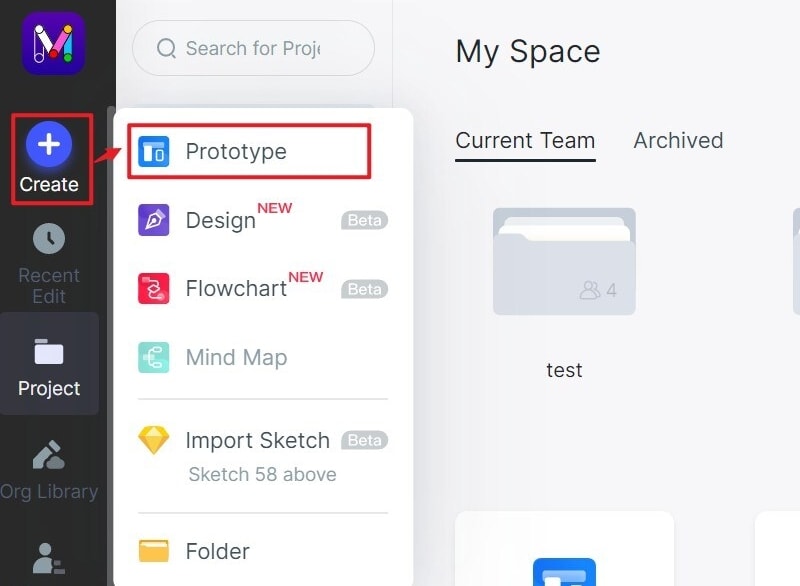
1. Start a Project
After creating your login, click "Create > Project", name it, and specify what device type you are designing for. This will give you a blank canvas as your starting page. You can also choose from one of the available templates to get started even faster.
2. Create your Design
On the left side, you'll see a "Quick Widgets" panel where you can store your frequently-used icons and other components.
To access the full asset library, just use the panel on the right side. You can search for any asset you need and find it.

To pull an asset into your screen, just double-click it or drag it over to the blank canvas. Customize the position, look, and other attributes of your component. Keep doing this until all your pages and page states are ready.
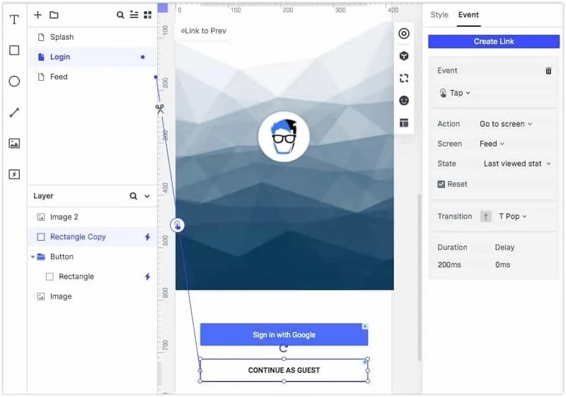
3. Prototype the Design
To start adding interactions, click your mouse pointer on the link icon to the left of any chosen asset. Drag that link and drop it into the required page on the left-side navigation panel next to the Quick Widgets tool panel.
Edit the link to add a gesture, a transition, and an effect.
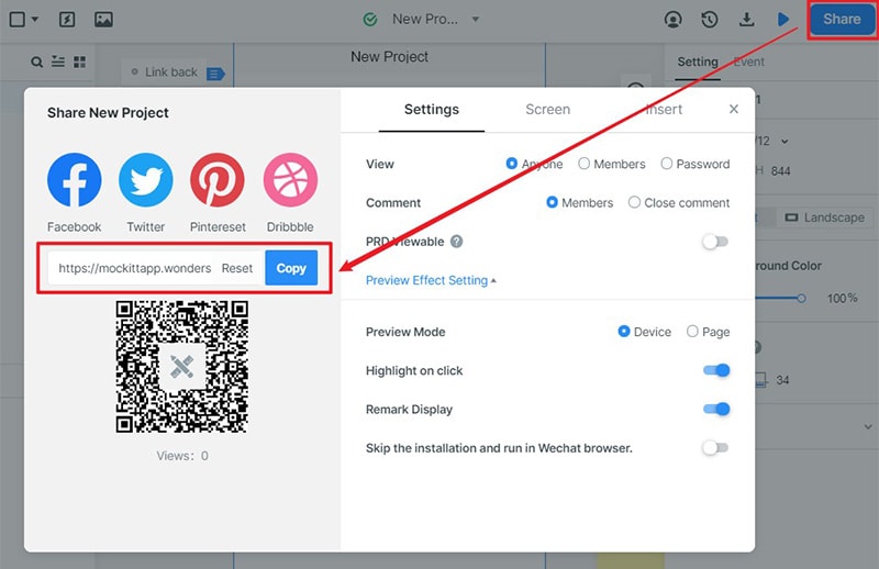
You can check the accurate working of the prototype at any time during the design phase by simply clicking on the "Preview" button.
Once your prototype is ready, you can click "Share" to generate the URL or QR code and specify the security parameters. You can also download the HTML Demo Package and send it to others for reviewing and commenting. Finally, when the prototype is approved, the developer can come in and download all the asset codes along with the style code for various devices.
Wondershare Mockitt is simple to use, affordable to subscribe to, and a pleasure to have when you're faced with complex projects with tight deadlines.
