Framer vs. Figma - Learn the Differences
Interface Design tools are usually known to be a designer's best friend. They are rightfully called so because they help designers bring out their creative idea into some form of a visual representation which can be easily understood by others. With the growing market for design tools, it is imperative for designers to choose the right tool to befriend. The design community is often divided between 2 popular tools Framer vs. Figma. Indeed, the choice can be difficult to make and honestly both these tools meet the industry standards. Read on to learn the differences between Framer vs Figma and understand which tool fits your requirements.
Differences between Framer and Figma
Framer and Figma are great web tools for prototyping.
Figma focusses heavily on productivity and tasks. A wide variety of built-in tasks are available which help the designer to action really fast. It is extremely easy to change colors, edit text and the corresponding config with Figma. The overall interface of the tool is simple enough for a beginner to grasp as well. Framer focuses on simplifying the process of creating real UI and interactions with out of the box tools. Framer comes with a wide variety of native tools like Scroll, page and tabs that help you auto-create UI elements.
Let's compare specific aspects of Framer vs. Figma -
- Controls - Figma comes with a variety of out of the box controls. Framer is great for customizing the controls but it has a limited set of controls to offer.
- Prototype Viewer - While both tools have quite intuitive and identical viewers, Framer provides a few extra features. Framer provides a quick preview panel that aids designers in quick validation of their prototypes. Sharing designs is also a lot simpler with Framer when compared to Figma.
- Version Control - When it comes to version control, Figma wins hands down since Framer does not offer a mechanism for version control.
- Extensions - Figma supports plugins which enable you to install features to quickly insert stock images, placeholder text, or you can add the ability to test color contrast for accessibility tests, and so on. However, Framer provides extensions support in the form of packages which can be technically overwhelming for some designers.
- Speed - Figma is certainly snappier. Since it is built on a task-oriented paradigm, the holistic design of the tool enables designers to accomplish tasks quickly.
- Coding and Code Generation - Figma is a no-code tool. On the other hand, Framer lets you import code and generate UI screens. Designers can also use real code to create or customize components. So if you can code JavaScript, HTML, CSS there is a lot of customization you can do with Framer. If you are a designer who prefers to delegate all the coding to developers, Figma is probably your best choice.
- User Research & Validation - It is no doubt that designers who validate their prototypes which are closer to reality get more detailed and useful feedback. The prototype outputs from Framer are certainly closer to real. Therefore, Framer is great choice for designers who are heavily involved in user research and validation.
Each tool has its own pros and cons and it is mostly a matter of preference for preference when it comes to choosing between Framer vs. Figma. A lot of experienced designers wish that they could have the best of both tools. Indeed, this leads us to explore more modern alternatives to Framer and Figma.
The best Framer and Figma Alternative
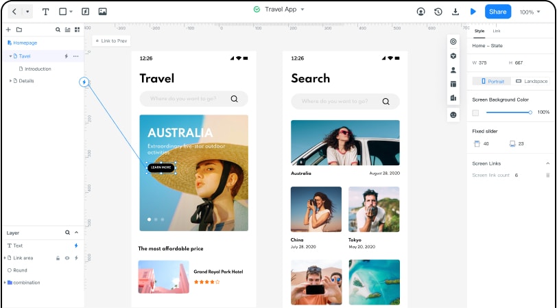
Wondershare Mockitt is a modern, snappier and feature rich alternative to Framer and Figma that simplifies direct workflows, collaborative teamwork and rapid prototyping. The tool boasts of minimal learning curve when designing interactive and animated prototypes. Mockitt brings the best of Framer and Figma as part of a single tool. It comes with a great collection of libraries full of built-in UI assets and templates. But that's not all. It allows designers to create and reuse their own libraries which allows customizations within workflows.

The real strength of Mockitt lies in its integrated material design kit. This kit offers a collection of templates that help you design a product with just a few clicks. For instance, if you are looking to design an e-commerce site, you will find a complete wireframe kit comprising of templates in an exclusive format for e-commerce websites. The reusable elements are also compatible with the Android platform.
Most designers work as part of a team and with team members becoming more geographically dispersed, a real time prototype builder where multiple designers can make changes simultaneously is imperative. Mockitt empowers designers to collaborate not just with fellow designers but also with developers. The tool offers browser based inspect and export tools which enable seamless communication of design specifications with the development team.
When it comes to choosing a cost-effective interface design tool, Mockitt should be your obvious choice. Unlike, Figma the pricing options offered by Mockitt are extremely reasonable and pocket friendly.
Without a doubt, Framer vs Figma is a long-standing debate. Whether you are an amateur designer or a pro with several years of experience, you will always crave for a combination of features from Framer and Figma. Fortunately, Mockitt provides exactly that union of features without compromising on quality and simplicity. It goes one step ahead as it comes with the material design kit which optimizes the design process and empowers designers with a collection of reusable and easy to code templates. It is apt to say that Mockitt = Framer + Figma.
