How to Do Card UI Design

Card UI designis a critical technique for modern mobile app and website UIs. Nowadays, cards are becoming a design staple across mobile app UIs and websites. The designs are intuitive, simple and appealing to users. They also act as great tools to develop highly responsive websites. When card UI design is used in the right way, they help in improving app or website navigation, thus giving users a great experience. It helps users remember information and isolate chunks in a friendly matter. Creating these designs is not hard, with the right tool and having some simple skills. Wondershare Mockitt is the best tool you can use to develop the designs fast.
The Best Tool for Card UI Design
This tool makes it easy for you to develop UX card design without having to master great programming or designing skills. The tool has several easy to use features that make it easy even for beginners to be able to create designs without a lot of hassles. It has an icon library rich in icons and widgets to help you do the designing work fast and efficiently. Using these icons and widgets is easy because you just need to drag and drop them. The tool also allows you to custom the widgets and be able to reuse them in the future. There are also a wide range of animations, page transitions and gestures you can apply in your mobile design. You also get a sketch plugin that you can sync using sketch file and link the screens to move your prototyping to higher levels of fidelity.
To allow you to share your UX card design with others, the tool allows for quick share and preview. You can do this through shareable URL or QR code that also allows you to preview and interact with your design without the need to log in. You can also share it with others to have a look, test and get recommendations you can use to make the right improvements.
How to Make Card UI Design Step-by-Step
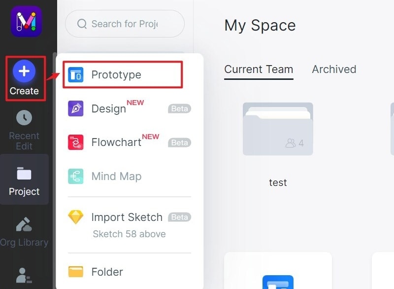
Step 1: Create a new project
- Login into the platform and click new account. Opt for blank project or project for demos. Move to settings, change the size of the project, name it and then save.
Step 2: Design the Card UI
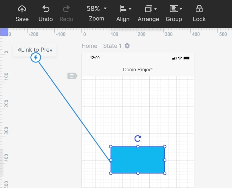
- Start by adding fast widgets and icons. Drag then to the canvas or press hotkey and draw. For my widgets, icons and build in widgets found on the right side, add them by double-clicking or dragging them to the platform. You can also save the widgets to use in future card UI design.

- Now add links between screens by selecting one widget and click new link you find in the link panel of the right side. Drag the link icon to the screen and set animations, action and gesture for the widgets.
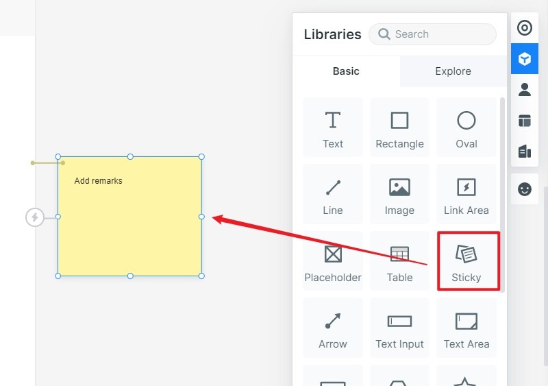
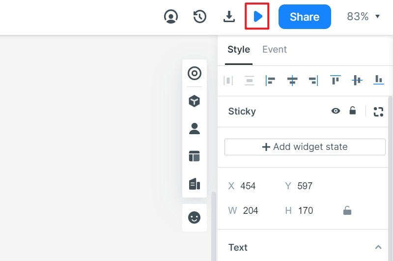
- Add notes to explain your card UI design further. Use the sticky feature found in the build-in widget library.
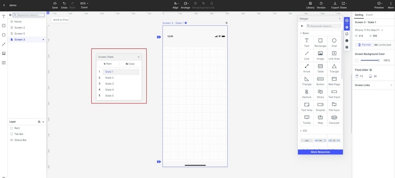
- Create interactive animations using dynamic widgets.
Step 3: Preview the card UI design
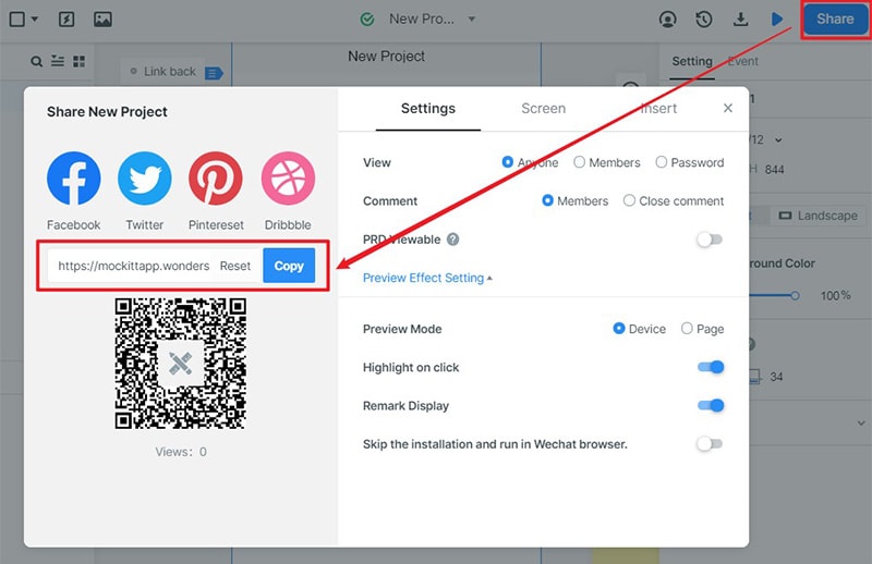
- Preview the card UI to ensure that it is working well in all platforms. When reviewing for your mobile, share the QR code or sharing link by clicking the share button, for PC use the top toolbar.
Step 4: Share the card UI
- After you are satisfied, it is working perfectly on all the devices; you can share it with others for suggestions to make improvement. Click the share button and receive the sharing link. Other people will be able to preview, check it is working and give feedback for improvement. This is a unique feature Wondershare Mockitt gives that most other tools do not.
Tips to do Good Card UI Design
Use the right imagery
UX card design mostly relies on videos or images. This is the case because visuals are the top things that people recognize as they scan the card design. Thus, choose the right image that allows you to communicate with a single glance. Ensure that you preview to ensure they are working well on all platforms.
Give priority to textual information
Anything created for users to read should be in text. A good card UI should have summarized information regarding a certain unit. Do not use long texts. Focus on short overview and make sure the text encourages your targets to explore further.
Apply simple typography
Never use complex typography for your card UI design. You can use sans-serif fonts for texts in the card since they look good in both small and large screens.
Show indicative interactive elements within your UX card design.
Make sure you indicate indicative interactive elements clearly in your card. Apply visual dividers to separate regions within the card.
Do not use scrolling within mobile card UI
It is good to know that card content might be taller compared to the screen space available. Therefore, card content should never be scrolled. If you do, you might create unpredictable scrolling behavior.
