The 5 Principles of User Interface Design

Any software, website, application, etc., requires an interface that communicates with the user. Structuring the interface that is in front of the user comes under the purview of user interface designing. The best design is the one that does not feel like one. Yes, you read it right; there is no typo here.
Because a UI design needs to work well, it does not have to look well. And designs that work well shall automatically look and feel amazing. Creating such designs depends on a lot of variables. Some of these include your audience, industry, and so on.
However, while including all the variables, there are a few principles of user interface or golden rules to create the designs and guide the designer to follow the ideal set of fundamentals.
Top 5 Golden Rules of UI Designing
1. The User Shall Have the Control of the Interface
Even though you are the creator of the interface, the control of the same must be given to the user. Why? When the users are controlling the interface or when they are made to look like they are in control, they will use the application, website, or any digital solution you have built with trust.

Source: Geniusee
They will learn it faster and feel comfortable engaging with it. Another way to make the users feel that they have total control over the interface is by making actions reversible. This helps them explore the interface more as they know that any action taken can be reversed.
On the contrary, imagine working with an interface where you have to take any action diligently because there is no coming back from making a wrong choice. While designing the interface, also make sure that you place the reverse function in the right places and while conforming to the platform.
For instance, on an iPhone, the users have to slide from the left end of their screen to go back, hence reversing an action they have taken. Now, if an application that you have designed does not conform to this action, they will not feel comfortable. Thus, designing an interface has to be in line with the platform and users.
2. Natural, Consistent, and Friendly
These are three different principles of user design interface merged into one golden rule that you should always keep in mind.
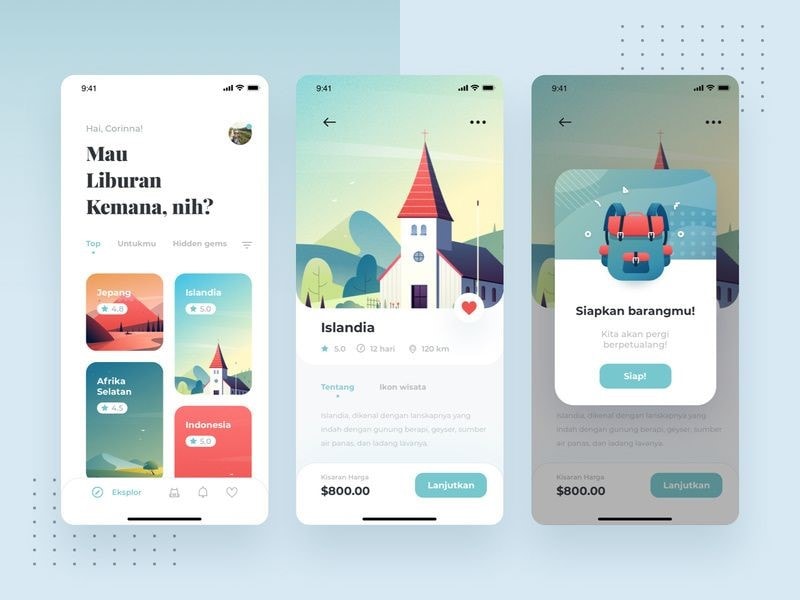
- Naturalness: A natural user interface is one that does not force the user to think about what they have to do next. In other words, the users have become habitual of using an interface in a certain way.
When you design an interface that requires additional explanations or works from the user's end, it won't be a natural experience, which can be hurting the business or brand value.

Source: Pinterest
- Consistent Behavior: This principle aligns with the previous in that it instructs the designers to keep the core of the design similar to the user's current knowledge.
However, you can transfer your knowledge to a new interface and make changes to how it looks, but the core functions and information must be the same. You cannot change things like command names, the visual presentation of information, and how interactive elements behave.
For instance, there is always a place for the CTA button on the webpage. It is either on the first fold or in the last. In addition, the social media handle icons or the contact information is at the page footer.
You know this, and the users know this. When they want to look for this information, the tendency is fixed to scroll down for contact and look at the top for the CTA. You should not change these things.
- Friendliness: Friends are supposed to forgive each other, yes. Well, you need to apply the UI principle of forgiveness while creating the interface and let your users revert an action by first warning them about the consequences.

A friendly interface is the one that will look to prevent situations a user can run into. So, the rule here is to understand your user and predict the actions they can take regarding your interface. Instruct them about the same and warn them while giving them the option to go back in case of a wrong decision.
3. It Should Be Easy to Navigate
Another important UI design principle is that your design must be easy to navigate. The navigation must always be clear, fast, and self-explanatory. Don't let your users second-guessing what an action button or scrolling will do.
The goal here is not to intimidate the users with clingy designs and complex triggers. Follow the KISS formula here as it is another one of the principles of user interface designers must understand.
An easy to navigate interface has two things;
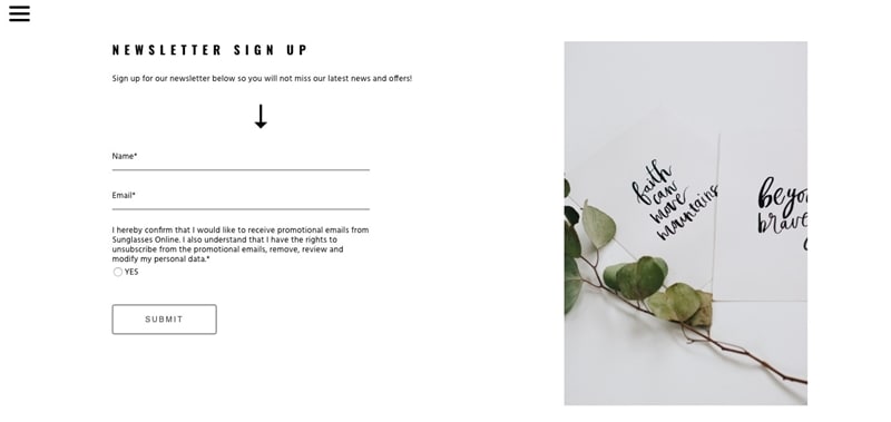
- Visual Cues: You need to make it clear to the user about where they are and what they are interacting with. Give them indicators that will help them navigate easily through the interface.

Source: Medium
- Prediction: Give your users a way ahead sort of feeling when they use the interface. For example, when you buy a product or build a profile, there are headlines on the top which depict the process. It helps the users know what lies ahead when they will click on the Next button.
4. Give them a Closure
Another one of the golden rules of the user interface is about giving your users closure to their interaction. The sequence of actions must be arranged in a manner that they have a beginning, middle, and end.

Source: Meme
This is the kind of informative feedback that your users would like to have and know that there is nothing for them to do ahead. As an example, when you buy a product online, you are given cues, predictive elements, and a final "Thank You For your Payment or Order" in the end. This indicates that they can now move forward.
5. Don't Let Users Use Their Memory
The critical point here is not to let your users think about what they did or entered in the previous page or window. Since humans have a limited capacity to remember things, you need to avoid building interfaces that force your users to put information in different places.
They should not have to re-enter the same information in various places or fill out an answer to move forward again and again. If you would have a form on the interface, fit it on a single page.
These are the documented and revered golden rules of the user interface, and some of these are taken from Ben Shneiderman's book. A central point in following all these principles of the user interface in implementing the rules and building a relevant interface aligns with the rules. Hence, you need the right information (given above) and the right platform to bring these rules into practice.
Introducing The Best Tool for UI Design - Mockitt

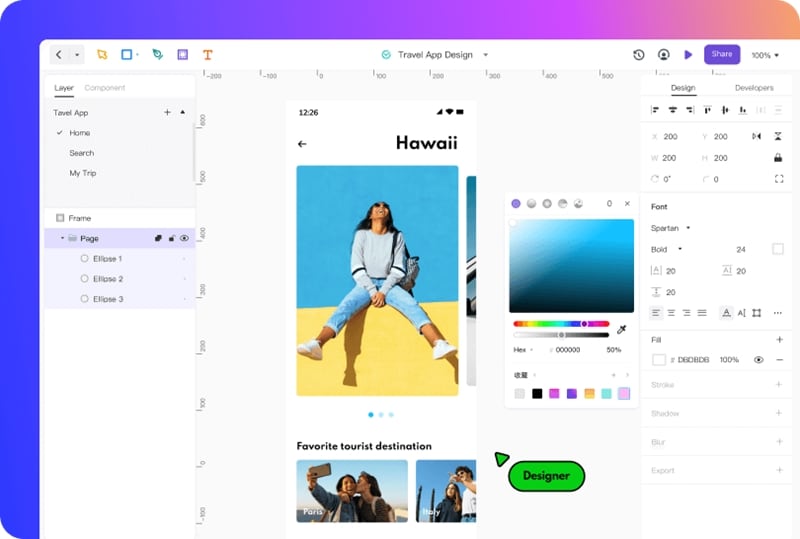
Wondershare's Mockitt has evolved from prototyping, flowchart making, and now to designing like a pro. The online software that comes packed with a bunch of new and incredible features to let designers take the stage and make the best designs in their life.
Most of all, Mockitt Design keeps things simple, fast, convenient, and effective. Starting from the toolbar to the canvas, layering, and all the way to sharing or exporting the design, it is quite an experience you will get while working with this tool.
In terms of the principles of the user interface, let's relate how Mockitt can align your designing practices with the golden rules that we have discussed above.
- You need to build an interface that the user controls. To do that, the basic requirement is adding all those elements which are triggered by the user, and then they give a response.
For instance, adding a sliding parallax effect and adding images to it. Mockitt can help you create such a design and add two arrows on either side to help your user move to the next or previous one.
- With Mockitt's design preferences, you can frame out a structure that resembles the natural state of a website embedded in a user's mind. However, with Mockitt, you can add to that design and make it look more appealing while retaining its natural state. You can create a draft and use the canvas to insert every type of shape and element you want in the design.
- Mockitt gives you access to a large community of designers and their designs that you can use as a template for your work. In addition to this, you will get access to hundreds of icons and item packs for your design while ensuring that you can easily maintain every such element's standard action/triggering capability.
As a result, Mockitt is your one-stop solution to build user interfaces that are well in line with the design principles. It adds to your creative side, complementing it with the technical dominance proffering an all-in-one solution UI designing.
Conclusion
We cannot put a pin on the timeline to say that this is the day humans were introduced to designing. In a world where Mother Nature inspires and surprises with its ability to create new experiences every day, designing as an activity has evolved.
Taking inspiration from nature, we have brought the concept of design to an interface. During all the years of design's development, some habits, actions, and perspectives stuck to the human mind. It is these basic and fundamental prerequisites of the man that have taken the shape of principles of the user interface.
And today, we have learned five golden rules of user interface that are meant to define how we interact with a digital interface. Along with the principles that matter to the creation of a user interface design, you need the right software to follow the principles and implement them within the design.
To help you with the designing part, Mockitt Design is the perfect choice as it allows making the UI designs by following the required principles and quickly.

