Top 5 Ecommerce UI Design Trends in 2024
If you own an ecommerce store, the sales you make are highly determined by the kind of website design you have. To make a lot of sales, it is necessary to have an ecommerce UI design that represents your business and showcases all that it entails. Note that the design is the first thing that your targets will see, meaning it should be fully optimised. With the right ecommerce UI, you end up leaving a long last impression that will make your business prosper. This article offers you some of the top UI ecommerce trends and how you can create one using Wondershare Mockit, which is the best design tool in the market.
Top 5 Ecommerce UI Design Trends
In modern times, there are several ecommerce UI design trends. It is worth knowing them so that you can know which ones to apply for your ecommerce store. Here are the best ecommerce UI design trends.
1. Design feeling
This is a trend that is often known as design thinking that most web designers are using to create high-quality designs. The methodology leads to the creation of designs with systematic reasoning, draw logic and focus more on the demand of the end-users. It aims to help the user get perfect solutions to some of the most complex problem they face. It brings in more creativity to the e commerce UI design. The trend also aims to ensure that the end-users are fully satisfied when they visit the website. It has several modules and features that make business owners attain their set objectives with their websites. The layout modules applied has several color schemes that offer an attractive effect to the site, making it attract a lot of visitors who turn to become long-lasting customers.
2. Mobile responsive design
Mobile-friendly design is a trend applied in designing a website in a way that it works for mobile devices before it can be accessed for other large devices. Nowadays most people use their mobile devices to browse the internet. This means that for any ecommerce UI design to attain its set objectives, it should be mobile responsive. With such a design, it means that all people using mobile devices can access the website without any hassles since it can be viewed well in all sizes of screens. For instance, magetique, which is a multipurpose magneto 2 theme, has several marketing designs. It has the simple up sell modules and the advanced design functions that makes it easy for a designer to customise the site with no CSS skills or other programming knowledge.
3. Animated
It is always good to have an attractive ecommerce UI design. Animation is a trend that is taking shape as it makes websites more attractive. It involves creating designs that have appealing visuals such as full-screen video, GIFs and cinemagraphics. These visuals are usually introduced to the landing page of the ecommerce website. For example, WooCommerce theme is the most current WordPress themes that provide the end-user with an intuitive, simple to use and highly responsive system. It provides a modern and clean UI ecommerce design with an interface that is SEO friendly. The interface has a myriad of shortcodes, unlimited slidebars, animation effects, several modules and many other features that makes users fully satisfied. It does not require a lot of programming skills to be able to put these animations on the design, all you need is to use the best tool that offers these visual and directs how to apply them.
4. Simple navigation
One of the qualities of a top website is easy navigation. The best ecommerce UI design should be easy to navigate, thus making the users have a positive experience while browsing it. Therefore, any designer should keep this in mind during the entire designing process. Simple navigation helps the end-user pick a process fast be it a tap, click or swipe. Voice recognition technology has been taking shape in modern times. Thus, UX designers have been at the forefront in trying to improve voice interactions. Trip Rev, which is a Travel Responsive Prestashop theme, offers simple navigation with modern features that any designer should be aware of. It has HTML 5 code that is developed with twitter bootstrap 3.x framework that makes it a great theme with easy to navigate options for all the website users.
5. Use of innovative and unique colors
For an ecommerce UI design to be friendly and appealing to the end-users, it should have colours that are applied correctly. The colors act as great tools that can help the design fulfil its function fast. In the coming years, it is expected that bold colors will be dominant in most ecommerce websites. This means that designers can put more focus on the use of neutral, monochromatic and bland color palettes together with while, blues and unintrusive grey colours. This helps to create a design with a more corporate look depending on the preference of the users and website demand. For instance, Recuidi- which is a healthy food store Magento theme offers a highly responsive template. The template provides an easy customisation option, highly interactive portfolio that works for almost all business types. Colour selection and designing offer a more appealing dimension to the entire website design.
As you do e commerce UI designing it is worth looking for ways that you can incorporate these top design trends to make the end products attain the set goals. Some might require you to learn some programming skills, but with Wondershare Mockitt, you can incorporate many of them in your design without a lot of hassles.

The Best Tool for Ecommerce UI Design
To create a good ecommerce UI design Wondershare Mockit is the best tool to use to do a satisfactory job within a very short time. You can create a good design fast, thus helping you save a lot of time. It offers you an opportunity to design a UI ecommerce design in a perfectly organised platform rich in easy to drag and drop features that makes the process easy, even for beginners. The drag and drop features ensure that you can do the design task with no coding needed, and this is one reason it is highly recommended. Once you finish building a clickable prototype, the tool allows you to share with your PC, laptop or any other mobile device. Wondershare Mockit also makes the designing process easy by allowing you to develop built-in widgets and object and combo templates. The tool also helps in generating QR codes that make it possible for you to do scanning of the code by use of Android or iOS device camera as you test your prototype. You can show how the prototype works to others and get suggestions on where to improve. Other features that make Wondershare Mockit be at the top of the others include easy access and edit option anywhere since your project is stored on the cloud, icon library, and it allows for easy creation of animation.

How to Create Ecommerce UI Design
Using Wondershare Mockit to create ecommerce UI design prototype is easy. Here are some steps to follow:
Step 1: Create a new project
When you login in, you click create new project begin your UI ecommerce design process. You can create the design for both web and mobile projects and customise your design to any screen size. You create a blank project, select the right device, give it a name and then save.
Step 2: Design the app
After creating a new project, you are now ready to start the designing work.
- Add icons and widgets. On the left side, there are fast widgets which you can add by double-clicking them, dragging or pressing the hotkeys and draw. On the other side, there are icons, build in widgets and my widgets. You can add these by either double-clicking or dragging them on the canvas. You can also edit the widgets if there is a need in the inspector panel.
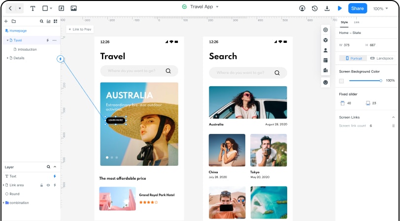
- Add links between screens. You can do this by selecting one widget, click new link in the link panels on the right side. Another way is by dragging the link icon on the left side of the widget to the target screen. After adding the links, you can now adjust gesture, animation and action on the link panel.
- Add notes. To add notes to your ecommerce UI Design, use the sticky feature found in the built-in widget library. Insert the input texts in the sticky. You can view the sticky using the preview mode.
- Create interactive animations. You should use the dynamic widgets to create interactive animation for your UI ecommerce. Use the function of screen state to hell in implementing a complete interactive animation in the screen. Use of screen state switching can help you change the colour, size and position on an image component on your screen.
Step 3: Preview the app/prototype/animation
- Now you can preview by clicking the preview tab on the top toolbar. This allows you to interact with your prototype on your personal computer. In addition to this, you can also change the preview settings like highlight on click, page scroll, shell or sticky. If you want a better presentation effect, click the full screen on the right top corner. There is also the black and white background switch you can also use.
Step 4: Share the app/prototype/animation
- After you are satisfied that your UI ecommerce design is good, you can now share it with others for suggestions. Send the QR code or link so that they can view it. They can give suggestions for improvement to help you create a satisfactory ecommerce UI.


