Top 5 Ecommerce UX Practices You Must Know
Ecommerce is one of the biggest aspects of life today. Everyday many customers or users buy and sell through digital markets. Like any other market, there are plenty of competitors, and to provide the best user experience, you must know about the best ecommerce UX designs and practices. It is important to give customers or users a simple yet efficient service to get your business distinguished, among others. Poor user experience affects your visitors, customers or users who are willing to interact with your website. So let’s not lose profits.
Top 5 Ecommerce UX Practices
Ecommerce or any medium, a business depends on only customers. To give the best user experience, you need to understand your target customers and their desires from a trustworthy ecommerce platform. Here are the top 5 ecommerce practices to improve your UX design (All the sources are taken from Wondershare Mockitt):
Compatible and Quick Responsive UX Design: -
When you are trying to build better ecommerce UX design, you must make an application with the highest compatibility; something which is compatible with every device like desktop, mobile, tabs and with every system like iOS, Android and Windows. A study says that 54% of the total ecommerce users are likely to use it through their mobile phones. With the rapid advancement of technology, conversion into mobile platforms is the best idea to get the better reach.
The key to keeping your customers engaged in your platform is to make a fast application so that they can jump into different products to see the thousand other possibilities. Usually, users don’t like to interact further if the task takes more than 3 seconds. The lesser the response time, the more a user likes to explore.
Minimalistic Design: -
Keeping a simple and clean design is not a drawback, but it enhances the user experience even more. Google, Apple, and Microsoft have minimized their design, focusing only on the essential features. This takes a little expertise in UX designing as you are cutting off a lot of data-keeping only most important on the screen. This allows a lot of space on the screen that enables the users to interact better without any complications. The key is to keep your Design more focused and clean.
If the visual experience is kept aesthetic yet effective, it would surely draw more attention. Colour tone, bigger images and lesser text with no extra embellishment let a user interact with your platform without feeling clumsy.
Easy Navigation: -
Navigation provides a user with proper guidance about how to proceed with the task. Organized and prominent navigation helps the users to find the exact product that they are looking for. If a user doesn’t find products through your platform, they will not interact with it anymore since there are plenty more other websites and applications to provide that service.
Make the required categories and subcategories input all the data about products to get them found easily by the users. A good left-hand navigation tool optimizes the search engine of your website. Organize the categories as per attributes, colors, sizes and all the other possible preferences. Here are some ecommerce UX design practices to create a powerful search bar:
- Offer the users suggestions with auto-complete so a user doesn’t even have to type whole thing and can also find what they want and other similar products.
- Allow the search option to search by product name, model no etc.
- Don’t just support texts but also abbreviation and symbols (to some extend) for the users who are not sure the about the details of the product what they are looking for.
Best Photography of Products: -
The images and video contents of the product are we hat users completely depend upon to judge the product virtually. Every user or customer wants to have a better look at the products which they will buy.
Make sure your customers see high-resolution pictures of the product, videos of its application, and real-life references with humans or models to understand their appearance. These are the things on which a user relies to judge the value of the product:
- Images from different angles revealing its details
- Large and variant images with proper color
- Close up shots
- 360-degree images
- Short video content
Product Detail Page: -
Product detail page is the most crucial part of the ecommerce user experience design. Since there is a lot of information on this page, it tends to look clumsy. Keep the description clean, brief, yet informative without any clutters. Here are some major practices to keep your product detail page more user friendly:
- Add to Cart Button: - A highly visible ‘add to cart’ or ‘buy now’ button to guide the user and make them proceed with the process.
- Use More Trust Badges: - Trust badges are the best way to convince customers about the product’s legitimacy. This makes the users more confident to make the purchase.
- Read and Review: - Allow the customers to rate the products on a scale and leave comments regarding it. This enables the other new customers to read those reviews and ratings before making the purchase.
The Best Tool for Ecommerce UX Design
As there is already many prototyping software available in the market to make the best ecommerce UX designs, you should look for the best.
Wondershare Mockitt : -
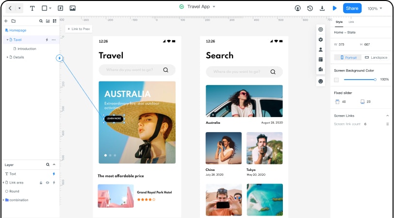
With numerous build-in templates, ease to work, and free access, this tool is the most useful software and deserves to stay on top.
Best features:
It is completely free for individuals to use as basic. The advanced level and enterprise is also pocket friendly, which gives you an extra push to your work without thinking of the cost.
- There are several widgets, templates, and icons already build in to help out the beginners. You can even create, edit widgets and save it in the library for future use.
- Simple drag and drop method to add the widgets on the canvas with ease.
- You can add links between your pages like – gesture, action or animation to create a better UI design. This allows you to make user-friendly designs yet attractive to interact with.
- The option for cloud storage allows you to save and reconnect to your work anytime, anywhere, without thinking of any data loss.
- Enterprise allows you to connect with graphic designers, developers and managers from millions of users by which you can create your team to get the best output of your UI designs for windows.
How to Create Ecommerce UX Design?
After knowing that Wondershare Mockitt is the best tool to create your ecommerce UX design prototype, it’s time to learn how to create a UX design. If you know how this prototyping platform can be utilized, you are more likely to build an awesome UX design prototype best for ecommerce. The steps to create a UX design prototype are the following:
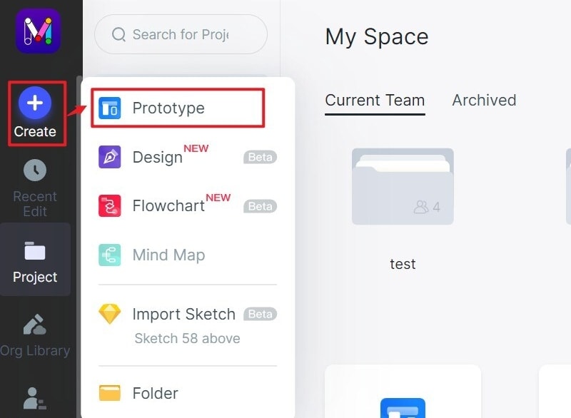
Step 1: Create a new project
- Start by choosing ‘Create Project’ after logging in successfully.
- Choose a new project with the compatible device type.
Step 2: Design your login UI
Add widgets and icons.
- There are components on both sides of the screen. On the left, there are ‘Fast Widgets,’ and on the right, there are ‘Build-in Widgets’, ‘My Widgets’ and ‘Icons’.
- The required widget can be double-clicked or dragged to the canvas from the panels.
- The edited widgets can be kept for future use by dragging to ‘My Widgets’ or by right-clicking it to ‘Add to Widgets’ to create your library.

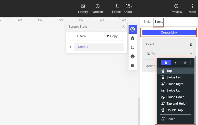
Add links between screens.
- Choose ‘New link’ from the right panel to set a gesture, action, or animation to the selected widget.
- Audio, video and spreadsheets can be added by putting its URL link for the desired file and publish it. This adds a better interaction between the user and the application.
Add Notes
- Add notes to your UX design that you want to keep in mind for future use.
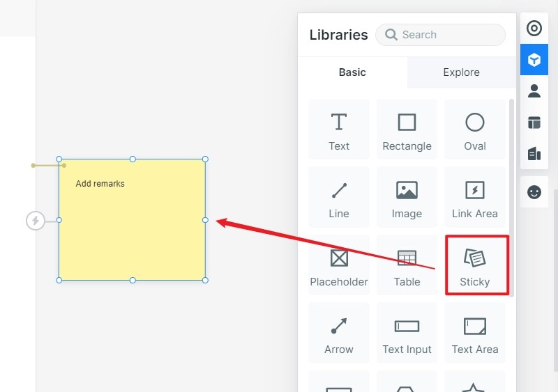
Create interactive animations
- Several icons and widgets in the library and build-in templates as a demo to help you out.
- Dynamic widgets are there to add interacting animation and manage the screen state by changing the size, shape and color of an image component.
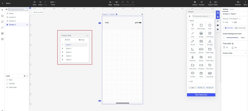
Step 3: Preview your UX design.
- You need to preview or test the ecommerce UX design prototype through the target device. This will allow you to understand the user experience that you are going to provide.
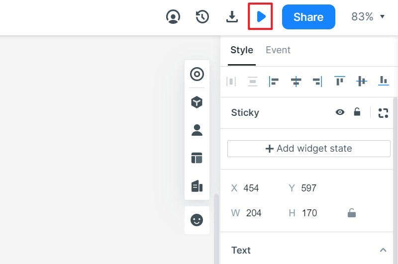
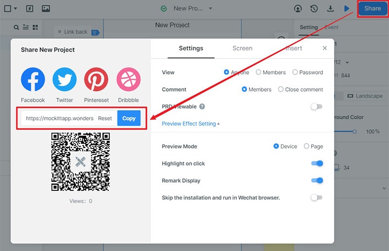
Step 4: Share your UX design
- After designing hand off your work to the professional developers to get the coding started.
- Collaborate with a team of developers, graphic designers and managers through Enterprise to get the best result.
