Top 5 Tips to Make Better iOS UI Design
In the present digital era, an organization’s apps drive its brand and revenue, be it on mobile or desktop platforms. Most of the organizations are attracted to how Apple iOS has developed its interface and they seek to implement it. And why not, we are in an era where iPhones and iPads are trending! The positive side of iOS UI design is clearly the awareness of masses with its touch, icons and functioning interface. On the other hand, the many strict guidelines hamper the speed and effectiveness of your iOS UI design.
User experience is the most vital element for any app. Designing a best in class iOS UI takes a lot of time, planning, creativity and research. With the increasing competition in the app market and different customer demands, it is important for app developers and businesses to build apps that provide customer satisfaction and rank higher in terms of ratings and user experience. That is precisely why we collated a list of do’s and don’ts for making a great iOS UI Design-
Do’s:
1) Research, Research, Research:
Never underestimate the value of researching. That is the only way you can come up with great content and design for an app. A detailed research paves the way for designing by ensuring the correct understanding and interpretation of user needs. During the research, you should attempt to answer some questions like – ‘What is the objective of the app?’, ‘What features will attract audience after the app is downloaded?’, ‘How will it be useful to the users?’, ‘What problems/issues will it solve that other apps may not?’
2) Typography is important:
The size of the text and font reveals a lot about the time spent in designing the app. Adequate size ensures that the text is readable by people of different visual prowess. The size of the text should be such that it’s readable without zooming. The ideal size of the text should be at least 11 points. Don’t make it too large or too small. Creative font choices can also influence users. Text styling that is synergistic with the design philosophy of the app will be appreciated more.
3) Contrast can make or break your app:
Contrast plays a vital role in how the app will look. Dull and too bold colours can hamper the attention of users. Applying colour contrast to your iOS UI design enhances the page and makes it match with your background and the text colour. Test your app lighting under various lighting conditions before confirming it. Using the right font colour and background will give an aesthetic appeal to your app.
4) Formatting:
Using the right formatting techniques ensures a neat layout and readability. Effective formatting of the application will yield in intuitive designs, through which the user can navigate the various features of the application. It’s important to design an app that is easily adaptable in any environment and provides great experience. All the contents of your application should fit into the frame without giving the users a chance to scroll horizontally or zoom.
5) Right Controls:
Right touch gestures will make interactions with your app feel easier and natural. Touch control UI elements provided by iOS like sliders, steppers, switches or text fields must be used at the right place naturally.
Don’ts:
1) Ignore your target audience:
Designers and businesses should know about the potential users. Many iOS UI designers do not spend enough time researching what the target audience wants and how it will be useful to them. Building an app without good knowledge about the target audience is synonymous to giving a toothbrush to a toothless person.
2) Too many Jargons:
Avoid using technical words or jargons on your app. People understand the language which they use in their daily life. If you use words which are difficult to understand, your users may lose interest. Use words that convey the message as well as increase the interaction between you and the users. Also, try using symbols and icons that are understandable by the people.
3) Making users wait for content:
Various app designers feel that it is better to make the users wait for the content to display in order to test their curiosity, which is not right. Making users wait for content will make them feel the app is hung or solidified. No user prefers blank screen even for a few seconds as the content loads. To avoid this, ensure that you design a fas and responsive app.
4) Not collecting User feedback:
Do not forget to collect feedback from users. Feedback helps improve the iOS UI design. Analyze their feedback and make necessary changes to your UI so that you provide a great user experience. Afterall, the app is designed for users.
5) Onboarding:
Avoid asking too many permissions (cookies, location, GPS, push notifications, etc.) to the users during their first use. This can create a negative impact on the users about your app as they do not trust your application yet. So, try to make the onboarding process simple with minimal requests/permissions.It’s easy to design an app but very difficult to make the audience love it. By following the above do’s and don’ts you are sure to create the best iOS UI design for your users. It is then clear that you need to plan your iOS UI design before it is implemented. Various tools available in the market can help you plan and prototype. However, if you want your iPhone UI design to stand out from other websites, Wondershare Mockitt is the most recommended tool.

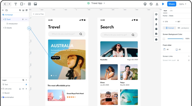
Wondershare Mockit is a collaborative prototyping tool for UI/UX designers and product managers. This tool comes with a large variety of easy to use iOS UI templates that will help you design effectively. While there are many tools available in the market for designing your iOS UI, Wondershare Mockit helps to animate and prototype the fastest. Wondershare Mockit has various features that are user friendly and will make your iOS UI design process effective -
1) Asset Library:
There are abundant widgets/icons available which are customizable. 20+ templates available and no designing experience is required.
2) Design:
Design prototypes easily and beautifully, without any coding knowledge. You can also import design files and add interactions.
3) Efficient Presentation:
You can demo your designs online/offline and get instant feedback. Also, you can easily share with one click.
4) Handoff:
You can increase the speed of design-to-development workflow. You can easily import sketch files with the help of the Sketch plugin. Wondershare Mockit automatically provides specs and multi-platform codes.
5) Cloud:
There is no need to install, download or update the software version. You can login and use it directly through a browser. It helps multiply efficiency and ensures data security and recovery.
6) Collaboration:
Team members can collaboratively view, edit and synchronize the information for the same project, with real-time communication, making it efficient and simple to use.


