How to Create Landing Page UI
Landing Page UI is an important part of a website. It’s the first page that appears when your visitors click on your website. Landing pages are also known as one-page website or one-action-page that push the visitors towards the required action. The primary aim of theLanding page UIis to generate leads and increase traffic on the website that helps in social media marketing and based on the uniqueness of the website it helps to convert the visitors to buyers and subscribers.
The Best Tool for Landing Page UI Design
There are various tools using which you candesign the features of your Landing page and eventually make it stand out from other websites. Moreover, when you are designing your landing page, it is likely that you are collaborating with a team which calls for the selection of a good tool.
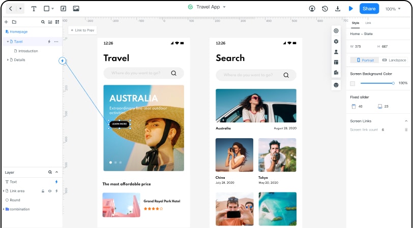
One of themost highly recommended tools is Wondershare Mockitt. While there are many tools available in the market for designing yourLanding page UI,WondershareMockithelps to animate and prototype much faster.WondershareMockithas various features that are user friendly and will easethe process of designing your Landing page -

- Asset Library:There are abundant widgets/icons available which are customizable. 20+ templates available and no designing experience required. You can also share the design system with the team to jointly manage, update and maintain assets.
- Design:You can design prototypes easily and beautifully, without any coding knowledge. You can also import the design files and add interactions.
- Efficient Presentation: A good design ensures efficient communication. You can demo your designs online/offline and get instant feedback. Also, you can easily share with one click.
- Handoff:With the help of this feature, you can increase the speed of design-to-development workflow. You can easily import sketch files with the help of Sketch plugin.WondershareMockitautomatically provide specs and multi-platform codes.
- Cloud:There is no need to install, download or update the software version. You can login and use it directly through a browser. It helps in multiplying efficiency and ensures data security and recovery.
- Collaboration:Team members can collaboratively view, edit andsynchronize the information for the same project, with real-time communication, making it efficient and simple to use.
How to Create Landing Page UI Design
We hear your next question - how do I begin designing thelanding page UIinWondershareMockit. Here’s how -
Create a new project –Onceyoulogin toWondershareMockit, you can get started by creating a new project and choosing the form factor and device type.
Design the app –You are now all set to start working on yourwireframingcanvas.
- Add a few widgets and icons. Several built-in widgets and icons are available and you can add them to the canvas by dragging them to the canvas or double clicking the widgets. Don’tworry, you can easily edit the widgets as you please. You can also save your widgets for reuse.
- Add links between screens. Now that you have brought in widgets and icons to your board, you should have the screens ready. However, they are all in isolationandit’stime to links them together. You can choose the widget and click “New Link” or drag and drop the link icon to link screens.
- Add notes. While a lot of your designs are usually quite intuitive, it helps to add some quick notes explain your design further. Especially when you are working in a team. Simply use the “Sticky” in the built-in widget Library and add a description.
- Create interactive animations. The dynamic widgets help you create animations which provides a more intuitive experience for theviewer.
Preview the app/prototype/animation –It’s now time to see how all the hard work has taken shape! By clicking on the ‘Preview’ button in the tool, you can see your landing page in action. You can preview the web page on your PC and mobile both online and offline.
Share the app/prototype/animation –It is likely that you are working with a team and need to get inputs on your early prototypes. You might also want to test your landing page with a few users for some early feedback. Click on the share button in the tool and you can generate a QR code or shareable link.
Useful Tips for Landing Page UI Design
Creating a good performing landing page is not easy. It needs to be attractive, good looking as well as communicate the message to the visitors. It’s hard to drive people towards your website, but by following some tips you can gain their attention and keep them engaged.
- Clean design:When a user lands on our page, the most important thing they see is the layout and how clean the web page looks. They do not stay on a page for longer that is chaotic and has lot of text or images. All the components on the landing page should co-relate with one another while ensuring the message is delivered in the right sense.
- Headlines that grab attention:Headlines are the main part of the content on any website. It is the starting point which creates understanding, interest and attention. Once the visitor’s attention is grabbed on your headline the next main thing is to have a detailed explanation about the product/service. Create killer headlines that does not exceed more than 10 words.
- Mobile friendly:Nowadays, making a mobile friendly landing page is essential. Your landing page should look great even on mobile devices. It should be easy to navigate and fast loading.
- Attractive & Colourful Images:Colours induce an aesthetic appeal that is attention seeking. An attractive and colourful image carries a statement in itself that will attract the users and extend their visit on your landing page.
- Less is more:A landing page should contain only what is necessary. Too much text, call-to-action and images clutters the web page. It’s not crucial to have more content as ‘Less is More’. The main aim of landing page is to guide the user to the offer and then convince to take action.


