Top 5 Principles for Good Landing Page UX
Landing pages can make or break your online business marketing. A good landing page will effortlessly convert visitors to leads, and this is the ultimate dream of every organization out there. But how can you design a good landing page UX? Besides technical expertise, there are myriads of other ingredients that need to be put to make your landing page UX tastier. If you are serious about designing an amazing landing page UX, then this article is here for you. In this article, we shall give walk you through the top 5 principles for a good landing page UX.
Top 5 Principles for Good Landing Page UX
Designing a good landing page UX involves a lot of considerations. The following are some of the principles for designing a good landing page UX.
1. Simplicity
Your landing page should be a simple as possible. Cramming too many unnecessary stuff on a single landing page takes away clarity. This chases away the visitor because he/she cannot understand what the page is all about. The main role of a landing page is to capture the visitor at first glance and convert to a lead. Most visitors don't have time to try and figure out what you are trying to give them. The attention ratio of your page is an important parameter. The ratio of unnecessary clickable items to the necessary clickable items should be at least 1:1.
2. Think First about the User
When designing a landing page, it is vital to keep the user in mind. A stunning interface with dynamic elements steals the user's glance, but when it is all about converting the visitor to a lead, more has to be taken into account. A responsive page is one major factor. Irrespective of the device the user access the landing page, make sure it is responsive. With the upsurge in mobile device usage, create landing pages that respond well also on mobile devices.
3. Create Eye-Catching designs
Everyone likes stunning appearances. Anything dull kills the urge to continue reading the landing page. The landing page should be standout and clear. It doesn't necessarily have to feature ground-breaking designs. A simple, eye-catching image integrated well with the concept can be so attractive. Make it simple, clear, and easy to understand. A combination of amazing coloring can make your landing page more attractive.
4. Avoid Distractions
The sole purpose of a landing page is to convert visitors to leads. Please provide them with what they require to land on your main page. One way to do this is to avoid any other distractions. That is, don't provide other things that can shift the attention of the visitor from your purpose. A good example is a slide bar. If you put a slide bar, the visitor will try to see other things out of curiosity. So if it is the registration page, then provide that page alone.
5. Make your CTAs and Links Recognizable
Imagine a landing page that you can't figure out what exactly will happen when you click a certain button or link. Visitors won't be ready to experiment but will leave the site. Pages should be clear on what action follows the given command. This means your CTA button should be easily recognizable. This way, you create a user experience that makes it easy to convert visitors to leads.
The Best Tool for Landing Page UX Design
Wondershare Mockitt is the best tool for landing page UX design. This is because it is unmatchable when it comes to features and user interface. If you are an amateur, don't expect tough navigation. The intuitive and user-friendly interface makes every navigation effortless and full of fun.
It offers an amazing pool of widgets and icons that allows users to create beautiful interfaces in a few minutes. The good thing is that you can save the edited widgets and icons so that you can reuse them. This saves you the time and energy needed to edit the same type of widgets. There are also several UI assets and templates. These templates are constantly updated and are suitable for a variety of industries. Just choose a template that suits your needs and customize it as you desire instead of starting to build your design from zero.
Use transition and animation effects to make your screens more appealing. This will steal the glance of your potential clients and therefore stand a chance of winning them.
Features of Wondershare Mockitt
- Team members can collaborate in real-time and co-edit the project on the same page remotely.
- It has plenty of UI assets and templates that make your design much faster.
- It has abundant widgets and icons for making beautiful interfaces.
- Users can animate their prototypes.
- It allows users to preview their designs on PC and mobile devices.
- It has good handoff design tools that ease the process of handing off designs to developers.
How to Create Landing Page UX Design
Step 1. Create a New Project
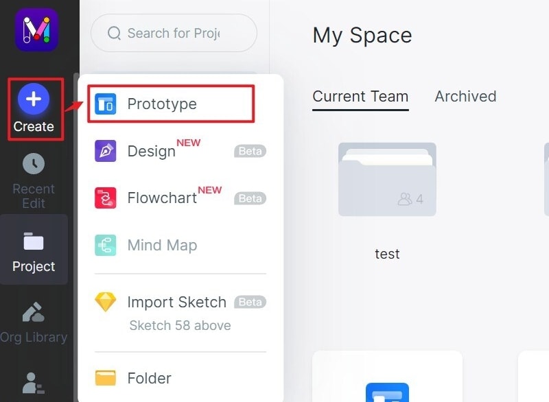
To begin with, open the tool using your browser and log in to your account. Locate and tap the "Create Project" button. Now select to either create a "Blank Project" or "Create project from demos." Provide a suitable name for your landing page project within the "Project name" field. Finally, choose the target device icon and click "Create" to start your design.
Step 2. Design the Landing Page
- Add Widgets and Icons
Now that you have chosen the desired device screen, it is time to add widgets and icons to your screen to make it more attractive. You can add widgets and icons from various categories like the Fast Widgets, Build-in Widgets, My Widgets, and Icons. Adding a widget or icon is simple. Just double click on the target widget and drag it to the canvas. If it is Fast Widgets, just hold the hotkeys and begin your drawing. For the other categories of widgets and icons, just drag them to the canvas and draw. Edit the widgets on the Inspector Panel and drag them to "My Widgets Library" to save for reuse.

- Add Links between Screens
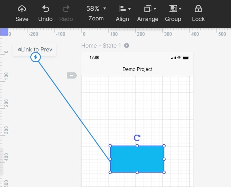
After adding the required widgets and icons, click on the icons you want to link to another page. You should see a circular handle on the right of this icon. Drag this handle to the destination page and release it. Repeat this same process for the other objects and pages that need to be linked.
- Add Notes
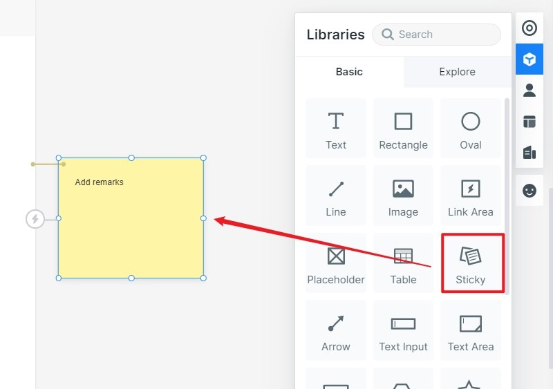
Go to "My Widgets Library" and select the "Sticky" widget. Input respective texts on the sticky note that appears.
- Create Interactive Animation
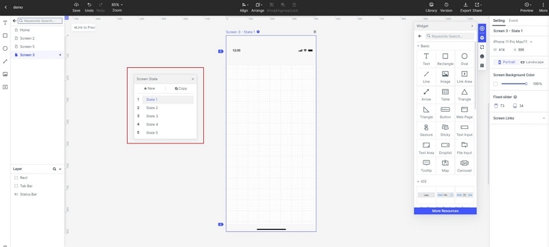
To create animations, hit on the "State" icon, and then select the "New State" button from the subsequent State Panel. Drag the link icon and drop it at the target state. You can customize the animation settings within the "Link Panel."
Step 3. Preview your Design
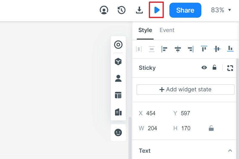
Navigate to the toolbar and click the "Preview" tab. Interact with your design and see whether it functions accordingly.
Step 4. Share the Design
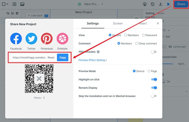
Locate and click the "Share" button. You will receive the QR code and a share link for your design. Share these details with your friends to access your design without logging in to Wondershare Mockitt.
