What is Responsive UI Design and How to Make Responsive UI?
User Interface Designs is interfaces developed in software or computerized devices by developers or designers. Designer mainly focuses on the look or style of the UI Design and aim to develop interfaces which are user friendly and enjoyable at the same time. It is used to improvement of the interactivity and presentation and looks of the mobile application and web applications. The prime goal is to increase the sales and growth, for any business and UI designs of applications helps in doing the same. With good user, satisfaction comes great incoming of users of that particular application.
What is Responsive UI Design?
Responsive UI design is the approach that is based on user’s behaviour and nature or environment based on the size of their screen, their platform and orientation. Designers use various size elements in their relative units and add media queries which allow the designers to automatically adapt to the browser space and ensure the consistency of the content across various devices. There are various technicalities involved, but the three core principles are:
Fluid Grid System – the elements occupy the same percentage of space no matter the size of the screen. Which means you are free to choose where and how pixels should appear, and you can also define a layout size so that your elements blend in the right way. So, you have to make sure to apply the percentage of the feature to the vital properties in a particular script; you will have a single design that shrinks down or expands depending on the user’s screen size.
Fluid Image Use – images are not fluid, unlike texts. You need to apply a right command in the script you are using to ensure that images shrink down or enlarge according to the size of the screen.
Media Queries – these are some filters used to detect the dimension of the browsing device to make theresponsive UIdesigns to appear appropriately. There are various tools which you can use to do the same and won’t have to depend on programming.
The Best Tool for Responsive UI Design
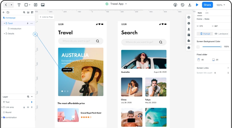
Wondershare Mockitt is the finest and the easiest prototyping software for creatingresponsive design UX. One can develop various prototypes and wireframes on this platform that too, without any cost. It comes with multiple built-in widgets and icons present to help you in making amazingresponsive UIdesigns. Then there are also meek drag and drop-down to make cool designs.

There several tools for making UI design tools available but it is a breakthrough tool which is considered to be one of the best wireframing designing tools. The best part about is the tool is that one can effortlessly link the screen as when one has used several other designing tools can get a little clumsy. It is a cool collaborative prototyping go-to tool that a lot of UI or UX product managers and designers go for. This tool is coming out with a fascinating process of converting an idea into a finished platform, opening a whole new world for the target audience where the user has access and can interact with anything and everything.
Numerous designs and ideas are being created and shared every day. Yet, your responsive UI design has to stand out, and it can have made possible on what are capabilities of the application you use and its’s functionality and significance. No matter what kinds of responsive design you are creating, it is that prototyping tool that will always help you achieve the best version of your idea without any professional proficiency.
How to Create a Responsive UI?
Now, we will discuss how to create aresponsive UXDesign using Wondershare Mockitt.
In this tool, one can easily create prototypes for any platform and easily customize the project size.
Step 1: Create a new project
- Create an account in the tool and log in.
- Select ‘Create Project’ after logging in
- Choose a blank project
- Choose the appropriate device type
Step 2: To start designing:
When designing, one will require certain widgets and icons. These features are already available on this tool:
- When you open a project, you will see assets on both sides.
- On the left side, there are ‘Fast Widgets’.
- On the right, there are ‘Build-in Widgets’, ‘My Widgets’ and ‘Icons’.
- Double click on the widgets or icons to select them.
- You can also drag and bring it on the canvas.
- Right-click on the widget to edit the widgets or icons according to your requirement.
- To save the edited widgets, drag the widgets to ‘My Widgets’.
- Or you can also right-click on it to ‘Add to Widgets’ to create your library.
Step 3: To link between screens, these are the steps:
- Choose ‘New link’ from the right panel and set a gesture. You can also set an action or animation to it the selected widget.
- Audio clips, video clips and any spreadsheets can also be easily added by putting the URL link for the looked-for file, and you can publish it.
Step 4: To access asset library and dynamic widgets
- There are already several widgets and icons in the build-in templates and asset library present as “demo.”
- “Dynamic widgets” helps in adding more components to your UI design. You can add interacting animation, size and colour and manage screen state by changing shape.
Step 5: Previewing your design.
- You will be required to preview and test the prototype through the target device.
To share your design
- You can easily add more people, such as developers or your teammates to preview and make changes in the design prototype.
- Collaborate with a team of developer, graphic designer and manager through Enterprise to get the best result

