How to Do Good Search UI Design
When you are doing search on a website or app, it is like having a conversation with these platforms. You express your information requirements as a query and the website or app then gives a response as a group of results. Therefore, creating a good search UI design is paramount to helping users attain their end goals. They expect to have a smooth and positive experience as they do the search. The users judge a website or app depending on the quality and how fast they get the results. Thus, a designer should create a search UI design that offers this good experience and value to end users.
The Best Tool for Search Bar UI Design
When you do a search for the best tool you can use to create a best search UX design there are several you come across. However, you should only rely on Wondershare Mockitt, which is the best tool that helps you do good designing within a short time. It is easy to use and full of short guides that make it easy for you to do the designing even if you are a beginner. The tool allows you to make an advanced search ui design for iOS and android devices. It has a clean, streamlined and organised workspace that makes it possible for designers to create prototypes without being distracted by clutter or writing even one code.
For designers working as a team, this tool allows for collaboration among the members during the process. You do not need to use other tools or send screenshots; you can add the members instantly. As you do the design job, the tool also allows you to use customised sized layouts. Users are provided with a chance to choose transitions, color themes, test the app and develop as many screens as they need. The tool also sand out from others with the many combos, object templates and predefined widgets you can integrate into your search bar UX design project by easy drag and drop moves.
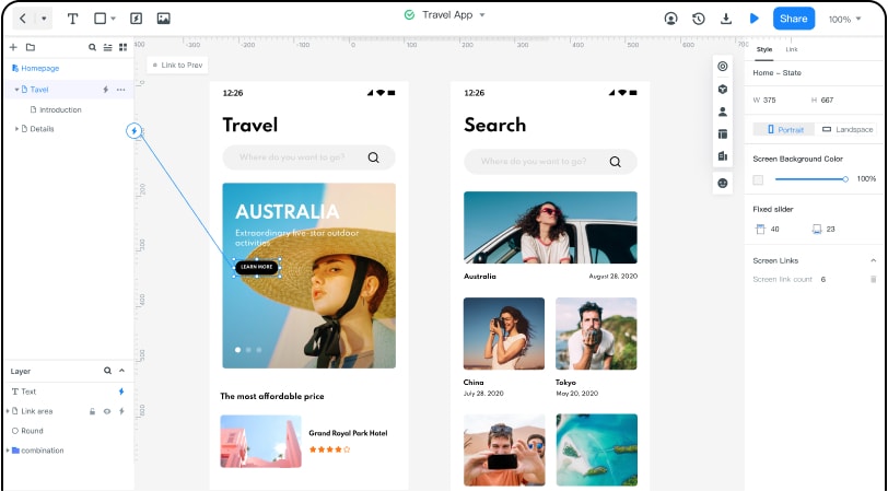
How to Create Search Bar UI Design
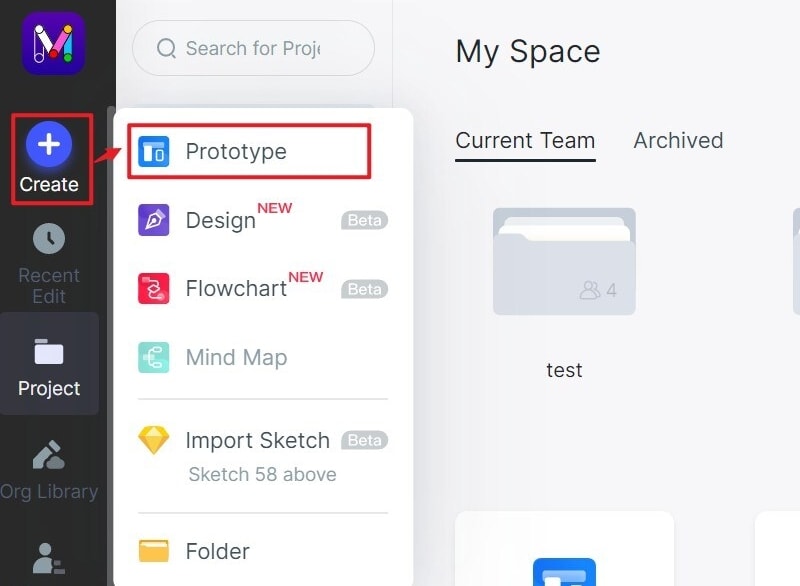
Step 1: Create a new project
- When you log in, select create a new project and start prototyping. Create a blank project or create from the template. Choose the device you want, then go to setting choose the name of your search ui design and save.
Step 2: Design the app
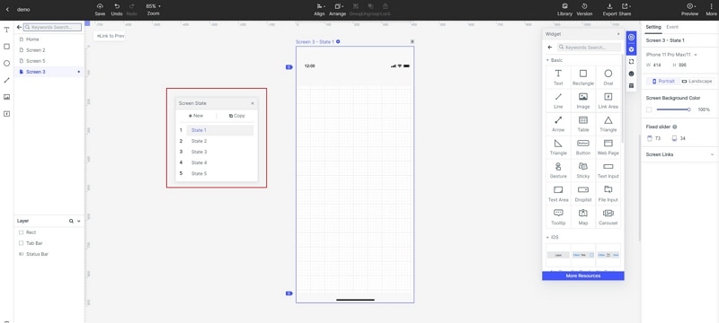
- Begin by adding widgets and icons. Add the fast widgets by dragging them on the canvas or double-clicking them. There are also build in widgets, icons and my widgets you add the same way either by dragging or double-clicking.

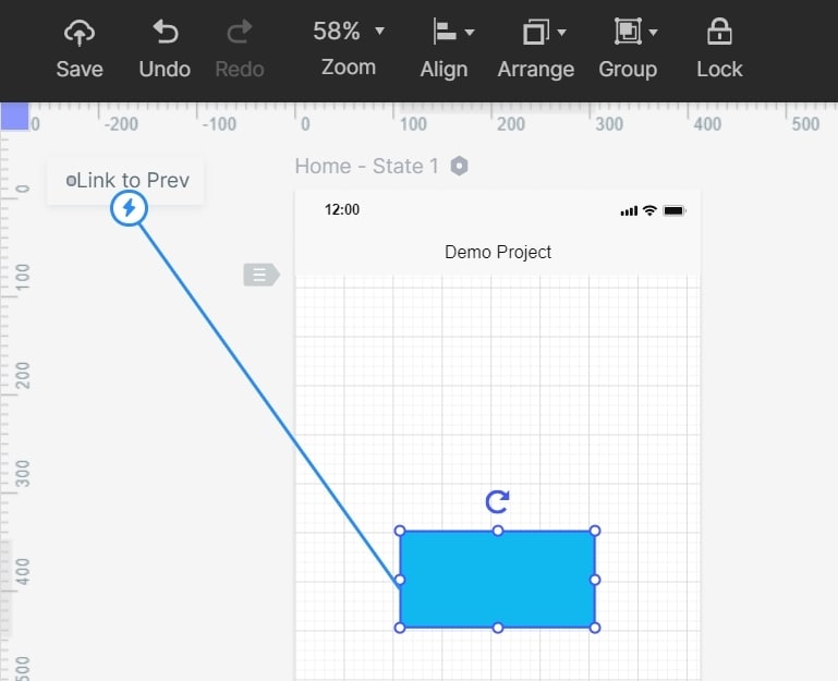
- Add links between the screens by choosing a widget and click new link or drag the link found on the left side. Then, adjust gesture, action and animation on the link panel.
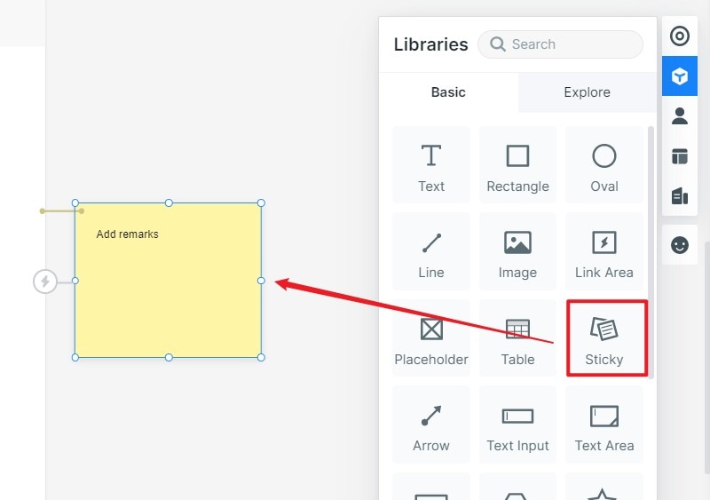
- Add notes to give more clarifications for your app. Use the sticky feature found in the icon library where you input the texts.
- Design interactive animations by use of dynamic widgets.
Step 3: Preview the advanced search UX design
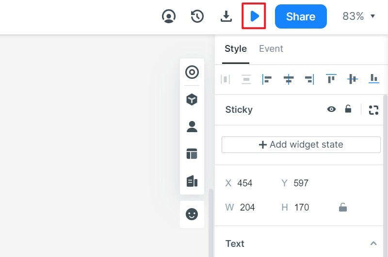
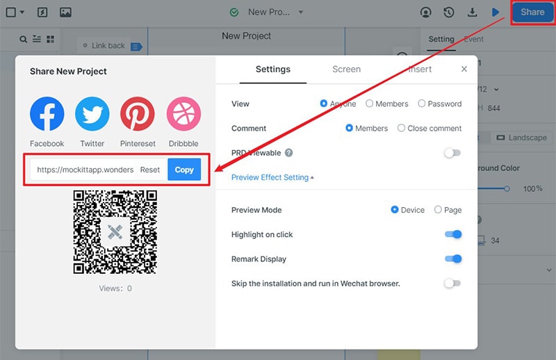
- Preview your advanced search ui design, on your mobile device or PC. For mobile previewing, share the QR code or sharing link by tapping the share button. To preview on the PC, use the top toolbar.
Step 4: Share the design
- Now you can share your search bar UI design with others. Click the share button and receive a sharing link. Other people get the chance to have a look at your design and give suggestions that can help you do the right improvements.
Step 5: launch
- After you get suggestions from the others and sure that your search bar UX design is perfect you can launch it for your target users to start using it.
Top 5 Search Bar UI Design Examples
Here are the best search bar UI design examples.
1. AppDynamics help center
AppDynamics is an advanced search ui design that has the search bar placed at the top of its help center. It invites users to ask all the questions they have in a direct and natural way. As the user types his or her query, autocomplete results come up, helping the user to get valuable information fast. In case you do not find the right results, you can move on and click see all results button, located on the right side of the search bar. After you click this button, you find a page full of results displayed that you can then filter by use of the list content types found on the left side. Besides, when you scroll to the bottom of the page, you also find related results that the search engine think bit of great help to you.
2. BikeTours.com site
BikeTours.com also makes the list of the top search ui design examples as it has search as one of its core features. It has a search bar that is positioned at the center of the homepage. When you click at its search bar, you find a dropdown that has a list of the top destinations and particular bike tours. After you click the search bar, you have the option to input your search query or choose a bike tour or destinations. In case you do not find what you want, click the search button, you get directed to a page with elegantly created cards highlights tours. The result pages have a lot of rich filtering capabilities that makes it easy for you to filter content categories like duration, country, price and others.
3. City of Boston site
When you go to City of Boston homepage, you access the search bar by clicking the search icon found in the right upper corner. When you click the icon, a huge search bar comes across the page. The bar runs the entire page length. Its CSSS styling matches the complete design of the site quite well. After entering your query and hit enter, you get a lot of filters and labeled search results. If you are aware of the filter to use for your search, check the right box and apply the filter to refine your search. In case you select the wrong filter, it is easy to reset with no need to re-execute your search query.
4. Duke University's Fuqua school of Business site
When you visit the website homepage, you get a nice search bar with the question what are you looking for? It is designed this way with the knowledge that most of the site visitors land on the website looking for certain information. This is why the search bar UI design has the home page around the bar. Besides, by guiding the site visitors to a more flexible interface such as a search bar, the website assists many people top get exactly what they are searching for. When you enter the search query, you get valuable autocomplete results. You have the option of searching for these results or pressing enter to go to the full page of the search results.
5. Swiftype website
To get the search feature on the site, you click the search icon located in the upper right corner. After you click the icon, you find a large search bar and results container that occupies the entire page. Since this site offer a whole page experience, you can focus on a single task to find what you need. In addition, you find easy to read and large search results, therefore users ensure they are clicking on valuable results. During your search, the autocomplete search results will continue to update. When you type your full query, you do not have to press enter since all results get displayed on the page.

