The Ultimate Guide for a Better Table UI Design
Want to Customize Table UI Design? Try Now!
In this article, you will see how and why you use a UI table inside your website design. Not only that, but we'll also show you the best table designs as an example to give you an idea of how to create the table of your own website.
Learn the best 5 examples and templates to design Table UI of your idea. You can also use a comprehensive tool to achieve the quick table UI design in few minutes.
- Part 1: What Is Table UI Design?
- Part 2: When and Why to Use a Table UI Design?
- Part 3: How to Design a Table UI Design?
- Part 4: 5 Best Table UI Design Examples and Templates
- Part 5: The Best Tool for UI Design - Highly Recommend
What Is Table UI Design?
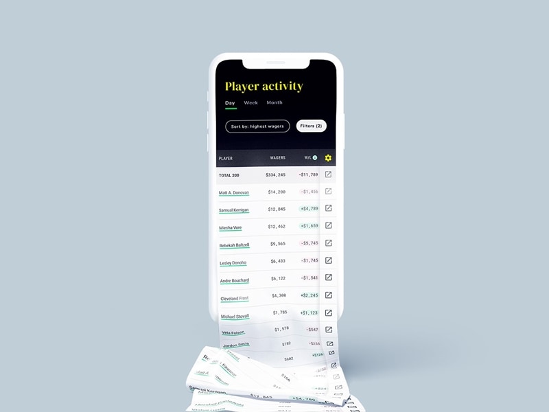
The purpose of table UI design is to visualize the data in a better way so the users can quickly scan, compare, sort, and filter the data to take their individual actions. In other words, table UI design is a structure that arranges the information into rows and columns.
In terms of UI/UX, data table UI elements or components use rows and columns to display information in a grid view. Well, a good UI table is not only limited to displaying the information of data; hyperlinks, scrolling, and buttons are used to interact with users for the decision-making process.
When and Why to Use a Table UI Design?
You have a large number of data sets and want to show it to the users in such a way so they can easily understand it. In this situation, the UI table is the best solution. Many designers and product teams appreciate this type of approach to present the data.
They believe that this type of approach would help them get a better user experience. In fact, this approach gets appreciation from the users as well.
Here are a few benefits of using a UI table inside your page design:
- Good Use of Space: Hence, your data comprises into the table, allowing more space on your interface. In easy words, the UI table makes more room to add more elements to your design.
- Clean Layout: Using the table UI design, your data or information presents in an organized way, giving a cleaner and clearer layout of your page.
- Improve Loading Speed: Unorganized or scattered information on the page may cause a shallow loading speed. To improve your loading speed, you've to present your data in a compressed way.
- Reducing the Complexity of Design: UI table can also remove or reduce the complexity of the page design by eliminating all unnecessary information from the design.
- Easy to Modify: Table UI design can be a good candidate for a better user experience. With a UI table, users can easily understand and extract the information.
You May Also Wonder: Top 10 Table Calendar Design
How to Design a Table UI Design?
So, our main objective is how to design a table UI design? It's not an easy task if you're handling enormous different types of data or information—lots of things that need to be considered while designing a UI table.
If you wonder how to make Table UI Design, try Mockitt UI/UX Designer to use pre-made templates and edit by yourself!
Well, we've collected some of the best practices to design a more acceptable table for your website/mobile or any other project. By following these practices, you'll achieve two things at the same time; user experience and most frequent or modern UI table design:
1. Choose the Row Style
We already know that the information inside the table is displayed in the form of rows and columns. It makes the users scan or read when looking to find quick data. So, when you're designing the UI table, make sure to choose the row style which suits the style of the website. Not be too judgmental with your own choices; your website is the priority.
Generally, there are four types of row style that need to be considered before designing:
- Table with Grids
- Horizontal Lines
- Zebra Stripes
- Free Forms
2. Table Headers
A table header row provides the primary information for the users. A fixed table header would be ideal for a large amount of information. The idea of a fixed table header is to provide the user's flexibility, so they don't have to scroll up and down again and again to recheck the column heading.
You May Also Wonder: Mobile Footer Designs for All Types of Businesses
3. Text Alignment
Alignments of text numbers and data are significant, especially when it comes to a large table set. You've to make sure that the table is readable and easy to scan.
Don't forget to follow these rules;
- Align numbers to the right
- Align texts to left
4. Add Filter and Search Option
Consider yourself working on a table that contains thousands of entries. So, would you find any data that is placed at the center of the table? By adding search and filter options, users will able to find things quickly and easily.
5. Don't use too many fonts, colors, or style
No doubt, colors, and styles make things attractive to the users. Perhaps, highlighting a particular column or row helps them remain focused on specific information. But too many uses of colors and style can make users uncomfortable and hard to focus on a single piece of information.
Well, these were some practices that you must consider while designing a UI table. Many other things also need to be considered, but mentioned practices are necessary for every UI table design.
5 Best Table UI Design Examples and Templates
So, you've got everything cleared regarding table design, right? If not, don't worry because we've collected some of the finest table UI design examples and templates. These examples will give you a more precise, like designing a better UI table for your website.
1. CSS UI Table
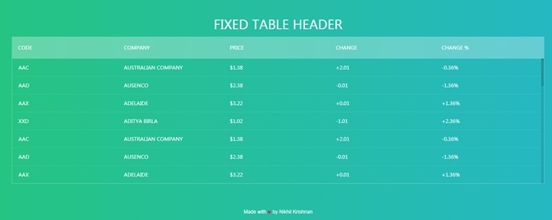
Image Source: Mockplus
So, what do we have here? A CSS UI table design with a fixed table header with five different rows on the top. This example also contains a vertical scrolling option which is good. And the background features a gradient since columns don't have borders which makes plenty of space for more data.
2. Add Row Table
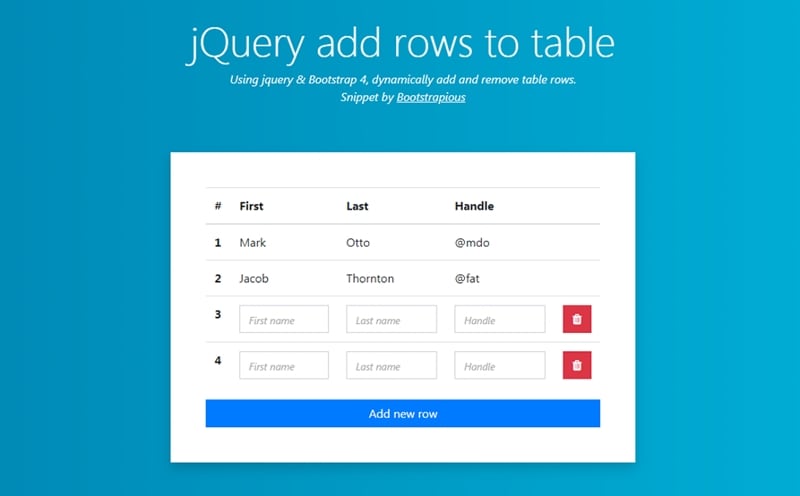
Image Source: Mockplus
Tables may be of different styles and types. Like this one. This table is designed on bootstrap to allow users to add more rows to the table. You can also remove an existing row from the table.
3. Grid Table
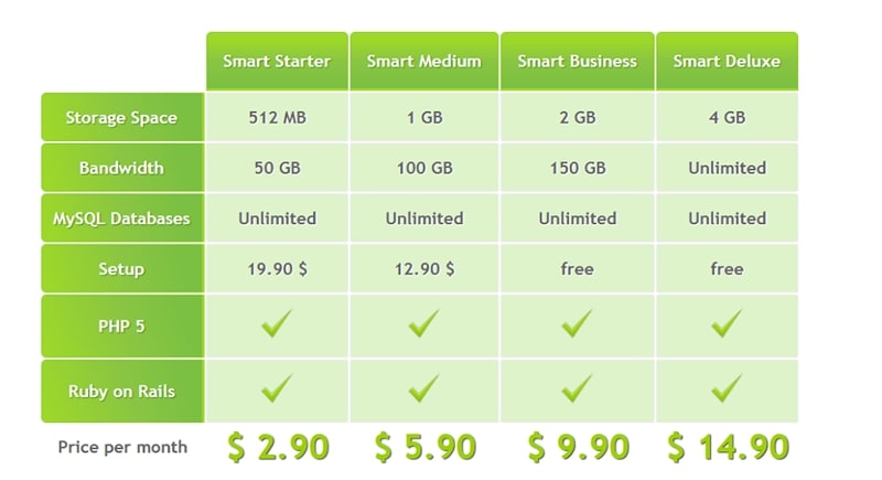
Image Source: Mockplus
Another crafty UI table design in our list. This time we have got a CSS-designed table. The purpose of this table is to create a comparison of different plans services.
4. Hover Effects
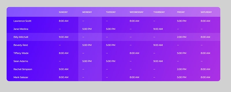
Image Source: Mockplus
This table is designed with the collaboration of HTML3 and CSS3 with 6 color options. Without any dividers, this table highlights the rows and columns hovering by users.
5. Zebra Striping Table
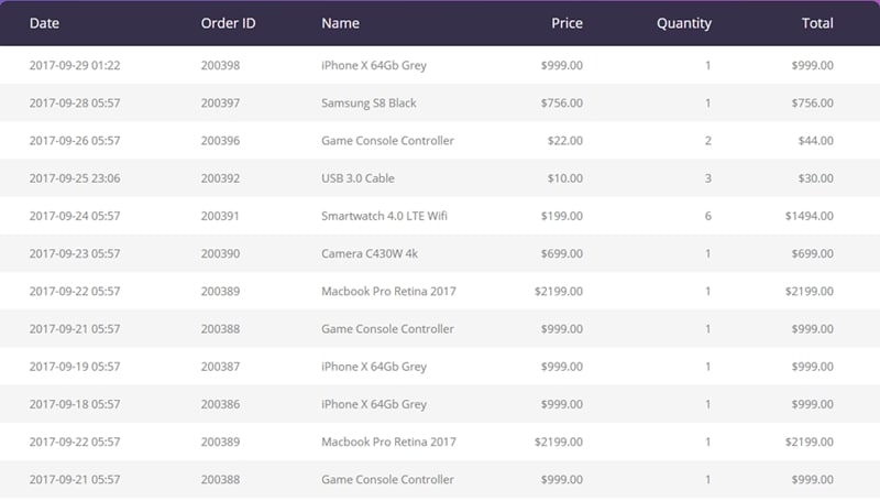
Image Source: Mockplus
Zebra striping is one of the most commonly used table designs on websites and mobiles. These types of tables provide responsiveness to your websites.
The Best Tool for UI Design
Have you ever wondered how and where these types of UI tables are made? Designing UI tables with coding can be a hectic task for any designer. Technology has turned the impossible things into possible.
Who would have thought that these types of designs can be implemented with the help of tools? We bet no one. That's why we've brought you a tool to ease your pain for designing the tables for the websites.
With the help of
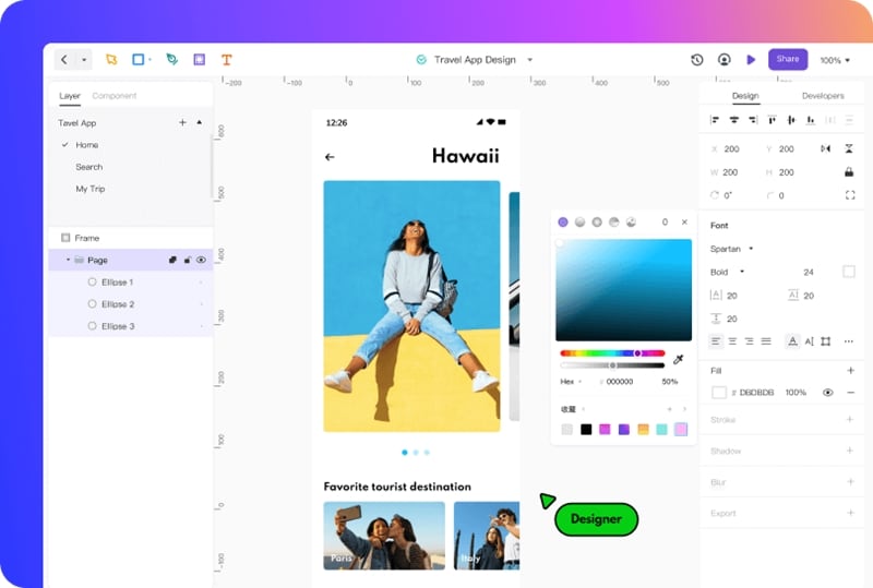
Let's get to know Mockitt first. Mockitt is a cloud-based graphic designing or prototyping tool that provides assistance to your thinking and creativity. With the amazing and latest features of Mockitt, you'll be able to do more than designing a table. That's why Mockitt has been the editor's choice.
Features of Mockitt
- Simple Design: Simplicity is the best thing we've seen in Mockitt. No extra feature available to hurt your design. Making table UI design in Mockitt would be a piece of cake for you.
- Rapid Prototyping: Mockitt has hundreds of custom templates and themes available. All of them are just waiting for you to use them. You get your own design within few clicks!
- Animation: Animation in table UI would be great innovation, isn't it?
- Interactive Screens: In Mockitt, you can use multiple screens at the same time. All you need is just to create links between two different screens using wireframes.
- No Coding Required: Most designers don't like the word "code". You're well aware of why they don't want to code? Yes, Mockitt provides code-free design! All you have to do is just drag and drop.
Conclusion:
Every day we see a new designer comes with a unique design. With the advancement in the tools, the competition is getting closer and closer. Don't know what to react to this? Should we make a worried face or a happy one? Well, that depends on our skills. If we polish our skills through practice and determination, then we should be pleased about it.
