Top 5 Timeline UI Design Examples
A good timeline UI design is a great determinant as to whether a website or app attains its desired goal or not. Most of the websites, apps, or social media platforms usually display their information in a timeline design: Facebook is a timeline of your life; Twitter is a timeline of your microblog musings; Path is a timeline of your photos and tags. Timelines have become so ubiquitous that not only do users immediately understand the interface and how to interact with it but they are almost comforted by the layout.
A timeline acts as the best way to showcase chronological events in an accurate and neat style. A good timeline UI design can be applied on the about us page to present vital moments or inform a company's story by use of dates and other things. There are timelines that showcase products, services, stories, or other crucial information.
Top 5 Timeline UI Design Examples
1. Telegram iOS UI Kit
Telegram iOS UI Kit from sketchappsources.com is a good UX timeline example you find online. It is a timeline UI design solution with a user-friendly front-end design that users love. It has a template that would be of great value for telegram bot behavior design. It is rich in symbols. When you look at the design you find several telegram app views. They include contact search, contacts, dialog, bot welcome, contact search-query, and charts. It has a vertical timeline UI design that is easy to understand the information provided because of the good display and high-level responsiveness. It does not have a lot of graphics, meaning that users are not distracted as they search for information.
2. Pets adoption app
The pets adoption app by Uplabs is a great platform designed to allow users to find pets in the surrounding area. It helps the users get those pets that are ready to adapt instantly. One of the top things about this timeline UI UX is that it is clean, meaning that the interface does not distract. It is easy to use even for those who have not accessed it before. The design is also fast and fun to navigate. It is user-friendly as it allows pet lovers to save animals around them and be friendly to them. The designs are also appealing and creative. With its ease of use, it makes it easy for users to post ads for adoption and sales. It can help you get any type of pet you might require.
3. Chatting App template
The Chatting App template has a timeline UI design that works perfectly for all mobile device interface requirements. The timeline design is simple, easy, and can be edited by use of the sketch app. It can also be used for both mobile and web apps. It has a modern and calm look which is one of the top features that users look for in a design even before they can navigate to look for information they need. The fact that it is editable also makes it great for users because it enables them to make the necessary changes to meet their specific needs. Its editable sketch file makes it easy to do all the changes you want. The screen is also fully customizable, layered carefully, and grouped in the sketch.
4. Android Web Browser Template
Android Web Browser Template is a top vertical timeline UI design example that is developed with users in mind. The design has several features that make it easy to use for everyone who wants to browse the internet from Android devices. It has a perfect screen design that makes it appealing to users since all the information presented can be viewed clearly. It is also fully customizable meaning you can use it in a way that meets your specific needs. The timeline design is also well organized with well-nested symbols and overrides. All the elements are well integrated making it easy for users to navigate through. The colors, typography, and style match well giving it a calm look. You can also change the color style.
5. Timeline
Timeline is another timeline UI UX design that is easy user friendly with great features. It is designed in a simple way meaning that even for those visiting it for the first time; it is easy to navigate without problems. Its minimalistic nature makes it easy to navigate through phones and other mobile devices. All the icons presented are easy to use and are highly responsive to any size of the screen. The buttons are located at the top making it easier for users to use them since they are easy to reach.
The Best Tool for Timeline UI Design
The Best Tool for timeline UI Design is Wondershare Mockitt. The tool allows you to do the design in a simple and quick way. One of the greatest features the tool has is that it allows you to access all screens in a single place. This means that it is possible for you to view the entire workflow, make changes and share the URL of flows. This is a feature you cannot get in other similar timeline UI UX tools. The tool has a ruler that is unique from other rulers you get in other tools. The ruler allows you to hover your mouse all over the area to view the current location of the unit.
The tool has a rich text editor that makes the editing work easy. You can open it with a simple double click. It gives you a chance to change text color, choose italic, bold, and set all others styles you want to apply for your timeline UI design. The tool also has a picture filter that makes it easy for you to make adjustments to your graphic effects such as brightness, blurring, and others. It has short guides that show all the basics you need to understand before you can use it. Besides, there is a forum and blog where you get tutorials, the latest news, and other relevant information.
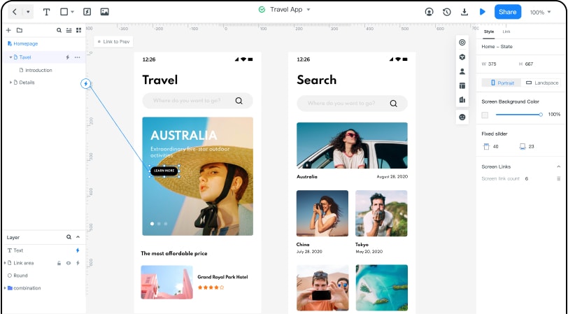
How to Create Timeline UI Design
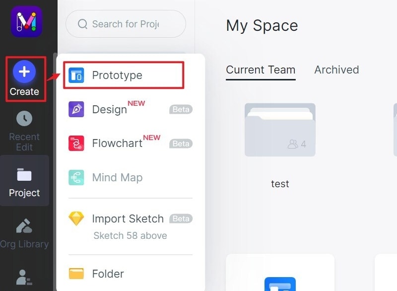
Step 1: Create a new project
- Log in and click a new project, select the device you are making the timeline UI design, and save. You can also create a new project for demos.
- In case you need to change the name of the project, click settings and make the necessary changes.
Step 2: Design the timeline UI design
- Add widgets and icons- Go fast widgets on the left side. Add them by double-clicking or dragging them to the canvas. Then, go to the right side where you find build-in widgets, my widgets, and icons, and add them the same way. If you want to make the changes to the widgets, the tool offers an edit option.

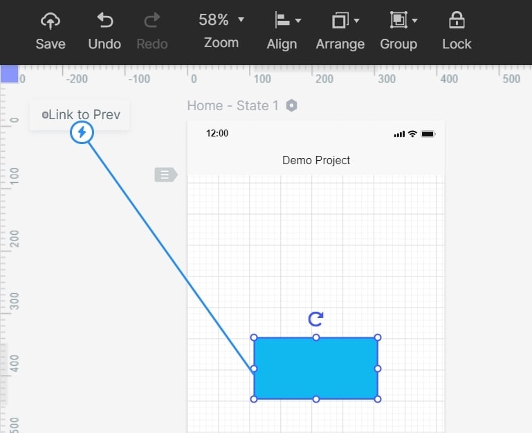
- Add links-now add links between the screens. Choose one widget and click the new link in the panel or by dragging the link icon found on the left side of the widget to the screen.
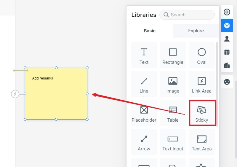
- Add notes- to make more clarification about your vertical timeline UI design, add text by using the sticky feature found in the library.
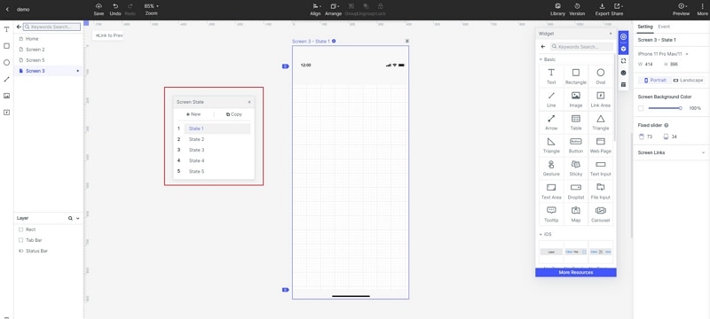
- Create interactive animations- create interactive animations using the dynamic widgets. To implement a full interactive animation with your targeted screens use the screen state.
Step 3: Preview the timeline UI
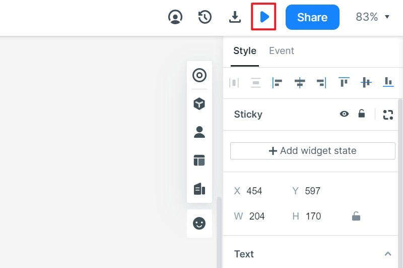
- Now it is time to preview your timeline UI UX design. It is necessary to do the previewing so that you can check and determine the functionality and the look of the design. This helps you determine whether it has attained the intended objectives.
Step 4: Share the UI timeline design
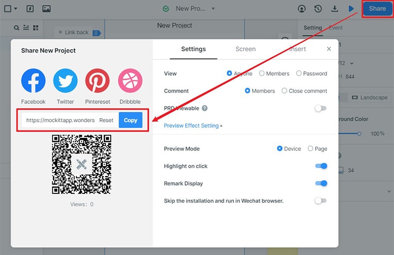
- After previewing and finding that the design is a good one, you can now share it with others for testing and get recommendations. Do the sharing by clicking the share button and receive a sharing link. This allows other people including the targeted user's preview and gives necessary suggestions that can help do the right improvements.
3 Tips to Design a Timeline
-
The timeline didn’t have to look much like a timeline for people to understand what it was.
The traditional, quintessential timeline is a horizontal, non-breaking line with points along it representing actions. But just ensure there are points along with it that corresponded to dates, then users will understand that this is a timeline of the page.
- Every point on a timeline represents something that happened that is relevant to the subject of the timeline.
Anything that falls on the timeline should represent an action. Focusing on actions allows us to assign dates to the actions, which is the whole point of the timeline. Make sure to include these dates. They don’t have to be extremely prominent, but they should be present.
- Using the basic progressive disclosure to show information.
It’s overwhelming to show everything at once. You can use collapse the navigation menu to show the most relevant information and told the user that they can expand the other years to see more information.

