Top 10 UI Design Patterns

The modern days with new-age technology, every problem has a solution, and the solution is an app. The apps serve the purpose to the users, but not every app is helpful even if it serves the purpose. The users tend to use or take help of the apps, which are less complicated and convenient. To provide that the apps and the designs follow some patterns that help to grow that connection between the app and the user. The user interface design or UI design patterns can be simple yet effective.
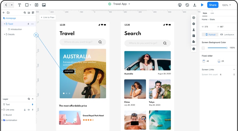
The Best Tool for UI Design
There are several prototyping software and designing tools available in the market. However, if you are looking for the best and most convenient one, Wondershare Mockitt is recommended for both beginners and expert designers as well.
Why is it best?
- Cost: - It is completely free for individuals for basic use. The advanced will cost you $49/ year and enterprise for $99/year. So it’s very much pocket friendly.
- Numerous widgets and icons: – There are several widgets and icons already build in widgets, templates and icons to help out the beginners. You can even create and edit widgets as per requirement and save it in the library for future use.
- Drag and drop: - Simple drag and drop method to choose and add the widgets in the canvas efficiently.
- Interaction: - You can add links between your pages like – gesture, action or animation to create a better UX and UI design. This allows you to make user-friendly designs yet attractive to interact with.
- Inspection: - You can seamlessly inspect through different projects to inspire or get inspired by commenting and discussing the designs of the project. You can also check the work in progress.
- Cloud Storage: - The option for cloud storage allows you to save and reconnect to your work anytime, anywhere without any worries of data loss. It also lets you share your designs with others. You can have access through multiple devices and sync them anytime.
- Enterprise:- Enterprise allows you to connect with graphic designers, developers and managers from millions of users by which you can create your team to get the best output of your UX and UI designs. This option comes when you are done with designing and looking forward to handing off your work.
What are UI Design Patterns
UI design or User interface design is the design what a user see or interact when using an app or website. These designs have patterns to work with, which helps to provide a solution to the respective user. UI patterns are some reusable components or common patterns which designers use to solve the common actions applicable to every app and websites. However, one may understand its use to the specific context of it. Mobile UI patterns are blueprints of designs that let the designers choose among the common yet the most effective user interfaces that can be helpful to create better UI.
These patterns have some basic aspects, like –
- Usability – This defines how well a user can achieve his goal of a specific context more efficiently with the help of a product or design (UI)
- Situation or Context – There should be a specific situation or context that enables the user to seek the product/app’s help. This can be considered as the problem.
- Solution – When there is a problem, there should be a solution. UI design patterns provide that solution.
Top 10 UI Design Patterns
There are many User interface design pattern to make a product or application even more effective. These patterns can simple or complex, but what matters, is its relevance. Here are the top 10 web UI patterns to solve the common problems:
1.Lazy Registration:
Many users have trouble or get annoyed with the lengthy registration process to try out the product or website. But that doesn’t mean the signup forms should be omitted but should be present in only one minimal part of the process. The complete registration can be done after the user gets introduced with the platform. This kind of late approach is called lazy registration. Such as – add to cart options before buying.
2.Progressive Disclosure:
Disclosing the information which is relevant to only the user’s current Action allows the user not to get confused or see any unnecessary information to that respective task. The other information will be disclosed only if requested, and that is the progress in discloser can be made. Such as – hidden comment sections or replies stays hidden until you click on it to see.
3.Forgiving Format:
Search buttons usually hold a lot of information for just one simple click. But providing that clutter of information can confuse a user. To avoid that and let users search more specifically and efficiently, there should be multiple options to enter the data. With the forgiving Format, the system does all the work by just putting specific information. Such as – the weather and navigation apps let you input or choose the name of a specific location and provide you with all the data regarding it.
4.Primary Action:
Only one first Action for each page is the best way to guide a user with ease. If there are too much Action or activity through one page, the user tends to get confused between the primary Action and secondary Action. Highlighting the primary Action, distinguish it with bright colours can make a user understand easily what to do and what do next to it. Such as – Sign up forms have only one primary Action to fill the form and sign in.
5.Breadcrumbs:
This is a well-user interface design pattern that navigates the user from the start page to the current page. One can see the progress from where it started and where it is working currently. Each page after the homepage is connected through a trail that can be seen and go back to. It is a simple, minimalistic design at the top of the page which can be texts or even graphic too. It has no purpose on the home page as it starts from there.
6.Registration to Account:
To start with any system or website, every user needs to do an account registration at the beginning, which allows having access to it. But filling out too much information is not something every user likes to do. So only the necessary information should be required, and that should be as minimum as possible. It can have a cool graphic element in the interface or not but make sure there are least possible texts with different size of fonts.
7.Marker for Required field:
Filling up a form online takes a lot of information in various fields, but only a few of them are required mandatorily. A marker next to the required fields allows the user to understand which information he can provide and have to provide. It’s better to remove all the non-mandatory fields; however, highlighting the required field with a marker can solve the purpose.
8.Steps left:
When a user is filling up information in multiple steps, there should be an indicator which allows the user to see how many steps left to reach his goal. This helps the user to understand which step he is currently in and what to do next. Serially arranged steps and very little information on what to do in that step guides the user to proceed securely without any tension.
9.Subscription Plans:
Users are extra cautious when it comes to spending money. So providing a detailed subscription plan in order (for required website only) can help them to spend them wisely. Basic features that a subscription plan should provide are –
- Name of the plan (basic/beginner, advance/pro etc.)
- Cost of the plan and validity (per month or per year)
- The list of the features that is included in the respective plan
- A signup button to start with the subscription plan
10. Hover Controls:
When there is a lot of information in one single page Hover controls can help a user to see only the necessary information by just hovering over the options without opening it into another page. So one can choose from the clutter of information.
