Top 10 Most Beautiful Church Website Design
Church websites have a very key role in building up church communities. Very often the new visitors will have a look at a church’s website before they decide to enter the building. People who visit church regularly will most certainly appreciate a well-designed, informative online presence for your community.
The most important objective of a church web page design is to provide information to its visitors. To achieve this goal the websites needs to have easy navigation and a well-designed site structure. Picking the perfect visuals and layout is extremely important in a church website design. Some church designs are based on lively, inviting visuals whereas others focus on calm and a simple look.
Create a Church Website Design
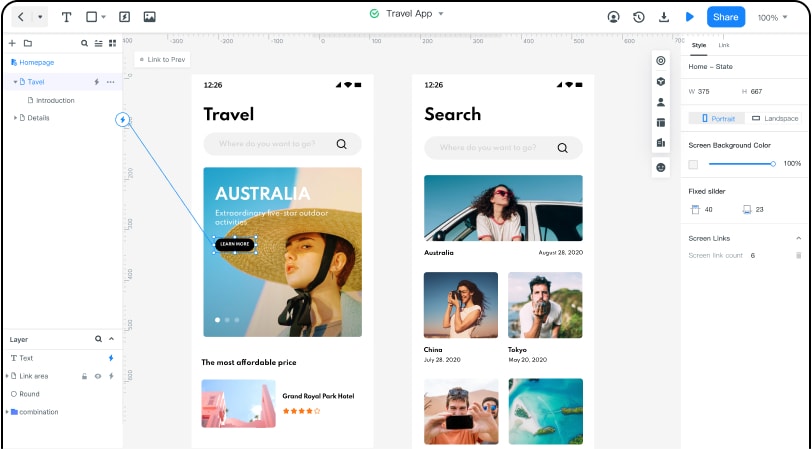
Wondershare Mockitt is one of the best professional and handy product design and collaboration platforms which can bring your ideas to life. With Mockitt you can save time by designing fast.
Features and Advantages
Now with Mockitt, you can boost your creativity beyond imagination. This online prototyping and collaboration tool allows you to empower your design journey, present your idea, validate your concept and then implement the design.
1) Enjoy abundant assets for free
On Mockitt, abundant widgets and icons can be directly used for free. Even if you have zero design experience, you can still make efficient prototypes. Moreover, you can easily customize these widgets, save and reuse them, all with just a single click.
2) Make interface design and interaction quickly
With Mockitt, you can create an impressive church website design. There is a built-in fully stocked asset library, drag and drop to build beautiful interfaces and interactions.
3) Design Demonstration
Mockitt allows you to efficiently demonstrate your built design and review it later. You can also share with others at the touch of a key. By sharing a link or a code, you can view your prototype on a computer or mobile phone sharing passwords and permissions can also be set.
4) Various Website templates to choose from
Mockitt provides you with a number of website templates to choose from according to your requirements and needs.
There are various website templates to choose from including industry, e-commerce, education, travel, medical, life, social and entertainment. These templates all can be chosen according to how you wish to build your beautiful church website design. Whether you want your website design for catholic church to be vibrant or colorful or whether you want it look professional, you will be able to find your required church website design templates on Mockitt.
10 Beautiful Church Website Design Examples for Inspiration
Here are some the most inspiring church website design ideas for you to take heed from.
1.First Church
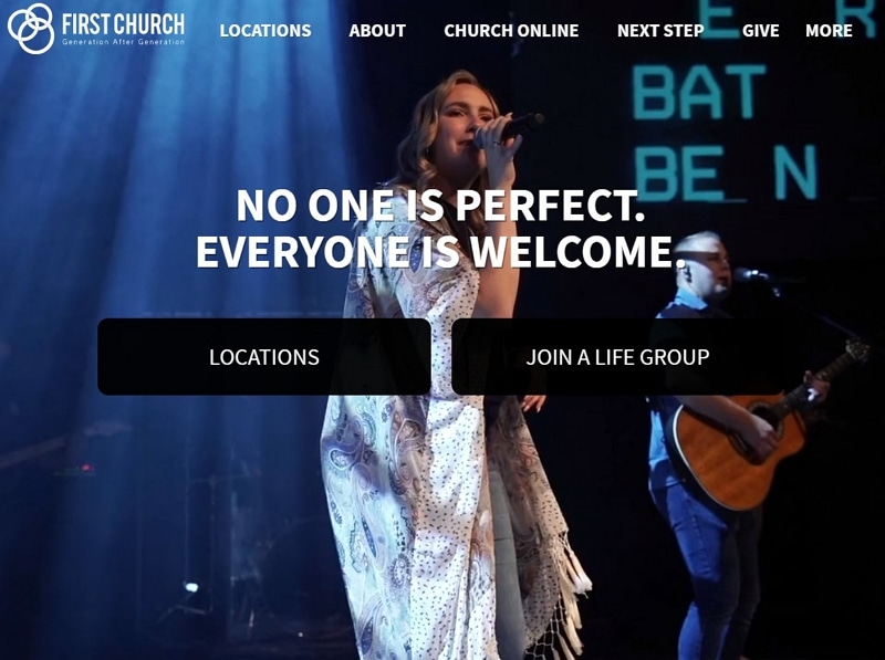
This website has the best of church website designs. There’s a nicely organized navigation bar on the top of the page which stays in place as you scroll down the page. They have efficiently used various call to action buttons such as – find a group, watch online, give online etc. Other than the home page, the other pages of the website are also very user friendly and informative. If you take a look at their “Plan a visit” page. You will see that it clearly mentions the service times and terms of the First Church. In addition to this there is also a section there which has information about the kids program.
The designers of this church website have very carefully made sure to design the website keeping their visitors in mind. They have thought about what their visitors would be looking for and made it very easy to find this information. What makes this website stand out and one of the best church website is the combination of great UX with a neat design and functionality.
2.The Village Church
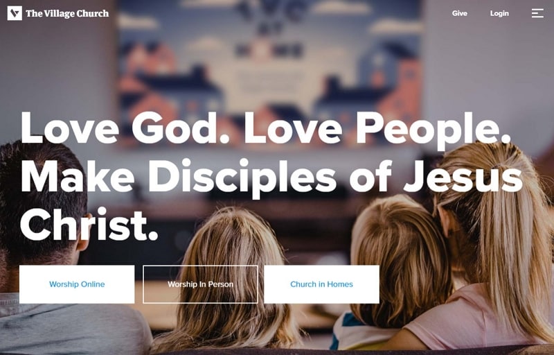
The designers of The Village Church website have chosen to focus on real life visuals and a constant color theme for their online presence. The website has been designed very beautifully with a very clean and contemporary look. The website is very user friendly, they have used hamburger menu instead of the conventional nav-ba, and the menu is designed in a very organized manner into drop down sub categories. The designers have very efficiently used the whitespace with exceptional color combinations, addition of lively visuals add that sparkling effect to the website which makes it one of the most beautiful church websites that one comes across.
3.Remnant Church
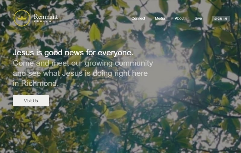
Remnant church’s website has been designed using full screen videos on the home page which showcases the regular day to day activities of the church. The visitors feel welcomed after visiting the website and the clips are very well chosen and give a friendly, warm and welcoming vibe. The website encourages the people to physically visit the church premises and connect with the community. The instructions about how to join the Sunday gatherings is clearly mentioned on the homepage of the website which is very clean and simple.
They also have an online portal for the registered members and visitors who can login and manage their profile. Their About us page includes happy family photos of the pastors.
4.Fuel Church
If you are looking to design a cool church website then “Fuel Church” is it. They are one of the cooler church websites out there on the web. They have a tagline “Carry the fire” and their home page showcases a video which is based on this theme. The website is very user friendly and they have an exceptional site navigation. Fuel Church does not use many real church activity visuals, however they have figured out various ways for their visitors to engage.
5.Hope Centre
Hope centre is a very old church (80 years old) which is being operated from six different locations throughout Australia. This website has been designed with a focus on mobile. There are several parallel sections that the site has been divided into. The video is showcased on the top section of the page whereas there are several important pieces of information and links to other pages on the rest of the homepage. The hamburger menu seems to be very tiny on a big screen but the navigations menu covers the full screen once you click on it.
Hope centre is a very good example of a Church website which is mobile focused, and if you are looking for ideas for creating one then this is it. Although the design of the website is very unconventional but still the site manages to be very user friendly.

6.Rockville Church of Christ
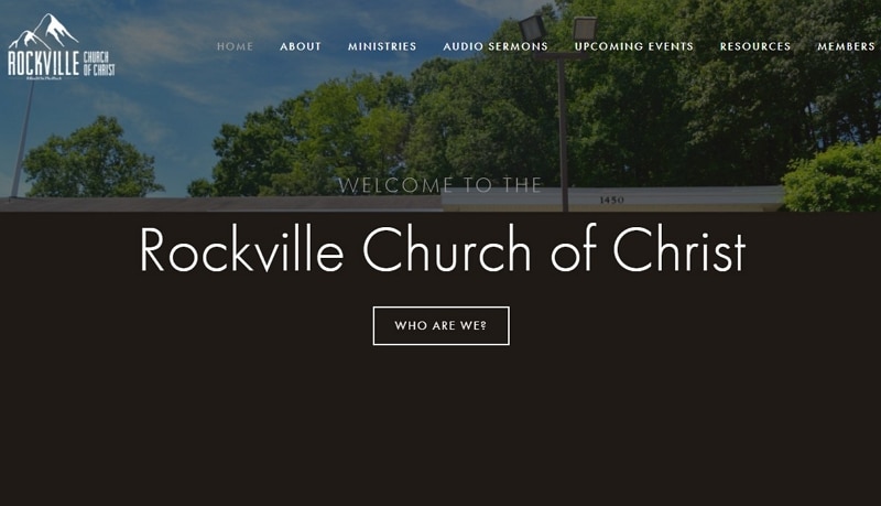
You will find many church websites which are small and very poorly designed. However Rockville Church is not of them. Although this is a very simple and basic website, but it has managed to comprise all the necessary and essential features that a small church website should have. The home page consists of a visual of the church followed by the schedule of the next Sunday worship. They have clearly mentioned the location and meeting times. And another very useful feature is the integration of Google Maps and a carousel of upcoming events.
7.Hill City
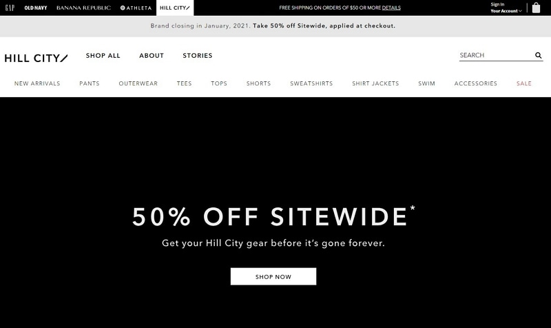
A major ingredient of a great church website is that it should be welcoming and inviting. Hill City church website starts with a welcoming video of fun loving and happy people. The website is precise and to the point. Any one who visits the website of Hill City church will surely stop and spend a few minutes looking at the video. Although the rest of the website is very simple and neat, however it is very well organized. The website has been designed with vibrant video content and manages to create interest of the visitors.
8.Trinity Hills Church
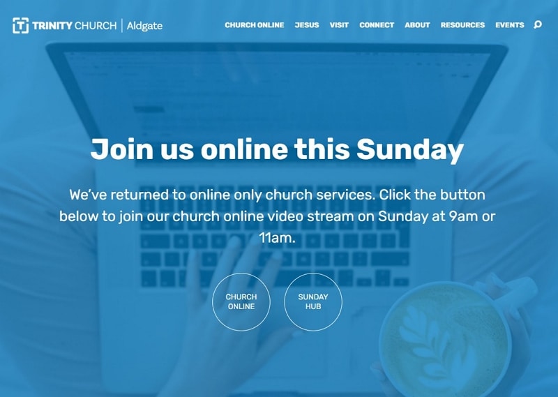
Trinity Hills church website is a very basic and has a very user friendly interface. While some modern church websites tend to divert from the normal design style. Trinity Church website has managed to stand out by using parallel scrolling and stylized imagery. The visitors can easily navigate through the website and can search from the navigation bar which has an added search functionality. They also have integrated Google maps at the footer of every page which gives directions to the church from any place.
9.Summit Church
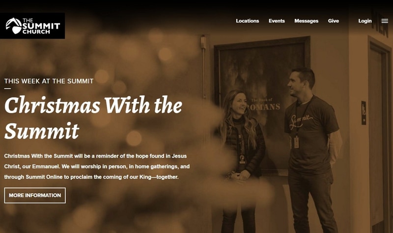
Summit church website has been very carefully designed to engage all of its visitors right from the home page. Most of the attractive church websites make sure that they use video content intelligently and focus on being mobile friendly. The summit church in addition to the sticky navigation bar use a hamburger menu for the ease of mobile visitors.
They have a grid based arrangement where each box focuses on a particular call to action on their homepage.
10.Radiant Church
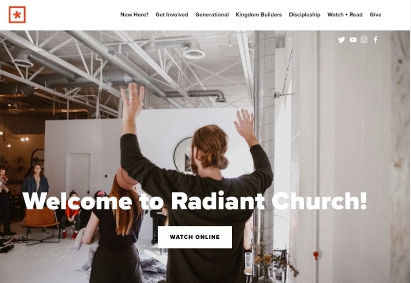
Although some people may argue that they have used ad out dated design practice on their website but it has worked perfectly for them as they have very wisely used full width visuals which make the visitors feel welcome. Radiant church have used a carousel of hero images on their homepage to engage their visitors.
Navigation bar has been used instead of a hamburger menu and the menu neatly manages all the pages of the site into sub categories. The visuals have been used very wisely to denote various sections by each page. The subtle parallax scrolling effect blends efficiently with the general design. In addition to this they have a complete section of archives of latest sermons which is very informative for the visitors.
