6 Mobile Web Design with Great UI and UX

With the coming of technologies like React Native, developing mobile web applications have been a breeze for the developers. But when it comes to mobile web design, the designers are still relying on their creativity and sheer skill to make the best designs with their imagination and intuitiveness.
Plus, ever since Google has focussed on updating search algorithms and their interface to best resonate with the mobile platforms, mobile web UI and UX importance have increased. So, if you have not paid attention to your mobile web design, it is time to start thinking about it. We have curated a list of the top mobile web designs that will help you jumpstart your UI and UX designing campaign for your help.
Good Tool for Mobile Website Design
Any mobile website design is as good as the tool that is used to create the screens and the entire interface. We recommend using Wondershare Mockitt for all sorts of mobile website designing and editing. Simply put, Mockitt is a cloud-based software that plunges the designer into an expansive pool of smart and next-gen feature integrations to create conversion-ready designs.
Not only can you create intuitive and best mobile website design on Mockitt, but this can be done with simple drag and drop item additions to the artboard. Here's how Mockitt can exalt your mobile website design from a simple paper idea to a dynamic and UI/UX based design.

Project Size and Widgets
The users are given the option to create custom designs for different devices and the dimensions of these projects are based on device selection. To add items and widgets, you have two bars on the left and right side of the screen to select and edit the widgets. The best part is that it is also possible to save the customized widget on the "My Asset" library for future use.
Import Sketch and Other Files
Sketch users will find it a breeze to switch to Mockitt and start working on the design. Just this time, they will have access to a lot of additional functions and items that can spruce up the creativity not using Sketch? Don't worry. You can also import your existing designs in PNG, JPG, and JPEG format and start working on them.
Preview, Share, and Handoff
Mockitt does not leave anything to chance and to bridge the gaping void between a designer and developer. The platform is blessed with "Handoff" for a seamless transition. However, before moving with the "Handoff", the entire project team can preview the design in real-time and experience the final product before it moves to development. Plus, the sharing is not restricted to the systems connected to the Network. Instead, the designs are shared across the web, with multiple users working from different locations.
A Huge Pool of Items
Widgets, Items, Animations, Transitions, Icons, Buttons, Colors, Fonts, and whatnot. The best part is that all these additions can also be adjusted as per the underlying platform. So, creating a mobile web page design for iPhone will give iPhone specific buttons and that too, those buttons that match the screen size of the chosen model. Isn't that great?
So, now that you are familiar with the tool, let's get some inspiration from amazing mobile friendly website design.
Superb Mobile Website Design Examples
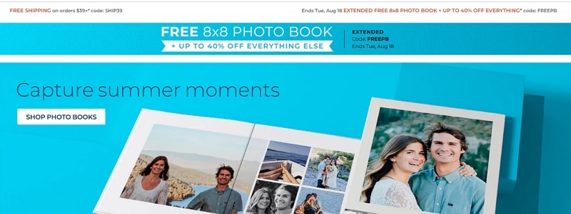
#1: Shutterfly
Customizing the stationery and other daily use items like photo books, cushions, photo frames, among others is all the buzz today. Shutterflys mobile website is great at enhancing the user experience and provides a smart interface. By giving the users access to a great mobile web page design, they are making it easy for them to research, preview, select, and pay for the product.
All the aspects of the website are not overpowering each other. Rather, everything from the discount section to the items preview thumbnail has got enough space to give the user a befitting idea about the product while making it easy to save the item for reconsideration.
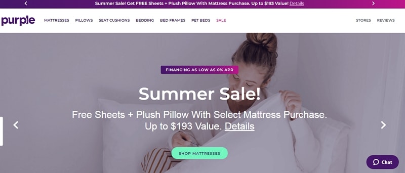
#2: Purple
Purple's focus is to drive the end-user attention towards the difference between their new-age products with that of the users. To share more information with the users, they share key aspects of the product in appreciable font size and a great color scheme that enhances the user's readability and entices them to explore more about the product.
To further augment the mobile web design's UI, Purple uses appropriate imagery to expand on the product's functionality and persuade the user to interact more.
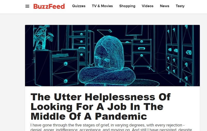
#3: BuzzFeed
With the increasing penetration of mobile and the in-the-train mobile surfing sessions, BuzzFeed adapted their mobile web page design to make it more mobile-friendly. So, the home screen is blessed with the most popular items adorned with appropriate imagery. From bigger sized images to smaller thumbnails and headlines, the transition of the content is smooth and flawless. Further to enhance the UX, they provide a menu on the left side that lists other main categories of the website.
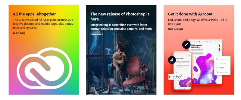
#4: Adobe
Adobe's granular approach of listing all the products they offer on a single mobile web page screen is quite revolutionary. Users can easily find out the product they want and would like to work with. Further, going from the main pages to the other associated pages is also a breeze with the Adobe side menu. It seems like they have successfully fused a huge product portfolio into a single menu, which makes it easy for you to explore everything in one go.
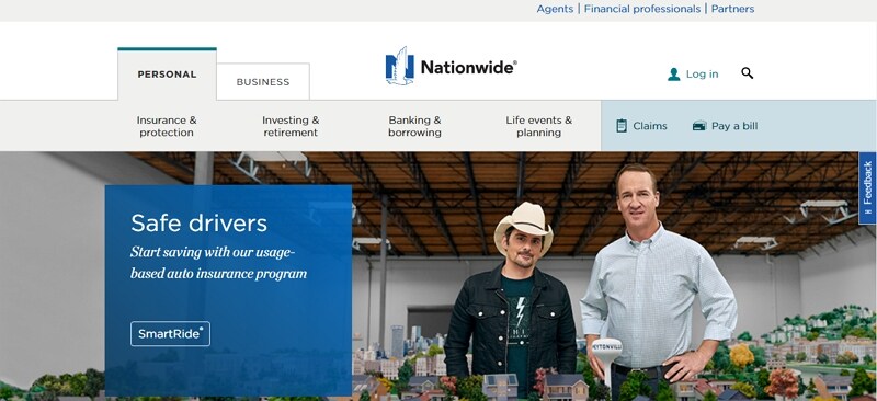
#5: Nationwide Insurance
It may seem to be a daunting task to prepare the web design mobile app for a company that works in the insurance industry. There is so much information to share a phone's screen will not suffice. Well, Nationwide Insurance's mobile website design has made it look like a breeze.
The segregation of different users into "Personal" and "Business" ensures that the user lands on the right page. The two most used options in insurance claims and payments are kept on the top, followed by a couple of options to explore the website further. It is easy, sorted, and a delight to use.
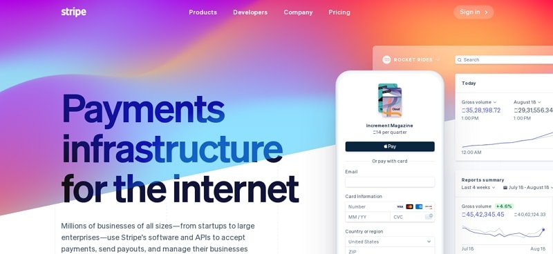
#6: Stripe
As fun as it is when money is credited in your account, an application that makes it possible may turn out to be a bit mundane and dull. But not Stripe, these guys have created a stupendous mobile web page design that looks like that you are surfing a daily tabloid application.
The color coding and menu segmentation is an apt example of UI and UX combined into one powerful punch of efficiency and optimality.
#7: SAP
SAP facilitates an amazing user experience by providing its users with a feature video befitting with the mobile device's screen size. To make it even better, the CTAs are embedded beautifully in a horizontal direction without overlapping with the main page video. SAP helps organizations with the management of their business operations and customer relations. Due to this, their mobile website menu design is designed to help the users reach them in one touch.