Top 8 Modern Website Design Examples For Your Inspiration
A modern website design should fulfill its intended function by conveying its specific message - simultaneously engaging/attracting the visitor. Several factors such as consistency, colors, typography, imagery, simplicity, and functionality all contribute to good website design. When designing a website there are many key factors that will contribute to how it is perceived.
A modern website design can help build trust and guide visitors to take action. Creating a great user experience involves making sure your website design is optimized for usability - form, and aesthetics and how easy is it to use. Your website needs to accommodate the needs of the user. Having a simple clear intention on all pages will help the user interact with what you have to offer.
Effective web design has both great design and great content. Using compelling language great content can attract and influence visitors by converting them into customers.
You can design a modern website with Wondershare Mockitt
Wondershare Mockitt is a collaborative prototyping tool for UI/UX designers. With Mockitt, you can create wireframes and interactive prototypes for mobile apps or websites. By using Sketch Plugin, you can import Sketch files and make prototypes quickly.
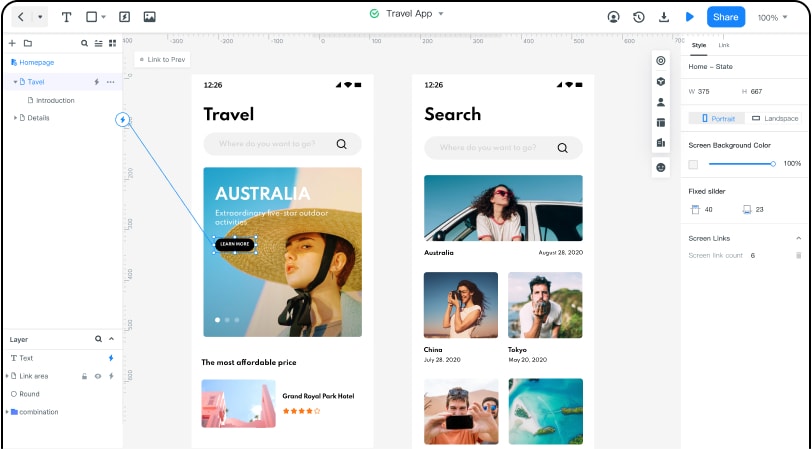
Mockitt has free version. Even for its premium features, it's an economical choice. with Sketch Plugin, you can sync with your Sketch files and quickly link the screens to take your prototyping to a higher level of fidelity. Once the Sketch files are uploaded to Mockitt, images of multiple resolutions can be automatically exported.
1. First of all, download and install the Sketch Plugin in Mockitt.
2.Then open the Sketch plugin and you will see welcome screen.
3. Then go to the plugins option at the top of the bar and open Mockitt.
4. Then you can see Sign Up form. Here you need to log in with your Mockitt account.
5. Then you can open a new project, by using the Sketch plugin you can get many customized layout.
The Best 8 Modern Website Design Examples
The development of the Internet towards an oversized information apparatus can be seen in the modern site design that has changed the appearance of the World Wide Web over the years. The mobile revolution in particular forced web designers to rethink radically. As a web designer you should know the latest web design and page design trends. A modern website design mostly makes use of these web design trends. We present 8 stunning modern websites design and website design trends so that you are well prepared for modern web design in 2020. If you want a modern web page design, you should consider these eight modern website examples or design trends.
1. The Great Discontent
Sometimes, inspiration doesn't come from a visual source — and isn't limited to a specific project. Instead, you might find a motivational story that pushes you to go further with your work and career, so you can design your way into new avenues. For those moments, The Great Discontent's interviews can kindle your creative fire. Jump into Q&As with successful designers, art directors, illustrators, and more, and grab some insight into what makes them — and their careers — tick.
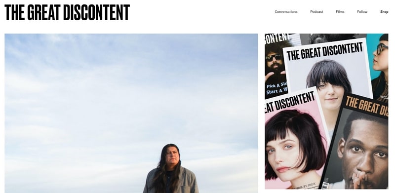
Sometimes, the design industry can feel hyper-focused on concrete things like deliverables, workflows, tools, and best practices. All that's powerful, and much needed, but it can also lead us to lose sight of the real human beings behind the pixels — and the often-powerful stories that led them to their dream careers. The Great Discontent affords us a rare, personal glimpse behind the screens to explore more nebulous, but ultimately more emotional topics like the links between creativity and vulnerability, th>e power of stories, and the often-difficult art of saying no. It's powerful stuff and could do more to inspire you than all the eye-candy 16 Dribbles could offer.
2. A List Apart
From its origins as a humble mailing list, A List Apart has grown into a key destination for the design community, becoming a reliable resource for quality articles that rise above the norm. I mean, how do you not read the journal that published Ethan Marcotte's "Responsive Web Design "? (Which, in case you've been on Mars lately, basically started the whole responsive design thing.) If you're looking for the top WordPress themes of 2020, A List Apart is not for you. But if you're looking for a thoughtful, innovative take on the finer points of designing for our digital world from the best designers on the web–it's the best damn design journal on the web.
3. Admire The Web
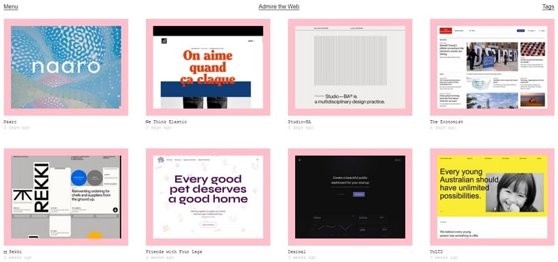
Admire The Web is another strong resource due to its high-quality curated content. Searching through the website proves a touch more cumbersome than others, but the reward is in the abundant content. Admire The Web may not be winning any design awards itself, but its content is extensively tagged, so if you don't mind straining your eyes a little, you'll be uncovering a rich vein of themed inspiration in no time. Something that I think a lot of sites need these days is the classic, Amazon-style "Similar content. " While it's easy to brush off when the match isn't so accurate, when you do find that post that really inspires you, similar content makes it easy to keep tunneling down that rabbit hole of inspiration.
4. Pttrns
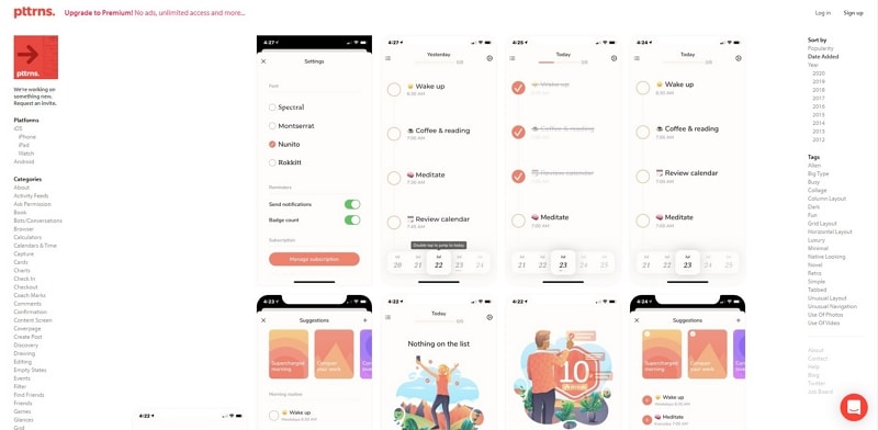
Nowadays, responsive design is a must need for a website. So any mobile app can serve as a superb source of inspiration for your smaller-breakpoint designs. Plus, if you abstract away from the medium a bit, it's not at all hard to imagine how a mobile design pattern might influence your larger-screen designs. Pttrns features more screens from each curated app, so you can easily get a broader sense of how design patterns play out across multiple environments and create consistency across the course of flow. Unlike many other sites, Pttrns focuses on design patterns, divvying up featured apps in categories like "confirmation, " "ask permission, " and "activity feed. " So if you're looking for inspiration within a small subset of interaction or flow, Pttrns will serve you up the best collection of results. While many of the designs and breakdowns in Pttrns are native apps, we all know that the mobile web is pretty much on par with native these days, so pulling mobile web layout inspiration from here is great.
5. Designspiration
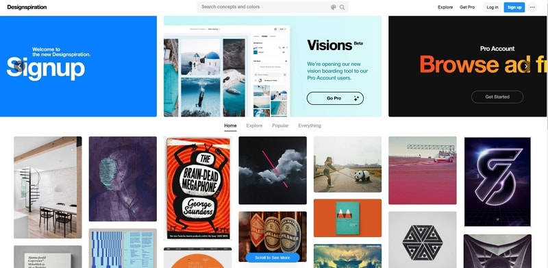
Designspiration is like the Pinterest. It's a simply massive, community-curated feed you can dive into for hours at a time. It doesn't focus on any particular form of design inspiration, but does give you the tools to focus in on particular themes if you'd like. Few curation sites add the personal element that comes from allowing you to save the things that inspire you. Instead of focusing on ephemeral, project-based inspiration, Designspiration lets you build up a personal cache of inspiration websites, and adjusts its feed based on your tastes. There's pros and cons to that, of course, but sometimes there's nothing like a stream fine-tuned to you.
6. Commerce Cream
Commerce Cream presents some of the best-looking ecommerce website designs submitted by design agencies. If you're looking for some ecommerce inspiration, Commerce Cream is a great resource to find a wide variety of design styles — including original, bold, modern, and minimal designs. Commerce Cream is a great place to find ecommerce design inspiration because they only feature the best-looking online stores out there. They also show you the agencies behind the designs, allowing you to discover impressive portfolios from some of the best web design agencies. Websites submitted on Commerce Cream are vetted before they make the website. Anyone can submit a store, but only select stores are picked to be featured. This ensures that all websites displayed are backed by quality design agencies.
7. Dark mode
One of the main trends of 2020 is dark design, mainly focusing on UI design giving users an option to enable dark themes. Dark backgrounds make design elements stand out more, creating a higher contrast ratio with the use of other colors, but still improving visual ergonomics by reducing eye strain. Dark mode web designs not only look ultra-modern, but they're easy on the eyes and make colors and design elements pop. Sometimes the most visually stunning web design trends have practical beginnings. Dark themes are better for OLED and AMOLED screens —saving power and extending screen lifespans —but that utility doesn't stop them from looking good. Dark backgrounds improve the visibility of other accent colors for truly dynamic design.
8. Abduzeedo
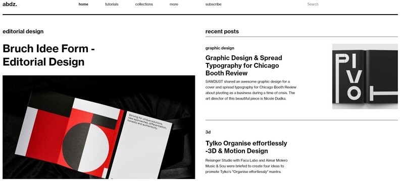
Abduzeedo offers up stiff doses of design inspiration on the daily — allowing you to keep up with today's web design trends. And because the staff doesn't limit itself to web design, you'll find it helps you stretch your personal design paradigm into new dimensions. After all, there's nothing to say your next website can't be inspired by awesome graphic design in a print ad. They highlight the full breadth of design disciplines. Abduzeedo isn't just for digital design inspiration. Instead, they highlight everything from photography to architecture. And as any creative knows, breadth and variety of inspiration can stimulate whole new ways of approaching any problem. Abduzeedo also brings diversity to their inspiration game via the wide variety of media they work in.
