10 Remarkable Samples of Website Design
Congrats! You are currently on the highway to impress your clients or visitors as we are about to mention the best platforms to take inspiration from.
Every web designer and developer is just like a scientist. They are looking for the perfect website design sample to replicate the ideas and build interactive app wireframes or prototypes. Fortunately, the internet is full of examples that can stir creativity and innovation.
The following not only present modern designs but also employ information architecture, conversion optimization, video marketing, UX, and UI strategies to full capacity.
- Part 1: Website Design Samples - They've done it right!
- #1: Zillow
- #2: Mixbook
- #3: Revols
- #4: Fiftythree Pencil
- #5: Boosted
- #6: Beagle
- #7: World of SWISS
- #8: Workstack
- #9: Woven Magazine
- #10: Simply chocolate
- Part 2: A Perfect Tool You Need for Web Designing as A Beginner
Website Design Samples - They've done it right!
#1: Zillow
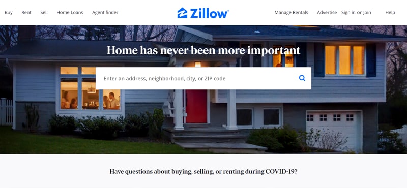
Zillow perfectly hits the nail on the head when it comes to convenience. As you look for the home of your dreams, you promptly get the options to research and share the stores you like, to find it all later on. It covers all important points of an ideal intuitive real estate site. The search bar is well-within the front area, which is feasible for new users. It enables you to make quick selections and search listings without having to look for any hidden search page. Zillow gives confidence to its visitors when they get familiarized with the interface so easily. Nice tact!
#2: Mixbook
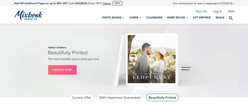
Mixbook boasts its own qualities right from the frontline. Their product is showcased on a sort-of catchy and easy to maneuver homepage that is clearly indicating what its product is, what is the product quality to expect, how it looks, and reviews from customers. This site is an excellent web design advertisement sample. Its brilliant approach is actively highlighting the main product and the most significant points the visitors would like to find answers to. Mixbook also has a sticky sub-navigation that allows users to steer around the page without much hassle while searching exactly what they're looking for.
#3: Revols
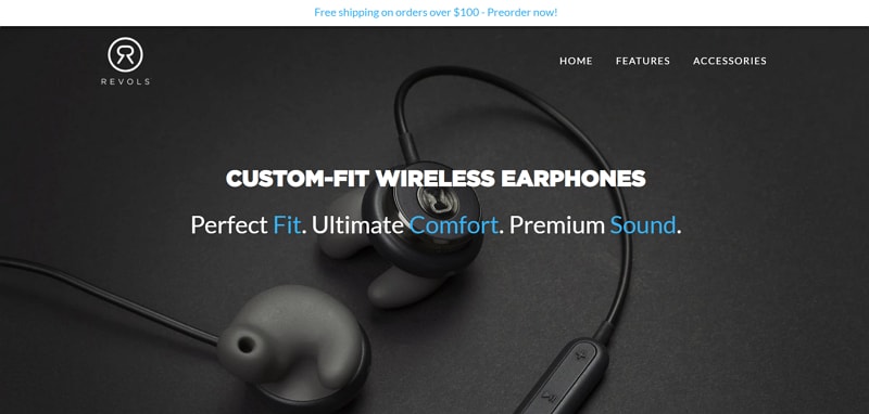
Revols triumphed in designing the most subtle yet effective website layout. It made a daring move by enlarging its small, sophisticated, and minimalist headphones using macro photography. This tactic makes the site look incredibly product-focused. The visitors are straight-drawn to the main thing website has to offer and they become more and more engaged with the experience these headphones are promising to provide. This web design sample is showing what wonders large font treatment can bestow. The high-definition and color contrast is also a nice touch, which adds to the larger-than-life earbud picture. They have made sure you notice and you remember their product.
#4: Fiftythree Pencil
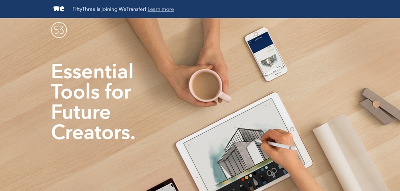
Fiftythree throws all its cards on the deck as it wins in designing an incredible interface without trying too hard. It captures all the functions and advantages for its Pencil Stylus all over the standalone product's page. These features and benefits are attached with attractive images to illustrate the product in action. In this way, the user gets to easily visualize themselves with the product and how they can use it in their projects. Fiftythree provides a layout and visual treatment in such a way that the product's anatomy section seems really unique. Through this dynamic scheme presented in the interface, users are compelled to read more about the product, as opposed to fixated sections that come one after another.
#5: Boosted
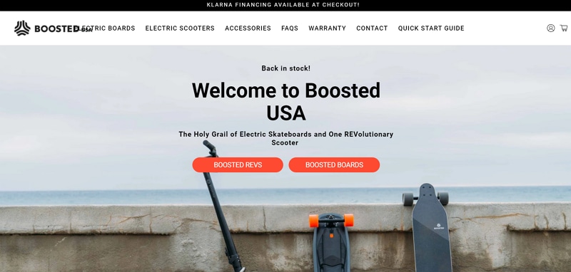
Boosted presents its website the same as its name. It took an average skateboard to a whole new level by incorporating brilliantly detailed photos of its product along with detailed descriptions on its platform. The site's interface is carefully designed with gray tones and white backgrounds to help the users keep their focus on the orange-hued call-to-action buttons. What visitors love about their website is that they have also included a blog that highlights issues that customers might want them to address. This invokes trust and adds an amazing level of transparency to their company. We put it on the list of best sample website designs for a reason!
#6: Beagle
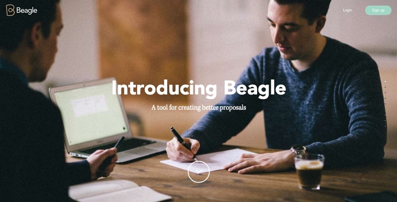
Beagle did a killer job by narrating the story of how their product came into being in an easy-to-digest way. Their strategy is concentrated on visual and progressive approach. Many startups struggle while introducing the concept of their product to existing markets. Potential consumers have tons of questions they want answers to. The hardest one is "Why should I even care?" along with "how does the product work?" and "How will it benefit me?”. Beagle clarified it all while simultaneously showing off what their product can do and compelling the user to purchase it. This web design sample motivates the designers and developers to implement "scroll hijacking" precisely which can be nightmarish if done wrong.
#7: World of SWISS
We live in a world where airline websites are riddled with massive usability issues. Not SWISS airlines, though! They've built an immersive website that pushes forward usability, accessibility, and incredibly responsive design. Other than that, SWISS did a task that is too hard to ignore. They described what it's like to actually fly with them. Impressive visuals and animations walk the visitor to multiple sections of the site that are brimming with information beyond the typical sales and marketing pitch. This web design advertisement sample catches the users' attention without a miss.

#8: Workstack
Hear O' designers, less is more! Workstack did an excellent job keeping the same notion in mind. Its website is condensed, organized, and small. However, they didn't forget to deliver all the value their product has to offer. The large, high-definition imagery and uniform use of color palette and styling throughout the pages make for a brilliant consistent design that goes perfectly with the color scheme of their software. In addition to that, they have presented their best package right in front which is a free trial. The offer is highlighted by a call-to-action green button that is brighter in contrast to the rest of the website.

#9: Woven Magazine
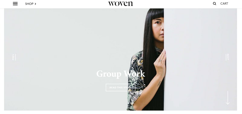
Woven is a unique online publication that gives recognition to artists, designers, and entrepreneurs while exploring the history of design through travel. Their simple yet interactive website proves that publications can indeed have appealing, engaging sites with easy-to-read content. This beautiful platform is free of any distractions that visitors might find dull. There are no pop-ups or obtrusive ads, and this site is all about the experience of the content itself. Woven Magazine had won Best Website Gallery award in 2015 by Pinterest. This web design sample teaches us that minimizing the distractions can earn us great credit.
#10: Simply chocolate
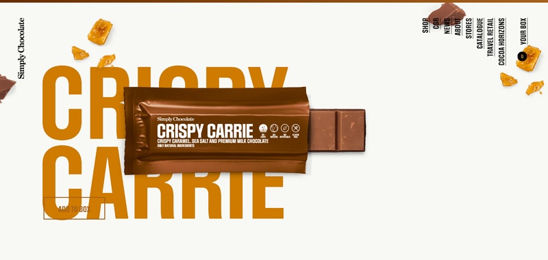
The Denmark-based chocolate maker called Simply Chocolate won the internet by creating the most appetizing website. Along with quirky product names, they've also used a very diverse color palette to promote each chocolate bar the right way. As you scroll through the platform, you will find consistency, attention-to-detail, and immense creativity. The 3D appearance of each chocolate bar urges the visitor to snatch one off the computer screen. Just when the craving intensifies, its web designers and developers have intelligently featured the "Add to Box" button to the bottom-left. This way, users can easily select the products they wish to buy while browsing.
A Perfect Tool You Need for Web Designing as A Beginner
As an online tool that specializes in building mobile app wireframes and prototypes, Wondershare Mockitt is much clapped in the Chinese tech work. However, the English devs are still to be acquainted with the amazing platform.
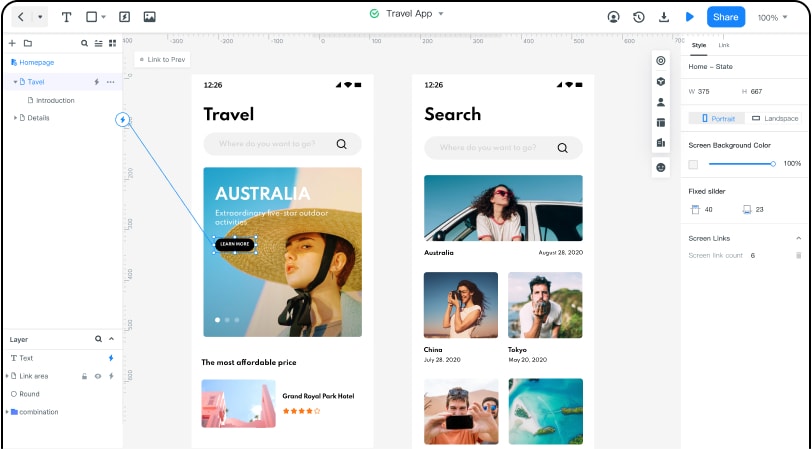
It allows you to build any prototype for Android and iOS devices. Without having to write a single line of code, you can create a clickable prototype for mobile applications and efficiently collaborate with your team members, faster. It has an organized and sleek workspace. Mainly, this tool is focused on the initiation of iOS and Android projects, but it also offers you to use custom-sized layouts. With simple drag and drop moves, you can blend object templates, predefined widgets, and combos into your projects.
When it comes to collaborations, Mockitt can also generate a QRcode. This way, you can test the prototype on your Android or Apple device. The code is simply scanned with the device's camera. It allows you to share your work and get feedback from colleagues or clients.
Another good news for UI/UX designers who are looking for a free prototyping tool to begin with. Mockitt does offer a free version. It supports up to 3 projects and up to 20 screens for each. Even if you want to enjoy the premium version, this incredible tool is incredibly cheap as compared to other options in the market.

