5 Website Footer Designs That Are Worth Referring
Generally, a website consists of three parts: header, main body, and footer. Opposite to the header, a website footer is the content section at the very bottom. Scroll down to see what is being referred to! The footer is more important than what you think, especially when you have visitors who scroll down quickly. A website footer enhances the website by providing critical information you want the users to see again and it provides them guidance without scrolling back. This article guides you every step of creating a good footer using a professional and handy product design platform- Mockitt.
How to design a website footer with Wondershare Mockitt?
Wondershare Mockitt is one of the fastest and efficient ways to turn your idea into a product. Below is the detailed step-by-step guide on how to create a basic website footer with Mockitt:
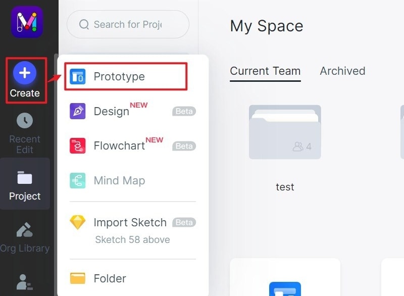
Step 1: Sign up and click on "Create Project", then name your project and choose the right device type. You can choose from a range of sizes.
Step 2: Widgets windows open. There are active widgets on the left and build-in widgets, icons, and My widgets on the right. The widgets can be added by dragging or double-clicking.
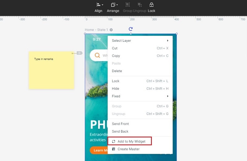
The properties of a widget such as fill, animation, or opacity can be edited in the Inspector Panel on clicking it. A widget can be saved for later use in the My widget library by dragging it to the 'My Widget' Panel or by right-clicking and adding.
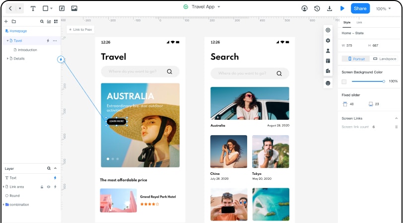
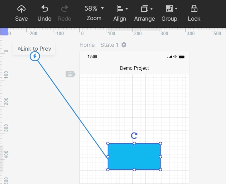
Step 3: Links can be added between screens. Click on 'new link' after choosing a widget to set the gesture, animation, and action for the widget.
Convert the widget to master by right-clicking and choosing 'Create Master.' After conversion, all the instances of the project will inherit the changes made to the properties.
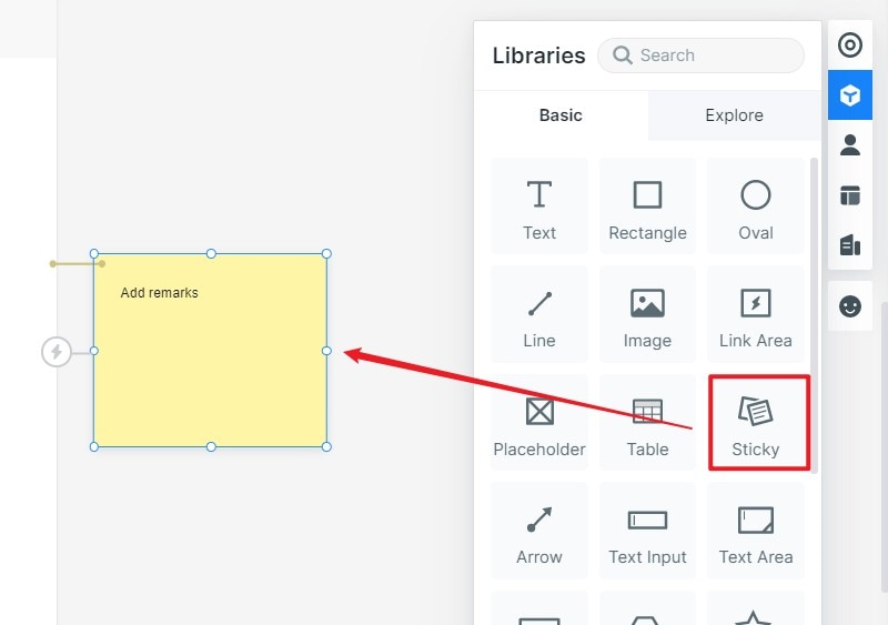
Step 4: To add text notes to your design, choose 'sticky' in the Build-in Widget Library.
Mockitt offers demo website footer templates. The screen can be added to the template by clicking 'move to' in the screen list. Similarly right-click the widget to 'add to widgets' to use it in the template
You can manage all your widgets in the library. To add images, create folders and click 'Add image.' With 'image label,' you can view the images by the label.
Step 5: Press shift or control key to select multiple widgets while performing labeling, moving, and deleting. In the collaboration/team section, you can share the photo gallery with collaborators in a team.Dynamic Widgets can be used to create interactive animation
Other advanced features can be added to the footer such as:
- Audio: Drag a 'Web Page' widget and set the URL from http://music.163.com
- Video: Get the URL from the embed tag on YouTube and enter in the 'Web Page' widget
- Animation: Click the 'State' icon besides Inspect Element. Click on 'New state,' and we can move the size/color/position of the widget
Advanced features can include Tab Navigation bar, Google Spreadsheets, and making a Carousel. The static design files can be made interactive using UI design elements. The prototypes can be previewed on PC, mobile, or offline and can be shared with others. Mockitt is the right platform for enterprise, team, and project management.
Five stunning website footer ideas for your inspiration
A good website footer design is proven to increase sales conversions by 23.77%. To successfully attract your visitor's attention, use a footer that is aesthetically and functionally pleasing. A good web footer design is simple, neat, professional, and trustworthy. Here's what a good footer generally includes:
- Necessary legal protection elements- Privacy Policy, Copyright, Terms of use
- Contact details- Email addresses, Phone numbers, Social media icons and addresses
- Call to Action- Sign up/ Sign in/ Subscribe sections
- Branding- Logo, Gallery, Events, and Awards
- Sitemap with SEO keywords
A footer says a lot about your business. These are some points that you need to keep in mind to create a good footer:
- Invest time in adding useful info
- Group high value links into categories and uses white space properly
- Engage with quality content but don't overcrowd
- Right color combinations and font goes a long way
- Link a contact form or live chat system
In one line, the best website footers are those which represent your website in a nutshell. There are no set rules until the footer captures the essence right and fulfills its purpose.
These are the 5 of the best footer design for website we found:
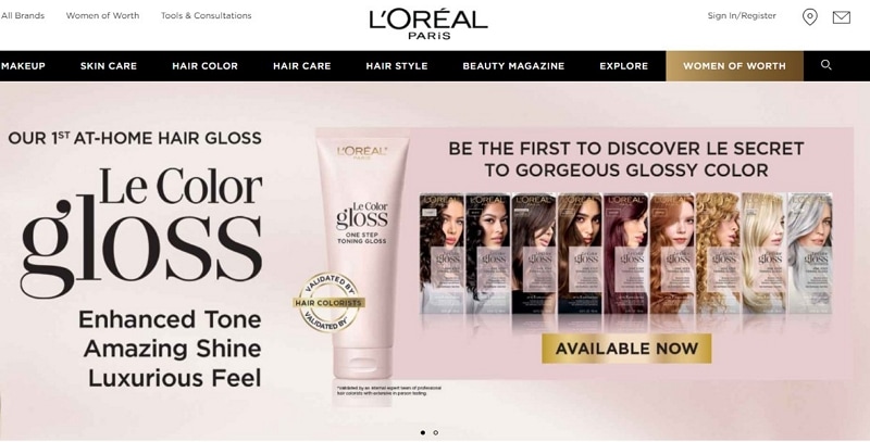
#1: L'Oréal Paris USA
L'Oréal Paris is a leading total beauty care company that needs no introduction. The website is editorial and lists its affordable luxury goods. The website's footer is monotone, matches the header, and reflects its mission of excellence in the field of beauty. The website footer design uses the two sections optimally. The left part is the CTA, which is getting the attention it needs. It also has social media icons. On the other side, all the essential links are categorically linked from About to Contact us. There is a sub footer for additional information, and the different text sizes work best in gathering attention.
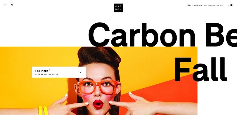
#2: Carbon Beauty
Another beauty website has made the cut. The footer of Carbon Beauty is one of the cleanest social share and footer designs. The website is visually appealing all in all. It displays its new range of products and is mostly pictorial. Scrolling down the page gives the feel of flipping through a good beauty magazine. The fade in and out transitions are present throughout, including the footer. This footer uses minimal links but surprisingly captures all the doubts the visitor might have. Besides this, legal elements, CTA, social icons, and links are present in a very balanced manner.
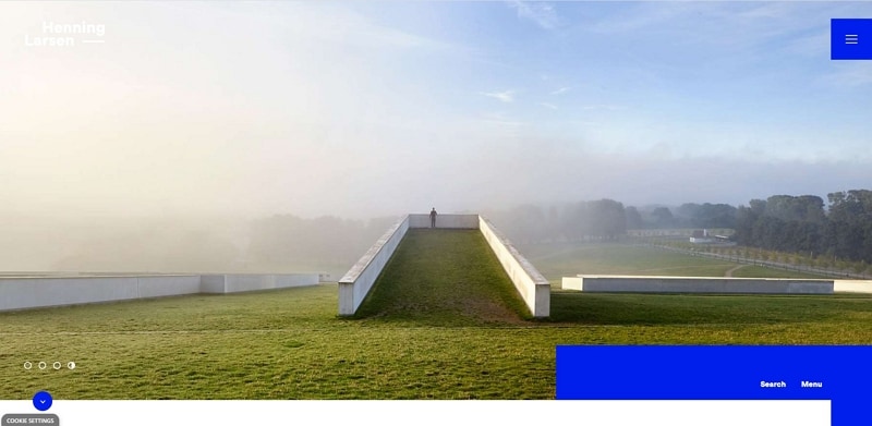
#3: Henning Larsen
Henning Larsen is a Copenhagen based design studio. Their website is minimalistic, uses large fonts, and manages white space efficiently. Like their website, their footer is innovative. The design is simple, having bold black sans serif text against a grey background. It is soothing and exciting at the same time. The most interesting part is the buttons on the left side, which are the current time of their every office. This adds so much personality and freshness to the design. The right focuses on social media, whereas the middle portion is dedicated to important links for the brand and contact details.
#4: The Spruce
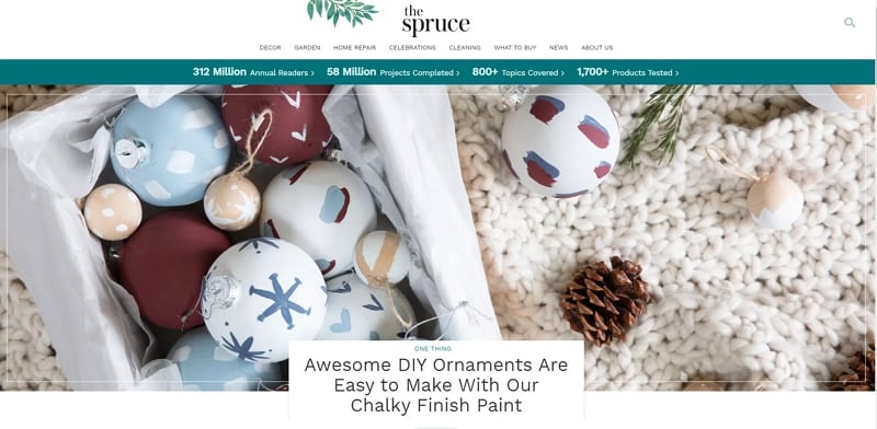
The Spruce is a website dedicated to interior design and housekeeping tips. The website is vibrant, full of pastel colors, and beautiful pictures. Till now, all the website footer templates had solid backgrounds, but they can be customized according to your website's idea. Personalization can be done by adding an image in the foreground, animation, or message whatever feels right. The footer of The Spruce is majorly divided into two parts. The left side summarizes what the website offers using the theme colors. The right side has all the details a footer should cover from CTA to SEO.
#5: eBay
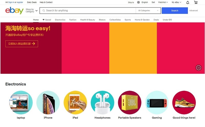
The footer of eBay's website takes one-third of the total space of the webpage. It has a pure white background with grey text. The footer is descriptive, and the links have been very well categorized. It is a simple yet effective footer. The titles are bolded, making it easier for users to navigate to what they are looking for. It is a footer that would urge visitors to stay on-site and explore for more. This footer has made it to the list because it covers almost everything a footer can have. The cherry on the cake is the location setting it offers in the right-bottom.
Now that you know how a footer can be made and have looked through a few examples, just go through the steps mentioned above and create the best footer!

