How to Redesign Facebook to Make it More Friendly
Facebook redesign has provided new inspiration to users with the improved features and ease of use. With more than 1.9 billion the facebook redesign 2020 has led to changes in trends on how people interact on the platform. New facebook redesign offers a great opportunity for a designer to try new features and their skills. With many tools available, it is easy to perform facebook app redesign to make it more interactive and intuitive. This article offers you a guide on how to create new facebook redesign using Wondershare Mockitt and top reasons why you need to redesign Facebook.
- Part 1. How to Redesign Facebook
- Part 2. What is Facebook Redesign
- Part 3. Why You Need to Redesign Facebook
How to Redesign Facebook
Facebook has introduced a new version that allows users to have a great experience as they interact with the platform. The new facebook messenger redesign is more intuitive and simpler to use. It also has a dedicated News Feed that allows users to discover and join conversations, interact with friends, follow trends and engage more with fans. The current version makes it easy to navigate between personal pages and profile. There are more relevant notifications and actionable insights. Besides, facebook redesign also has integrity and safety features that make it easy to detect impersonator accounts and spammy content. Redesigning facebook is not hard. With Wondershare Mockitt you can build the facebook app redesign to make it more user-friendly and modern. This helps resolve the issues among many user who complain of the new version being cluttered with visuals.
Steps to follow when redesigning facebook app using Wondershare Mockitt
Step 1: Create a new project
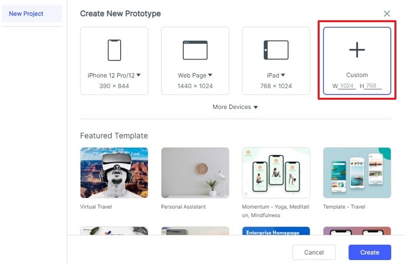
Click "Create" and then "Prototype". Specify the name of the project. In this case name it Facebook app. Choose the device you want to redesign the app. In this case choose "Mobile" and choose the Android or iPhone. Pick iphone to create iOS version of the facebook app. Choose "iphone 12 pro" from the list provided. Then click "Create" and the project is created.
Step 2: Design the launch screen
On the platform, select default "Home Screen State 1", double click on its name and rename to "Launch screen". Remove by deleting all the elements such as navigation bar, you find on the screen because you do not need them for the launch screen. You are left with an empty artboard with a white background colour. To keep everything organised, go to the widgets and choose a rectangle. Drag and drop it to the artboard and enlarge it to fit the artboard.
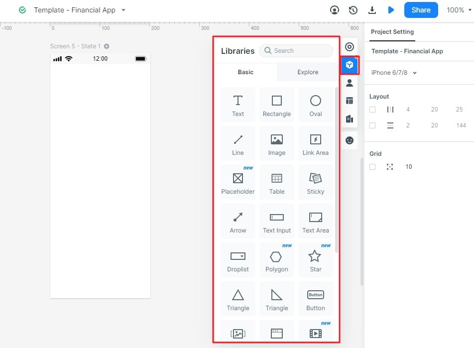
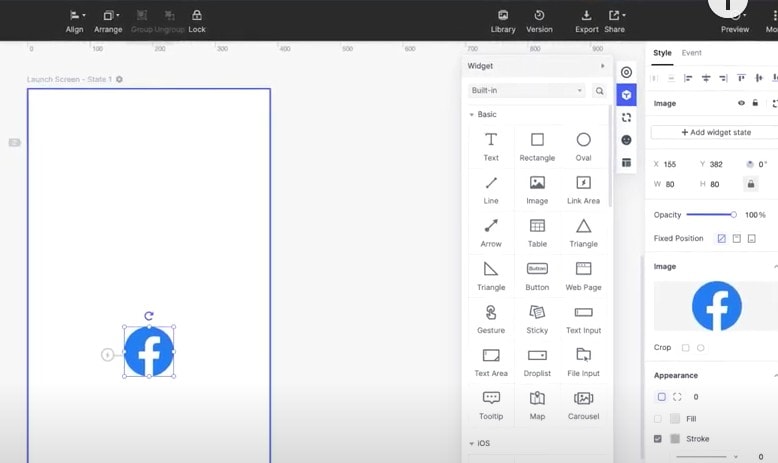
Now insert the facebook logo by clicking the "Library", choose the logo from the "Mine" section and then click insert to screen. Go to the "Style" section to modify the logo to ensure it fits well on the screen and give it all the dimensions you need. Then you need to insert the Facebook name below the logo. Press "T" to get the "Text layer" and type Facebook. Choose the right font and the right colour. Change the spacing and align it horizontally.
Step 3: Design the home screen
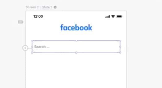
After creating a project, start by changing the background colour of the design canvas from gray to white. Do this by unchecking the field. Choose a "Rectangle" from the widgets. Insert the Facebook logo at the top of the design canvas. Go to the "Library" click "Mine" choose the facebook logo and insert to the design screen. Change the dimensions according to your specific requirements. Align the logo horizontally to the center and then move it up. Next you need to insert the search bar. Go to widgets and select "Text input", drag and drop it to the design canvas and modify its width accordingly. Make it rounded to give it a modern look by going to the "Appearance" section and click "Radius" and set the corner to your desired dimensions. Now change the "Text Layer" at the top to "Search".
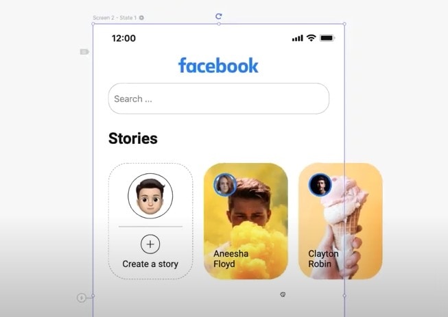
Start designing the Story section by clicking "T" on the keyboard and write Stories on the design canvas. Create a "Rounded rectangle". Drag and drop "Rectangle" from the widgets and modify its dimensions. Go to appearance to check 'Radius' to make it rounded. The first rectangle is for you to create Stories while the others are for your friends' Stories. Put your image in the rectangle by uploading it from "My Library"and crop it to make it fit well. Below the image put a "Line" by dragging and dropping it from the widgets. This line acts as a separator. From here add a "+" icon from the widgets to allow you to add stories. Then, put a "Text input" and write "Create a story". Now select all these elements and groups them together. Hit CTRL+ G and rename it Story 1. Repeat the same process to create other stories.
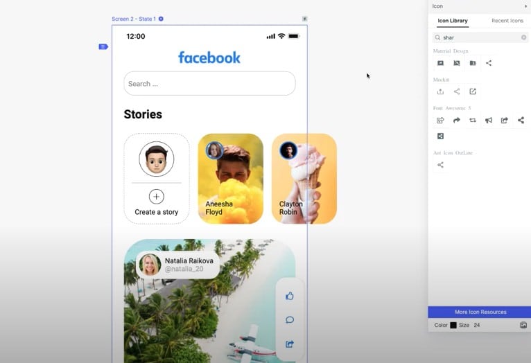
Next you need to design the Post section of the facebook app. Drag and drop a "Rectangle" on the canvas and set the corner radius. Then, upload images from the library and then post them. For user information drag and drop a rectangle on the post to write first, last name and insert profile picture. For the post you need elements for Like, Comments and Share. Duplicate the rectangle and rotate it to 90 degrees. Choose these elements from the "Icon library" and change their colour to blue from the "Appearance" section.
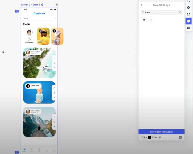
The last thing to do is to create "Tab bar". You do not have to create them from scratch. Go to built in section, select "Tab bar 2", drag and drop it at the bottom of the design canvas. To change its background colour, go to the "Appearance" section and choose the desired colour. Now change the icons and labels. Click "Appearance" section where you get directed to the icons section. Change the "First label" into "Home icon", then second to Media icon, third to Post icon and them last to Menu icon. Change the colours of the icons accordingly from the appearance section. Now it is time to preview the home screen by clicking "Preview" button to check whether it has the functionality and look desired.
Step 4: Design the interaction
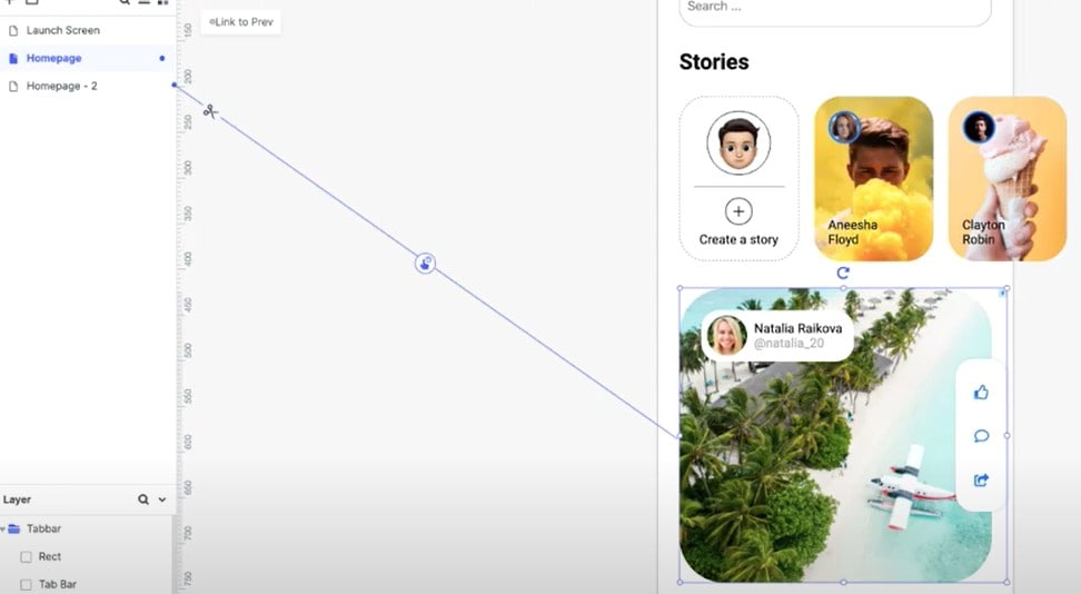
Now that the Home screen is ready it is time to add interaction. First, you need to duplicate the Home screen. Before that, rename it to home page, then choose duplicate and name it home page 2. Go to Home page and hold one of the posts and a thunderbolt icon appears right next to the post. Click on that, drag and drop it on Home page 2. You create an "Event" there and the post is now connected to Home page 2. Now you need to add an image to the page. Go to the "Library", "Mine" and then choose an "lmage" and put it.
Step 5: Design the animation
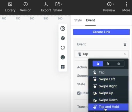
To design animation, go to "Home page", select your post, on the right side select "Event" and modify the preferences of this particular event. Click "Tab menu" and select "Tap" and "Hold". For transition choose none and for duration you can choose 200ms or any other according to your preference. Apply the same for the delay section. Now preview to see how it works. You can add more animations as you wish since Mockitt offers various animation options.
Video Toturial on Facebook Redesign
What is Facebook Redesign
Facebook redesign is the new look performed throughout the mobile apps and desktop. It is a brighter, clean and more contemporary version of the facebook. The new facebook redesign focuses more on groups and events. With the new version you enjoy faster access to some of the critical features and has a simple design and more white space. The facebook redesign 2020 incorporates sleeker icons, larger fonts, dark mode and a simple layout that has fewer columns of information.
In the new version, facebook stories are located above the "Update Status" box. Above the redesigned menu bar there are several tabs located at the left hand corner of the screen in the previous facebook screen. The biggest changes from the past version are the new feeds and groups. The redesign has more focus on groups which facebook views as core to the platform. The groups tab has changed to make it easy to find new groups you are interested. There are more connections among facebook features and groups like the facebook watch and marketplace. Facebook redesign has more new more features and for particular communities such as chat for gaming groups, better facebook live interactions and improved features for those who use it to buy and sell.
Why You Need to Redesign Facebook
Redesign facebook offers a lot of benefits that you would not get from the previous version. Here are major reasons you need to redesign facebook.
More conversations
One of the reasons you need to redesign facebook is that it allows for more conversation. If your main goal of having a facebook account is to attract a huge audience through content, then the redesign is a great option for you. It allows for more conversations that help you build communities and engagements with your audience.
More inspiration
With facebook redesign, you have ample information provided. You can view various personalised stream on your desired subjects. You have a great opportunity to select what you want to watch or read. You can set your streams so that it can pay more attention on posts close to your friends. You can easy switch back and forth between various feeds.
User friendly
With facebook redesign, links and photos are larger drawing more attention. The larger sizes help make facebook redesign more user friendly, if you are a business person, your ads attract more audience. The redesign is more streamlined, simpler and easier to navigate, so everyone finds it appealing to use.
Improve your design skills
Facebook redesign is a great opportunity for you to test new skills, it does not only involve testing a new palette, it allows you to gain more skills and have a great influence on the future of digital design.

