Steps to Design a Beautiful Calendar in Figma
Creating a Figma Calendar UI design using the tool itself is not that hard. However, before getting into it let's first get introduced to what Figma is.
Figma is a web-based graphic design and a prototyping tool. It enables users to work collaboratively on projects from anywhere in the world. Figma is also known as a UI and UX design application that can be used to design websites, applications, or smaller design components. An additional reason why the designers love Figma offers its users a free plan where they can create and store up to 3 designs at a time. Now let's move towards the part where we talk about designing a calendar Figma step by step.
- Part 1: How to Design a Calendar in Figma
- Part 2: How to Design a Calendar in Figma Alternative
- Part 3: 5 of the Best Figma Calendar Templates
How to Design a Calendar in Figma
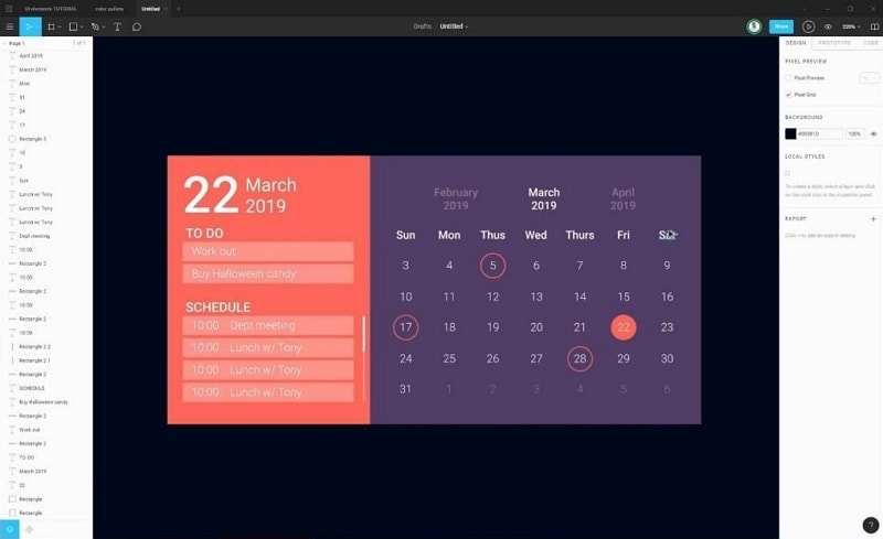
If you want to design a well-optimized and appealing calendar design, then there are many things to be kept in mind. Here's an example of Figma Calendar UI Design:
Step 1 - Choose a solid colour background by selecting the desired colour from the menu on the right-hand side.
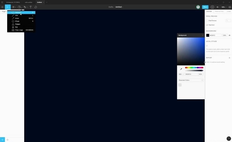
Step 2 - Now select a rectangle from the top left corner of the screen and adjust the width and height (left side of the screen) according to your design considerations.
Step 3 - Now in this example the rectangle is duplicated and its dimensions are changed as per the design requirements.
Step 4 - Now, fill both the rectangles with the colours of your choice making sure that it looks appealing.
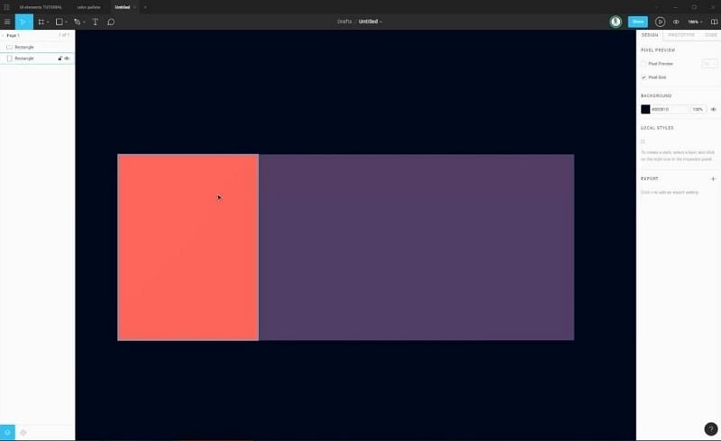
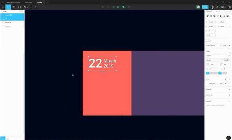
Step 5 - Now add the calendar details one by one. Varying sizes for the main date, month, and year at the top looks good!
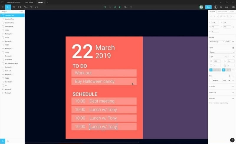
Step 6 - Add to-do lists as per your requirements and fill in the details.
Step 7 - Now use a circle, square depending on your requirements for adding the days of the months.
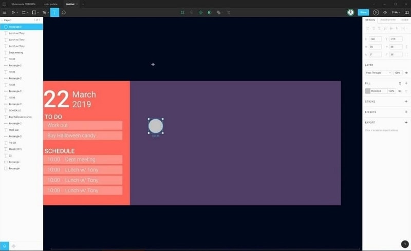
Note: Duplicate a certain element to save time.
Step 8 - Don't worry about the spacing between two elements as it can be unified by selecting the elements all together and using the "distribute vertical spacing" option at the top right of the screen.
Step 9 - Now, duplicate the elements which are well-spaced and finalized and space them horizontally.
Step 10 - Correct the numbering within the circular elements as shown in the image below.
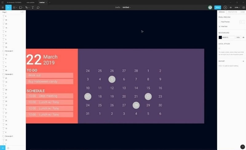
Tip: Use the default calendar of your PC or laptop for reference. (located at bottom right, just click on the date once.)
Step 11 - Remove the excess circle background elements and keep a few of them as to represent a marked date. Also, use white font for date numbering if the background is of dark colour and vice-versa.
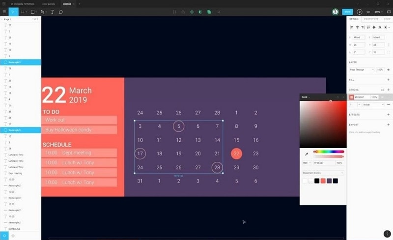
Step 12 - Choose a colour (orange in this case) for your circular element located behind the date numbering. Select the remaining circular elements together and apply the same colour (orange) stroke to them.
Step 13 - Now, make the dates of the past and the coming month grey in colour to highlight the dates of the current month.
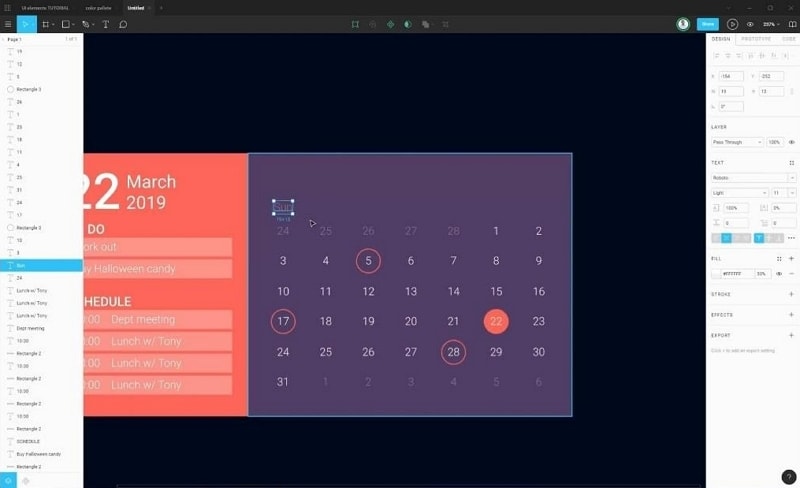
Step 14 - Finally, add the month and year at the top of the dates as shown in the image below. If you utilize the calendar UI kit Figma, then you will be able design it faster.
How to Design a Calendar in Figma Alternative
Wondershare Mockitt is a online designing, prototyping, collaboration, plus a productivity software that enables you to unlock your whole potential. The very tagline of the tool is "Display, verify, and implement ideas efficiently." Mockitt is also cloud-based which means you relief from the process of installing the software, saving the projects manually.
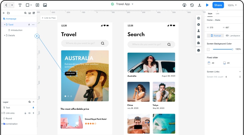
It offers animated prototypes which makes sure that no coding is required. It almost has a zero learning curve as the interface is easy to absorb even if you are a complete newbie. Additionally, the drag and drop functionality makes the whole process much easier too.
- The tool has a great collection of minimalistic asset libraries that are in trend nowadays.
- The service also enables its users to experience the users a Real-time collaborative and seamless communication. This helps in Team efficiency and product management.
- Online commenting is the best feature of the tool to conveniently collect feedback from your team members.
- The Tool ensures financial level security and also has a 128-bit SSL protocol for data transmission encryption. Multi-level disaster recovery backup.
Let's see how we can design a calendar with Wondershare Mockitt as we saw with Figma.
Step-by-Step Guide on how to design a calendar
Calendar designing in Mockitt requires some similar tools as we saw in Figma but which a slightly different interface comes into play. Down below, we have given a comprehensive guide that will take you to a step by step process of creating a professional calendar.
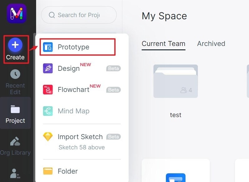
Step 1 - Create a new project by clicking the "Create" > "Prototype".
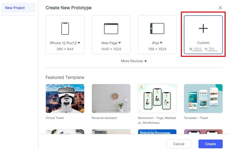
Step 2 - Name the project and select the desired platform in this case I selected the "webpage".
Step 3 - Select the rectangle tool and create two solid colour rectangles that will form the calendar background.
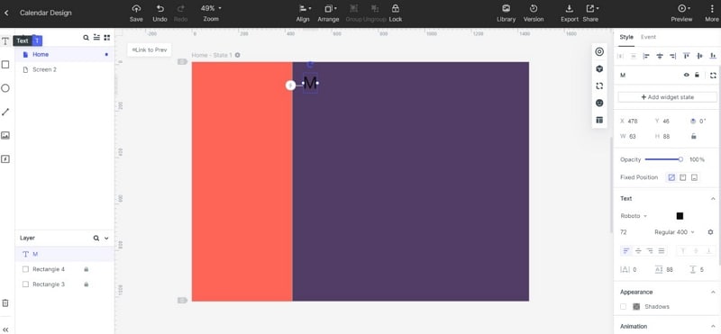
Step 4 - I first created the day's headings at the top similar to what we saw in Figma.
Step 5 - Add circles to the project and then simultaneously number them one by one. Later remove the desired circles and follow the instructions stated in step number 12 in the Figma step by step process above.
Note: Before proceeding with the numbering make sure you space out the circle elements equally by selecting the "Align" feature on the top.
Step 6 - Now add the main Day, date, and year format on the left using the "text" feature.
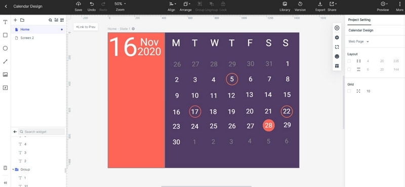
Step 7 - Add the remaining text elements like "to-do' and "schedule" on the rectangle bars made using the rectangle tool and decreasing its opacity afterward.
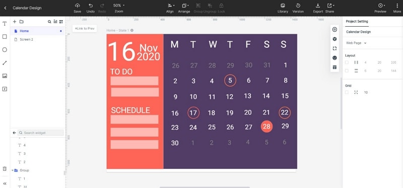
Step 8 - Fill the remaining to-do rectangles and save the template, It is as simple as that.
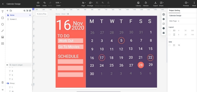
Here is the final product that I made without any prior experience of using Mockitt:
5 of the Best Figma Calendar Templates
Calendar templates are a trendy designing arena nowadays and out of so many of these here we have compiled the Best 5 Figma Calendar Templates. All of them are loved by professional UI designers, so you could easily choose one that suits your needs.
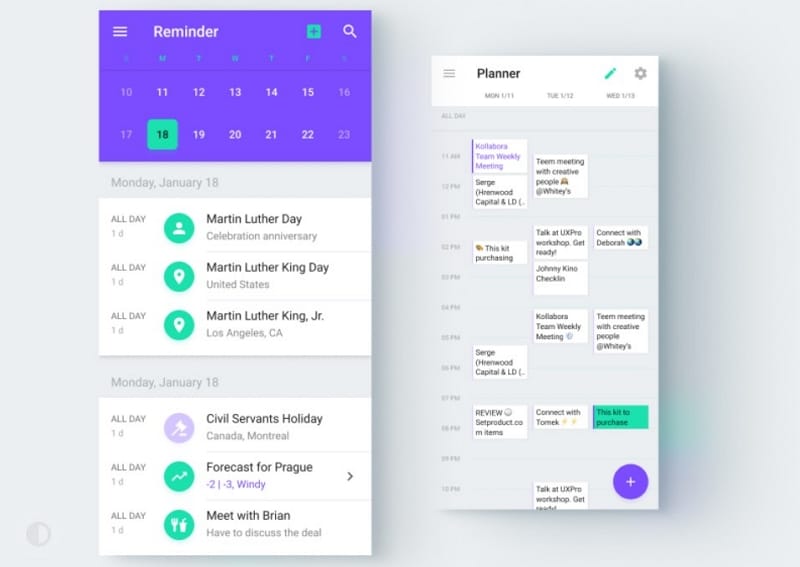
1. The Colour Contrast Design
Source: dribble
This is by far the best looking Figma calendar template out there the shades of neon looking purple and cyan look catchy and attract the eyes of the user but at the same time, it is not too vibrant as the overall white interface balances out the two colours and makes the template look more minimal and professional.
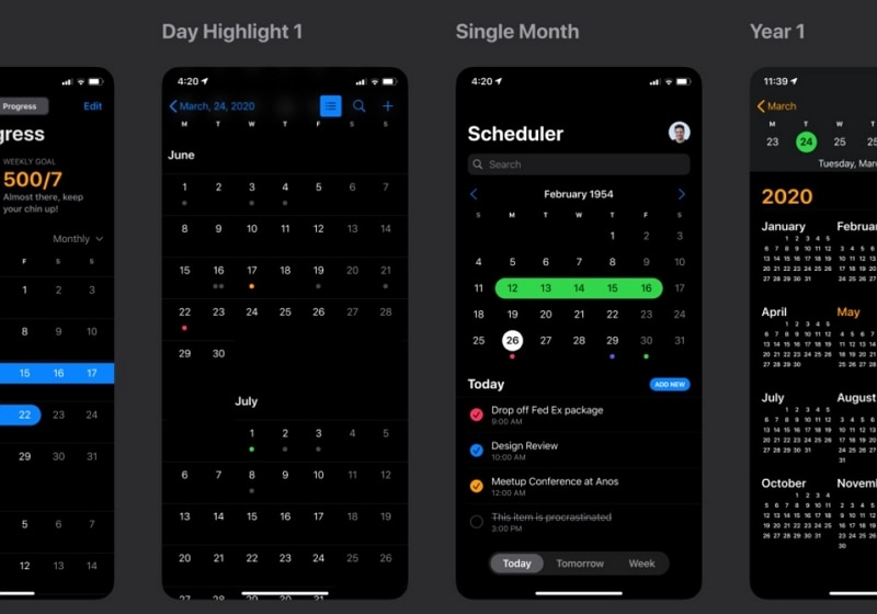
2. The Black Magic Mode
Source: dribble
With the smartphone world going towards the dark mode loved by millions of users across the world this specific template is best for the people who love to stick to the dark mode. Whereas the complementary green and blue shades look great with the calendar.
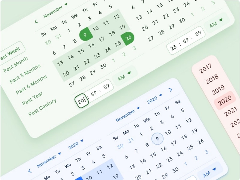
3. The Soft Colour Pallet
Source: dribble
These soft shades of blue, green, and pink are best for the people who love a light touch of colours to their belongings. This template looks fresh and minimalistic at the same time. Plus, the clean interface is a win-win situation for the users.
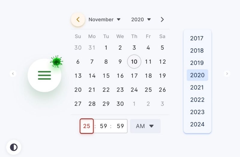
4. Minimal Pandemic Awareness Theme
Source: dribble
This Figma template will be best suited for the hospitals and businesses who choose to promote awareness regarding the current situation around the world. The vibrant white interface provides a much cleaner look, and makes the other elements like date, time and illustrations easily identifiable.
5. The Simplicity
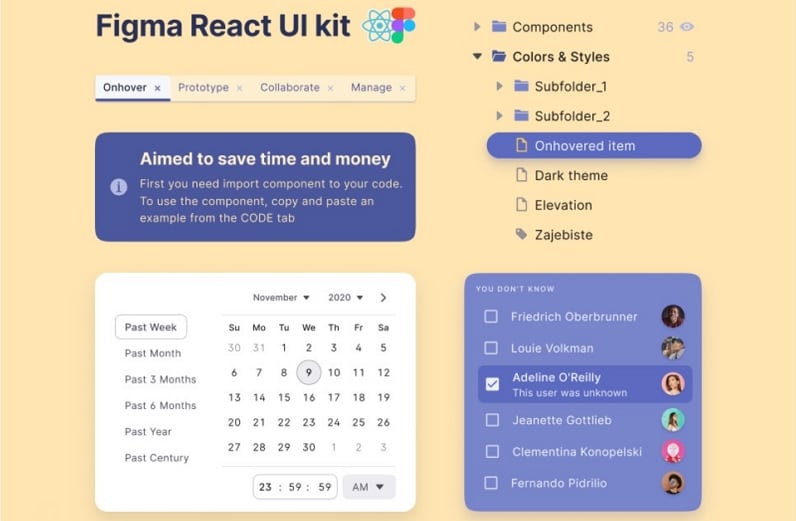
Source: dribble
This is the most basic but effective Figma calendar UI template around. This piece is best suited for the audience who love the pure minimalistic experience as well as for the use in professional areas. Simple is good!
