How to Design a Website: A Step-By-Step Guide for Beginners
Designing a perfect website can be very challenging, especially for beginners. In the beginning, they don't know how to design a website. They all just need a little bit of push and some guidance. Well, if you are a beginner and wanted to know how to design a website? How to design a website layout? Or how to design your own website? You are in the exact right place.
In this article, we are going to cover a step-by-step guide for beginners, how they should design a perfect website.
How to design a website using Mockitt?
Well, there are lots of prototyping or web designing software available in the market, but we generally prefer Wondershare Mockitt as our priority. There are many reasons for choosing this platform. You will know the reasons after go through to this software. You can create lots of design ideas in Mockitt and customize according to your need.
If you are not familiar with Mockitt, here's the step-by-step guide on how to design a website in Mockitt.
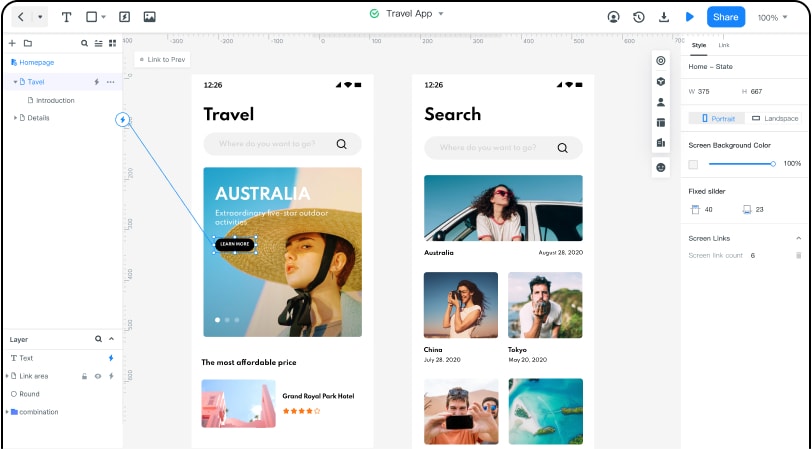
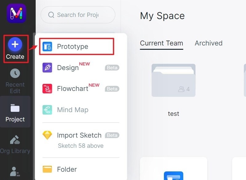
Create a New Project: After logging in, just click "Create Project" to start designing.
In Mockitt you can create designs for multiple platforms such as mobile (iOS/Android), Pad, Web, TV, and Smartwatch.
You can create a Blank Project, choose the right device for you, and the project name, or choose to "Create Project from demos."
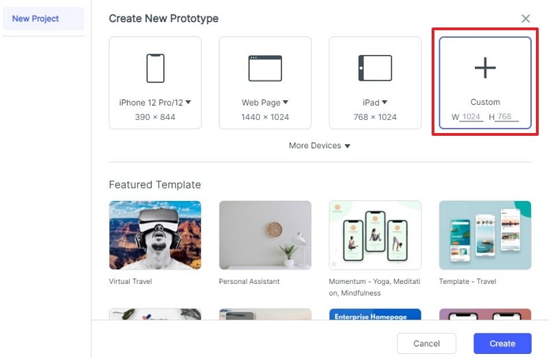
Change project size: You can also customize the project size for any screens.
After creating your project, drag the cursor on your created project and click "..." -> "Settings."
Then you could change the project name, device type, or screen, and save.
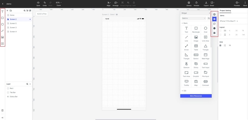
Add Widgets & Icons: On the left side of the display are the fast widgets. There are three ways to add fast widgets to the canvas.
1. Double click the widgets
2. Drag the widgets to the canvas
3. Press the hotkeys and draw
On the right side of the display are assets. There are three types of assets in Mockitt: Build-in Widgets, My Widgets, and Icons. And there are two ways to add them to the canvas.
1. Double click the widgets
2. Drag and drop the widgets to the canvas

Edit the Widgets: Click on any widget, and you can edit its properties in the Inspector Panel at the rightmost side of the screen (marked in red).
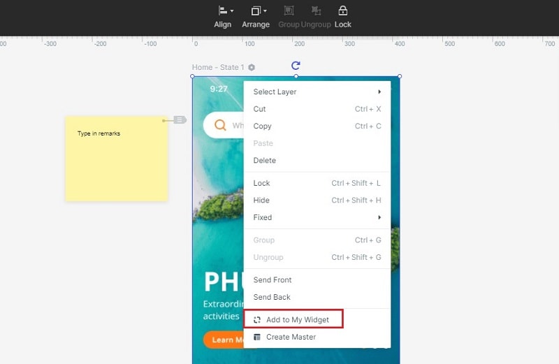
Save Widgets for Reuse: Sometimes, you designed a widget too well and you want to use this widget again for the future. You can save the style of the widget for future reuse.
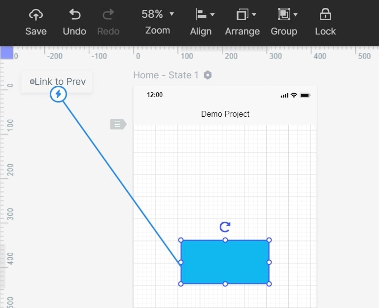
Add links between screens: There are two ways to add links for screens:
- Select one widget and select "New Link" in the right marked panel. After this, you can set gestures and animation for the widget.
- Drag the Link icon on the left of the widget to the target screen. After this, you can adjust gestures, actions, and animation on the link panel.
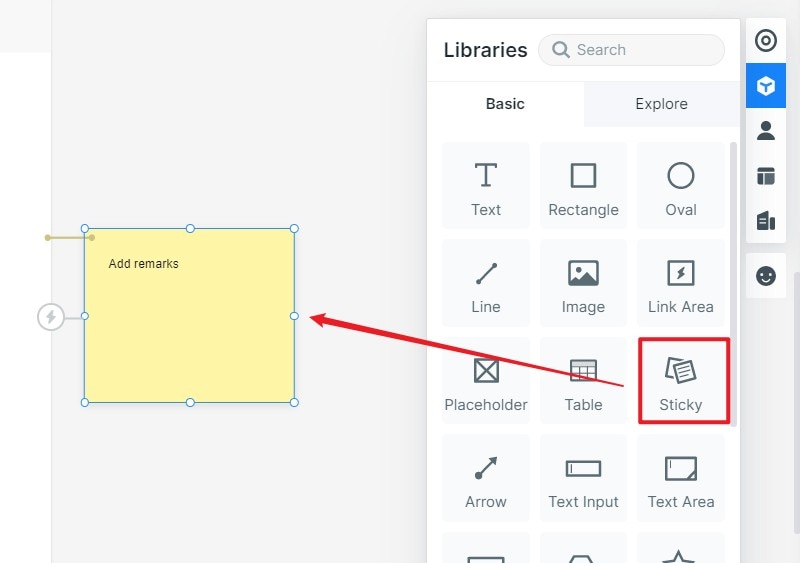
How to Add Notes for your design: Well, you can add notes for your design to explain your design to others. There is a built-in "Sticky" in the widgets library. Simply click on "Sticky" and enter your comments and text in Sticky. You can also preview your notes in the Preview Mode.
There are lots of features inside the Mockitt. Just go to their site and sign up for the project and explore different amazing features.
How to design a website layout?
Designing the website layout can be very tricky, but not very difficult if we avoid some common mistakes, and every designer must do as a beginner. In this post, we bring you the three simple website layout designs that will help you to understand the main aspects of how to design a website layout? For better understanding, follow this post carefully and read word by word to the end.
For your understanding, we've selected three simple websites layout that is attractive and appealing to the visitors.
1. SFMOMA
San Francisco Museum of Modern Art has the best layout for the visitors. Mostly, we liked their layout is that the design is so simple and clear. Museum's website contains art that inspires our imagination. Their website contains fewer numbers of links to most actions the user can take.
Like any other museum website, the SFMOMA website does an excellent job of showing their featured works, exhibitions, events, and much more. Featured video right at the top of the home screen makes users see what's going on inside the museum.
There's a home menu right at the left top side of the layout, containing three items, Exhibitions, Artist & Artworks, and the last thing is #MuseumFromHome. #MuseumFromHome option is the main reason that drives visitors to their website.
SFMOMA has the best and simple layout structure for users and an excellent example for the designers to understand how to design a website layout in general.
2. R2D3
Well, the R2D3 website layout stands second in our list. Their website design is not as simple as SFMOMA, but it has a significant website layout structure.
Previously, the website we visited was related to commerce, but this one is related to education. Most educational websites rely on books, pdf files, notes, and video lectures but R2D3 is a pure visual introduction to machine learning.
R2D3 uses lots of animations, helps clear the complex concepts in just a simple and visual way. The homepage of the R2D3 is created to-the-point for the visitors. When users visit the website, they will face the table of content in front of them and bingo! Start learning. Isn't that simple? Yes, it is.
3. Poulos Collective
Poulos Collective stands at third in an attractive web design layout for the user's perspective. The layout contains different cards that fade away as you scroll down. What makes the layout more beautiful and attractive? The answer is simple: scrollable cards.
A little bit about the Poulos Collective is a consultancy agency that designs a UI game plan. The site not only looks so attractive but also lightweight, fantastic color schemes, and heavily readable text & font styles.
Another thing about the design is it appears the same on mobile devices as it's open on the laptop's web browser. Generally, this website is similar to the mobile interface. If you look at the first time, you'll be considering it as a mobile interface. But in reality, it is not; this layout created for all interfaces. That the vital thing about this design.
How to design a website layout with Mockitt?
Why we choose Mockitt to design website layouts? There are lots of reasons; Mockitt is easy to use, especially for beginners.
Still, having doubts? Don't worry; we are here to guide you on how to design a website layout with Mockitt.
First, all you need is to sign in to Mockitt. If you haven't created an account yet on Mockitt, go to their site and sign up for the best plan.
Now create a project mentioned above to get started. Here's you can see the different layouts you can design for your website. You can import your personalized Icon or Splash screens to your design. Your primary work starts with the "Home" card, drag your cursor to the home card, and see an edit option floating on it.
Here now, you can design whatever you want to design. There are lots of options available for the designer that can help them to design amazing layouts. You can add text, rectangle shapes, oval shapes, link area, insert images, and draw lines to your design. Also, you can add multiple screens to your project.
Sign up for the Mockitt and explore more and more amazing features.

