Everything You Need to Know about Figma Design System
Figma design system is simply a way to describe how your assets, styles, and libraries are stored on the Figma design platform. Creating a design system in Figma is simple, and it saves you time by being shareable and distributable to a high degree. Any design system is defined by the consistency of its various libraries, and it is crucial to every company that puts design at the forefront of its activities.
This article talks about the design system Figma users can create and share with others, along with some Figma design system template examples that highlight the platform's strongest features. After showing you how to create a design system for Figma, we'll also talk about a very powerful Figma alternative where you can create complex design systems with custom assets and shareable libraries at the enterprise level, but one that is also affordable enough for much smaller companies and entrepreneurs to use for their own design and prototyping needs.
- Part 1: Introduction for Figma Design System
- Part 2: The Best Figma Alternative
- Part 3: Top 5 Figma Design System Template & Examples
Introduction to the Figma Design System Creation Process
A design system can be created on any creative platform, but Figma makes it easy by focusing on what matters. Any design system on Figma is instantly shareable with others, and the advantages of using an online design tool like Figma are obvious. Here they are:
- Searchable asset libraries
- Styles that are shareable
- Access libraries online from anywhere
- Components can be customized and reused
- Override properties for a single asset under a master component
- Easy for developers to inspect and download asset and style code
- Push global update to all teams across multiple locations
- Permissions-based access for contributing to team libraries
- Dashboard to view design system use
- Asset usage insights
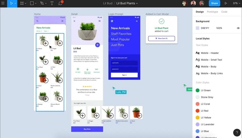
Apart from so many benefits to be gained for your design system Figma offers an ideal platform to maintain design consistency across your organization. Make your brand instantly recognizable across all web and mobile applications that you produce. And no more worrying about version control, lost assets, or unused components. The analytics and dashboard part of the platform gives you full visibility into all your design systems on Figma.
If you're just getting started out on your design system journey, there are several Figma design system template options for you to choose from. There are platform-specific design system templates for iOS and other device types, templates for eCommerce, templates for fonts, templates for Material design, templates for styleguides, and even templates for Figma buttons. A lot of them are free to download and use but there are several premium options as well. The advantage of working in Figma is that there is a huge third-party community to support whatever you need, whether it's UI kits, templates, or entire design systems. Of course, if you want your designs to stand out and be unique, you'll need to develop your own. This is precisely why Figma allows your designers to contribute their designs to help the design systems evolve over time, yet gives you full control over who contributes and where those assets reside.
The Best Figma Alternative
Figma is an excellent design system with a great third-party ecosystem, but it’s not necessarily the best one around. Figma can be very expensive for smaller design companies and individual designers, not only due to the cost of the subscription fees but also the cost of premium third-party utilities like Figma design systems, UI kits, templates, and other asset libraries. For that reason, online tools like Wondershare Mockitt are quickly becoming the go-to choice for cost-conscious design teams.
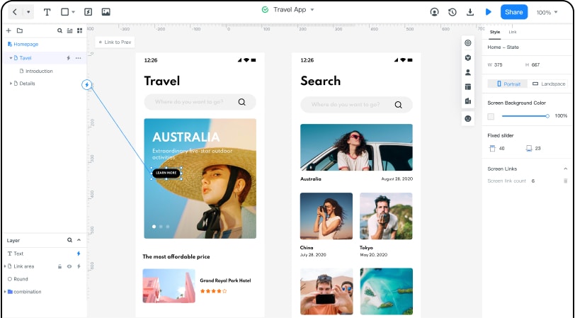
Wondershare Mockitt not only provides the majority of features you'll find in Figma but also does it at a much more reasonable price point. For example, Figma Organization costs $540 per user per annum, while Wondershare Mockitt Enterprise costs just $144 per user per annum. The price difference is stark, but the difference in features is minimal. In addition, Mockitt offers a much more user-friendly interface compared to Figma. Actions like quick linking of assets to target pages to establish interactions, drag-and-drop action, the quick-access widget panel, etc. make it easier and faster to work on designing and prototyping.
Here are some of the features:
- Rich Asset Library: Mockitt offers a massive library of assets that is complemented by UI kits, templates, and other components. Assets can also be customized and added to personal libraries, which can then be shared across teams to create your own design systems without having to rely on third-party utilities.
- Dynamic Widgets: Widget-level interaction can be introduced without having to depend on multiple page states. You can also assign a Master status to a widget so all other instances of that widget can be globally edited by just editing one instance. This helps you work faster and bring more consistency to your prototypes, which is the entire purpose of design systems.
- Easy Prototyping: Possibly the most powerful feature of Mockitt is how rapidly you can prototype a design. Just drag the link icon from the component to its corresponding page state, edit the link to add a gesture, a transition, and an effect, and you're done!
- Powerful Collaboration: Whether it's working on the same design with other designers or letting others review and comment on your design or even sharing prototypes with others, the real-time environment gives you the opportunity to communicate and receive feedback almost instantly. Sharing is as simple as sending a secure URL or QR code to a stakeholder, and you can let them view your prototype offline by downloading the HTML demo package.
- Easy Developer Handoffs: This is usually a very stressful event in the life cycle of any digital product, but Mockitt makes it a pleasant experience. The designs are code-ready when the developer wants to come in and inspect them or download the asset code and style code. That takes a massive burden off the designer's shoulders because Mockitt does all the heavy lifting.
Try Wondershare Mockitt with the free-forever plan that allows you to work on three projects with 20 screens each. You can even add a collaborator to your projects. Once you're happy with how well the online product works for you, you can consider upgrading to an affordable plan.
Mockitt vs. Figma: Advantages of Using Mockitt
If you're considering switching from Figma to Mockitt, there are a couple of other things you should be aware of:
First of all, the biggest reason that Mockitt offers a better experience is the way the platform allows users to interact with it. For instance, the drag-and-drop feature makes it much easier to move elements around and place them on your design screen. Another great feature is the quick prototyping we discussed earlier. A basic prototype can be created in as little as 10 minutes.
The second advantage, of course, is the pricing aspect. Not all businesses can afford to spend hundreds of dollars a year per designer just to have the right tools for the job. Mockitt fills the gap between super-premium products and cheap ones that don't have robust functionality. You can do everything from creating simple wireframes to complex mockups and do hi-fi prototypes in a short time with Wondershare Mockitt.
Top 5 Figma Design System Examples
If you're currently working with Figma and you need some templates to freshen up your design systems, here are some ideas to choose from. They are available either for free or at a premium, and they are all marked accordingly.
Material Dashboard from SetProduct (Premium)
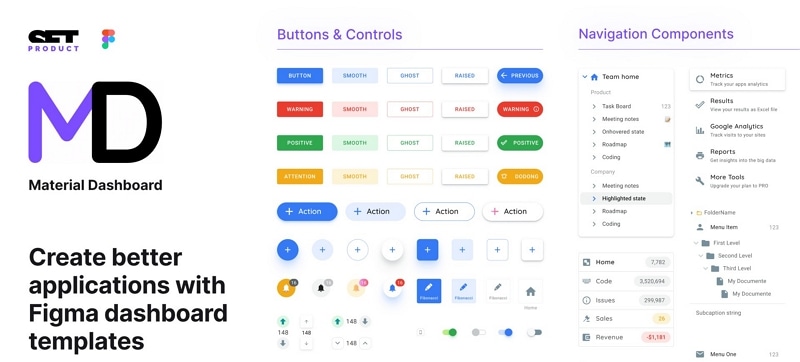
Material Design was originally developed by Google in 2014 but soon grew to be ubiquitous in various operating systems. The idea behind Material Design is to give web and app components the life-like feeling that it is replacing paper and ink. In other words, it brings rich textures to digital elements and makes them stand out. The example shown here brings MD to your dashboard applications.
Argon UI Kit from Creative Tim (Free)
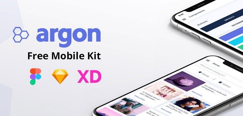
Argon is a basic mobile UI design system template with lots of screens designed specifically for iOS and Android devices. The screens are all customizable and you won't have to pay to download the template. Although these were created with Figma, they can also be used by other platforms such as Adobe XD and Sketch.
Core Design System from Ryan Sael (Free for Personal Use)
Another free Figma design system is the Core Design System, which essentially consists of different types of UI experiences. The main attraction of this free download is that it fits projects of all sizes, and you'll find lots of layered UI that you can customize per your needs. The only catch is that it is only available for personal use, not commercial projects.
S8 Figma Design System from Roman Kamushken (Premium)
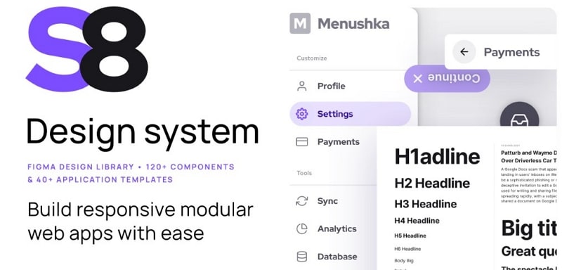
This excellent design system comprises over 40 templates for apps and over 120 different UI components. It also offers some interesting UI pattern combinations that are commonly used in web applications. It's easy to search the repository for what you need, and the design theme is maintained throughout the components and templates, all of which are customizable.

